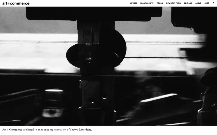
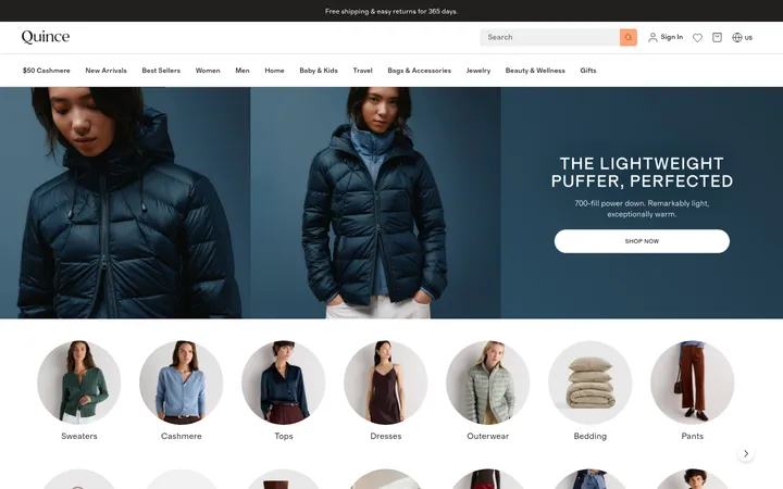
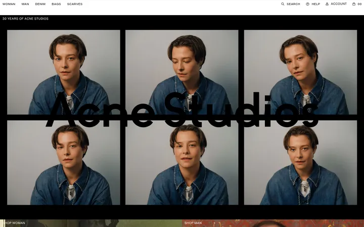
North star · Keep the interface quiet and sharply legible so oversized editorial type and richly colored brand photography carry the visual impact.
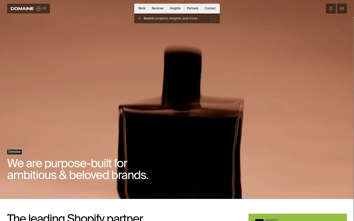
The page’s foundation is stark white, punctuated by black hero, partner, and footer bands. Black carries headings, navigation, and most copy; muted gray and pale gray handle secondary text, borders, and subtle link or card surfaces. Green tones appear sparingly in Shopify-related links or partner callouts, not as the dominant brand palette. Suisse Intl is used throughout, with regular-weight, tightly tracked display headlines and small, understated utility labels. The opening hero is a full-bleed moving-image-like photograph with white copy anchored low on the left; the page then shifts into a clean, editorial rhythm of left-aligned text and image-led project grids. Sections are spacious and mostly white, while dense service links and location lists provide moments of compression. Photography supplies the strongest color, with warm product and lifestyle imagery giving each project its own palette. Hairline borders and flat surfaces keep the interface crisp rather than ornamental.
Site-wide display headings, body copy, navigation, links, buttons, labels, and forms.
角色
示例
字号
字重
行高
字距
特大标题
Large hero or editorial statements with close-set, high-impact lines.
Domaine
80px
400
0.9
-0.04em
一级标题
Primary page and section headlines, usually left-aligned.
Domaine
48px
400
1
-0.04em
二级标题
Prominent section introductions and supporting editorial headings.
Domaine
40px
400
1.1
-0.04em
三级标题
Compact uppercase labels such as SERVICES and section markers.
The quick brown fox 敏捷的狐狸
24px
400
1.1
-0.01em
四级标题
Card, feature, and supporting subsection headings.
The quick brown fox 敏捷的狐狸
18px
400
1.2
-0.02em
正文
Descriptions, explanatory copy, testimonials, and article text.
The quick brown fox 敏捷的狐狸
14px
400
normal
0
辅助文字
Project metadata, dates, and compact image or card notes.
The quick brown fox 敏捷的狐狸
12px
400
normal
0
按钮
Short CTA and action labels.
The quick brown fox 敏捷的狐狸
12px
400
normal
0
导航
Compact global navigation and utility controls.
The quick brown fox 敏捷的狐狸
12px
400
normal
0
链接
Large display-style text links, including prominent service links.
Domaine
80px
400
0.9
-0.04em
间距与布局
基准单位 1px · 密度:适中
60px版块间距
3px元素间距
8px卡片内边距
1382px内容最大宽度
2px
3px
4px
5px
10px
15px
20px
29px
60px
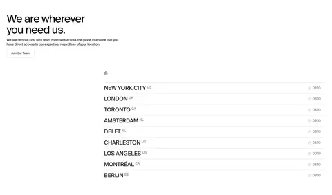
A long, mostly single-column page uses a measured 1382px maximum content width, with selected three- and four-column image or service grids. Text is predominantly left-aligned, with uneven image placement and asymmetrical compositions adding editorial character. Broad white sections create a spacious baseline; the full-width black hero, partner band, and footer break the rhythm. Project, partner, and insight areas tighten the density, while service lists, location rows, and image galleries use generous separation rather than enclosing every item in cards.
圆角与层次
按钮 · 3px
输入框 · 3px
卡片 · 3px
图片 · 3px
徽标 · 3px
导航 · 3px
链接 · 3px
没有测到阴影:页面是扁平的,层次靠底色和描边区分。
The interface is predominantly flat, with no measured shadow system. Pale-gray surfaces, thin gray rules, and occasional dark card outlines define controls and content boundaries. Small, subtly rounded corners appear on buttons and cards, while project images remain visually direct and unframed. Contrast comes from black section bands and layered photography rather than elevated panels.
组件
下面的预览按实测的按钮、输入框、徽标、卡片样式重建(字体用替代字体)。
Floating navigation
Compact top navigation combines a white menu panel with a dark search strip; small utility controls sit at the upper right.
Hero statement
Full-bleed photographic opening with a small dark brand label and large white, left-aligned headline near the bottom.
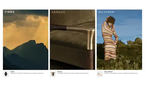
Project cards
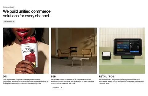
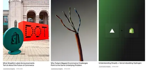
Rectangular brand imagery arranged in a three-column project row, with compact names and migration or project details.
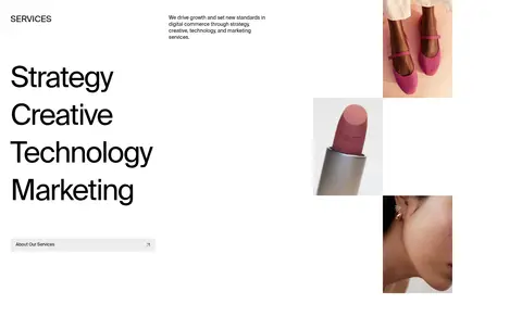
Service list
Large, simple text links for Strategy, Creative, Technology, and Marketing, balanced against staggered product imagery.
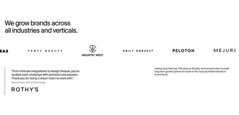
Partner directory
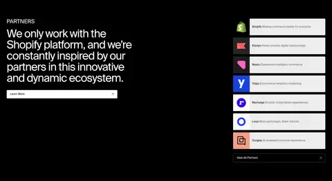
Black section pairs a large white statement and CTA with a vertical stack of white partner rows and colorful logos.
Insight feed
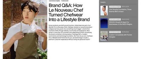
Editorial article cards mix photography, compact metadata, oversized headlines, and a neighboring list of recent insights.
Newsletter footer
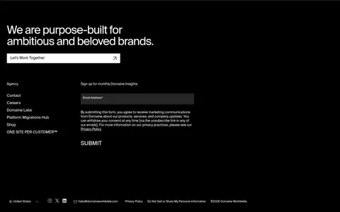
Black footer combines a large closing statement and CTA, compact site links, and a small email signup form.
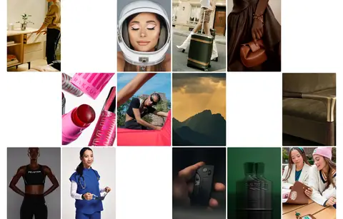
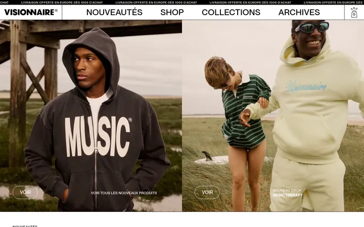
Imagery · Photography is the primary expressive medium: the hero uses a full-bleed, warm-toned product or lifestyle film still, while project and industry imagery ranges across fashion, beauty, interiors, food, and commerce. Images are rectangular, often arranged in editorial grids or staggered compositions, and retain their own color grading rather than receiving a uniform overlay. Interface icons and logos remain small supporting details.
Reserve green accents for commerce or partner callouts.
Let project photography contribute its own color palette.
Keep major headlines large, regular-weight, and tightly tracked.
Use left-aligned editorial copy and varied image layouts.
Separate flat content with whitespace and fine rules.
✕ 不该做
Do not apply gradients or decorative shadows.
Do not make green the dominant interface color.
Do not box every section into rounded cards.
Do not center all headings or make the page symmetrical.
Do not use heavy typography or ornamental display faces.
Do not suppress the imagery with a uniform color treatment.
给 AI 的提示词
想快速出一个同风格的新页面,把这段话连同 DESIGN.md 一起发给 AI。
Build a new page in Domaine’s editorial commerce-agency style. Use Gallery White (#ffffff) as the primary canvas and Studio Ink (#000000) for typography, navigation, and selective full-width dark sections. Set Suisse Intl, or a close Inter substitute, in regular weights; keep utility text small and display headlines large with tight tracking. Use Rule Gray (#dbdbdb) for fine separators and Mist Gray (#ededed) for restrained controls. Commerce Green (#048060) and Shopify Lime (#95bf46) should appear only as sparse partner accents. Structure the page as spacious left-aligned editorial sections mixed with asymmetric image grids. Favor authentic, richly colored product and lifestyle photography over decorative graphics. Keep surfaces flat, corners modest, and shadows absent; create hierarchy with image scale, whitespace, and alternating dark bands.