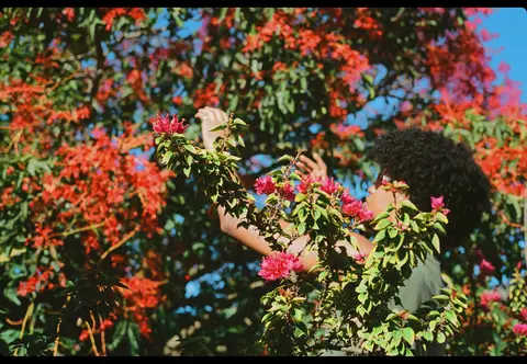
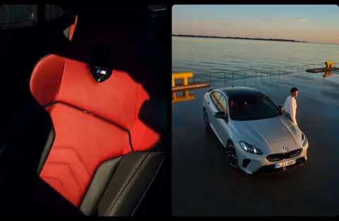
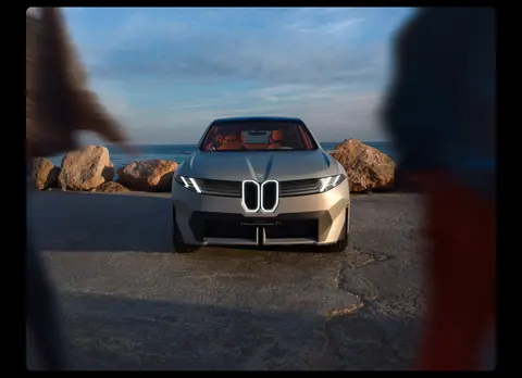
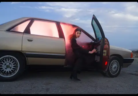
North star · Keep the interface monochrome and understated so each cinematic project image, not decorative UI, commands attention.
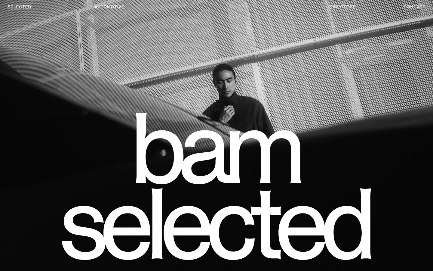
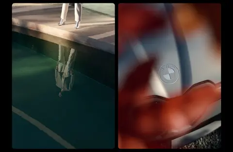
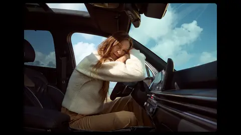
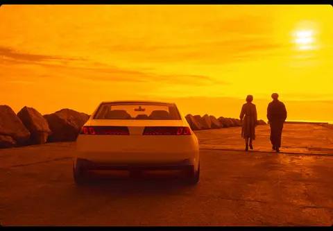
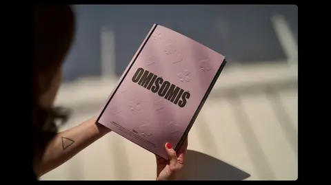
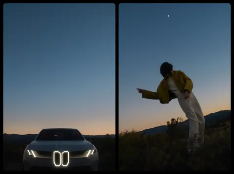
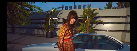
The page uses a deliberately spare monochrome interface: #000000 anchors the canvas and #ffffff carries navigation, headings, and the oversized opening wordmark. The hero’s black-and-white photograph establishes the mood, while the project sequence introduces saturated colors only through the photography; these hues are image content, not interface accents. Compact uppercase navigation and labels contrast with a very large, expressive brand mark. Helveesti is measured for the small interface text, with consistent tracking and uppercase treatment. Projects are arranged as broad, vertically stacked image compositions, alternating full-width frames with paired images. Black gutters keep separate works distinct without adding decorative card chrome. Sections follow a steady, spacious rhythm, and text stays secondary to the imagery. Reproduce the page as a quiet gallery: restrained interface, high-impact photography, and no invented color accents.
A vertically scrolling, single-column portfolio uses a measured page maximum width of 1390px and a comfortable section rhythm. The opening viewport is a full-bleed photographic hero with navigation overlaid along its top edge and an enormous centered wordmark. Below, project compositions alternate between paired frames and wide single images; headings align to the start. Keep the black canvas visible as gutters and avoid adding conventional boxed content columns.
圆角与层次
没有测到阴影:页面是扁平的,层次靠底色和描边区分。
The measured interface is flat, with no shadows or gradients. Black gutters provide separation between photographs instead of borders or elevated cards. Keep the navigation and wordmark layered directly over the hero image; use contrast from the image and white type rather than introducing decorative panels.
组件
下面的预览按实测的按钮、输入框、徽标、卡片样式重建(字体用替代字体)。
Overlay navigation
A compact uppercase row sits over the hero image, with links for Selected, Automotive, Directors, and Contact in white.
Hero wordmark
An oversized white “bam selected” wordmark dominates the opening black-and-white photographic frame.
Project heading
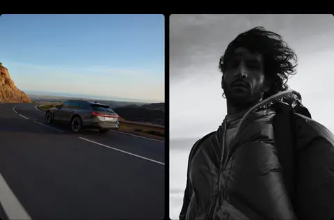
Short white project titles, such as AUDI and A6 ALLROAD, introduce image-led work and align to the start.
Project image composition
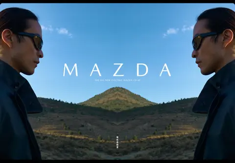
Wide single images and paired frames alternate down the page, separated by the black canvas.
Project link
Where present, a plain white uppercase link sits alongside project content without a button background.
Imagery · Use cinematic photography as the primary content: automotive campaigns, portraits, landscapes, and lifestyle scenes. The opening image is black and white, while later project images retain vivid natural color. Mix wide single frames with paired images, preserving each image’s own crop and strong photographic atmosphere; do not add illustrations or interface graphics as substitutes.
Do not let supporting copy compete with the photography.
Do not replace the monochrome hero with a colorful interface treatment.
Do not introduce extra font families without evidence.
给 AI 的提示词
想快速出一个同风格的新页面,把这段话连同 DESIGN.md 一起发给 AI。
Build a new photography portfolio page in BAM Photographers’ restrained gallery style. Use Gallery Black (#000000) for the full-page canvas and Paper White (#ffffff) for navigation, headings, and interface labels; keep color confined to the photographs. Start with a cinematic full-bleed hero, overlay a compact uppercase navigation row, and give the brand wordmark dominant scale. Use Helveesti where available, or a close sans-serif substitute, for lightly tracked uppercase interface text. Organize the work as a spacious vertical sequence of broad images, alternating single frames and paired compositions, with short start-aligned project titles. Preserve black gutters between works. Keep the interface flat: no shadows, gradients, colored buttons, or ornamental card chrome. Prioritize atmospheric automotive and lifestyle photography over explanatory copy.