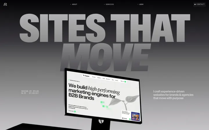
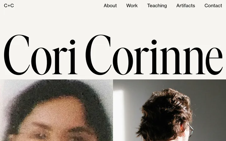
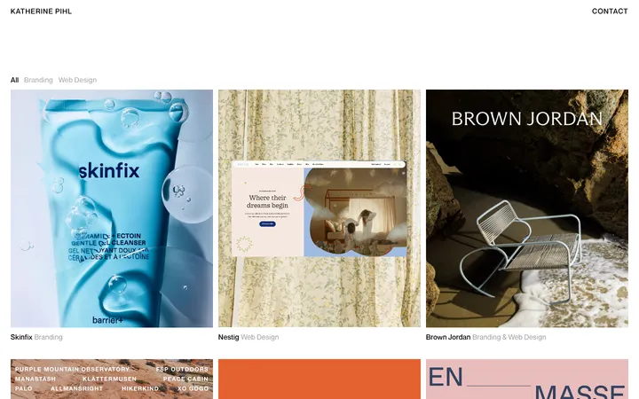
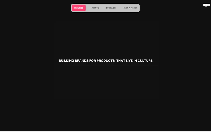
North star · Let oversized, tightly tracked project typography and expansive white space carry the identity; keep every other element quiet.
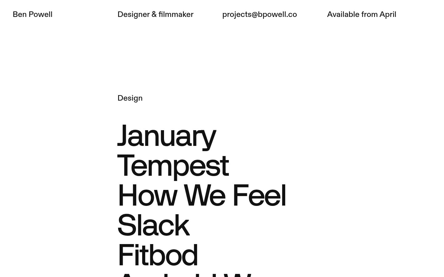
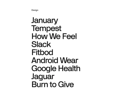
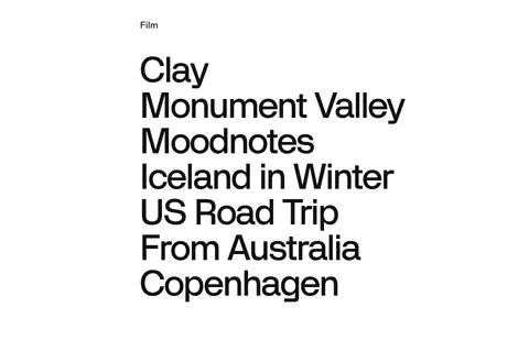
The visual identity is built from a strict two-colour palette: white (#ffffff) carries nearly the entire page, while near-black (#111111) supplies the text and the final contact band. There are no decorative gradients, shadows, or rounded cards; contrast and typography do the work. A compact header distributes the designer’s name, role, email, and availability across the width. Below it, project names form a prominent, left-aligned text list with generous surrounding whitespace. Design and film are separated into successive sections rather than boxed into cards. The measured layout uses a two-column structure for the project areas and a three-column services area, within a 1360px maximum page width. Diatype handles supporting text and links, while Teg gives the display and heading styles their characteristic scale and tight tracking. Media exists in the project content, but the page’s defining impression is its quiet, text-led presentation. A black contact footer closes the otherwise white page.
Display and main headings, especially the prominent project-name list
角色
示例
字号
字重
行高
字距
特大标题
Oversized project names and dominant portfolio display text.
Ben Powell
86.5px
500
1.05
-0.033em
一级标题
Major heading treatment, including the prominent contact email.
Ben Powell
57.5px
500
1.04
-0.017em
正文
Supporting descriptions and compact header information.
The quick brown fox 敏捷的狐狸
26px
500
1.15
0
链接
Text links in project lists and contact details.
The quick brown fox 敏捷的狐狸
26px
500
1.05
0
间距与布局
基准单位 8px · 密度:适中
54px版块间距
—元素间距
—卡片内边距
1360px内容最大宽度
3px
4px
8px
16px
24px
32px
40px
50px
54px
56px
101px
104px
108px
Use a broad page canvas capped at the measured 1360px maximum width. The header spreads four short identity and availability details across the top. Project sections use a two-column structure, with category labels and large text lists aligned to a consistent content area; services shift to three columns. Keep density comfortable and preserve long open intervals between content groups. The measured section rhythm is 54px, with a larger amount of whitespace apparent around the project lists. End with a full-width inverse contact section.
圆角与层次
没有测到阴影:页面是扁平的,层次靠底色和描边区分。
The page is flat: measured data reports no shadows, gradients, or radius scale. Avoid raised cards and layered surfaces. Sections are distinguished by whitespace and typography, with the #111111 contact band providing the clear contrast at the bottom; borders are not a prominent visual device.
组件
下面的预览按实测的按钮、输入框、徽标、卡片样式重建(字体用替代字体)。
Top identity row
A single horizontal line of four concise details: name, professional role, email, and availability, spaced across the white canvas.
Project category list
A small category label sits above a large, tightly set list of project-name links; design and film appear in separate sections.
Services list
A three-column content section listing capabilities and selected clients without card containers.
Contact footer
A full-width #111111 closing band with a prominent projects email and smaller supporting footer details.
Imagery · Project sections contain image assets, but the supplied views make the text-led composition the defining feature. Treat project imagery as supporting work previews rather than decorative background: keep it associated with its project, preserve its natural visual character, and avoid adding gradients, illustration, or 3D embellishment. The screenshot does not establish a specific image treatment, framing style, or video behavior, so do not impose one.
Make project names the strongest typographic element.
Keep project links as plain text rather than buttons.
Separate content groups with generous whitespace.
Use a dark contact band to close the page.
✕ 不该做
Do not introduce accent colours beyond the measured palette.
Do not add gradients, shadows, or rounded cards.
Do not crowd the project lists with decorative UI.
Do not turn text links into prominent filled CTAs.
Do not treat project imagery as the page-wide background.
Do not add unmeasured sizing or spacing values.
给 AI 的提示词
想快速出一个同风格的新页面,把这段话连同 DESIGN.md 一起发给 AI。
Build a new portfolio page in Ben Powell’s restrained, editorial style. Use Gallery White (#ffffff) as the canvas and Ink Black (#111111) for text and the contrasting contact area. Keep a compact, horizontally distributed identity row above a left-aligned content column. Use a strong display sans for large project names, with tight tracking and compact line spacing; use a clean sans for supporting details. Organize work into clearly labeled text-led groups, then include a straightforward services or capabilities section and a dark contact footer. Preserve generous whitespace and a flat visual treatment: no shadows, gradients, rounded cards, or invented accent colours. Keep links typographic and understated. Treat any work imagery as project-specific supporting content rather than decoration, and do not invent image styling unsupported by the reference.