North star · Keep the interface quiet, white, and sharply editorial so the artwork supplies the color and motion.
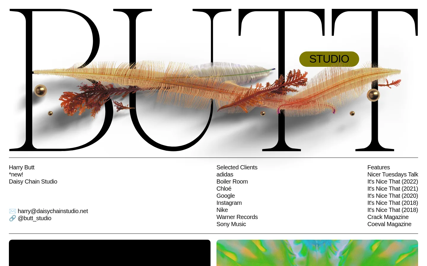
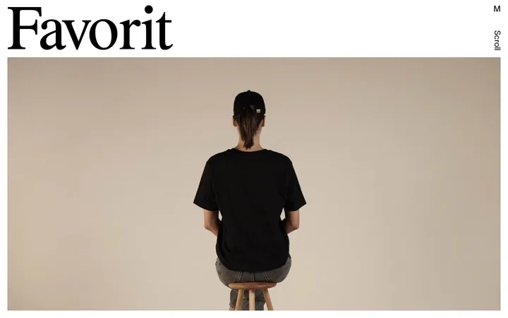
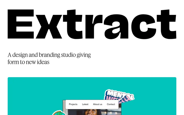
The visual strategy is an editorial portfolio built on a bright white page, not a dark interface: black type, fine black rules, and generous white intervals establish a quiet structure around vivid project media. The enormous Caslon wordmark dominates the opening viewport, with a small olive-toned studio label appearing as part of the hero artwork rather than a dependable interface color. Helvetica carries the practical content, from the compact studio and client details to project descriptions and credits; Caslon returns in selected project titles. The long page alternates broad media rows with aligned project information, allowing thumbnails and video stills to provide most of the color and visual energy. Light-gray video placeholders and pill-shaped Download controls are the clearest recurring interface treatments. Keep the underlying UI flat and typographic, and treat colors sampled from campaign imagery as project-specific content rather than brand tokens.
Studio details, project headings, body descriptions, links, and controls.
Aa 设计
Caslon
网络字体 · 字重 400 · 占比 4%
免费替代:Libre Caslon Display
Oversized opening wordmark and selected project-title styling.
角色
示例
字号
字重
行高
字距
一级标题
Oversized serif studio wordmark in the opening hero.
BUTT STUDIO
42px
400
1
-0.02em
二级标题
Prominent project names and editorial section titles.
BUTT STUDIO
40px
400
1
-0.03em
三级标题
Secondary project titles and client or project labels.
BUTT STUDIO
37.5px
400
1
-0.03em
正文
Studio details, project summaries, and production credits.
The quick brown fox 敏捷的狐狸
20px
400
1.2
-0.02em
链接
Inline credits, social links, contact links, and Download actions.
The quick brown fox 敏捷的狐狸
20px
400
1.2
-0.02em
间距与布局
基准单位 4px · 密度:适中
70px版块间距
—元素间距
20px卡片内边距
1380px内容最大宽度
4px
5px
10px
20px
30px
70px
The page uses a wide, single-column editorial canvas with a measured maximum width of 1380px. The opening wordmark spans the upper area; a thin rule separates it from a three-part studio, client, and feature information row. Below, media sits in repeated side-by-side rows, followed by project titles and descriptions aligned in columns. Later projects sometimes use full-bleed media. A measured 70px section gap and 20px card padding support a comfortable rhythm without making the work feel disconnected.
圆角与层次
按钮 · 9999px
没有测到阴影:页面是扁平的,层次靠底色和描边区分。
The interface is predominantly flat, with no measured shadow system. Fine black horizontal rules divide the intro and project information, while media images and placeholders provide the main visual blocks. Use restrained corner rounding on media and fully pill-shaped Download controls; let spacing and artwork, not elevation, establish hierarchy.
组件
下面的预览按实测的按钮、输入框、徽标、卡片样式重建(字体用替代字体)。
Opening wordmark
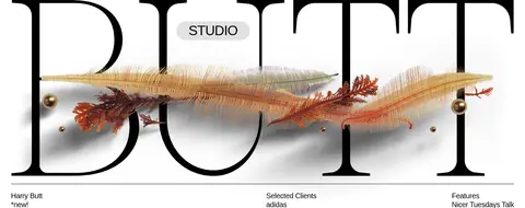
Oversized Caslon studio lettering fills the opening white area; layered imagery crosses the type, with a small Studio label embedded in the artwork.
Studio information row
A thin black rule separates the hero from three aligned text groups for the artist and contact details, selected clients, and features.
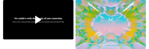
Project media pair
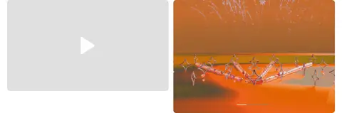
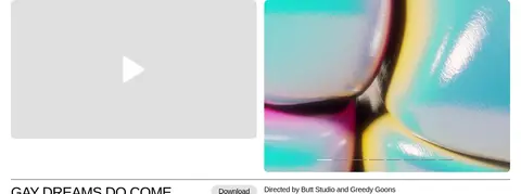
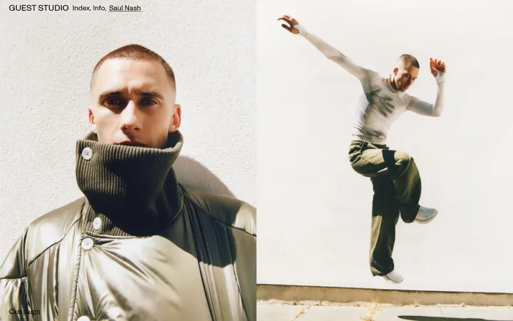
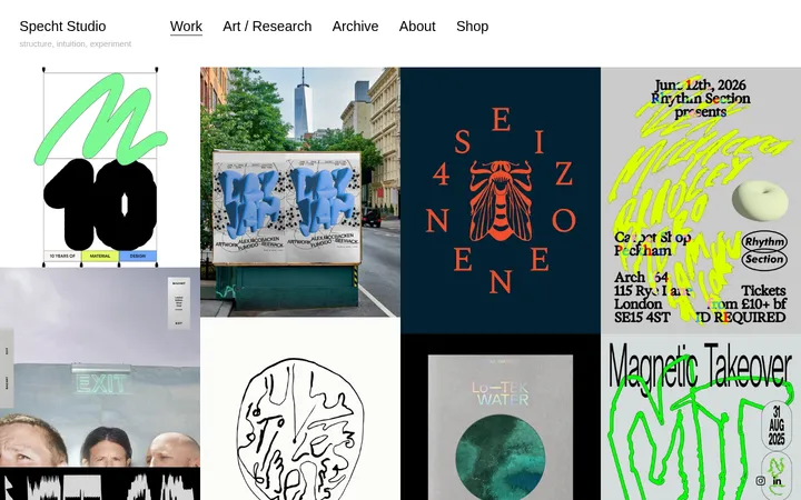
Project imagery commonly appears in two neighboring media panels, mixing video placeholders and colorful stills.
Project information
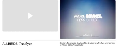
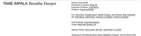
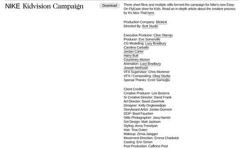
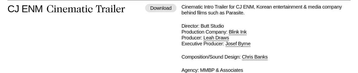
A fine rule and aligned columns introduce the project title, optional Download control, description, and detailed credits.
Download pill
Light-gray, pill-shaped control with black 20px Helvetica text and no shadow.
Dark media frame
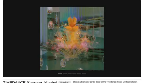
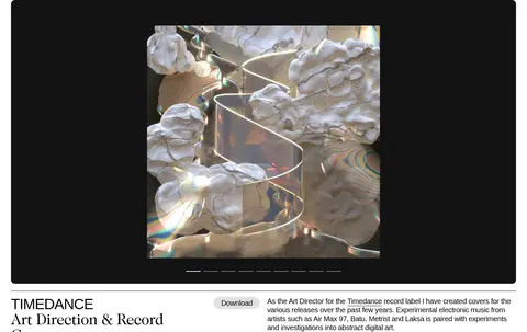
A #131313 rectangular media field surrounds centered project artwork in selected full-bleed presentation blocks.
Imagery · Project media is the primary source of color: campaign stills, motion-work frames, CGI, graphic compositions, and video panels. The hero layers delicate, organic-looking imagery across oversized lettering. Project frames are cleanly cropped and often arranged as pairs; some later portfolio items place a smaller image within a dark field. Preserve source-art colors rather than applying a shared tint.
Reserve Caslon-style serif for the wordmark and selected titles.
Let project artwork supply most of the color.
Separate project information from media with fine rules.
Keep video placeholders light gray and Download controls pill-shaped.
✕ 不该做
Do not turn the whole page into a dark interface.
Do not apply one color filter across project imagery.
Do not add gradients or decorative shadows to the UI.
Do not replace the editorial rhythm with dense dashboard cards.
Do not use the campaign imagery palette as global brand colors.
Do not make every heading serif or oversized.
给 AI 的提示词
想快速出一个同风格的新页面,把这段话连同 DESIGN.md 一起发给 AI。
Build a new portfolio page in the BUTT STUDIO visual style: use a white #ffffff canvas, #000000 Helvetica-like text and hairline separators, and generous editorial spacing. Open with a large Caslon-like serif identity or page title; keep any decorative hero imagery distinct from interface colors. Arrange portfolio entries in a broad media-first grid, then align project titles, descriptions, credits, and optional controls in clean information columns. Use #e0e0e0 for video placeholders and restrained Download pills, and reserve #131313 for intentional dark media frames. Let each project’s own photography, CGI, or motion stills provide color. Keep elevation minimal, use no decorative shadows, and preserve a calm reading rhythm through consistent rules and whitespace.