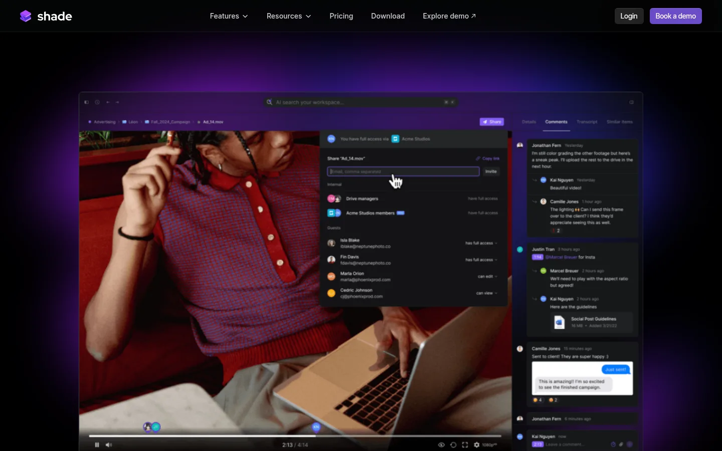
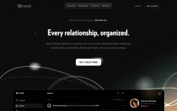
Shade以近乎纯黑的画布、克制的紫色点缀和鲜明的产品画面,呈现面向创意团队的云端NAS。醒目的紧凑标题与低调的界面演示、功能面板和客户背书交替出现。
North star · Keep the page almost entirely black and let concise typography, violet accents, and rich product media provide the hierarchy.
The page is built on a near-black canvas, with very dark charcoal surfaces separating cards and occasional section bands. White headlines establish hierarchy; cool gray supporting copy stays subdued, while violet is reserved for key actions and subtle atmospheric glow. Inter Tight gives the display and body copy a compact, contemporary shape, with Inter used for navigation and a monospace face for small technical labels. A centered, constrained content area gives long sections room to breathe. The layout alternates broad text-led introductions with columns of product cards, split feature narratives, and large interface demonstrations. Photography and screen captures carry most of the colour, so gradients and bright UI details appear as supporting imagery rather than competing brand colours. Thin, low-contrast separators, restrained shadows, and rounded dark cards keep the interface polished without making it feel bright or decorative.
配色 点色块复制色值。用途说明来自对页面的实测位置(背景、文字、描边、按钮)与截图判读。
品牌色
Pitch Canvas
#000000
Primary page canvas and continuous background across the long homepage.
强调色
Shade Violet
#6a4bc7
Primary demo CTA fill and restrained brand highlight.
Plum Glow
#340f35
Dark purple gradient visible in card and atmospheric product artwork.
Deep Violet
#3a2266
Gradient and illustrated card accent; use sparingly outside media.
Midnight Blue
#032c69
Blue gradient accent appearing in product-card artwork and interface imagery.
Deep Ocean
#02406d
Blue-cyan illustration gradient accent rather than a recurring page control colour.
表层色
Carbon Surface
#08090a
Dominant dark card and inset interface surface, only slightly lifted from the canvas.
Night Plum
#0c020c
Near-black stop within decorative purple gradients, not a primary UI surface.
Black Violet
#020105
Almost-black gradient stop in decorative card artwork.
Blue Black
#000007
Near-black blue gradient stop, primarily within decorative imagery.
Ocean Black
#00060a
Near-black blue gradient stop used in decorative card visuals.
Graphite Panel
#0e0e10
Secondary card and inset panel surface that subtly distinguishes content from the canvas.
中性色
Slate Copy
#90959d
Main muted text and secondary headings against the dark canvas.
Bright Text
#ffffff
High-priority headings, navigation labels, and selected interface text.
Soft Navigation
#cccccc
Low-emphasis navigation and supporting text.
Pale Silver
#d4d4d8
Occasional subdued interface or supporting text, not a dominant text colour.
文字 背景 对比度 WCAG #ffffff Bright Text#000000 Pitch Canvas21:1 AAA #ffffff Bright Text#08090a Carbon Surface19.93:1 AAA #ffffff Bright Text#0e0e10 Graphite Panel19.28:1 AAA #90959d Slate Copy#000000 Pitch Canvas6.97:1 AA #90959d Slate Copy#08090a Carbon Surface6.62:1 AA #90959d Slate Copy#0e0e10 Graphite Panel6.4:1 AA
字体 字号阶梯:Custom(比例约 1.871,正文 16px)。示例用免费替代字体渲染,数值为实测。
Aa 设计
Inter Tight 网络字体 · 字重 500 · 占比 83%
免费替代:Inter
Display headlines, section titles, body copy, and captions.
Aa 设计
Inter 网络字体 · 字重 400 / 500 · 占比 13%
免费替代:Inter
Navigation labels and compact interface text.
Aa 设计
VCR OSD Mono Regular 网络字体 · 字重 400 · 占比 4%
免费替代:Space Mono
Small technical or category labels.
角色 示例 字号 字重 行高 字距 特大标题 Large hero and feature headlines, set tightly to command attention.
Shade
56px 500 1.11 -0.027em 一级标题 Compact section-level headings and supporting headline hierarchy.
The quick brown fox 敏捷的狐狸
20px 500 1.2 0 正文 Feature explanations, product descriptions, and general page copy.
The quick brown fox 敏捷的狐狸
16px 500 1.5 0 辅助文字 Card descriptions and secondary notes beneath media.
The quick brown fox 敏捷的狐狸
14px 500 1.5 0 导航 Header navigation and prominent site links.
The quick brown fox 敏捷的狐狸
14px 500 2 0 代码 Small monospace eyebrow labels and technical markers.
const style = 1;
14px 400 1.2 0
间距与布局 基准单位 4px · 密度:宽松
160px 版块间距
4px 元素间距
— 卡片内边距
1024px 内容最大宽度
1px
2px
3px
4px
5px
6px
7px
8px
10px
12px
20px
24px
32px
50px
56px
64px
A centered content column sits within a measured maximum width of 1024px, with generous side margins at desktop sizes. Sections follow a spacious vertical rhythm and often begin with a small label, then an aligned headline and supporting copy. Content alternates among single-column statements, split text-and-media sections, multi-column cards, and wide product demonstrations. Feature panels use dense internal UI, while the surrounding page remains intentionally sparse. Keep alignment mostly to the left and avoid crowding adjacent sections.
圆角与层次 sm · other, card
sm · link
inset · card
inset · card
The interface is mostly flat, with separation provided by near-black surface changes and faint hairlines rather than prominent outlines. Cards use restrained, low-contrast shadows and soft inset highlights to lift them from the canvas. Product mockups can carry deeper layered shadows, but text sections should remain clean and unboxed.
组件 下面的预览按实测的按钮、输入框、徽标、卡片样式重建(字体用替代字体)。
Header navigation Compact horizontal navigation on the black canvas, with muted labels and a bright violet demo button at the right.
Primary demo CTA A violet-filled, softly rounded button with concise white label text and restrained glow.
Eyebrow label Small uppercase category text, often paired with a simple icon or technical marker above a headline.
Feature card Dark, subtly elevated card combining a concise feature title, short copy, and a product or workflow preview.
Product showcase Large, rounded interface image or video placed within a dark frame; keep UI content legible and visually rich.
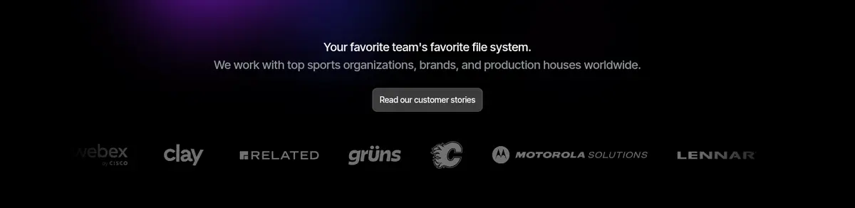
Customer proof Centered trust statement and customer-story link followed by a restrained horizontal customer logo row.
Imagery · Use large, dark-framed product screenshots and video-like interface demonstrations as primary proof. Supporting photography shows remote creative teams and real collaborative work; crop it into consistent cards rather than decorative full-bleed imagery. Preserve the screenshots’ colourful media previews and interface accents, while keeping surrounding backgrounds dark. Subtle violet or blue glows may sit behind hero media without overtaking the content.
页面版块 共 11 个版块,按页面从上到下排列,每个都标了类型、布局和交互套路。
该做与不该做 ✓ 该做 Use #000000 as the dominant page canvas. Set important headlines in white and supporting copy in measured gray tones. Reserve #6a4bc7 for the primary action and selective brand highlights. Give major sections generous vertical breathing room. Use product screenshots to bring colour and specificity into dark layouts. Keep cards dark, softly rounded, and subtly elevated. ✕ 不该做 Do not introduce bright section backgrounds. Do not use violet gradients as a substitute for clear hierarchy. Do not let product imagery overwhelm its surrounding copy. Do not apply heavy borders or dramatic shadows to every card. Do not make secondary text as bright as primary headlines. Do not add decorative UI colours that are not grounded in the product imagery. 给 AI 的提示词 想快速出一个同风格的新页面,把这段话连同 DESIGN.md 一起发给 AI。
复制 Build a new Shade page section on the near-black #000000 canvas, using Carbon Surface #08090a and Graphite Panel #0e0e10 only to separate content panels. Use Bright Text #ffffff for headlines and Slate Copy #90959d for supporting copy. Keep Shade Violet #6a4bc7 for the primary action; use the other violet and blue tones mainly inside media or restrained glow effects. Set headlines and body in Inter Tight, navigation in Inter, and small technical labels in a monospace face. Use a centered, constrained content column, spacious section rhythm, left-aligned copy, and alternating text, card, and product-demo layouts. Frame real product screenshots in softly rounded dark surfaces. Favor subtle hairlines and quiet shadows over prominent outlines; maintain a calm, technical, media-focused feel.
DESIGN.md Tailwind v4 CSS 变量 Design Tokens
---
title: "Shade design system"
variant: extended
source: https://shade.inc/
captured_at: 2026-10-12
theme: dark
industry: saas
generator: Design DNA (https://four.wiralomi.com/style/shade-inc)
ai_generated: true
ai_label: "本文件由 AI 辅助生成:数值取自公开网页的实测样式,命名、用途说明与建议为模型解读。商标归原所有者。 / AI-assisted content"
---
# Shade · Design System
> A dark, spacious stage for collaborative media workflows
**Theme:** dark · **Industry:** saas · **Source:** https://shade.inc/ · **Captured:** 2026-10-12 (1440×900 desktop)
_AI-assisted content: values are measured from the public page at capture time; names, roles and guidance are model-written interpretations. Trademarks belong to their owners._
Shade uses a near-black canvas, restrained violet accents, and vivid product imagery to present its cloud NAS as a focused tool for creative teams. Large, tightly set headlines alternate with understated interface demonstrations, feature panels, and customer proof.
## North star
Keep the page almost entirely black and let concise typography, violet accents, and rich product media provide the hierarchy.
## Overview
The page is built on a near-black canvas, with very dark charcoal surfaces separating cards and occasional section bands. White headlines establish hierarchy; cool gray supporting copy stays subdued, while violet is reserved for key actions and subtle atmospheric glow. Inter Tight gives the display and body copy a compact, contemporary shape, with Inter used for navigation and a monospace face for small technical labels. A centered, constrained content area gives long sections room to breathe. The layout alternates broad text-led introductions with columns of product cards, split feature narratives, and large interface demonstrations. Photography and screen captures carry most of the colour, so gradients and bright UI details appear as supporting imagery rather than competing brand colours. Thin, low-contrast separators, restrained shadows, and rounded dark cards keep the interface polished without making it feel bright or decorative.
## Colors
| Name | Hex | Token | Group | Role |
|---|---|---|---|---|
| Pitch Canvas | ` | `--color-pitch-canvas` | brand | Primary page canvas and continuous background across the long homepage. |
| Slate Copy | ` | `--color-slate-copy` | neutral | Main muted text and secondary headings against the dark canvas. |
| Carbon Surface | ` | `--color-carbon-surface` | surface | Dominant dark card and inset interface surface, only slightly lifted from the canvas. |
| Bright Text | ` | `--color-bright-text` | neutral | High-priority headings, navigation labels, and selected interface text. |
| Shade Violet | ` | `--color-shade-violet` | accent | Primary demo CTA fill and restrained brand highlight. |
| Soft Navigation | ` | `--color-soft-navigation` | neutral | Low-emphasis navigation and supporting text. |
| Plum Glow | ` | `--color-plum-glow` | accent | Dark purple gradient visible in card and atmospheric product artwork. |
| Night Plum | ` | `--color-night-plum` | surface | Near-black stop within decorative purple gradients, not a primary UI surface. |
| Deep Violet | ` | `--color-deep-violet` | accent | Gradient and illustrated card accent; use sparingly outside media. |
| Black Violet | ` | `--color-black-violet` | surface | Almost-black gradient stop in decorative card artwork. |
| Midnight Blue | ` | `--color-midnight-blue` | accent | Blue gradient accent appearing in product-card artwork and interface imagery. |
| Blue Black | ` | `--color-blue-black` | surface | Near-black blue gradient stop, primarily within decorative imagery. |
| Deep Ocean | ` | `--color-deep-ocean` | accent | Blue-cyan illustration gradient accent rather than a recurring page control colour. |
| Ocean Black | ` | `--color-ocean-black` | surface | Near-black blue gradient stop used in decorative card visuals. |
| Pale Silver | ` | `--color-pale-silver` | neutral | Occasional subdued interface or supporting text, not a dominant text colour. |
| Graphite Panel | ` | `--color-graphite-panel` | surface | Secondary card and inset panel surface that subtly distinguishes content from the canvas. |
### Semantic aliases
`--color-canvas` → ` (Pitch Canvas) · `--color-surface` → ` (Carbon Surface) · `--color-surface-2` → ` (Graphite Panel) · `--color-text` → ` (Bright Text) · `--color-text-muted` → ` (Slate Copy) · `--color-text-subtle` → ` (Soft Navigation) · `--color-accent` → ` (Shade Violet) · `--color-accent-2` → ` (Deep Violet) · `--color-accent-3` → ` (Midnight Blue) · `--color-on-accent` → `
### Contrast (WCAG 2.x)
| Text | Background | Ratio | Level |
|---|---|---|---|
| ` | ` | 21:1 | AAA |
| ` | ` | 19.93:1 | AAA |
| ` | ` | 19.28:1 | AAA |
| ` | ` | 6.97:1 | AA |
| ` | ` | 6.62:1 | AA |
| ` | ` | 6.4:1 | AA |
| ` | ` | 13.08:1 | AAA |
| ` | ` | 12.41:1 | AAA |
| ` | ` | 12.01:1 | AAA |
| ` | ` | 3.44:1 | AA-large |
### Gradients
- `linear-gradient(rgba(255, 255, 255, 0.05) 0%, rgba(97, 106, 115, 0) 15%)`
- `linear-gradient(160deg, rgba(255, 255, 255, 0.05) 0%, rgba(0, 0, 0, 0) 100%)`
- `linear-gradient(160deg, rgba(255, 255, 255, 0.05) 0%, rgba(0, 0, 0, 0) 140%)`
- `radial-gradient(99.74% 100% at 50% 0%, rgba(74, 21, 75, 0.7) 0%, rgba(29, 5, 29, 0.42) 100%)`
## Typography
| Family | Token | Source | Weights | Role | Free substitute |
|---|---|---|---|---|---|
| Inter Tight | `--font-body` | webfont | 500 | Display headlines, section titles, body copy, and captions. | Inter |
| Inter | `--font-inter` | webfont | 400, 500 | Navigation labels and compact interface text. | Inter |
| VCR OSD Mono Regular | `--font-mono` | webfont | 400 | Small technical or category labels. | Space Mono |
- **Inter Tight:** Medium-weight, compact sans; display headlines use tight negative tracking, while copy remains sentence case.
- **Inter:** Medium navigation with relaxed line height; keep labels crisp and generally in title or sentence case.
- **VCR OSD Mono Regular:** Use sparingly for small uppercase eyebrow labels and technical cues.
### Type scale — Custom (ratio ≈ 1.871, base 16px)
| Role | Size | Weight | Line height | Letter spacing | Case | Family | Used for |
|---|---|---|---|---|---|---|---|
| display | 56px | 500 | 1.11 | -0.027em | — | Inter Tight | Large hero and feature headlines, set tightly to command attention. |
| h1 | 20px | 500 | 1.2 | 0 | — | Inter Tight | Compact section-level headings and supporting headline hierarchy. |
| body | 16px | 500 | 1.5 | 0 | — | Inter Tight | Feature explanations, product descriptions, and general page copy. |
| caption | 14px | 500 | 1.5 | 0 | — | Inter Tight | Card descriptions and secondary notes beneath media. |
| nav | 14px | 500 | 2 | 0 | — | Inter | Header navigation and prominent site links. |
| code | 14px | 400 | 1.2 | 0 | — | VCR OSD Mono Regular | Small monospace eyebrow labels and technical markers. |
## Spacing & layout
- Base unit **4px**, density **spacious**.
- Scale (most used values): 1, 2, 3, 4, 5, 6, 7, 8, 10, 12, 20, 24, 32, 50, 56, 64 px.
- Section rhythm 160px · element gap 4px · card padding — · max content width 1024px.
A centered content column sits within a measured maximum width of 1024px, with generous side margins at desktop sizes. Sections follow a spacious vertical rhythm and often begin with a small label, then an aligned headline and supporting copy. Content alternates among single-column statements, split text-and-media sections, multi-column cards, and wide product demonstrations. Feature panels use dense internal UI, while the surrounding page remains intentionally sparse. Keep alignment mostly to the left and avoid crowding adjacent sections.
## Shape & elevation
- Radius: button `6px` · card `6px` · media `6px` · nav `6px` · link `8px` · xs `2px` · sm `3px` · md `4px` · lg `6px` · xl `8px` · pill `9999px`
- Shadow `sm` (other, card): `rgba(31, 32, 35, 0.09) 0px 0.60947px 2.43788px -0.60947px`
- Shadow `sm-2` (link): `rgba(0, 0, 0, 0.09) 0px 1px 4px -1px`
- Shadow `inset` (card): `rgba(0, 0, 0, 0.09) 0px 4px 24px 0px, rgba(0, 0, 0, 0.4) 0px 30px 50px 0px, rgba(255, 255, 255, 0.1) 0px 1px 0px 0px inset`
- Shadow `inset-2` (card): `rgba(0, 0, 0, 0.18) 0px 0.602187px 0.602187px -1.25px inset, rgba(0, 0, 0, 0.16) 0px 2.28853px 2.28853px -2.5px inset, rgba(0, 0, 0, 0.06) 0px 10px 10px -3.75px inset`
- Shadow `inset-3` (card): `rgba(51, 3, 129, 0.09) 0px 4px 24px 0px, rgba(0, 0, 0, 0.4) 0px 30px 50px 0px, rgba(255, 255, 255, 0.1) 0px 1px 0px 0px inset`
- Shadow `inset-4` (card): `rgba(0, 0, 0, 0.09) 0px 4.01778px 24.1067px 0px, rgba(0, 0, 0, 0.4) 0px 30.1333px 50.2222px 0px, rgba(255, 255, 255, 0.1) 0px 1.00444px 0px 0px inset`
The interface is mostly flat, with separation provided by near-black surface changes and faint hairlines rather than prominent outlines. Cards use restrained, low-contrast shadows and soft inset highlights to lift them from the canvas. Product mockups can carry deeper layered shadows, but text sections should remain clean and unboxed.
## Imagery
Use large, dark-framed product screenshots and video-like interface demonstrations as primary proof. Supporting photography shows remote creative teams and real collaborative work; crop it into consistent cards rather than decorative full-bleed imagery. Preserve the screenshots’ colourful media previews and interface accents, while keeping surrounding backgrounds dark. Subtle violet or blue glows may sit behind hero media without overtaking the content.
## Components
### Header navigation
Compact horizontal navigation on the black canvas, with muted labels and a bright violet demo button at the right.
### Primary demo CTA
A violet-filled, softly rounded button with concise white label text and restrained glow.
### Eyebrow label
Small uppercase category text, often paired with a simple icon or technical marker above a headline.
### Feature card
Dark, subtly elevated card combining a concise feature title, short copy, and a product or workflow preview.
### Product showcase
Large, rounded interface image or video placed within a dark frame; keep UI content legible and visually rich.
### Customer proof
Centered trust statement and customer-story link followed by a restrained horizontal customer logo row.
### Measured component styles
- **Primary button** (“Book a demo”): background ## Do
- Use ## Don't
- Do not introduce bright section backgrounds.
- Do not use violet gradients as a substitute for clear hierarchy.
- Do not let product imagery overwhelm its surrounding copy.
- Do not apply heavy borders or dramatic shadows to every card.
- Do not make secondary text as bright as primary headlines.
- Do not add decorative UI colours that are not grounded in the product imagery.
## Agent prompt
Build a new Shade page section on the near-black ## Page sections (top to bottom)
| # | Type | Layout | UX patterns | UI patterns |
|---|---|---|---|---|
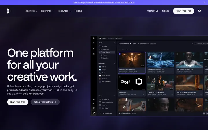
| 1 | hero | Centered, wide product video beneath a compact horizontal navigation. | Explore product visually, Book a demo | Black canvas, Violet primary button, Large framed interface media |
| 2 | logo-cloud | Centered trust statement, customer-story link, and a horizontal customer logo row. | Read customer stories, Scan customer logos | Muted copy, Small understated link, Monochrome logo row |
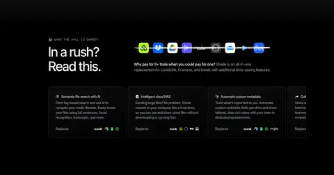
| 3 | comparison | Headline at left, short explanation and feature cards arranged across the right and lower area. | Understand product value quickly, Compare replaced tools | Small eyebrow, White heading, Dark feature cards |
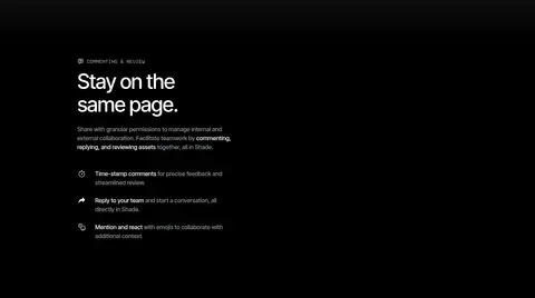
| 4 | feature-split | Two-column feature section with explanatory copy and supporting collaboration media. | Review together, Comment and reply | Eyebrow label, Large split headline, Dark media panel |
| 5 | comparison | Single-column statement introduces the value comparison, with a broad open area for supporting content. | Compare tool consolidation, Highlight cost savings | Eyebrow label, Prominent white headline, Minimal framing |
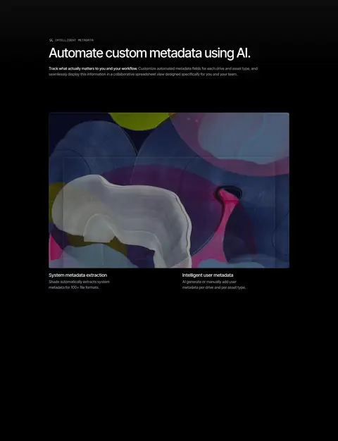
| 6 | product-showcase | Headline and short introduction above a broad product demonstration and supporting examples. | Understand automated metadata, Inspect metadata views | Dark interface screenshot, Compact explanatory captions, Large media area |
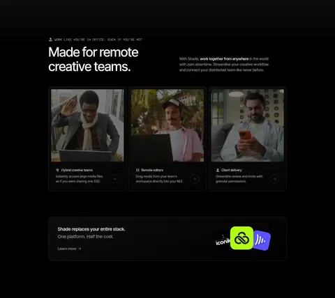
| 7 | feature-grid | Section heading and short description followed by three image-led feature cards and a tool comparison banner. | Explore team workflows, Learn about replacing tools | Three-column cards, Rounded photography, Wide promotional panel |
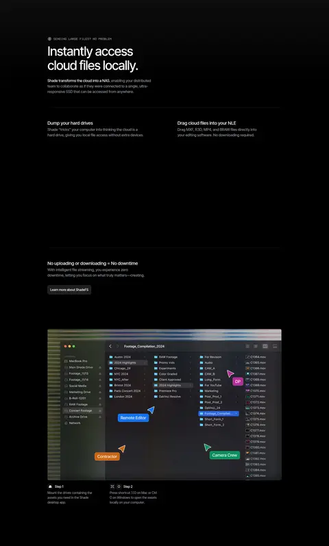
| 8 | how-it-works | Introductory headline and copy above a two-column explanation and a wide desktop workflow demonstration. | Follow setup steps, Learn local access workflow | Dark product media, Thin separators, Compact step labels |
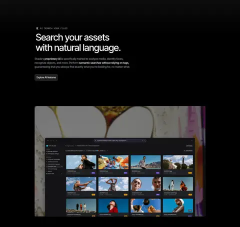
| 9 | product-showcase | Left-aligned headline and copy followed by a large centered search interface image. | Explore AI search, View asset results | Large dark interface screenshot, Small CTA link, Black canvas |
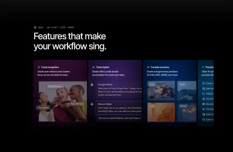
| 10 | feature-grid | Section heading above a horizontal multi-column row of colourful feature cards. | Scan additional capabilities, Discover feature details | Dark feature panels, Media previews, Violet and blue accents within cards |
| 11 | cta | Brief closing statement paired with two prominent next-step links. | Get started, Book a demo | Minimal black background, Short closing headline, Violet action button |
---
本文件由 AI 辅助生成:数值取自公开网页的实测样式,命名、用途说明与建议为模型解读。商标归原所有者。
Generated by Design DNA · https://four.wiralomi.com/style/shade-inc