North star · Let generous white space and dark-teal typography lead, using saturated color only to clarify actions or frame product and customer proof.
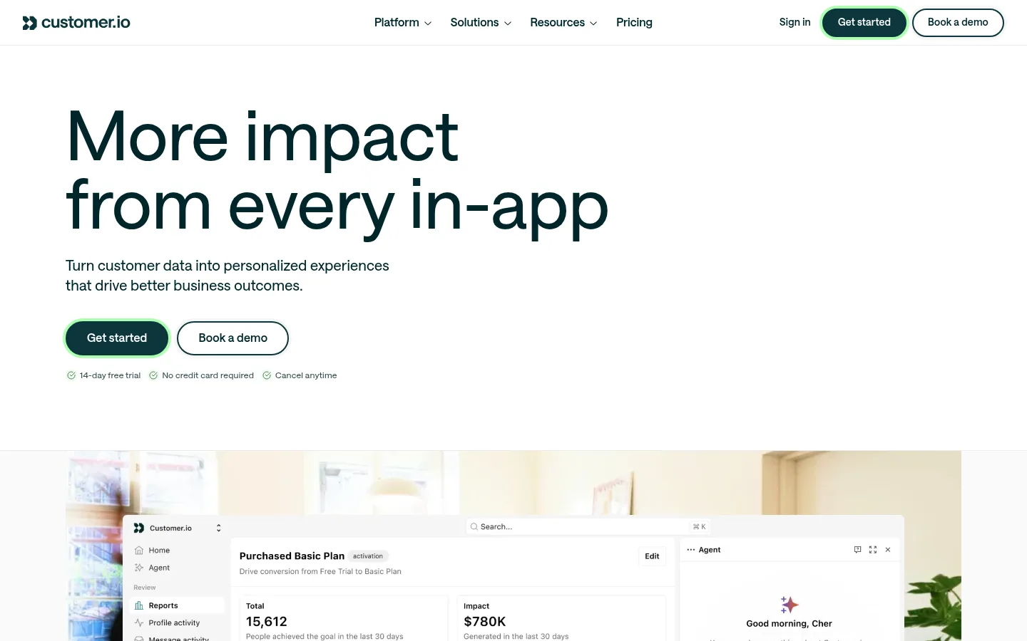
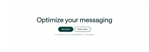
The page uses white as its defining canvas, letting deep teal text carry the identity rather than relying on decorative backgrounds. Large, left-aligned headlines use a clean, softly weighted sans serif; concise supporting copy and clear CTA pairs keep the hero direct. The layout moves from a two-column opening into broad product and feature areas, with generous vertical separation and compact text within individual modules. Most sections remain flat and white, while a full-width deep-teal enterprise band and dark footer create strong visual anchors. Product screenshots and interface imagery provide tangible proof; small illustrations and partner marks add detail without replacing the product story. Customer testimonials introduce pale peach and pale blue panels, with portraits and colored geometric framing. Borders and fine dividers define modules, while rounded CTA outlines and a subtle bright focus halo supply the main interface accents.
All page typography, from oversized hero headings to navigation, body copy, links, and labels.
角色
示例
字号
字重
行高
字距
特大标题
Oversized display headlines where featured.
Customer.io
96px
475
1
0.002em
一级标题
Hero headline and primary page-level heading.
Customer.io
64px
475
1
0.003em
二级标题
Major section headings and prominent CTA heading.
Customer.io
40px
475
1.13
0.005em
三级标题
Feature, capability, and solution card titles.
Customer.io
30px
475
1.13
0.007em
四级标题
Compact content headings and nested feature titles.
The quick brown fox 敏捷的狐狸
24px
500
1.25
0.008em
正文
Descriptions, supporting copy, and testimonial text.
The quick brown fox 敏捷的狐狸
16px
475
1.38
0.013em
辅助文字
Small labels, trial notes, and case-study metadata.
The quick brown fox 敏捷的狐狸
14px
475
1.38
0.014em
导航
Top navigation and footer navigation links.
The quick brown fox 敏捷的狐狸
16px
600
1.38
0
链接
Text links and secondary actions.
The quick brown fox 敏捷的狐狸
16px
600
1.38
0.013em
间距与布局
基准单位 8px · 密度:紧凑
32px版块间距
8px元素间距
—卡片内边距
1256px内容最大宽度
1px
2px
4px
6px
8px
10px
12px
16px
24px
32px
40px
64px
96px
Use a centered content frame capped at the measured 1256px, with broad full-width bands for the product showcase, enterprise section, and footer. The hero is a two-column composition with left-aligned copy and media; subsequent feature groups use one-, two-, or three-column arrangements. Keep the overall density compact within modules but generous between major sections. Maintain the measured 8px spacing base and align headings, cards, and text consistently to the left, reserving centered alignment for the enterprise introduction and closing CTA.
圆角与层次
按钮 · 2px
图片 · 6px
导航 · 9999px
hairline · button
hairline · button
The page is predominantly flat: white sections and most cards rely on spacing rather than deep shadows. Use fine pale-gray dividers to define boundaries, with a brighter focus halo around the primary CTA. Dark enterprise panels and pale testimonial blocks create contrast through surface color, not layered elevation.
组件
下面的预览按实测的按钮、输入框、徽标、卡片样式重建(字体用替代字体)。
Primary CTA
Filled Estuary Teal (#0b363b) pill button with white semibold text, a fine matching border, and a bright focus halo.
Secondary CTA
White or transparent pill button with Deep Ink (#00262b) text and a dark-teal outline, paired beside the primary action.
Hero
Left-aligned oversized headline, short supporting copy, two CTAs, and compact trial reassurance above a broad product showcase.
Feature modules
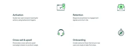
Open white layouts with short titles, concise descriptions, and product or feature imagery; organize content in varied column counts.
Enterprise panel
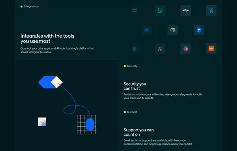
Midnight Teal (#00191c) band with a centered introduction and a darker, divided grid for integrations, security, and support.
Customer case studies
Alternating testimonial compositions use peach (#fdf0e9) and sky (#e2f4ff) panels, customer portraits, outcome metrics, and compact links.
Footer
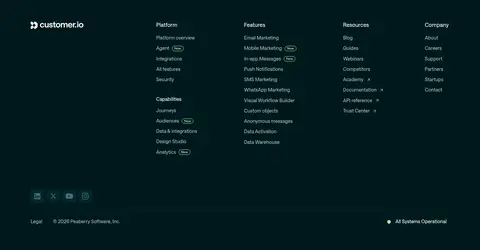
Deep Midnight Teal (#00191c) multi-column navigation with muted light links, brand mark, and a restrained bottom utility row.
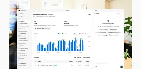
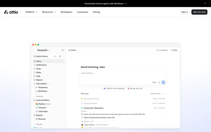
Imagery · Prioritize real product interface imagery: the hero’s broad dashboard screenshot makes the platform immediately tangible, while later sections use interface panels and smaller feature visuals. Use customer portraits in testimonial cards with bold clipped geometric framing. Partner logos and simple illustrations are supporting details; keep them crisp and restrained rather than treating them as decorative hero art.
Reserve Midnight Teal (#00191c) for strong full-width anchors.
Pair a filled CTA with a clearly outlined alternative.
Show authentic interface imagery as product proof.
Keep feature copy concise and left aligned.
Use pale testimonial colors as distinct case-study panels.
✕ 不该做
Do not turn every section into a dark block.
Do not use saturated accents as large page backgrounds.
Do not crowd headlines with supporting paragraphs.
Do not add heavy shadows to otherwise flat modules.
Do not replace product screenshots with generic stock imagery.
Do not make all content cards equally prominent.
Do not use unmeasured spacing, colors, or corner radii.
给 AI 的提示词
想快速出一个同风格的新页面,把这段话连同 DESIGN.md 一起发给 AI。
Build a SaaS page in Customer.io’s visual language: start with a Gallery White (#ffffff) canvas, Deep Ink (#00262b) typography, and a spacious, left-aligned hero. Use the measured saansFont or a close DM Sans substitute, with oversized, softly weighted headlines and compact supporting copy. Pair a filled Estuary Teal (#0b363b) pill CTA with a white outlined alternative. Give product interface imagery a prominent, clean presentation. Keep most feature sections flat and light, with clear alignment and generous separation; use Midnight Teal (#00191c) for one strong enterprise band and the footer. Frame customer proof in Peach Wash (#fdf0e9) and Sky Wash (#e2f4ff), with portraits, metrics, and concise quotes. Use pale dividers, restrained accent colors, and no heavy shadows.