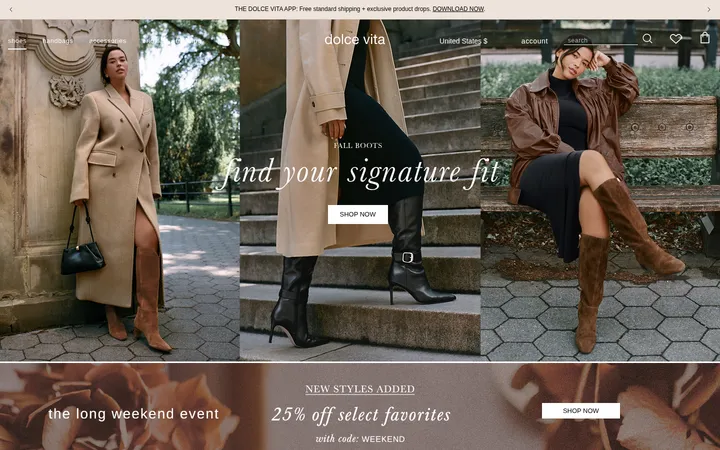
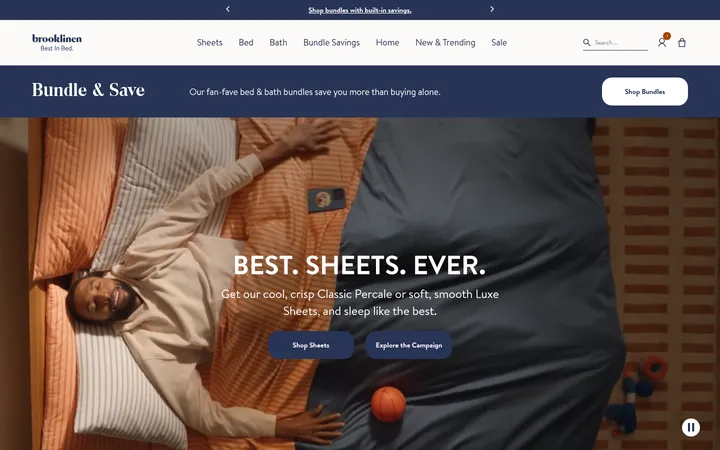
North star · Keep the interface quiet and let confident, inclusive fashion photography lead every section.
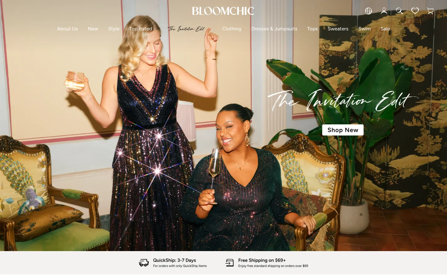
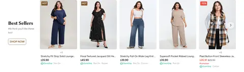
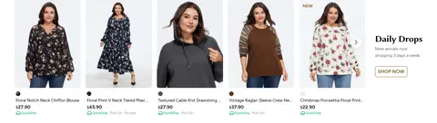
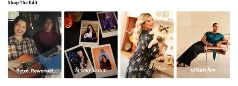
The visual strategy is built around a white canvas and a fashion-editorial image rhythm. The opening campaign is full-bleed photography with lightweight white navigation and a compact, contrasting shop action; warm interiors and clothing colours belong to the photography rather than the interface palette. Below it, pale service strips and a promotional banner bridge into image-led category tiles, then tightly merchandised product rows. Black Figtree text keeps navigation, prices, and utility content legible without competing with the photography. Biolinum appears sparingly for display headings, adding a softer editorial note. Product cards are mostly flat, with light neutral labels and small sale or new badges. The page alternates broad photographic moments with dense, aligned retail grids, then closes with a warm off-white footer for support, company links, and app promotion. Spacing feels comfortable, while the number of visible products maintains a distinctly commercial pace.
Primary interface and retail type for navigation, body copy, labels, and utility content.
Aa 设计
Biolinum
网络字体 · 字重 500 / 600 · 占比 3%
免费替代:Lora
Occasional display-heading face, measured on the main heading role.
角色
示例
字号
字重
行高
字距
一级标题
Display heading treatment for prominent section titles.
BloomChic
30px
500
1
-0.025em
正文
Product names, descriptions, and general storefront copy.
The quick brown fox 敏捷的狐狸
14px
400
1.29
0
辅助文字
Compact product details, helper text, and supporting labels.
The quick brown fox 敏捷的狐狸
12px
400
1.5
0
导航
Primary category navigation and top-level links.
The quick brown fox 敏捷的狐狸
16px
400
2.88
0
间距与布局
基准单位 4px · 密度:适中
48px版块间距
8px元素间距
—卡片内边距
1344px内容最大宽度
1px
3px
4px
6px
8px
10px
12px
16px
18px
20px
24px
32px
40px
The page uses a wide, centered retail canvas, with the measured maximum width of 1344px and full-bleed campaign media at the top. After the hero, sections resolve into a service strip, promotional and category imagery, then 12-column product grids. Headings align to the left of product modules; category and editorial cards form orderly multi-column rows. Sections breathe with a measured 48px section gap, while small repeated product details keep the shopping experience comfortably dense. The footer changes to a warm-toned multi-column information layout.
圆角与层次
卡片 · 6px
图片 · 6px
徽标 · 4px
链接 · 6px
md · other
md · other
hairline · other
Most of the storefront is flat, with white space and media edges defining sections rather than prominent shadows. Product media and cards use measured 6px corner radii; small badges use 4px corners. Very subtle measured shadow treatments appear on miscellaneous elements, while fine neutral borders provide restrained separation.
组件
下面的预览按实测的按钮、输入框、徽标、卡片样式重建(字体用替代字体)。
Campaign hero
Full-bleed campaign photo with white brand and navigation overlays, handwritten campaign lettering in the image, and a compact contrasting shop action.
Service strip
Pale horizontal band with small black delivery and shipping icons, short service claims, and compact supporting copy.
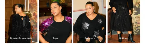
Category tiles
Image-first fashion categories arranged in a tight row, with labels placed over the photography.
Product rail
Twelve-column merchandising area with repeated product cards, image-led presentation, compact names and prices, and HOT or sale labels.
Status badge
Compact 4px-radius labels, including Coral Signal sale badges with white text and Cocoa Bronze NEW labels.
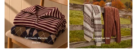
Editorial content cards
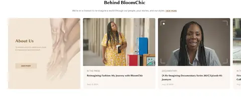
Lifestyle and behind-the-brand media cards grouped in aligned rows, with titles and concise supporting copy.
Footer
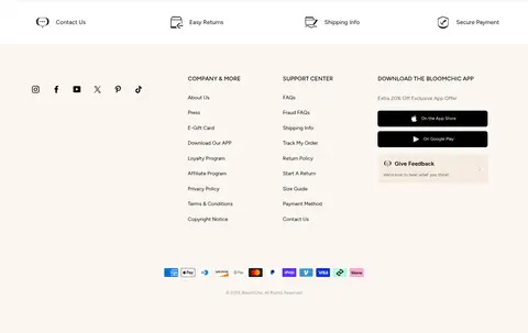
Warm off-white information area with service links, social icons, company and support columns, app links, and payment marks.
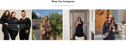
Imagery · Photography is the primary visual content: full-width campaign imagery, diverse plus-size models, outfit close-ups, category tiles, and editorial lifestyle cards. The hero uses a cinematic room scene with its campaign lettering embedded in the image, while product imagery is consistently framed in clean cards. No 3D or illustrative style defines the page; warm photographic colours should not be mistaken for UI palette colours.
Let campaign and product photography occupy the visual foreground.
Keep the default page ground Gallery White (#ffffff).
Use Figtree for navigation, product information, and utility copy.
Reserve Biolinum for occasional editorial display headings.
Use Coral Signal (#eb4d3d) for small sale markers, not large panels.
Keep product cards aligned and labels compact.
Separate footer information into clear, quiet columns.
✕ 不该做
Do not turn photographic colours into interface palette colours.
Do not add heavy shadows to every product card.
Do not use decorative display type throughout the interface.
Do not make accent colours compete with the product imagery.
Do not replace the white canvas with broad saturated section bands.
Do not overcrowd navigation or product metadata.
Do not treat the hero as a generic text-heavy landing banner.
给 AI 的提示词
想快速出一个同风格的新页面,把这段话连同 DESIGN.md 一起发给 AI。
Build a new BloomChic-style fashion storefront page with an editorial, image-led hierarchy. Use Gallery White (#ffffff) as the main canvas and True Ink (#000000) for primary interface text. Use Figtree for navigation, body copy, product labels, and utilities; reserve the measured display face or a close substitute for occasional editorial headings. Make the lead campaign area photographic and expansive, with restrained overlay navigation and a clear shop action. Follow with quiet service information, image-based category discovery, and aligned product grids. Use Soft Silver (#efefef) for subtle separation and Coral Signal (#eb4d3d) only for small sale badges. Keep cards flat, media corners gently rounded, and footer information organized on a warm, subdued surface. Avoid adding unmeasured colours or letting interface decoration compete with the clothing photography.