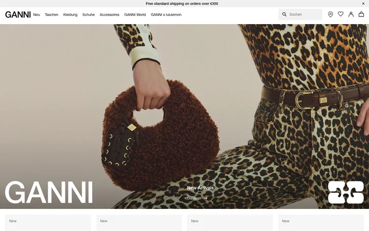
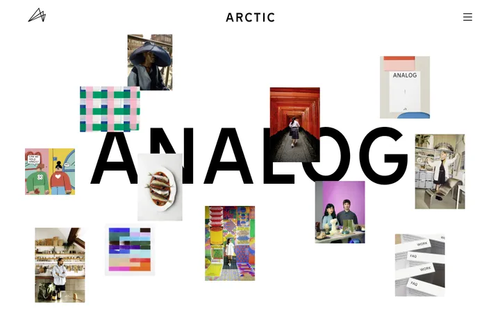
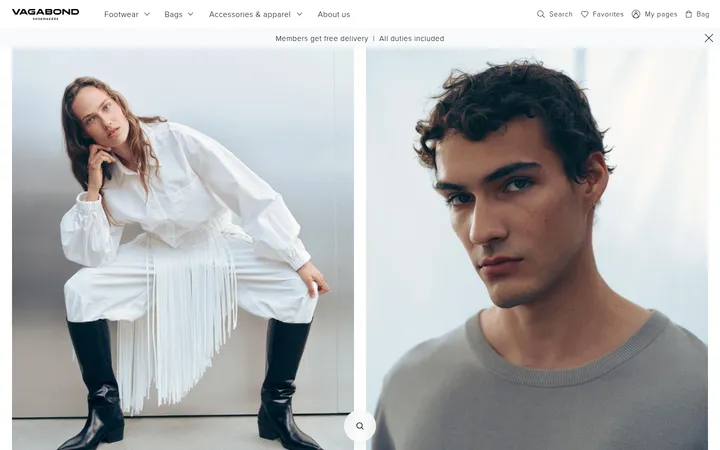
North star · Keep the interface monochrome and quiet, then let large, atmospheric fashion imagery create the page’s visual impact.
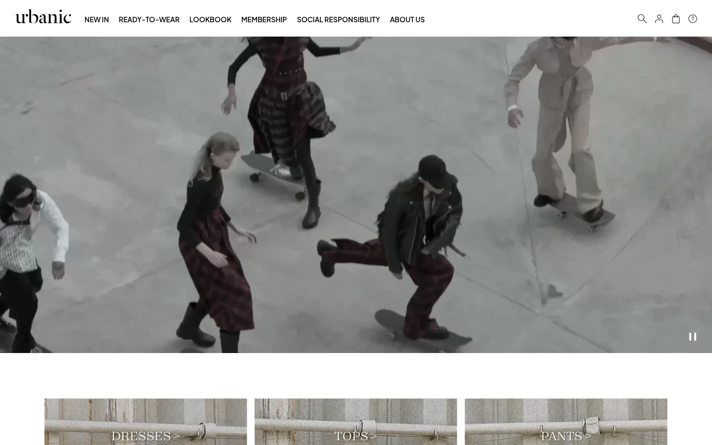
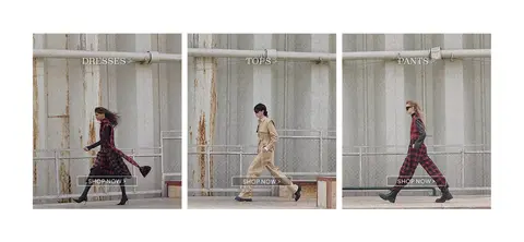
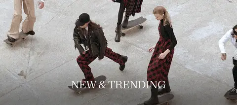
The page uses a white canvas and near-black typography to keep attention on the fashion content rather than decorative interface elements. Black is reserved for navigation, utility links and icons; softer charcoal supports headings and copy, while a very pale gray marks section boundaries. The header is compact and horizontal, with a serif wordmark contrasted against bold sans-serif navigation. Plus Jakarta Sans carries the measured interface typography, using restrained weight changes rather than color to establish hierarchy. A wide, muted-toned campaign video leads, followed by three evenly aligned category photographs and another full-width editorial image. The images are intentionally atmospheric and softly desaturated, so their grays and dark clothing harmonize with the neutral shell. Generous white intervals separate these media blocks, while the footer shifts to a dense multi-column directory of support and brand links. The overall effect is flat, quiet and editorial, with visual emphasis created by image scale and spacing.
Navigation, body copy, headings, captions and links throughout the interface.
角色
示例
字号
字重
行高
字距
一级标题
Editorial campaign or featured collection headline.
Urbanic
28px
400
1
0
正文
General interface copy and supporting text.
The quick brown fox 敏捷的狐狸
14px
500
1.29
0
辅助文字
Small footer details and secondary labels.
The quick brown fox 敏捷的狐狸
12px
400
1.33
0
导航
Main uppercase header navigation.
The quick brown fox 敏捷的狐狸
14px
600
5.57
0
链接
Compact text links, including footer and responsibility links.
The quick brown fox 敏捷的狐狸
12px
400
1.33
0
间距与布局
基准单位 2px · 密度:适中
40px版块间距
—元素间距
—卡片内边距
1380px内容最大宽度
2px
10px
12px
14px
20px
30px
40px
60px
80px
A compact horizontal header sits above a full-bleed campaign video. Below it, three category cards share a row, followed by another full-width campaign image and a multi-column footer. The measured page max width is 1380px, while the main campaign media spans the viewport. Keep the grid aligned and comfortable rather than dense, with broad white intervals separating media sections. Footer columns form a practical directory rather than a prominent promotional panel.
圆角与层次
没有测到阴影:页面是扁平的,层次靠底色和描边区分。
The interface is predominantly flat: measured data reports no shadows, and component borders are absent. Use white space and occasional pale-gray section hairlines to distinguish areas rather than raised cards. Keep image blocks flush and let their scale, not layering effects, establish hierarchy.
组件
下面的预览按实测的按钮、输入框、徽标、卡片样式重建(字体用替代字体)。
Header navigation
White horizontal header with a serif Urbanic wordmark, uppercase 14px Plus Jakarta Sans navigation at weight 600, and compact utility icons.
Campaign video
Wide, full-bleed fashion video directly below the header, with a small pause control positioned over the lower-right edge.
Category cards
Three aligned fashion image links for Dresses, Tops and Pants, with restrained overlay labels and shop actions.
Editorial campaign image
A full-width fashion photograph used as a lower-page feature, with a large centered white serif headline over the image.
Footer directory
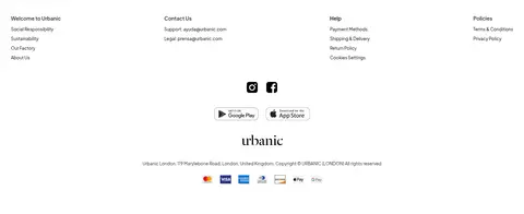
White footer arranged into four link columns for brand, contact, help and policies, followed by social, app-store, wordmark and payment details.
Imagery · Use fashion photography and campaign video as the primary visual content. The hero video is wide and atmospheric, showing models in motion with a subdued, gray-toned treatment. Category cards use full-bleed portrait-oriented fashion images with restrained text overlays. A second wide editorial image anchors the lower page; avoid decorative illustrations or synthetic 3D styling.
Keep the canvas white and the interface palette monochrome.
Give campaign photography the strongest visual presence.
Use uppercase, weight-600 sans-serif navigation.
Separate major media sections with generous white space.
Align category tiles evenly in a three-column row.
Keep footer links compact and grouped into clear columns.
✕ 不该做
Do not introduce bright interface colors or gradients.
Do not add shadows or rounded-card styling.
Do not crowd the campaign imagery with interface controls.
Do not turn the header into a tall promotional block.
Do not use decorative illustrations in place of fashion photography.
Do not over-style link text with heavy treatments.
给 AI 的提示词
想快速出一个同风格的新页面,把这段话连同 DESIGN.md 一起发给 AI。
Build a new Urbanic-style fashion storefront page with a restrained editorial feel. Use Gallery White (#ffffff) as the canvas, Urbanic Ink (#000000) for navigation and links, Soft Charcoal (#262626) for headings and supporting copy, and Mist Line (#f4f4f4) only for subtle separators. Set interface text in Plus Jakarta Sans, with compact uppercase navigation at weight 600. Create a concise horizontal header, a dominant full-width fashion campaign image or video, and a balanced row of image-led category links. Follow with another wide editorial feature and a practical multi-column footer. Keep image treatment atmospheric and muted; preserve generous white space between blocks. Favor flat surfaces, crisp alignment, and minimal controls. Avoid gradients, shadows, rounded cards, and decorative color accents.