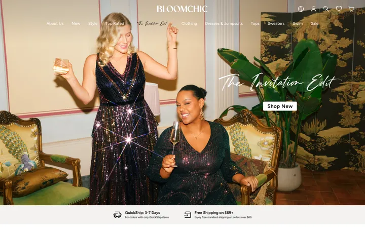
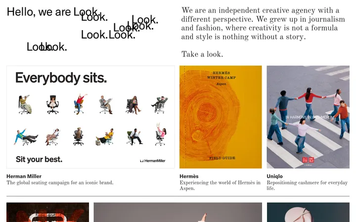
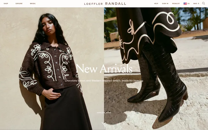
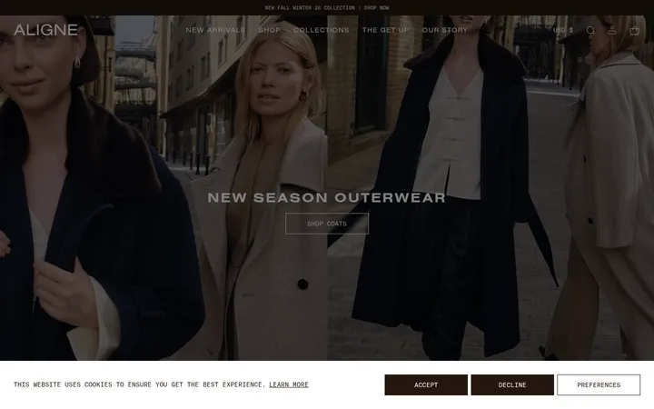
North star · Let fashion imagery and oversized editorial lettering stand out against a warm, quiet canvas; keep commerce details small, black, and direct.
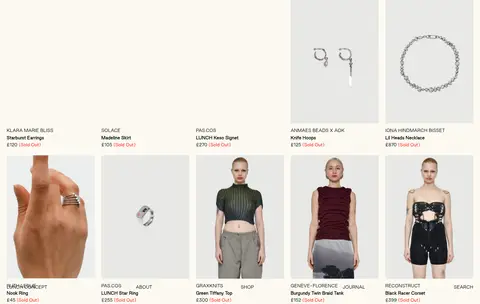
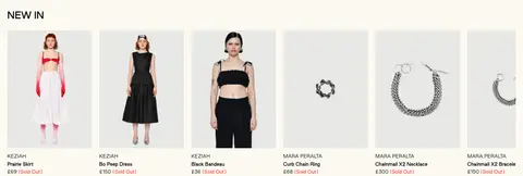
The page uses a warm off-white canvas (#fcfaf1) as its main field, letting product photography and black text carry the storefront. Black (#000000) anchors navigation, product labels, and headings; bright red (#ff0000) appears as a small textual accent, including sold-out notices, rather than as a large button colour. A pale lavender (#b8aad0) footer forms a distinct closing band, while cream (#f4f1e4) marks the centered designer transition. Good Sans handles compact uppercase navigation and product metadata alongside uppercase section headings; the display treatment is more expressive, using an oversized Redaction-style wordmark and a dramatic italic serif-like designer heading. The structure alternates open canvas with dense, image-led merchandise rows. Product thumbnails sit in pale image fields with little visible framing, while a wide fashion photograph and oversized logo establish the opening visual. Spacing feels generous around editorial transitions and tighter around catalog labels.
配色
点色块复制色值。用途说明来自对页面的实测位置(背景、文字、描边、按钮)与截图判读。
品牌色
强调色
表层色
中性色
页面底色 · Warm Canvas表层 · Soft Lavender表层 2 · Parchment主文字 · Editorial Ink描边 · Editorial Ink强调 · Signal Red
Navigation, headings, product labels, body copy, captions, and links throughout the storefront.
角色
示例
字号
字重
行高
字距
特大标题
Oversized LUNCH wordmark and expressive editorial display lettering.
LUNCH
72px
700
1.8
0.002em
一级标题
Primary uppercase storefront or merchandise-section heading.
LUNCH
32px
700
1
0.005em
二级标题
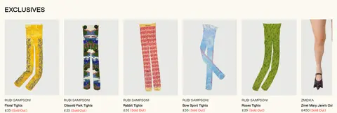
Uppercase subsection headings such as NEW IN and EXCLUSIVES.
The quick brown fox 敏捷的狐狸
24px
700
1.8
0.007em
正文
Store introduction and explanatory editorial copy.
The quick brown fox 敏捷的狐狸
16px
400
1.8
0.01em
辅助文字
Compact product names, prices, and small supporting labels.
The quick brown fox 敏捷的狐狸
12px
400
1.8
0.013em
导航
Uppercase site navigation and menu labels.
The quick brown fox 敏捷的狐狸
12px
400
1.8
0.013em
链接
Small uppercase text links such as FIND OUT MORE.
The quick brown fox 敏捷的狐狸
12px
400
1.8
0.013em
间距与布局
基准单位 1px · 密度:适中
80px版块间距
20px元素间距
—卡片内边距
1400px内容最大宽度
2px
5px
10px
20px
30px
60px
80px
A broad, centered storefront uses the measured 1400px maximum width and comfortable section rhythm. The opening is image-led, followed by a short centered introduction and dense product assortments. Catalog rows range from five columns to wider ten-column layouts in the measured sections, with compact metadata directly below imagery. A centered designer-transition band separates product groupings. The page closes with a full-width lavender footer; align its message and link groups as distinct areas.
圆角与层次
没有测到阴影:页面是扁平的,层次靠底色和描边区分。
The interface reads as flat and print-like: measured data reports no shadows, gradients, or component radii. Separate catalog items through image placement and open canvas rather than raised cards. Keep outlines and borders minimal; black is the measured border colour, while the lavender footer and cream designer band provide the clearest section separation.
组件
下面的预览按实测的按钮、输入框、徽标、卡片样式重建(字体用替代字体)。
Compact header navigation
Use small uppercase Good Sans labels in black, arranged unobtrusively around the storefront identity.
Editorial introduction
Place concise centered brand copy and a small FIND OUT MORE text link on the warm canvas.
Product tile
Show a clean product image with compact designer, item, price, and availability text beneath; links are black and status may use red.
Product assortment
Arrange linked catalog tiles in a dense, image-forward row, with section headings such as NEW IN or EXCLUSIVES.
Designer transition
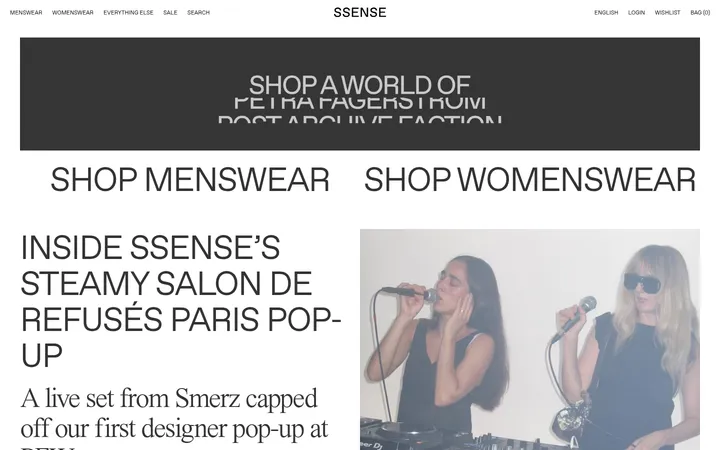
Center an expressive SHOP BY DESIGNER heading on a narrow Parchment band.
Closing footer
Use a full-width Soft Lavender field with a prominent closure message, grouped small links, and an oversized LUNCH wordmark.
Imagery · Use fashion editorial photography as the dominant visual language: a striking wide campaign image anchors the opening, while product photography presents garments, accessories, and jewelry as individual catalog tiles. Keep product images clean and consistently framed against pale, often light-gray backgrounds. The measured page also shows a monumental dimensional LUNCH wordmark within the imagery; treat this as a brand-specific graphic rather than a generic interface decoration.
Keep the main canvas warm off-white and visually quiet.
Let product photography lead each assortment.
Keep product names and prices compact beneath images.
Use uppercase black labels for navigation and section headings.
Reserve lavender for the closing footer treatment.
Use red sparingly for textual status accents.
Separate catalog groups with clear editorial breathing room.
✕ 不该做
Do not add shadows, gradients, or rounded card styling.
Do not turn the red accent into a large CTA surface.
Do not clutter product tiles with oversized metadata.
Do not replace the warm canvas with stark white.
Do not make every section a boxed card.
Do not let decorative graphics overpower product imagery.
给 AI 的提示词
想快速出一个同风格的新页面,把这段话连同 DESIGN.md 一起发给 AI。
Build a fashion concept-store page in LUNCH's editorial style. Use Warm Canvas (#fcfaf1) for the main field and Editorial Ink (#000000) for navigation, headings, product labels, and links. Keep Signal Red (#ff0000) to restrained text accents, and use Parchment (#f4f1e4) for a centered category transition. Finish with a full-width Soft Lavender (#b8aad0) footer and a bold, oversized wordmark treatment. Use a clean sans-serif similar to DM Sans for compact uppercase navigation and readable catalog metadata, with a contrasting display face for brand moments. Lead with fashion photography, then arrange product images in dense, open grids with concise labels below. Favor flat surfaces, minimal borders, generous editorial pauses, and no shadows or rounded cards.