North star · Keep the content airy and legible, using the blue-violet gradient for key moments and mint only for the primary action.
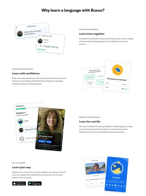
The page opens with a full-width blue-to-violet gradient hero, placing a large white headline and supporting copy beside a playful illustration of learners communicating across a world map. A vivid mint-green pill CTA creates the clearest action contrast; the header controls stay compact and legible. Below, white sections alternate between centered headings and two-column feature stories, with product-interface illustrations acting as visual anchors. The language picker uses circular flag imagery in a relaxed horizontal row. Nista is used consistently: heavy, large headings establish hierarchy, while body copy remains regular and readable. Dark charcoal text and muted slate copy keep white sections calm, with pale blue reserved for the footer surface. Content is spaced generously rather than boxed into dense cards. The recurring gradient CTA band near the bottom reconnects the otherwise airy page to the colorful hero.
All measured text, including headings, body copy, navigation, links, captions, and buttons.
角色
示例
字号
字重
行高
字距
一级标题
Hero headline, large white type over the gradient.
Busuu
40px
800
1.3
0
二级标题
Major section titles, generally centered on white.
Busuu
36px
800
1.3
0
三级标题
Feature titles and smaller content headings.
The quick brown fox 敏捷的狐狸
24px
800
1.5
0
正文
Hero description, feature explanations, and general copy.
The quick brown fox 敏捷的狐狸
16px
400
1.7
0
辅助文字
Eyebrows, labels, and compact supporting text.
The quick brown fox 敏捷的狐狸
14px
700
1.7
0
按钮
Bold labels on pill-shaped calls to action.
The quick brown fox 敏捷的狐狸
16px
700
normal
0
导航
Compact, bold header navigation and controls.
The quick brown fox 敏捷的狐狸
14px
700
1.7
0
链接
Prominent blue inline links and related actions.
The quick brown fox 敏捷的狐狸
18px
700
1.7
0
间距与布局
基准单位 2px · 密度:宽松
143px版块间距
10px元素间距
—卡片内边距
1200px内容最大宽度
2px
3px
5px
6px
8px
10px
12px
14px
15px
16px
20px
24px
28px
30px
32px
40px
Use a spacious single-page composition within the measured 1200px maximum content width. The opening hero is a full-width two-column band, with copy on the left and learner artwork on the right; the language selector follows as a centered horizontal category row. Feature content alternates image and copy across two columns, with centered section headings and broad vertical breathing room. Keep the footer in three columns over pale blue. Measured section rhythm is spacious, with a 143px section gap and 10px element gap.
圆角与层次
按钮 · 9999px
输入框 · 5px
导航 · 16px
链接 · 16px
hairline · other
md · nav
sm · button
The page is mostly flat: white sections and broad gradient bands do the structural work. Use subtle shadows to lift the navigation and primary CTA, and light borders for inputs and footer separators. Layered course and notification mockups may cast soft shadows for legibility, but avoid enclosing every feature in a card.
组件
下面的预览按实测的按钮、输入框、徽标、卡片样式重建(字体用替代字体)。
Primary CTA
Mint-filled pill button with charcoal bold text, a matching 2px border, and a subtle shadow. The measured label is “Learn for free.”
Header actions
Compact top-right controls sit over the hero gradient; use white or outlined pill treatments and clear contrast.
Language selector
Centered heading above a horizontal row of circular flag icons and muted language labels, with subtle directional controls.
Feature split
Alternate concise feature copy and tilted product-interface illustrations in a two-column rhythm; keep the surrounding background white.
Gradient CTA band
Full-width blue-violet gradient section with centered award marks, heading, supporting copy, and mint pill action.
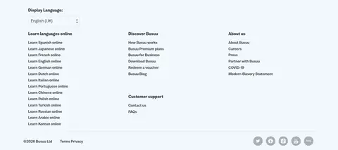
Footer
Three-column navigation on pale blue with a language input, subtle borders, and small utility links.
Imagery · Use friendly, colorful illustrations of learners, language bubbles, and learning interfaces rather than relying on large photographic backgrounds. Place hero artwork beside the copy and use smaller tilted product mockups to illustrate feature stories. Flags appear as circular icons in the language picker. Keep illustrations crisp and lightly dimensional; treat any colors inside mockups as illustration detail, not as core brand tokens.
Use Nista or a close rounded sans-serif throughout.
Keep the main canvas white and content sections open.
Reserve the blue-violet gradient for prominent bands.
Make the primary CTA mint with charcoal text.
Alternate feature copy and illustration placement.
Keep headings bold and section titles clearly separated.
Use pale blue for the footer surface and restrained dividers.
✕ 不该做
Do not make every section a boxed card.
Do not use the gradient as a page-wide background.
Do not let mockup colors redefine the brand palette.
Do not crowd the language selector or feature sections.
Do not use sharp rectangular primary buttons.
Do not replace readable body copy with decorative type.
Do not use mint as a large section background.
给 AI 的提示词
想快速出一个同风格的新页面,把这段话连同 DESIGN.md 一起发给 AI。
Build a new Busuu-style education page with a clean white canvas, spacious sections, and a friendly rounded sans-serif such as Nista or Nunito Sans. Use Charcoal Ink (#252b2f) for primary text and Slate Copy (#666e7e) for supporting copy. Create one or two full-width gradient moments using Vivid Violet (#6e00f8), Bridge Periwinkle (#563ce9), and Signal Blue (#116eee). Make the primary action a rounded Learning Mint (#11ee92) pill with charcoal bold text. Organize content into centered headings and alternating two-column feature stories, pairing concise copy with bright learning illustrations or interface mockups. Use circular category icons where relevant, subtle borders, and soft elevation only for controls or layered artwork. Keep generous vertical breathing room and finish with a Cloud Blue (#f2f7fd) multi-column footer.