North star · Let confident Bumble Yellow and oversized Ink make the first impression, then give human photography and spacious white sections room to connect.
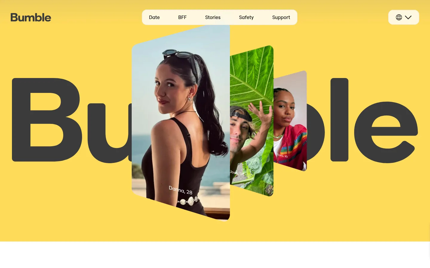
The page is anchored by Bumble Yellow (#ffdb5b), which fills the immersive hero and returns on the app callout and dating-category cards. Gallery White (#ffffff) provides a calm field for editorial content, while Ink (#202020) carries oversized hero lettering, headings, navigation and primary buttons. BumbleSans is used consistently, with large, confident headings and readable body copy rather than decorative type or all-caps styling. The layout moves from a full-bleed, image-layered opening into spacious white two-column stories, a pale-gray feature panel and side-by-side yellow service cards. Photography is central: portraits and real-life moments are cropped into rounded vertical panels or broad cards, with the hero images overlapping the brand wordmark. Rounded corners soften the strong color blocks; fine light borders and restrained shadows keep cards distinct without making the page feel dense. The overall effect is energetic but human, with clear contrast between brand moments and quieter reading sections.
Site-wide typeface for display headlines, section titles, paragraphs, navigation, links, and buttons.
角色
示例
字号
字重
行高
字距
特大标题
Oversized hero wordmark-style headline over the yellow opening.
Bumble
68px
600
1.03
0.007em
一级标题
Primary page or major feature headline.
Bumble
49px
600
1.12
0.009em
二级标题
Section titles such as the Member Circle feature heading.
Bumble
40px
400
1
0
三级标题
Subsection and category-card headings.
Bumble
34px
600
1
0.012em
四级标题
Smaller supporting titles in editorial content.
The quick brown fox 敏捷的狐狸
24px
400
1
0
正文
Descriptive copy in story, feature, and category sections.
The quick brown fox 敏捷的狐狸
20px
400
1.25
0.016em
辅助文字
Image labels and compact explanatory text.
The quick brown fox 敏捷的狐狸
16px
500
1.5
0
按钮
Primary and secondary calls to action.
The quick brown fox 敏捷的狐狸
17px
500
1.18
0.018em
链接
Text links such as the service-card discovery links.
The quick brown fox 敏捷的狐狸
17px
400
1.5
0
间距与布局
基准单位 4px · 密度:适中
40px版块间距
16px元素间距
12px卡片内边距
1360px内容最大宽度
1px
8px
10px
12px
14px
15px
16px
20px
22px
24px
32px
34px
40px
The page uses a wide, centered composition with a measured maximum content width of 1360px. A full-width hero gives way to mostly white sections organized as two-column image-and-copy layouts, followed by paired service cards and a split testimonial. Section spacing feels generous, while text blocks remain compact and left-aligned. The footer resolves into three link columns and a separate social and utility row. Keep the density comfortable and preserve clear visual transitions between yellow brand bands and white editorial space.
圆角与层次
按钮 · 16px
卡片 · 24px
导航 · 16px
sm · section, card, footer
hairline · card
The design is mostly flat: strong color fields, white canvas, and lightly bordered cards do most of the grouping. Rounded panels and overlapping hero portraits create depth without heavy effects. Shadows are subtle and limited; keep separators delicate and avoid dark, dramatic elevation.
组件
下面的预览按实测的按钮、输入框、徽标、卡片样式重建(字体用替代字体)。
Hero navigation
Brand mark at the left, centered rounded white navigation capsule, and a compact language control at the right, set over the yellow hero.
Layered portrait hero
Large dark display lettering sits behind overlapping portrait panels, turning the brand wordmark into a visual backdrop.
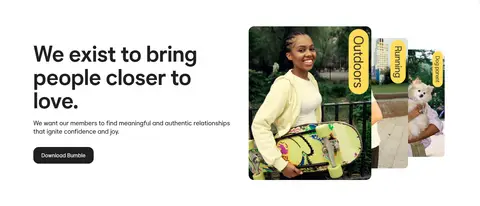
Editorial feature split
Left-aligned heading and short copy share a two-column row with a group of rounded lifestyle images; a dark download button anchors the text.
Member Circle panel
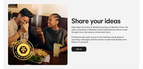
Pale-gray rounded feature band pairs a large community photo with a heading, supporting copy, and compact dark signup action.
Service cards
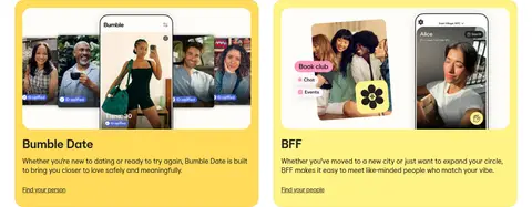
Bumble Date and BFF appear as adjacent yellow-toned rounded cards with app-and-people imagery, concise descriptions, and text links.
Testimonial feature
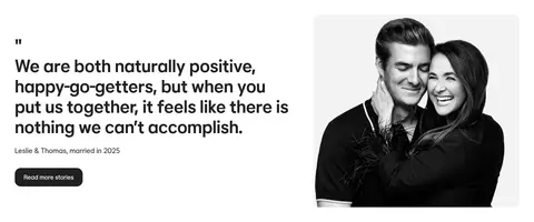
A large quote and attribution sit beside a monochrome couple portrait, with a dark story-reading button.
App download banner
Rounded yellow callout combines a short heading, QR instruction and code with overlapping phone mockups.
Multi-column footer
The large wordmark balances three compact link groups, followed by a lower row for QR access, social icons, and utility controls.
Imagery · Use candid, diverse people and real-life scenes as the core visual content. The hero layers portrait panels across the oversized brand wordmark; later sections pair lifestyle photography with copy, and service cards show app experiences alongside people. Frame images in rounded cards or vertical crops, keeping photography vivid and natural. Product UI appears within imagery rather than as a substitute for human portraits.
Use Bumble Yellow (#ffdb5b) for distinctive brand moments.
Set primary copy and high-impact lettering in Bumble Ink (#202020).
Alternate bright brand panels with open Gallery White (#ffffff) sections.
Use authentic people-focused photography as the main visual anchor.
Keep feature stories left-aligned in spacious split layouts.
Use rounded cards and subtle Soft Divider (#eeeeee) borders.
✕ 不该做
Don't replace the signature yellow with a gradient.
Don't make every section a colored card.
Don't use heavy shadows or thick outlines.
Don't crowd the page with dense copy or tightly packed controls.
Don't let app mockups overwhelm the human photography.
Don't use a decorative typeface or all-caps styling for all headings.
给 AI 的提示词
想快速出一个同风格的新页面,把这段话连同 DESIGN.md 一起发给 AI。
Build a new Bumble-style page with Bumble Yellow (#ffdb5b) as a bold, selective brand field and Gallery White (#ffffff) as the main reading canvas. Use Bumble Ink (#202020) for clear headings, navigation and filled CTAs. Set type in BumbleSans, or a close free sans-serif substitute, with confident large headlines and readable, natural-cased body text. Create an image-led hero with overlapping rounded portraits, then use spacious left-aligned split sections, a soft Cloud Panel (#f3f3f3) feature band, and rounded yellow service cards. Favor candid, diverse photography over decorative illustration. Keep borders delicate in Soft Divider (#eeeeee), shadows restrained, and the layout comfortable rather than dense. End with a clear app-download CTA and a structured multi-column footer.