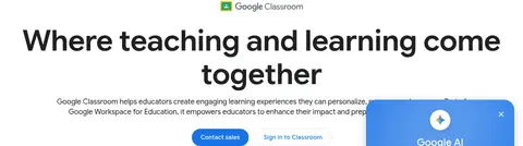
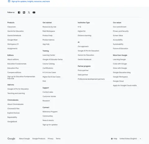
页面以 Google 克制的白蓝配色呈现亲和、面向教育场景的产品内容。居中的大标题、交替排布的信息模块和浅色功能面板,让较长的产品介绍更易浏览。
North star · Keep the page bright and spacious, using Google blue for clear actions and modular layouts to make dense education content easy to scan.
The visual strategy is built on a white canvas, with very light gray section bands providing quiet separation across a long page. Google blue marks primary actions, links, and selected interface details; a soft green testimonial band and green highlights add restrained variation rather than competing with the core palette. Google Sans Flex carries the page throughout, from large, dark centered headlines to compact navigation and readable body copy. Headings use confident scale and tight alignment, while body text remains neutral and open. The layout alternates centered introductions, two-column feature stories, and pale multi-column benefit panels, using generous whitespace to keep each content group distinct. Product screenshots and education imagery show real interface context and people, while small icons and app marks reinforce the Workspace ecosystem. Rounded cards and pill-shaped buttons soften the otherwise flat, structured presentation.
配色
点色块复制色值。用途说明来自对页面的实测位置(背景、文字、描边、按钮)与截图判读。
品牌色
强调色
表层色
中性色
功能色
页面底色 · Canvas White表层 · Cloud Gray表层 2 · Pale Sage主文字 · Google Ink次要文字 · Slate Gray弱文字 · Charcoal Gray描边 · Divider Gray强调 · Google Blue强调 2 · Link Blue强调 3 · Classroom Green
All page typography: headings, navigation, body copy, links, and buttons.
角色
示例
字号
字重
行高
字距
特大标题
Oversized promotional display headline where shown.
Google for Education
80px
600
1.15
-0.006em
一级标题
Primary hero headline and major page section titles.
Google for Education
48px
600
1.17
-0.01em
二级标题
Secondary section headings and prominent feature titles.
Google for Education
28px
400
1.29
0
三级标题
Feature-card headings and smaller content group titles.
The quick brown fox 敏捷的狐狸
20px
400
1.4
0
正文
Explanatory copy, descriptions, and standard paragraphs.
The quick brown fox 敏捷的狐狸
16px
400
1.5
0.006em
辅助文字
Compact uppercase labels and editorial metadata.
The quick brown fox 敏捷的狐狸
14px
500
1.71
0.036em
按钮
Primary and secondary call-to-action labels.
The quick brown fox 敏捷的狐狸
16px
500
1.5
0
导航
Header navigation, menus, and footer navigation.
The quick brown fox 敏捷的狐狸
16px
400
1.5
0.001em
链接
Inline links and text-based calls to action.
The quick brown fox 敏捷的狐狸
16px
400
1.5
0.006em
眉题
Small uppercase section or feature labels.
The quick brown fox 敏捷的狐狸
14px
500
1.71
0.036em
间距与布局
基准单位 8px · 密度:适中
48px版块间距
8px元素间距
—卡片内边距
1296px内容最大宽度
2px
8px
12px
16px
20px
24px
32px
36px
48px
60px
80px
120px
The content moves between a centered, single-column introduction and broad multi-column feature areas, with occasional two-column image-and-copy stories. A measured maximum width of 1296px supports wide desktop sections; text blocks are often centered while feature lists and footer columns align left. Section spacing follows a comfortable rhythm, with generous breaks between major topics and tighter grouping inside cards. Pale full-width bands punctuate the otherwise white page. The overall density stays low enough to let headlines, interface screenshots, and benefit summaries read independently.
圆角与层次
按钮 · 9999px
卡片 · 24px
图片 · 20px
导航 · 8px
链接 · 4px
sm · other
sm · button
md · card
md · other
Most content sits flat against the page, relying on white space and pale section backgrounds rather than prominent shadows. Fine gray borders define secondary buttons and interface edges. Rounded product cards and the floating AI announcement panel create limited depth, with the latter using a soft shadow over the hero content.
组件
下面的预览按实测的按钮、输入框、徽标、卡片样式重建(字体用替代字体)。
Pill CTA buttons
Primary Contact sales uses Google Blue #1a73e8 with white text; secondary Sign in to Classroom uses a white fill, blue text, and a #dadce0 outline. Both use fully rounded ends.
Announcement strip
A full-width, lightly blue-tinted banner below navigation pairs centered announcement copy with an inline blue link and a right-aligned close control.
Feature showcase cards
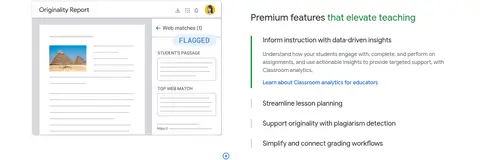
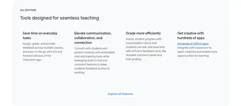
Rounded panels place Classroom product screenshots above a concise title, description, and compact text-link action.
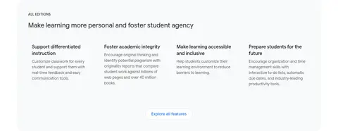
All-editions panels
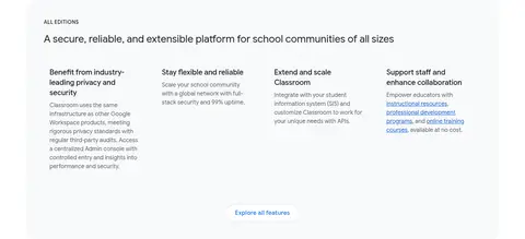
Broad #f8f9fa bands group a section heading with several left-aligned benefit columns and a centered exploration link.
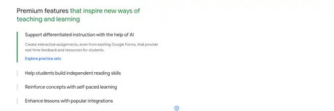
Expandable feature list
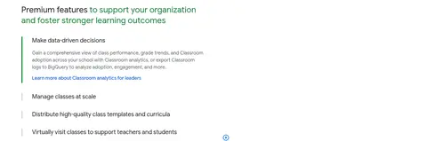
A selected feature uses green emphasis and a vertical green rule alongside supporting copy; other topics remain compact rows.
Story gallery
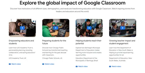
A row of classroom-video thumbnails pairs each image with a title, brief case-study description, and watch-video link.
Testimonial band
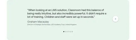
A #e6f4ea panel presents a large customer quotation, attribution, pagination dots, and a circular next control.
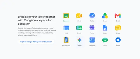
Imagery · Product-interface screenshots are framed inside broad, rounded media panels, often paired with adjacent feature copy. Customer stories use documentary-style classroom and educator imagery, including video thumbnails with visible play affordances. Workspace app icons and small illustrations support the ecosystem sections. Images retain natural colors and clear context; they are not unified by a heavy filter or decorative overlay.
Reserve Google Blue for actions, links, and clear navigation emphasis.
Break long content into alternating centered and split-layout sections.
Use pale gray bands to group multi-column benefit summaries.
Pair product screenshots with concise, relevant explanatory copy.
Keep typography consistent with Google Sans Flex or a close sans-serif substitute.
✕ 不该做
Do not introduce unmeasured brand colors or gradients.
Do not place every content group inside a bordered card.
Do not let decorative imagery overpower interface content.
Do not compress the long page into dense, uninterrupted text.
Do not use heavy shadows as the primary separation method.
Do not turn small labels or navigation into oversized headings.
给 AI 的提示词
想快速出一个同风格的新页面,把这段话连同 DESIGN.md 一起发给 AI。
Build a new education product page in Google for Education’s calm, spacious visual style. Use Canvas White (#ffffff) as the main background, Google Ink (#202124) for prominent headings, and Slate Gray (#5f6368) for supporting copy. Apply Google Blue (#1a73e8) to primary CTAs and Link Blue (#1967d2) to inline links. Use Cloud Gray (#f8f9fa) for broad feature bands and Pale Sage (#e6f4ea) only for a testimonial or similarly distinct proof point. Set the page in Google Sans Flex, or Roboto if unavailable. Organize content into centered introductions, split feature stories, and multi-column benefits with generous whitespace. Use rounded media and pill buttons, subtle borders, and minimal shadows. Let real product UI and educational imagery explain the product without decorative clutter.