North star · Let deep green typography and product-led proof carry the page, with generous light space and dark bands used only for emphasis.
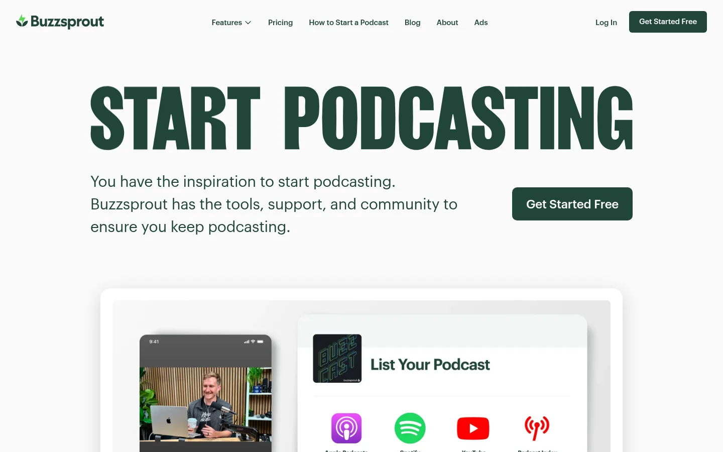
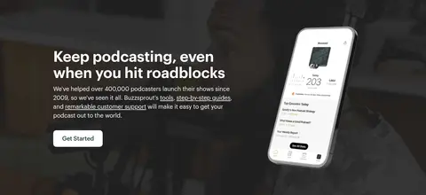
The page is built on a near-white canvas (#fafafa), with deep evergreen (#214538) carrying navigation, links, body copy, and the primary CTA. The darker charcoal-green (#151e1b) is reserved for immersive full-width feature bands, where light text and product imagery create a deliberate change of pace. Graphik keeps the system clean and human: oversized, tightly tracked display lettering anchors the hero, while restrained body and navigation styles support scanning. The layout uses a centered content frame, generous open areas, and modular split or multi-column sections; the rhythm alternates white content fields with dark feature panels rather than adding decoration everywhere. Product screenshots, device mockups, and podcast-platform marks demonstrate the software in context. Cards rely on subtle borders and selective soft shadows, while pale yellow-to-gold accents appear sparingly in gradient-led sections. Keep the overall impression calm, legible, and creator-focused.
配色
点色块复制色值。用途说明来自对页面的实测位置(背景、文字、描边、按钮)与截图判读。
品牌色
强调色
表层色
中性色
功能色
页面底色 · Studio White表层 · Night Forest表层 2 · Evergreen表层 3 · Butter Cream主文字 · Night Forest次要文字 · Evergreen弱文字 · Studio White描边 · Quiet Divider强调 · Soft Marigold强调 2 · Golden Signal
Site-wide display, headings, body copy, navigation, links, and buttons.
角色
示例
字号
字重
行高
字距
特大标题
Oversized hero headline and other high-impact page statements.
Buzzsprout
60px
600
1.1
-0.003em
一级标题
Primary page-level heading where the hero display treatment is not used.
Buzzsprout
50px
600
1.1
-0.005em
二级标题
Major section titles, often centered above supporting content.
Buzzsprout
35px
400
1.1
-0.005em
三级标题
Feature and subsection headings paired with descriptive copy.
Buzzsprout
30px
400
1.5
-0.008em
四级标题
Smaller feature titles and card-level headings.
The quick brown fox 敏捷的狐狸
25px
400
1.5
-0.006em
正文
Introductory copy and primary explanatory paragraphs.
The quick brown fox 敏捷的狐狸
20px
400
1.5
-0.008em
辅助文字
Small supporting labels, review details, and compact interface notes.
The quick brown fox 敏捷的狐狸
14px
400
1.43
-0.011em
按钮
CTA and secondary action labels.
The quick brown fox 敏捷的狐狸
14px
400
1.5
-0.011em
导航
Header links and compact navigation items.
The quick brown fox 敏捷的狐狸
15px
500
1.5
-0.011em
链接
Prominent inline or standalone resource links.
The quick brown fox 敏捷的狐狸
24px
400
1.5
-0.007em
眉题
Compact uppercase category or section label above a heading.
The quick brown fox 敏捷的狐狸
11px
600
1.45
0.08em
间距与布局
基准单位 4px · 密度:紧凑
40px版块间距
12px元素间距
16px卡片内边距
1080px内容最大宽度
4px
5px
6px
8px
10px
12px
14px
15px
16px
20px
24px
30px
32px
40px
50px
80px
Use a centered content frame with a compact header and a spacious, text-led hero. The measured page maximum is 1080px; build sections around that frame, then let feature bands span the viewport. Alternate centered introductions, split feature layouts, and multi-column proof sections. The measured spacing system is compact at its base, but the screenshot's large open fields and section breaks give the page room to breathe. Keep alignment purposeful: centered for showcases and reviews, left-aligned for explanatory feature content.
圆角与层次
按钮 · 10px
卡片 · 8px
图片 · 8px
徽标 · 50%
导航 · 8px
hairline · card
lg · card
lg · card
hairline · card
Most sections feel flat and spacious. Product previews sit in softly raised white panels with subtle shadows; cards may use a thin pale-gray border instead of heavy outlines. Reserve stronger shadowing for large interface mockups, and avoid layering effects that would make the otherwise clean page feel glossy.
组件
下面的预览按实测的按钮、输入框、徽标、卡片样式重建(字体用替代字体)。
Header navigation
A compact horizontal header on the light canvas, with evergreen links and a dark-green Get Started Free action.
Primary CTA
Evergreen fill with white Graphik text; measured variants range from compact navigation treatment to a prominent hero action.
Hero headline
Large, bold, tightly tracked uppercase display statement centered over the introductory copy and product preview.
Product preview panel
Bright, softly elevated frame for podcast dashboard, directory, or device UI screenshots.
Dark feature band
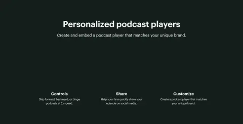
Full-width #151e1b panel pairing light copy with product imagery or feature descriptions.
Review cards
Light-background testimonial content arranged in columns, with star ratings, short quotes, and compact attribution.
Directory tiles
A grid of podcast platform marks and listing states inside a product-oriented distribution section.
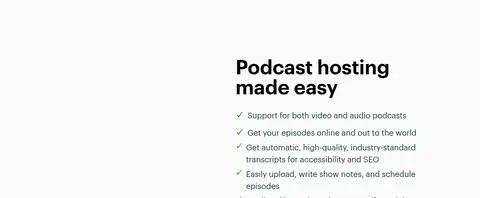
Imagery · Use real product UI screenshots and device mockups to explain podcast publishing and listening workflows. Frame them as clean, bright panels with restrained borders and soft shadows, allowing interface details to remain legible. Use platform marks as supporting proof, not as the central visual identity. In dark feature bands, place device imagery against the deep background for contrast. The page is product-led rather than illustration- or photography-led.
Use #214538 for navigation, links, and primary actions.
Keep large display headlines bold and tightly tracked.
Use #151e1b for selected full-width feature bands.
Show product interfaces as legible framed previews.
Let whitespace separate the long sequence of sections.
✕ 不该做
Don't turn every section into a card.
Don't use bright yellow as a persistent page background.
Don't substitute generic stock imagery for product UI.
Don't make dark bands the default section treatment.
Don't use heavy borders or dramatic shadows everywhere.
Don't add decorative colors that are absent from the measured palette.
给 AI 的提示词
想快速出一个同风格的新页面,把这段话连同 DESIGN.md 一起发给 AI。
Build a new Buzzsprout-style SaaS page with a bright #fafafa canvas and an editorial, creator-friendly feel. Use Graphik, or Inter as a free substitute, with bold tightly tracked display headlines and calm, readable body copy. Use Evergreen (#214538) for navigation, links, and white-text primary CTAs; use Night Forest (#151e1b) only for selected full-width feature bands. Keep the content centered within the measured 1080px maximum width, varying centered showcases with left-aligned feature copy and split product sections. Use product dashboards, device previews, and podcast-platform marks as concrete evidence. Give screenshots subtle borders or soft shadows, not glossy effects. Preserve generous visual breathing room and use the Soft Marigold (#fae38b) to Golden Signal (#f4c419) gradient only as a restrained section accent.