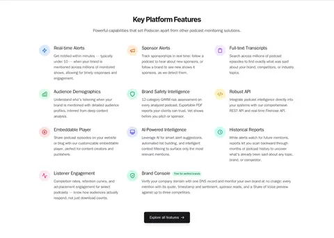
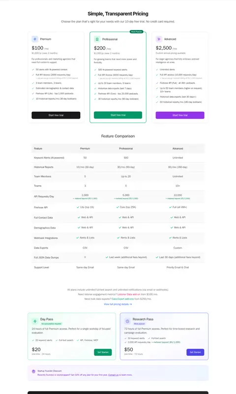
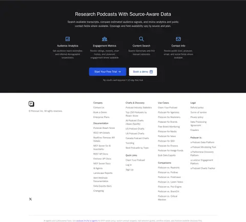
North star · Keep the interface bright and information-rich, using dark type, delicate boundaries, and emerald only to direct attention to action or meaningful signals.
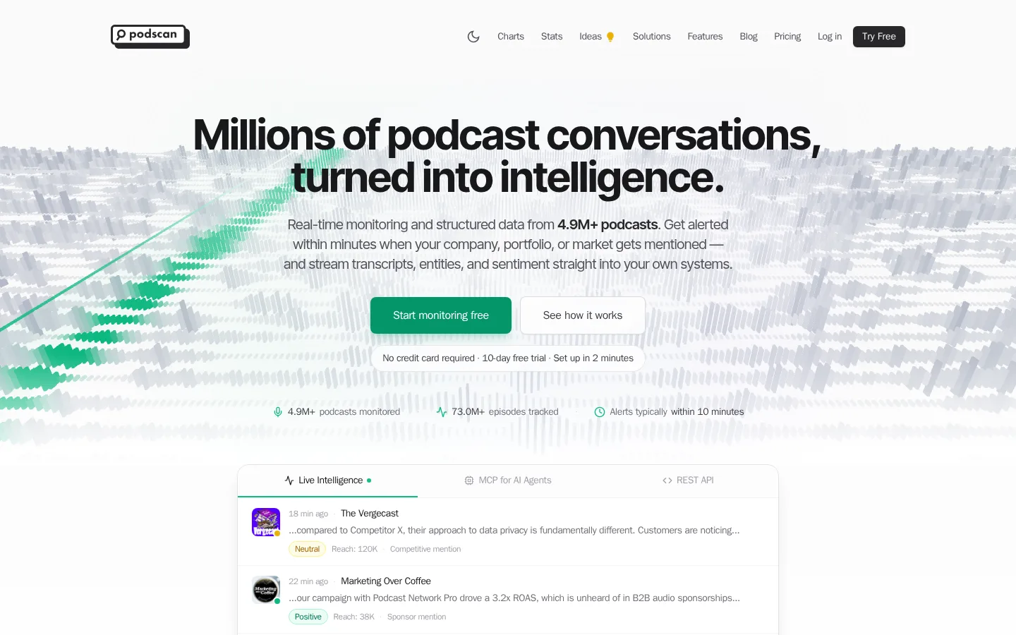
The visual system is built on a near-white canvas, dark ink typography, and fine gray borders. Emerald is the primary action color, while blue and violet appear in selected links, cards, and plan actions; small mint and yellow badges communicate sentiment in transcript examples. Large, tightly tracked sans-serif headlines establish a confident editorial hierarchy, balanced by compact navigation and readable body copy. The hero centers its message over a pale, panoramic data visualization with green signal accents, then presents live product activity as a bordered interface preview. Across the long page, white and very light gray section bands create rhythm without strong contrast. Cards, comparison tables, feature lists, and pricing panels make dense platform information scannable. Soft gradients and restrained shadows add depth only where product previews or interactive elements need separation.
配色
点色块复制色值。用途说明来自对页面的实测位置(背景、文字、描边、按钮)与截图判读。
品牌色
强调色
表层色
中性色
功能色
页面底色 · Gallery White表层 · Carbon Ink表层 2 · Media Black主文字 · Carbon Ink次要文字 · Slate Copy弱文字 · Quiet Zinc描边 · Boundary Gray强调 · Podscan Emerald强调 2 · Link Blue强调 3 · Deep Link Blue
Primary system font for navigation, body copy, buttons, cards, and most headings.
Aa 设计
Inter Tight
网络字体 · 字重 700 / 400 / 600 · 占比 4%
免费替代:Inter
Display headline, selected section headings, and the search input text.
角色
示例
字号
字重
行高
字距
特大标题
Oversized centered hero headline above the product preview.
Podscan
60px
700
1
-0.025em
一级标题
Primary page or major section heading in system sans.
Podscan
30px
700
1.2
-0.013em
二级标题
Section titles, especially centered product and pricing headings.
The quick brown fox 敏捷的狐狸
24px
700
1.33
-0.017em
三级标题
Feature, card, and subsection titles within content grids.
The quick brown fox 敏捷的狐狸
20px
700
1.4
-0.02em
正文
Descriptions, feature explanations, and general interface copy.
The quick brown fox 敏捷的狐狸
16px
400
1.5
-0.025em
辅助文字
Compact supporting labels, notes, and badge text.
The quick brown fox 敏捷的狐狸
14px
400
1.43
-0.029em
按钮
CTA labels and other interactive control text.
The quick brown fox 敏捷的狐狸
16px
500
1.5
-0.025em
导航
Small, medium-weight labels in the horizontal top navigation.
The quick brown fox 敏捷的狐狸
14px
500
1.43
-0.029em
链接
Inline links and card-level navigation actions.
The quick brown fox 敏捷的狐狸
16px
500
1.5
-0.025em
代码
Compact API or technical data labels where code styling is present.
const style = 1;
12px
400
1.33
-0.033em
间距与布局
基准单位 8px · 密度:适中
64px版块间距
12px元素间距
16px卡片内边距
1104px内容最大宽度
2px
4px
6px
8px
10px
12px
16px
20px
24px
32px
64px
A centered, responsive page uses a measured 1104px maximum content width and a comfortable density. The hero aligns centrally, with a full-width visual backdrop and a contained live-activity preview. Content alternates between centered introductions, two-column feature showcases, and multi-column card grids. Repeated white and #fafafa bands distinguish major sections without heavy dividers. Use generous section intervals, consistent card interiors, and dense but orderly tables for pricing comparisons.
圆角与层次
按钮 · 8px
输入框 · 12px
卡片 · 12px
图片 · 8px
徽标 · 9999px
导航 · 8px
链接 · 8px
hairline · card, button, other
md · button, link, media
sm · button
md · button
The page is mostly flat: thin gray boundaries define cards, inputs, and tables. Use subtle short shadows beneath interactive controls and a slightly deeper lift for prominent media or product cards. Rounded corners soften modules without turning the layout into floating dashboards; reserve stronger dark surfaces for media and the footer.
组件
下面的预览按实测的按钮、输入框、徽标、卡片样式重建(字体用替代字体)。
Primary CTA
Emerald fill (#059669), white medium-weight sans-serif label, and an 8px radius; use for the main monitoring or trial action.
Top navigation
Compact horizontal links in muted gray with dark text emphasis, ending in a concise trial action; keep the header visually light.
Product preview card
White interface panel with a fine #e4e4e7 boundary, rounded corners, subtle shadow, and small status or sentiment details.
Feature card
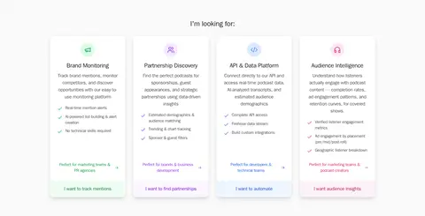
Modular white card with a simple colored icon, short heading, concise supporting copy, and a restrained link or action.
Sentiment badge
Pill-shaped label with a pale mint or yellow background, matching colored text, and a fine semantic border.
Pricing plan
Three comparison-friendly plan cards with clear price hierarchy, compact feature lists, and contrasting trial buttons; one plan receives emerald emphasis.
Search input
White rounded field with a fine gray border and dark text, placed within a centered database-search module.
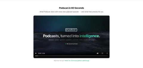
Imagery · The hero uses an abstract panoramic data visualization: pale gray waveform-like structures with a green signal path, fading into white rather than competing with the headline. Product screenshots and interface previews are framed in light cards with restrained borders. A dark video thumbnail provides the clearest tonal contrast. Small logos and illustrative icons support specific sections; keep them subordinate to real interface content.
Keep the canvas white and the section backgrounds only subtly varied.
Use emerald for the most important action and meaningful live-data cues.
Set prominent headlines in a bold, tightly tracked sans-serif.
Make feature and pricing information scannable with clear card structure.
Use thin neutral borders before adding shadows.
Keep product previews visually realistic and contained within light frames.
✕ 不该做
Do not introduce large saturated background blocks across ordinary sections.
Do not use every accent color with equal prominence.
Do not let decorative data graphics overpower the hero copy.
Do not make cards feel heavily raised or glossy.
Do not compress long-form pricing and feature details into undifferentiated text.
Do not treat colors from badges or product illustrations as the core brand palette.
给 AI 的提示词
想快速出一个同风格的新页面,把这段话连同 DESIGN.md 一起发给 AI。
Build a new Podscan-style SaaS page with a bright, calm, data-first interface. Use Gallery White (#ffffff) as the main canvas, Carbon Ink (#18181b) for headlines and primary text, Slate Copy (#52525b) for supporting copy, and Boundary Gray (#e4e4e7) for delicate borders. Make Podscan Emerald (#059669) the clear primary action color; use Link Blue (#2563eb), Violet Action (#9333ea), and Signal Rose (#db2777) only as restrained secondary accents. Set a centered bold sans-serif headline above concise copy and a believable product preview. Organize subsequent content into alternating white and faint-gray bands, modular feature cards, a searchable data panel, and comparison-friendly pricing. Keep generous section breathing room, low visual elevation, fine boundaries, and realistic interface details. Use gradients and illustrations sparingly, and ensure every color supports hierarchy or product meaning.