North star · Let clear product UI and centered, spacious storytelling lead; use indigo for actions and navy only for purposeful contrast.
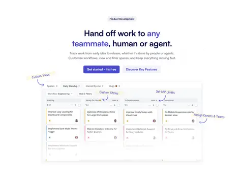
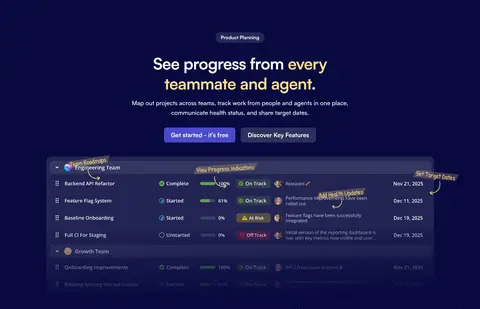
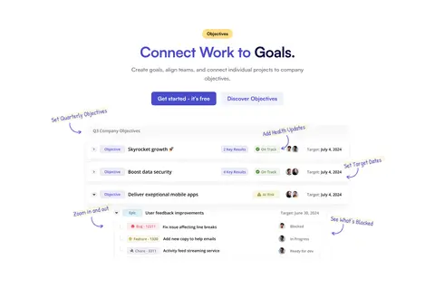
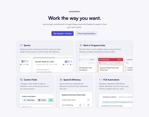
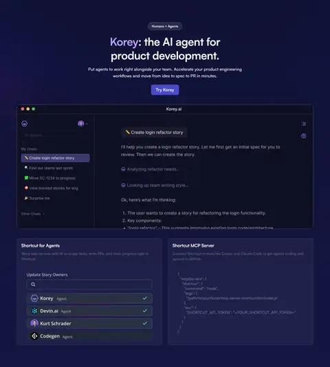
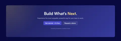
The page is built on a white canvas, with pale lavender-gray bands separating feature areas and deep navy sections reserved for selected product stories and the closing CTA/footer. Indigo is the key action color: it marks primary buttons and selected headline emphasis, while dark ink carries headings and navigation. Satoshi is used throughout, combining heavy, tightly tracked display headlines with readable medium-weight body copy. Sections favor centered introductions followed by product UI imagery or two-column content; the page alternates open white space with denser card and interface layouts. Product screenshots are the main visual asset, shown large enough to explain workflows rather than as decorative thumbnails. Cards use pale surfaces, subtle borders, rounded corners, and restrained shadows. The overall rhythm is spacious and orderly, with consistent button styling and occasional yellow badges adding a small contrast note.
All page typography, from display headlines and navigation to body copy, buttons, and captions.
角色
示例
字号
字重
行高
字距
特大标题
Large centered hero and campaign headlines.
Shortcut
64px
700
1.12
-0.02em
一级标题
Primary section headlines and prominent feature titles.
Shortcut
48px
700
1.25
-0.02em
正文
Explanatory paragraphs beneath headings and within feature areas.
The quick brown fox 敏捷的狐狸
18px
500
1.6
0
辅助文字
Small supporting notes, UI labels, and customer details.
The quick brown fox 敏捷的狐狸
14px
500
1.35
0
按钮
Primary and secondary CTA labels.
The quick brown fox 敏捷的狐狸
18px
700
1.3
0
导航
Header navigation and prominent menu labels.
The quick brown fox 敏捷的狐狸
16px
700
1.25
0
链接
Secondary links and card actions.
The quick brown fox 敏捷的狐狸
14px
500
1.5
0
眉题
Uppercase category labels above section headings.
The quick brown fox 敏捷的狐狸
14.5px
700
1.1
0.08em
间距与布局
基准单位 4px · 密度:宽松
96px版块间距
8px元素间距
—卡片内边距
1296px内容最大宽度
4px
5px
6px
8px
10px
12px
14px
16px
20px
24px
32px
96px
Use a centered content frame with a measured maximum width of 1296px and a spacious 96px section rhythm. The header is a single horizontal navigation row. Most sections begin with centered headings and concise copy, then shift into two-column feature layouts, product showcases, or card grids. Alternate white canvas sections with pale lavender-gray bands and occasional full-width navy sections. Keep density low around introductions, letting product UI occupy the visual focus.
圆角与层次
按钮 · 8px
卡片 · 16px
图片 · 50%
徽标 · 9999px
导航 · 8px
链接 · 10px
md · card
md · card, section
md · nav
md · media
The page is mostly flat, relying on section color changes and fine card borders to define structure. Use subtle, soft shadows beneath interface panels and customer cards rather than dramatic elevation. Rounded card surfaces sit close to the background; dark sections gain depth through a restrained navy gradient, not heavy effects.
组件
下面的预览按实测的按钮、输入框、徽标、卡片样式重建(字体用替代字体)。
Primary CTA
Solid Shortcut Indigo (#494bcb) button with white text, an 8px radius, and bold Satoshi lettering; keep it visually dominant.
Header navigation
Single horizontal row on white, with dark ink links, compact dropdown indicators, and an indigo sign-up button.
Eyebrow badge
Small pill or compact rounded label above section headings; use pale surfaces or Warm Badge (#ffde87) for selected new-item emphasis.
Feature card
Pale Mist Lilac (#f0f0f7) or white card with a fine divider border, rounded corners, and restrained shadow.
Product showcase
Large, crisp product UI panel, optionally surrounded by short hand-drawn-style workflow annotations.
Dark feature band
Full-width Midnight Ink (#08093f) section with light text, product imagery, and concise centered introduction.
Secondary action
Quiet text or pale-surface button alongside the primary CTA, visually subordinate and typically indigo or dark-ink labeled.
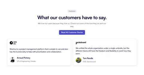
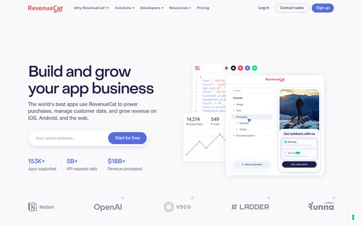
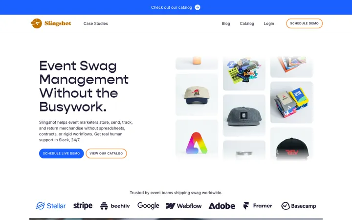
Imagery · Product interface screenshots and workflow mockups are the main imagery; customer portraits and small partner or certification marks support specific sections. Frame product UI as large, legible panels, often with subtle shadows and rounded edges. Use diagram-like annotations sparingly around screenshots. There is no dominant photographic or 3D art direction; interface imagery should feel crisp and integrated with the page.
Reserve indigo for primary actions and selective emphasis.
Center section introductions above their content.
Show product interfaces as legible, substantial panels.
Separate major content areas with pale or navy bands.
Keep shadows subtle and borders fine.
Use generous whitespace between section groups.
✕ 不该做
Do not turn every section into a card grid.
Do not use bright colors beyond measured accents.
Do not crowd headings with dense explanatory copy.
Do not add decorative photography that competes with product UI.
Do not apply strong shadows to every element.
Do not use navy as the default light-section background.
Do not introduce unmeasured sizes, colors, or radii.
给 AI 的提示词
想快速出一个同风格的新页面,把这段话连同 DESIGN.md 一起发给 AI。
Build a new page in Shortcut’s visual style: a white, spacious canvas with centered Satoshi headings and clear product-led storytelling. Use Midnight Ink (#08093f) for headings and navigation, Shortcut Indigo (#494bcb) for primary CTA buttons and selective emphasis, Quiet Slate (#686878) for supporting copy, and Cloud Lavender (#f6f6fa) or Mist Lilac (#f0f0f7) for soft section and card surfaces. Alternate open white sections with occasional full-width navy feature bands. Lead feature areas with concise centered introductions, then show substantial, crisp product-interface panels or orderly two-column content. Keep borders delicate, shadows restrained, and card corners consistent with the measured rounded treatment. Add only small Warm Badge (#ffde87) labels where useful. Preserve generous section rhythm and avoid decorative assets that distract from the interface.