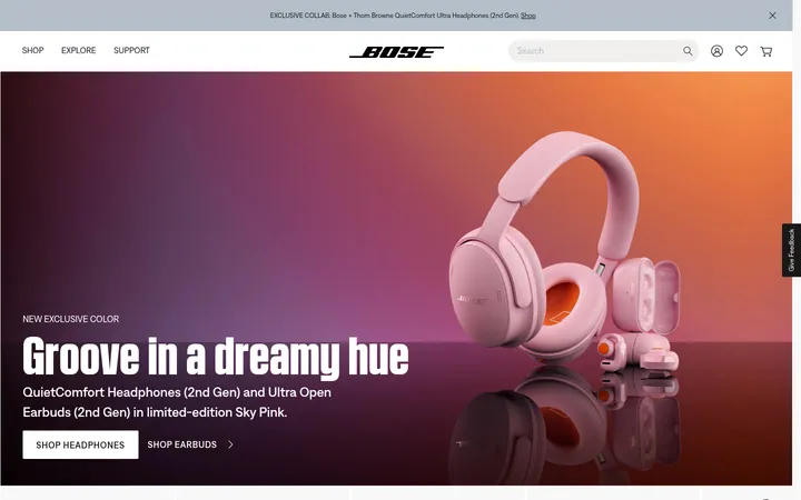
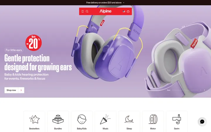
North star · Keep the interface quiet and monochrome so campaign imagery and product photography carry the visual emphasis.
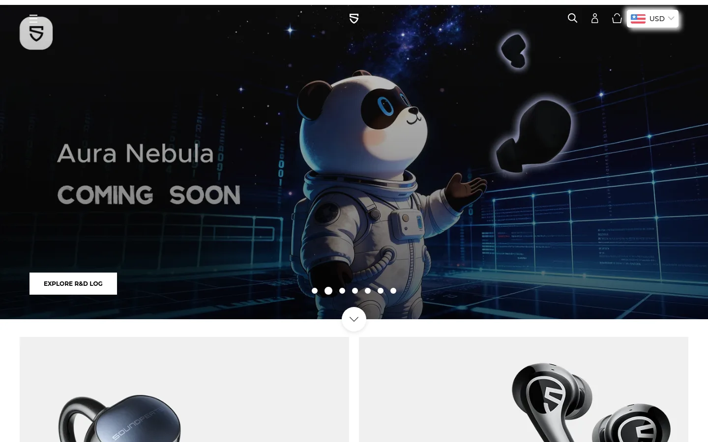
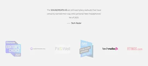
SOUNDPEATS uses a restrained monochrome interface as a quiet frame for expressive campaign and product imagery. White is the dominant canvas; pale gray panels distinguish product tiles and category cards, while near-black text and black controls provide crisp contrast. The opening hero is cinematic and full bleed, with dark space imagery and a prominent product campaign, then the page shifts into a spacious two-column product mosaic. Montserrat is used throughout: compact, bold uppercase buttons contrast with lighter, generously leading body copy and restrained headings. Product photography carries most of the color and visual texture, including dark earbuds against pale backgrounds and atmospheric category images. Sections alternate between white shopping areas, video-led brand storytelling, category tiles, media quotations, and a darker service/newsletter band before a black footer. Alignment is clean and grid-based, with broad gutters and little decorative chrome.
配色
点色块复制色值。用途说明来自对页面的实测位置(背景、文字、描边、按钮)与截图判读。
品牌色
表层色
中性色
功能色
页面底色 · Gallery White表层 · Mist Gray表层 2 · Deep Black表层 3 · Soft Ink主文字 · Soft Ink次要文字 · Quiet Gray弱文字 · Deep Black描边 · Deep Black
Body copy, descriptive links, and longer editorial text.
Aa 设计
Montserrat-Medium
网络字体 · 字重 500 / 700 · 占比 47%
免费替代:Montserrat
Headings, navigation, captions, and product-card labels.
Aa 设计
Montserrat
网络字体 · 字重 500 / 700 · 占比 3%
免费替代:Montserrat
Buttons and small uppercase action labels.
角色
示例
字号
字重
行高
字距
一级标题
Compact hero or primary campaign heading.
The quick brown fox 敏捷的狐狸
23px
700
1
-0.043em
二级标题
Centered section titles and brand-story headings.
The quick brown fox 敏捷的狐狸
22px
500
1.65
0
正文
Long-form brand copy and explanatory text.
The quick brown fox 敏捷的狐狸
18px
500
2
0
辅助文字
Small product names and supporting labels.
The quick brown fox 敏捷的狐狸
14px
500
1
0
按钮
Uppercase primary CTA labels.
The quick brown fox 敏捷的狐狸
12px
700
normal
0
导航
Header and navigation labels.
The quick brown fox 敏捷的狐狸
14px
500
1
0
链接
Editorial links and product discovery text.
The quick brown fox 敏捷的狐狸
18px
500
2
0
眉题
Small uppercase, widely tracked section cues.
The quick brown fox 敏捷的狐狸
12px
500
normal
0.2em
间距与布局
基准单位 2px · 密度:适中
40px版块间距
—元素间距
—卡片内边距
1360px内容最大宽度
1px
5px
6px
8px
12px
14px
15px
18px
20px
25px
28px
30px
35px
40px
50px
60px
The measured content max width is 1360px, with a comfortable density and a 40px section gap. The opening hero spans the viewport; below it, product tiles form a two-column mosaic, followed by full-width storytelling and a centered category area with paired image cards. Most sections sit on white with broad gutters and clear separation rather than enclosing borders. The lower service/newsletter band is divided into columns, then transitions into a multi-column black footer. Keep alignment deliberate and let imagery define each section's scale.
圆角与层次
按钮 · 50%
导航 · 2px
md · nav
md · button
Most surfaces are flat, with spacing and pale-gray panels doing the separation work instead of cards with visible outlines. The measured navigation has a soft, symmetric gray shadow; a button shadow is also present in the measured data, but the prominent shopping CTA reads primarily through its solid black fill and white text. Keep layering restrained.
组件
下面的预览按实测的按钮、输入框、徽标、卡片样式重建(字体用替代字体)。
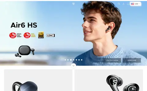
Campaign hero
Full-bleed image or video with overlaid campaign copy, carousel dots, and a high-contrast white action.
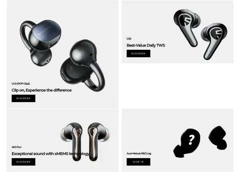
Product mosaic
Two-column product discovery area with pale #f0f0f0 tiles, product imagery, concise labels, and DISCOVER links.
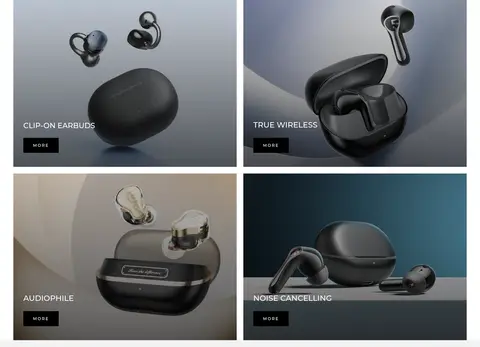
Category tiles
Paired photographic panels with darkened imagery, uppercase category labels, and compact MORE controls.
Brand story video
Wide video-led section paired with centered introductory copy and restrained heading treatment.
Service strip
Four concise customer-service benefits arranged in a horizontal band above the newsletter area.
Newsletter signup
Dark band with a short invitation, email input, and simple light submit control.
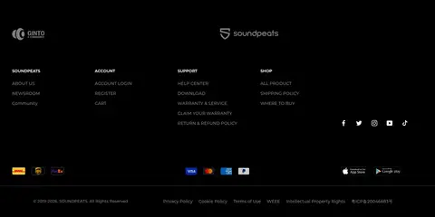
Footer
Black multi-column navigation with brand mark, support and account links, social icons, and fine-print details.
Imagery · Large campaign imagery sets the first impression, ranging from cinematic dark space scenes to bright lifestyle portraits. Product tiles use isolated earbud photography against pale gray or white, while category panels use moody close-ups with dark overlays for readable labels. Embedded video supports the brand story. The imagery is photographic and product-focused, not a decorative illustration system.
Reserve black for high-contrast actions and dark lower-page bands.
Give product photography generous space.
Use pale-gray panels to group product tiles.
Keep CTA labels short and uppercase.
Build section rhythm with whitespace rather than heavy borders.
✕ 不该做
Do not add bright interface accents absent from the measured palette.
Do not crowd the product mosaic with extra copy.
Do not put every section inside a bordered card.
Do not use oversized decorative typography.
Do not let dark overlays obscure product details.
Do not make the footer compete with the hero.
给 AI 的提示词
想快速出一个同风格的新页面,把这段话连同 DESIGN.md 一起发给 AI。
Build a new SOUNDPEATS-style storefront page with a calm monochrome interface and imagery-led hierarchy. Use Gallery White (#ffffff) as the main canvas, Soft Ink (#1c1b1b) for headings and copy, Mist Gray (#f0f0f0) for product panels, and Deep Black (#000000) for primary CTAs and dark footer or newsletter regions. Set typography in Montserrat: compact headings, light-feeling body copy with generous leading, and bold uppercase button labels. Organize content into broad, clearly separated sections with generous gutters; use product photography in a two-column mosaic and dark, readable category imagery. Keep decoration minimal, avoid invented accent colors, and rely on whitespace and tonal panels rather than outlines. Finish with a compact service strip and structured multi-column footer.