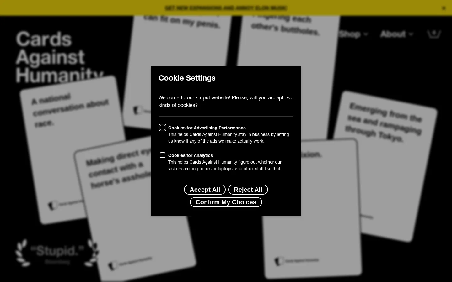
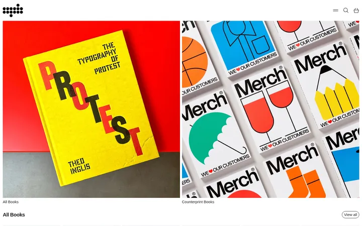
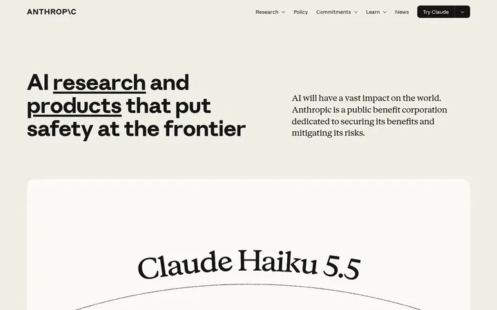
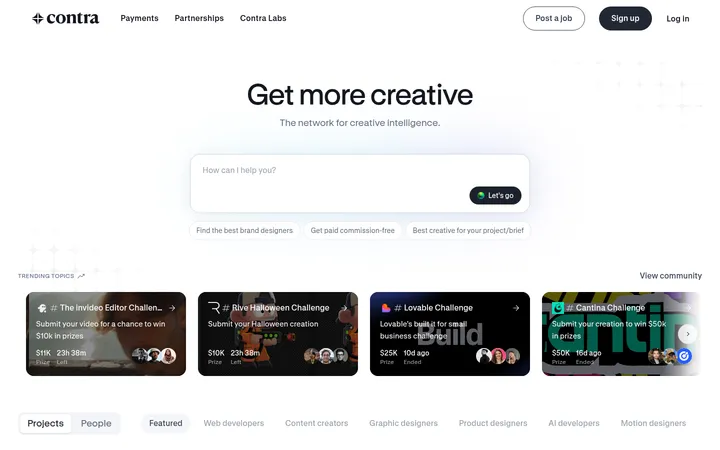
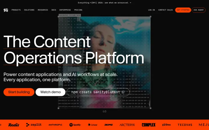
North star · Keep the interface stark and legible in black and white, then let irreverent copy and vivid card artwork provide the color and surprise.
The visual system is built on a hard black-and-white contrast: black hero, shop, editorial, FAQ, and footer areas alternate with clean white explanation and signup bands. White and black do most of the work; measured yellow, purple, red, and bright card colours appear as compact accents or within campaign artwork rather than as a competing site-wide palette. Helvetica Neue LT carries the page in heavy, oversized headlines and dense, readable body copy, with no decorative tracking or uppercase treatment. Content sits in a centered, constrained frame, while section backgrounds stretch edge to edge. Product and campaign cards bring saturated colour, bold lettering, and hand-drawn or photographic details into the otherwise restrained interface. Rounded pill buttons and card corners soften the geometry; thin gray rules structure the FAQ. Spacing is comfortable and sections feel deliberately distinct, allowing punchy copy and imagery to set the pace.
Primary family for headlines, body copy, links, buttons, and card text.
Aa 设计
Helvetica Neue
系统字体 · 字重 700 · 占比 5%
免费替代:Arial
Minor system-font fallback for bold text.
角色
示例
字号
字重
行高
字距
特大标题
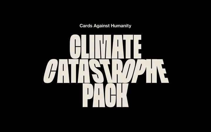
Oversized hero or campaign display messaging.
Cards Against Humanity
80px
800
1
0
一级标题
Primary section headings such as shop and editorial titles.
Cards Against Humanity
65px
800
1
0
二级标题
Large secondary section headlines.
Cards Against Humanity
55px
800
0.98
0
三级标题
Subsection titles and prominent campaign-card headings.
Cards Against Humanity
40px
800
1.05
0
四级标题
Introductory or supporting explanatory copy.
Cards Against Humanity
28px
400
1.29
0
正文
Bold body emphasis and concise supporting statements.
The quick brown fox 敏捷的狐狸
20px
800
1.3
0
辅助文字
Small labels, card metadata, and compact supporting notes.
The quick brown fox 敏捷的狐狸
14px
800
1
0
按钮
Short, bold action labels on pill controls.
The quick brown fox 敏捷的狐狸
14px
800
1
0
链接
Prominent inline editorial links and action text.
Cards Against Humanity
28px
400
1.29
0
间距与布局
基准单位 2px · 密度:适中
90px版块间距
—元素间距
—卡片内边距
1260px内容最大宽度
5px
10px
12px
15px
20px
30px
32px
40px
50px
90px
160px
Use full-width alternating black and white section bands, with inner content constrained to the measured 1260px maximum width. The hero is a single-column, media-led black canvas; explanatory and signup content sit in narrower, left-aligned reading columns. Shop products form a horizontal, colorful card row, while campaign cards and footer links use compact multi-column arrangements. Keep section spacing comfortable, with a measured 90px section gap where applicable. The overall density is moderate: large headlines and whitespace offset busy card artwork and the long FAQ.
圆角与层次
按钮 · 9999px
卡片 · 13px
链接 · 9999px
inset · button, link, footer
inset · button
Favor flat black or white section surfaces over layered UI. Cards use measured rounded corners, while FAQ rows are separated by thin gray rules. Buttons are pill-shaped and may use a subtle inset outline treatment; avoid soft drop shadows, elaborate gradients, or excessive depth.
组件
下面的预览按实测的按钮、输入框、徽标、卡片样式重建(字体用替代字体)。
Primary pill CTA
Black fill, white bold label, pill radius, and a subtle inset black outline treatment; use for purchase and download actions.
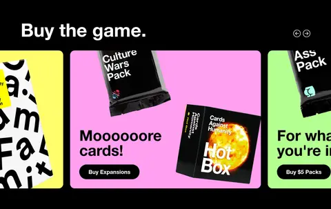
Product card carousel
A horizontal row of colorful card faces with rounded corners, packaging imagery, bold copy, and embedded action labels.
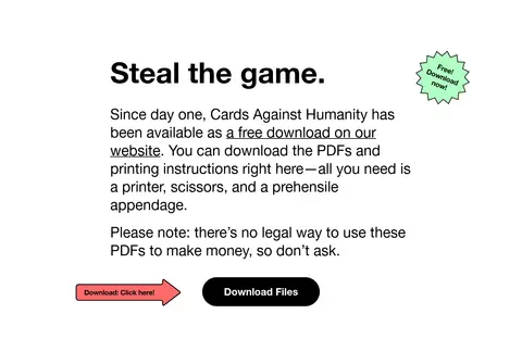
Editorial download block
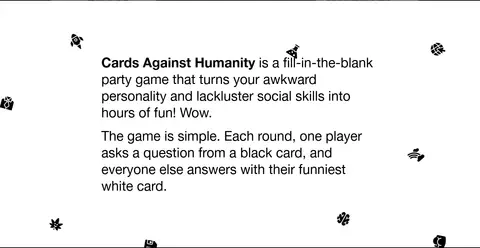
White background, large black heading, narrow explanatory text column, small playful badge, and paired download prompt and CTA.
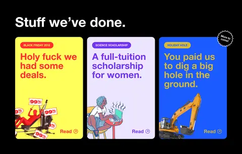
Campaign cards
Bright compact cards with short labels, oversized colored headlines, and illustration or photographic details.
FAQ accordion
Black section with bold white questions, thin gray horizontal rules, plus controls, and a white pill-shaped Expand All action.
Email signup
White section with a large bold headline, outlined email field, arrow action, and a small reassurance note.
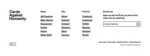
Multi-column footer
White background, compact black wordmark, underlined link lists, social links, and a small email signup.
Imagery · Use product packaging, playing-card visuals, and campaign artwork as the main visual material. Cards are bright, highly legible, and often combine bold typography with illustrative or photographic details; the shop row can feel like a horizontally browsable carousel. Keep surrounding UI spare so artwork and irreverent copy stand out. Avoid generic lifestyle photography as a substitute for the distinctive game and campaign visuals.
Alternate black and white full-width section bands.
Use bold Helvetica-style headlines with compact line spacing.
Keep core controls black or white with high-contrast labels.
Reserve vivid colors for product and campaign artwork.
Use rounded pills for prominent actions.
Structure long FAQ content with fine horizontal rules.
✕ 不该做
Do not wash the whole interface in bright accent colors.
Do not replace the bold typography with delicate display fonts.
Do not add gradients or decorative shadow-heavy panels.
Do not crowd the explanatory text column with extra decoration.
Do not make product artwork look like generic stock photography.
Do not use uppercase styling as a default.
给 AI 的提示词
想快速出一个同风格的新页面,把这段话连同 DESIGN.md 一起发给 AI。
Build a new Cards Against Humanity-style page with a stark, high-contrast foundation. Use Ink Black (#000000) and Gallery White (#ffffff) for alternating full-width sections, readable text, and primary actions; keep Rule Gray (#808080) for restrained dividers. Set bold Helvetica Neue-style headlines and plain, legible body text, with oversized section titles and no ornamental tracking. Use pill-shaped buttons and rounded cards. Place colorful product imagery in focused card rows, drawing on Card Lemon (#fffe5b), Lavender Card (#ede5ff), Electric Blue (#1b5bff), Bubblegum Pink (#ffa0f0), and Acid Green (#b4ff91) only where artwork calls for color. Keep copy irreverent, layouts uncluttered, and section spacing comfortable. Build responsive columns that collapse cleanly without losing the alternating section rhythm or strong type hierarchy.