North star · Keep the storefront monochrome and orderly so the colour and character of the products lead.
The interface is built on a strict two-colour foundation: #ffffff for the canvas and #1c1c1c for text, navigation, borders, and occasional inverse bands. Colourful books and merchandise provide nearly all the vivid colour, so the interface stays neutral and lets product artwork define each impression. Helvetica is used throughout; headings are bold and tightly tracked, while product details and navigation remain small, regular, and practical. The page alternates between wide image-led openings, compact product grids, an oversized editorial statement, and a dark sample-sale split. Product images sit in orderly, closely spaced columns with short names and prices directly beneath. Rounded outline pills distinguish actions such as “View all” and “Subscribe” without introducing a filled brand colour. The overall strategy is deliberately flat and restrained: sharp imagery, clear alignment, dense catalog browsing, and few decorative interface effects.
配色
点色块复制色值。用途说明来自对页面的实测位置(背景、文字、描边、按钮)与截图判读。
品牌色
表层色
页面底色 · Paper White表层 · Print Ink主文字 · Print Ink次要文字 · Paper White描边 · Print Ink
文字
背景
对比度
WCAG
#1c1c1c Print Ink
#ffffff Paper White
17.04:1
AAA
#ffffff Paper White
#1c1c1c Print Ink
17.04:1
AAA
字体
字号阶梯:Custom(比例约 2.049,正文 15px)。示例用免费替代字体渲染,数值为实测。
Aa 设计
Helvetica
系统字体 · 字重 400 / 700 · 占比 100%
免费替代:Arial
Used throughout navigation, headings, product information, body copy, and actions.
角色
示例
字号
字重
行高
字距
特大标题
Large bold editorial statement introducing the publisher.
Counter-Print
63px
700
1
-0.025em
一级标题
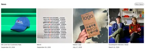
Section headings such as All Books, News, and Vouchers.
The quick brown fox 敏捷的狐狸
20px
700
1
-0.025em
正文
Store description, product names, prices, and supporting copy.
The quick brown fox 敏捷的狐狸
15px
400
1.2
0
按钮
Compact labels on outlined pill actions.
The quick brown fox 敏捷的狐狸
15px
400
1.2
0
导航
Primary menu, search, cart, and utility navigation.
The quick brown fox 敏捷的狐狸
15px
400
1.2
0
链接
Product links, collection links, and supporting navigation.
The quick brown fox 敏捷的狐狸
15px
400
1.2
0
间距与布局
基准单位 4px · 密度:适中
56px版块间距
15px元素间距
—卡片内边距
1418px内容最大宽度
4px
8px
11px
15px
19px
23px
28px
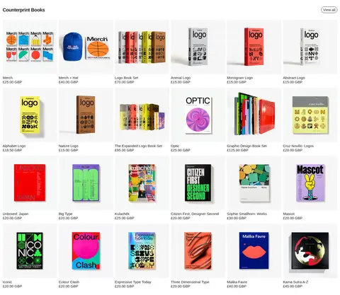
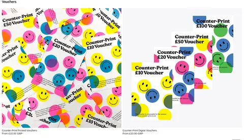
The page spans a broad desktop canvas, with measured maximum content width of 1418px. A compact header sits above a two-image opening, followed by six-column product collections, a full-width editorial statement, split promotional content, a four-column news feed, and two-column voucher imagery. Sections maintain a comfortable rhythm with a measured 56px section gap; product grids are dense, consistently aligned, and captioned immediately below each image. The footer returns to a sparse two-column arrangement.
圆角与层次
按钮 · 9999px
输入框 · 9999px
徽标 · 9999px
链接 · 9999px
没有测到阴影:页面是扁平的,层次靠底色和描边区分。
The interface is predominantly flat, with no measured shadows or gradients. Separate sections through whitespace, image boundaries, and occasional contrast reversal rather than floating cards. Actions and selected controls use thin #1c1c1c outlines on the white canvas; the dark promotional band is a clear surface change, not a raised layer.
组件
下面的预览按实测的按钮、输入框、徽标、卡片样式重建(字体用替代字体)。
Compact header
White header with a small dot-based brand mark at the left and understated menu, search, and cart icons aligned to the right.
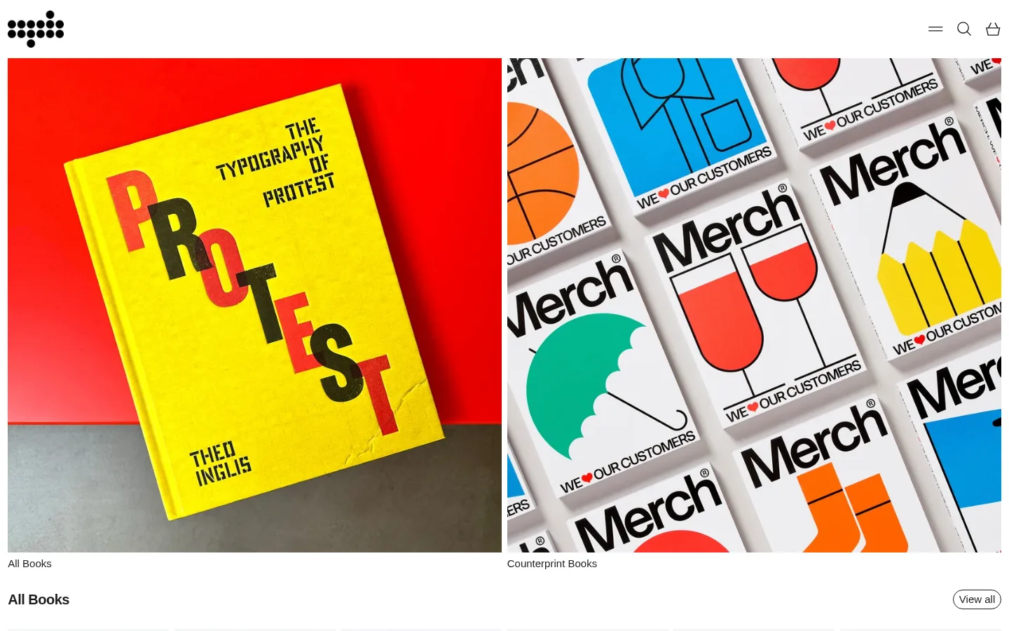
Image-led opening
Two large adjacent visual panels introduce the All Books and Counterprint Books collections, with small labels directly beneath.
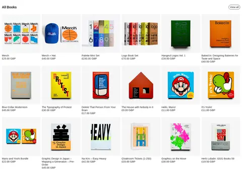
Product collection grid
Six-column desktop catalog of rectangular product images, short titles, and prices; section heading and outlined View all action sit above.
Editorial statement
Large bold, tightly tracked text block on white, used as a prominent publisher introduction between catalog sections.
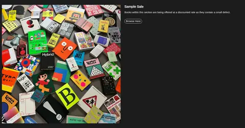
Sample Sale split
Dark #1c1c1c band with a large colourful books photograph on one side and white descriptive copy plus a compact outlined link on the other.
Newsletter and footer
Minimal subscription form with a rounded outlined email input and Subscribe action, followed by utility links, region selector, and small legal text.
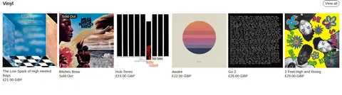
Imagery · Product imagery is the main source of colour and personality: book covers, printed goods, records, and merchandise are shown as crisp product photographs or cover artwork. The opening uses large side-by-side image panels, while catalog sections repeat smaller rectangular images in aligned grids. Keep supplied artwork vivid and unfiltered; avoid adding decorative overlays or treating illustration colours as interface colours.
Keep the interface palette to #1c1c1c and #ffffff.
Let product artwork provide the vivid colour.
Use Helvetica or a close sans-serif substitute consistently.
Align product images and captions into clean repeated columns.
Keep product names, prices, and navigation visually compact.
Use thin outlined pill actions for key secondary controls.
✕ 不该做
Don't add decorative gradients or shadows.
Don't introduce bright interface colours sampled from product covers.
Don't turn catalog items into elevated, rounded cards.
Don't make navigation or product metadata oversized.
Don't crowd the page with extra ornamental graphics.
Don't soften or recolour the supplied product imagery.
给 AI 的提示词
想快速出一个同风格的新页面,把这段话连同 DESIGN.md 一起发给 AI。
Build a new Counter-Print-style ecommerce page with a quiet monochrome interface and image-led catalog. Use #ffffff (Paper White) as the canvas and #1c1c1c (Print Ink) for text, navigation, borders, and any inverse promotional band. Use Helvetica or Arial, with bold tightly tracked headings and regular, compact body and product labels. Give the header a small logo and restrained menu, search, and cart controls. Organize content into broad image-led collection panels, aligned multi-column product grids with names and prices beneath images, and occasional editorial or split promotional sections. Use vivid colour only inside genuine product imagery. Keep actions as thin outlined pills, layouts flat, and section spacing generous; avoid shadows, gradients, decorative colour blocks, and card-like elevation.