North star · Build the page as a sequence of bold, centered campaign moments, using cream and red to punctuate a black canvas without softening the condensed editorial typography.
The page uses a stark palette to make the campaign feel urgent but irreverent: black is the dominant field, warm cream carries readable display type and content, and vivid red marks the product campaign, selected headings, and flame-like artwork. Helvetica Neue LT handles compact, heavy body copy and links, while Spektra supplies the tall, condensed display voice for the oversized all-caps hero and section headings. The layout is a centered, single-column story rather than a conventional shop grid: a full-bleed black opening leads into explanatory copy, a striking red product band, a cream discount panel, a black tree-planting section, and a cream FAQ. Product-card imagery and illustrated motifs are treated as campaign artwork, not as a separate color system. Generous vertical pauses give each block room to land, while the FAQ switches to a tighter, left-aligned reading column. Controls stay simple and pill-shaped, keeping the copy and graphics in focus.
Hero display lettering, section headings, and large pill-button labels.
角色
示例
字号
字重
行高
字距
特大标题
Oversized, tightly stacked uppercase hero title.
Cards Against Humanity
201.5px
400
0.82
0
一级标题
Large uppercase campaign and section headings.
Cards Against Humanity
100px
400
1
0
二级标题
Product, planting, and other secondary section headings.
Cards Against Humanity
40px
400
1
0
三级标题
Compact display headings within content blocks.
Cards Against Humanity
32px
400
0.88
0
四级标题
FAQ questions and emphasized supporting subheads.
Cards Against Humanity
30px
800
1.27
0
正文
Dense explanatory copy and FAQ answers.
The quick brown fox 敏捷的狐狸
14px
800
1.29
0
链接
Bold inline links and discount-related copy.
Cards Against Humanity
28px
800
1.29
0
间距与布局
基准单位 2px · 密度:适中
80px版块间距
—元素间距
—卡片内边距
867px内容最大宽度
7px
8px
15px
20px
25px
29px
30px
40px
60px
80px
100px
Use a centered, single-column composition with a measured page max width of 867px for the main content. The opening hero is visually full-bleed and centered; subsequent sections alternate broad color fields rather than introducing a multi-column site grid. Keep substantial vertical separation between campaign chapters, then tighten the rhythm within paragraphs and FAQ entries. The FAQ is left-aligned for scanning, while its section title remains centered. Let product graphics, circular discount artwork, and text blocks overlap or sit within their own broad bands as shown, without adding unrelated cards or navigation chrome.
圆角与层次
按钮 · 50%
输入框 · 10px
卡片 · 50%
md · button
The design is mostly flat: large color bands, typography, and artwork create hierarchy instead of stacked surfaces. Use the measured white hairline only where the discount card needs an outline. Buttons are pill-shaped and primarily solid black or cream, without conspicuous shadow treatment; avoid adding card shadows or layered dashboard styling.
组件
下面的预览按实测的按钮、输入框、徽标、卡片样式重建(字体用替代字体)。
Hero title
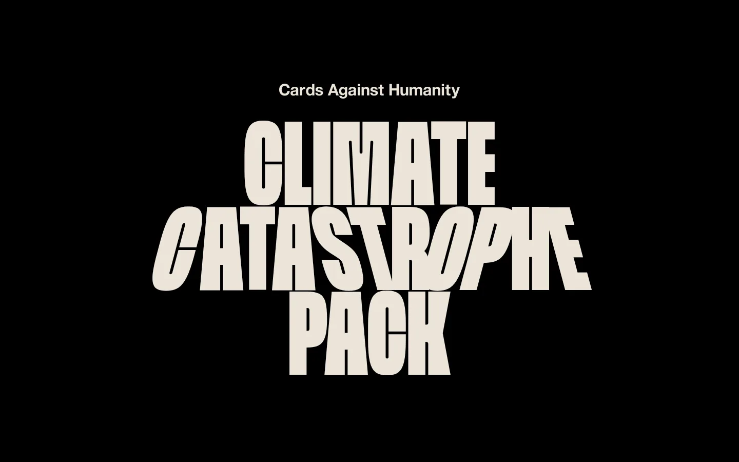
Centered oversized uppercase Spektra lettering in warm cream on black; treat the title as the primary artwork.
Campaign product band
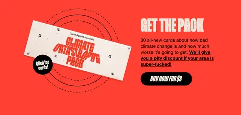
Bright red section combines the product-card image and campaign copy, ending with a black pill CTA labeled for the purchase.
Discount lookup
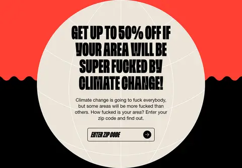
Cream circular graphic interrupts the red-to-black transition; pair its condensed uppercase heading with explanatory copy and a black-bordered zip-code input.
Pill CTA
Large Spektra label inside a fully rounded black or cream button; use the contrasting page color for its text.
Planting message
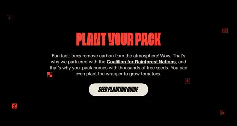
Black section centers a red display heading, short supporting paragraph, and cream pill for the seed-planting guide.
FAQ list
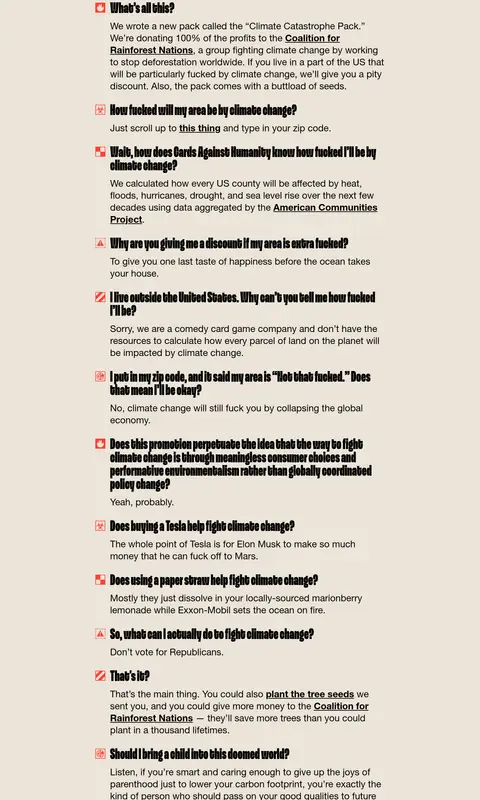
Warm cream reading surface with centered red title, left-aligned question-and-answer entries, bold display questions, and inline links.
Imagery · The page relies on supplied campaign artwork and card/product imagery rather than conventional lifestyle photography. Use bold, flat graphic elements such as the red flame border, card mockup, circular map-like discount illustration, and small decorative marks. Keep imagery high contrast and integrated with section backgrounds; the hero lettering itself is the main visual. Illustration colors should not be mistaken for extra brand tokens.
Keep the opening and major story sections on solid black.
Reserve warm cream for legible text and the FAQ and discount surfaces.
Use red as a focused campaign accent, not a general UI color.
Set major headlines in condensed, tightly stacked uppercase display type.
Center campaign blocks and switch FAQ content to left alignment.
Use supplied card and illustration artwork as page-specific campaign assets.
✕ 不该做
Do not add gradients or unmeasured palette colors.
Do not turn the page into a conventional product grid.
Do not use soft shadows to create interface depth.
Do not spread red across body text or unrelated controls.
Do not loosen the display typography with extra tracking.
Do not compress FAQ copy into decorative cards.
给 AI 的提示词
想快速出一个同风格的新页面,把这段话连同 DESIGN.md 一起发给 AI。
Build a campaign landing page in the Cards Against Humanity Climate Catastrophe style. Use Campaign Ink (#000000) as the main field, Warm Parchment (#ebe4d8) for high-contrast type and the FAQ/discount surfaces, and Catastrophe Red (#ff4034) for a single bold product band and campaign artwork. Set oversized condensed uppercase headlines in a Spektra-like display face; use a heavy Helvetica-like sans for copy and links. Structure the page as centered, single-column story sections with generous vertical breaks, then a compact left-aligned FAQ. Integrate product-card and flat illustrated assets into the sections rather than building a generic ecommerce grid. Keep controls pill-shaped, forms simple, and surfaces mostly flat. Use white (#ffffff) only for a measured fine outline when appropriate. Preserve the blunt, playful editorial voice and prioritize readability over decoration.