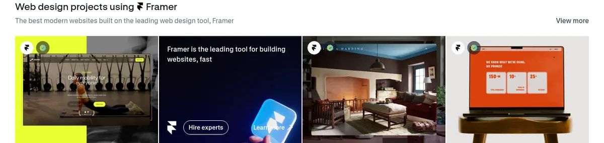
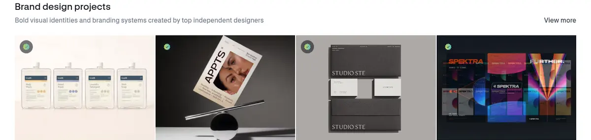
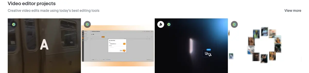
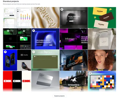
North star · Keep the interface visually quiet and let the creators’ project imagery supply the color, character, and proof.
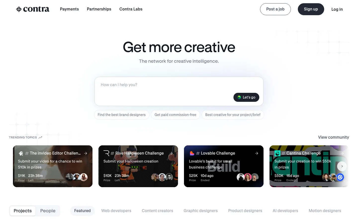
The page is built on a white canvas, with a near-black wordmark and navigation establishing a crisp, high-contrast entry point. Most sections stay white; pale gray appears in compact chips and profile metadata rather than as broad alternating bands. Rounded dark buttons provide the main action contrast, while cool blue and violet accents are restrained and do not compete with the work imagery. GT Standard’s clean sans-serif forms keep headings, labels, and dense project metadata readable; the hierarchy is made through scale and weight, not decorative typography. A centered prompt-led hero opens into horizontal trending cards, then a sequence of compact project galleries with clear section titles and “View more” links. The page uses a broad desktop content area and four-column project grids, separated by generous vertical breathing room. Photography, motion previews, and graphic design mockups bring nearly all the color and texture, framed as a browsable creative feed.
Primary family for navigation, body text, links, buttons, and captions.
Aa 设计
GT Standard L
网络字体 · 字重 500 / 600 / 400 · 占比 3%
免费替代:Inter
Light display and heading family, with selective use for compact uppercase eyebrows.
角色
示例
字号
字重
行高
字距
一级标题
Centered hero headline, set larger than surrounding interface copy.
The quick brown fox 敏捷的狐狸
23px
500
1.39
0.02em
二级标题
Project and creator section headings, aligned to the left.
The quick brown fox 敏捷的狐狸
19px
400
1.47
0.02em
正文
Hero support copy, descriptions, and creator or project details.
The quick brown fox 敏捷的狐狸
14px
500
1.43
-0.01em
辅助文字
Compact card metadata and low-priority labels.
The quick brown fox 敏捷的狐狸
12px
500
1.33
-0.01em
按钮
Primary actions and small card-level action labels.
The quick brown fox 敏捷的狐狸
14px
400
1.43
-0.01em
导航
Top navigation and category navigation labels.
The quick brown fox 敏捷的狐狸
14px
500
1.4
0
链接
View-more links and other navigational text.
The quick brown fox 敏捷的狐狸
14px
500
1.43
-0.01em
眉题
Small uppercase section labels such as trending-topic markers.
The quick brown fox 敏捷的狐狸
8px
600
0.88
0.15em
间距与布局
基准单位 4px · 密度:适中
72px版块间距
4px元素间距
—卡片内边距
1368px内容最大宽度
2px
4px
6px
7px
8px
10px
12px
16px
20px
24px
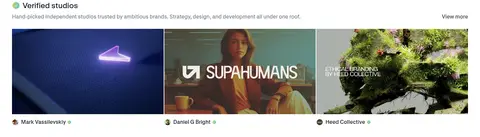
The desktop page spans a broad centered content area measured at a maximum width of 1368px, with the hero centered and subsequent section headings aligned left. Project feeds use four-column grids; studio projects use three columns, while the trending rail is horizontally browsable. A measured 72px section gap establishes a relaxed rhythm, balanced by compact 4px element spacing and a comfortable overall density. The long page remains mostly white instead of alternating large color bands.
圆角与层次
按钮 · 9999px
卡片 · 20px
图片 · 50%
徽标 · 4px
导航 · 10px
链接 · 16px
hairline · media
lg · button
inset · badge
inset · other
Most content sits flat on the white canvas, with layout and image boundaries doing the organizational work. The hero prompt uses a light border and restrained shadow to read as an interactive panel; buttons may receive a soft shadow. Rounded cards and pill actions add definition, while hairlines stay subtle and dark borders are limited to specific controls.
组件
下面的预览按实测的按钮、输入框、徽标、卡片样式重建(字体用替代字体)。
Primary navigation
A clean white top bar with a dark Contra wordmark, text links, outlined “Post a job” action, dark pill “Sign up” button, and a plain login link.
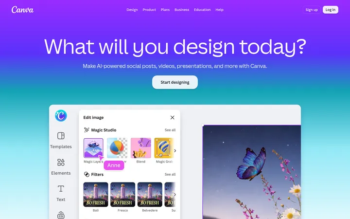
Prompt hero
Centered headline and muted supporting line above a wide, lightly bordered prompt panel. The panel includes a short placeholder and a dark rounded “Let’s go” action.
Suggestion chips
A row of understated outlined suggestions below the prompt, using muted text and pill-shaped borders rather than strong colored fills.
Trending challenge rail
A horizontal row of image-backed challenge cards with dark overlays, concise white copy, prize or timing details, and creator avatars.
Category navigation
Compact project and people tabs followed by a horizontal list of specialty filters; the selected option is clearer than the muted inactive labels.
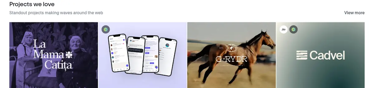
Project gallery
Section heading and supporting description above a four-column image grid, with “View more” aligned opposite the section title and creator actions on project cards.
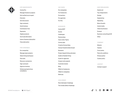
Footer link columns
A sparse white footer with multiple narrow columns of small grouped navigation links and the Contra mark.
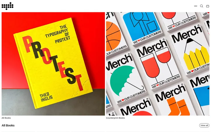
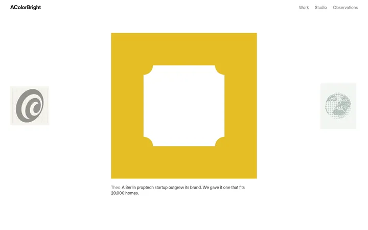
Imagery · Creator work is the page’s main color source: project thumbnails include brand systems, product interfaces, campaign graphics, photography, and moving previews. Cards use a consistent rectangular gallery framing, with occasional creator markers or overlays kept on top of the image. The trending row uses darkened, text-overlaid challenge artwork; other galleries favor vivid, edge-to-edge previews without decorative framing around every tile.
Keep the main canvas white and the overall interface restrained.
Use Slate Ink (#222834) for the clearest primary actions.
Let project previews provide most of the page’s color.
Align gallery headings and descriptions to the left.
Use muted slate text for secondary copy and helper labels.
Separate long page sections with generous whitespace.
✕ 不该做
Do not introduce large saturated background bands.
Do not turn measured gradient colors into dominant UI fills.
Do not decorate headings with display effects or heavy shadows.
Do not wrap every project thumbnail in a prominent card shell.
Do not make secondary labels compete with the creative work.
Do not replace the browsable gallery rhythm with dense text blocks.
给 AI 的提示词
想快速出一个同风格的新页面,把这段话连同 DESIGN.md 一起发给 AI。
Build a new Contra-style page with a clean white canvas (#ffffff), Carbon Text (#14171f) typography, and a restrained hierarchy. Use Slate Ink (#222834) for primary pill actions, Cloud Mist (#f2f4f7) for quiet metadata surfaces, and Quiet Slate (#677084) for supporting copy. Keep vivid accents such as Sky Signal (#9ddef9) and Periwinkle Signal (#979df1) limited to decorative details; project imagery should carry most of the color. Use a centered hero, clear left-aligned gallery sections, generous vertical separation, and compact controls. Render creator work in image-led grids with minimal framing, readable metadata, and visible “View more” paths. Use clean sans-serif typography similar to Inter, restrained borders, subtle panel elevation, and rounded controls. Preserve ample whitespace and avoid adding heavy decoration or oversized color blocks.