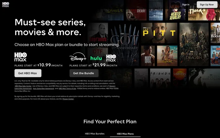
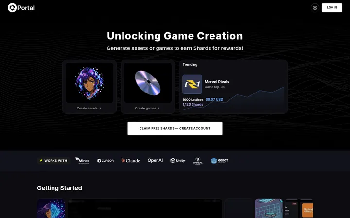
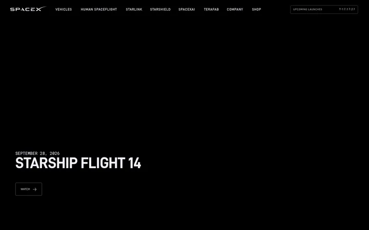
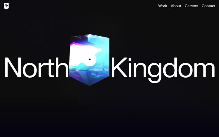
North star · Let cinematic, full-bleed game imagery carry the emotion, and use the black canvas with restrained high-contrast CTAs to keep the interface clear.
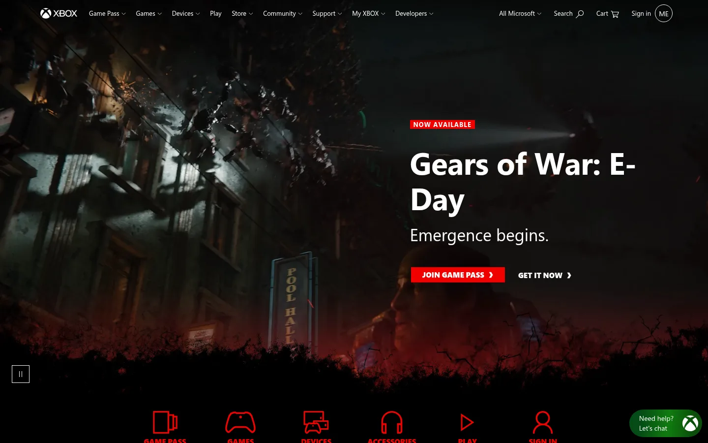
The homepage is anchored by a black canvas (#000000), letting dark cinematic game imagery blend into the page rather than sit inside obvious containers. White (#ffffff) carries navigation and headlines; the bright red (#f00000) appears as a focused promotional signal on the hero label and primary Game Pass CTA. The measured green tones belong to the wider Xbox palette, while the screenshots show the first viewport led more strongly by black, white, red, and media artwork. Segoe UI provides readable navigation and flexible editorial hierarchy, with SegoeProBlack reserved for emphatic action labels. A full-bleed hero gives way to a dense, asymmetric mosaic of large image-led cards and smaller text panels. Most content stays flat against black, while select light cards and the pale gray footer create contrast. Spacing is comfortable around major sections but compact inside the promotional grid, keeping the page energetic without sacrificing scannability.
配色
点色块复制色值。用途说明来自对页面的实测位置(背景、文字、描边、按钮)与截图判读。
品牌色
强调色
表层色
中性色
页面底色 · Console Black表层 · Screen White表层 2 · Slate Panel表层 3 · Footer Mist主文字 · Screen White次要文字 · Quiet Gray弱文字 · Console Black描边 · Screen White强调 · Signal Red强调 2 · Xbox Green强调 3 · Deep Green
Primary interface and editorial type for navigation, headings, body copy, links, and footer content.
Aa 设计
SegoeProBlack
网络字体 · 字重 900 / 600 · 占比 9%
免费替代:Roboto Black
Heavy display treatment for prominent campaign and commerce action labels.
角色
示例
字号
字重
行高
字距
特大标题
Large campaign display headline treatment where the hero needs maximum emphasis.
Xbox
62px
700
1.16
-0.01em
一级标题
Primary hero or major page headline, notably the featured game title.
Xbox
46px
700
1.22
-0.01em
二级标题
Section-level headings introducing content stories or broad page areas.
Xbox
34px
400
1.18
0
三级标题
Card titles for featured games, hardware, and editorial promotions.
The quick brown fox 敏捷的狐狸
24px
700
1.25
0
正文
Hero descriptions and supporting copy within image-led content cards.
The quick brown fox 敏捷的狐狸
20px
400
1.2
0
辅助文字
Small availability labels, metadata, and compact supporting details.
The quick brown fox 敏捷的狐狸
11px
400
1.45
0
按钮
Compact button labels for primary promotional and shopping actions.
The quick brown fox 敏捷的狐狸
13px
400
1.5
0
导航
Small top navigation labels and supporting navigation items.
The quick brown fox 敏捷的狐狸
11px
400
1.45
0
链接
Inline action links and secondary navigation links.
The quick brown fox 敏捷的狐狸
16px
400
1.5
0
间距与布局
基准单位 4px · 密度:适中
72px版块间距
5px元素间距
—卡片内边距
1296px内容最大宽度
1px
2px
3px
4px
5px
6px
7px
8px
10px
12px
16px
20px
24px
36px
43px
72px
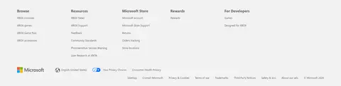
Use a full-width black canvas with a measured page max width of 1296px for contained content. The first section is a full-bleed, single-column media hero, with text aligned left over the image; below it, compact category links lead into a dense asymmetric card mosaic. Mix wide image-led features with smaller text-and-image tiles, rather than imposing a uniform catalog grid. Preserve generous separation between major sections, while keeping card interiors and navigation compact. Finish with a pale gray, three-column footer.
圆角与层次
按钮 · 50%
sm · link, button
The page is primarily flat: black canvas, image tiles, and text panels define structure without prominent shadows. Keep card corners square as measured, and use thin white borders only for small controls such as the circular account affordance. Separate areas through tonal contrast, image boundaries, and spacing rather than stacked elevation.
组件
下面的预览按实测的按钮、输入框、徽标、卡片样式重建(字体用替代字体)。
Top navigation
Compact white Xbox and destination links sit over the dark hero; keep the header unobtrusive so the media remains dominant.
Campaign hero
Full-bleed gameplay media with a left-aligned text block, a red availability label, a large bold title, supporting line, and paired actions.
Primary CTA
Use the measured #f00000 fill and white label for JOIN GAME PASS; the action is compact, rectangular, and visually prominent.
Secondary action link
Set GET IT NOW in white, heavy uppercase lettering beside the primary button, with a small directional chevron.
Category shortcuts
A horizontal strip of red line icons and labels provides quick paths to Game Pass, games, devices, accessories, play, and sign-in.
Editorial tile mosaic
Arrange game and product stories in unequal image-led cards, alternating dark text panels, bright imagery, and occasional white content surfaces.
Footer directory
End with a #f2f2f2 band containing compact link lists in three measured columns, plus brand and utility details.
Imagery · Lead with full-bleed cinematic game video or photography, framed to leave a readable text zone over darker image areas. The rest of the page relies on richly colored game, controller, console, and apparel imagery arranged in large, varied tiles. Keep the art crisp and dramatic; red campaign artwork belongs to the featured game content, not to a universal interface tint.
Keep the main canvas black and let campaign media fill the available space.
Use white for primary navigation, headlines, and actions on dark backgrounds.
Reserve #f00000 for high-priority campaign labels and primary CTAs.
Use #9bf00b for occasional shopping actions, paired with #054b16 text.
Build varied, image-led tiles instead of a uniform card grid.
Use Segoe UI for interface and editorial copy, with heavy display labels used selectively.
✕ 不该做
Don't add gradients to the hero unless the artwork itself contains them.
Don't turn every card into a rounded, elevated surface.
Don't use red as a blanket page background or tint over unrelated content.
Don't let text overlays compete with busy areas of the game imagery.
Don't make navigation or secondary copy as prominent as the hero headline.
Don't replace the dark-to-light footer contrast with an all-black ending.
给 AI 的提示词
想快速出一个同风格的新页面,把这段话连同 DESIGN.md 一起发给 AI。
Build a new Xbox-style gaming page around a #000000 Console Black canvas, using #ffffff Screen White for navigation and readable content. Start with a full-bleed cinematic image or video and place concise, left-aligned campaign copy over a quiet dark area. Give the primary action a compact #f00000 Signal Red fill with white text; reserve #9bf00b Lime Signal and #054b16 Deep Green for a secondary shopping moment. Use Segoe UI-style typography for clear hierarchy and heavy uppercase labels only for key actions. After the hero, compose an asymmetric, image-led mosaic of game, hardware, or membership stories, mixing dark text panels with occasional light cards. Keep surfaces mostly flat and square-edged, use spacing rather than shadows to define groups, and conclude with a #f2f2f2 Footer Mist directory band.