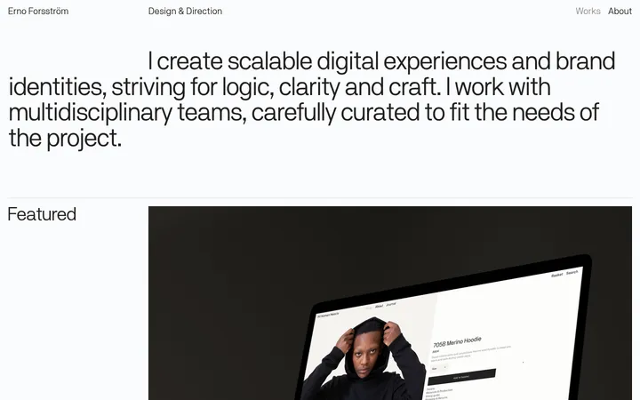
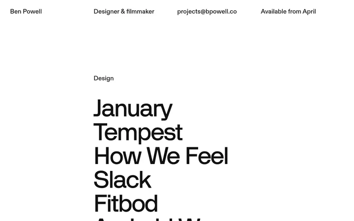
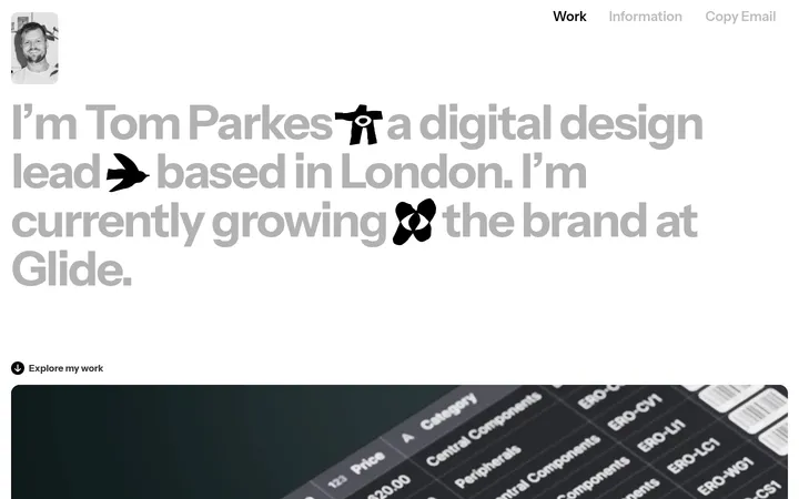
North star · Keep the interface pale, quiet, and consistent so the project imagery—not the chrome—carries the visual emphasis.
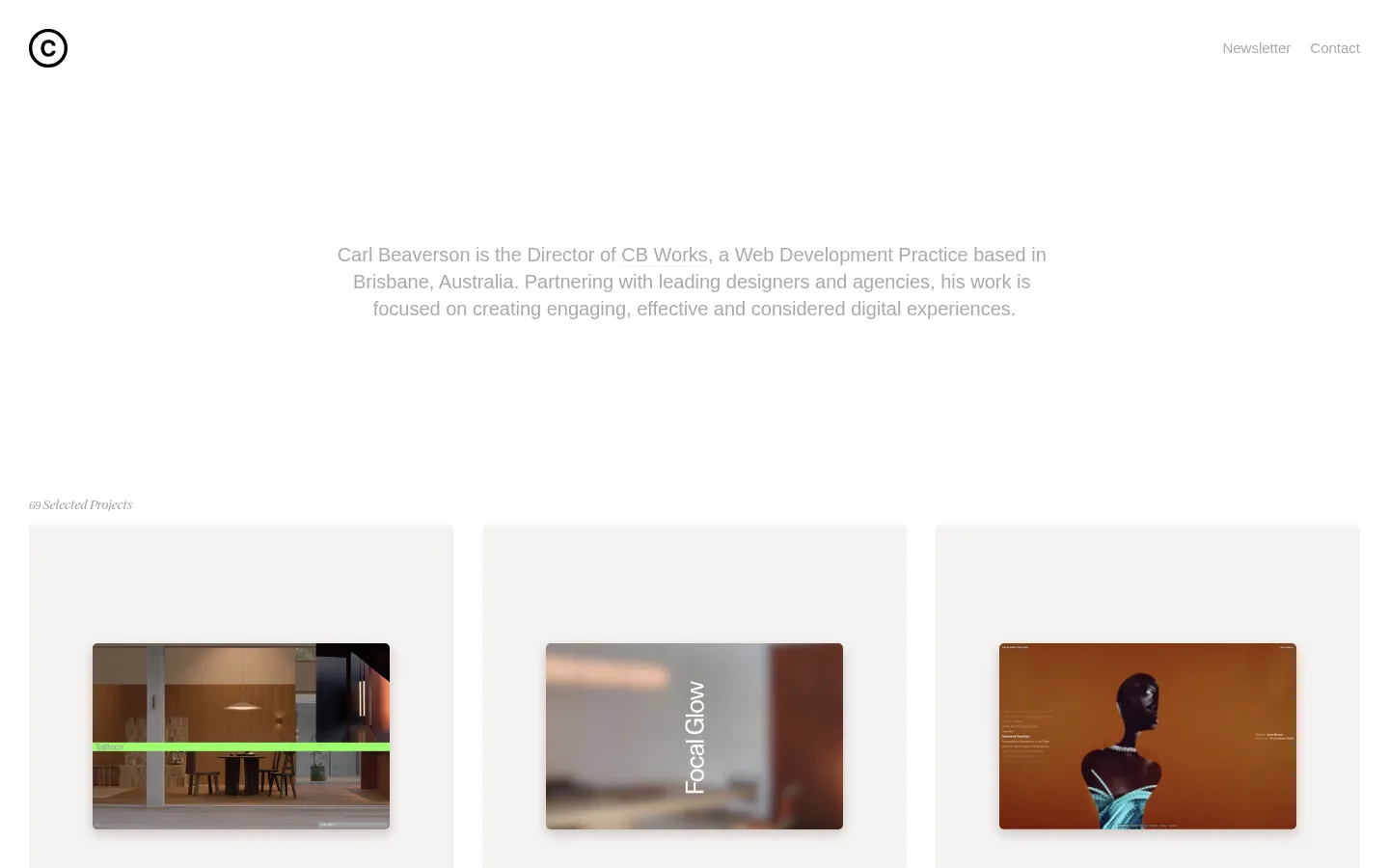
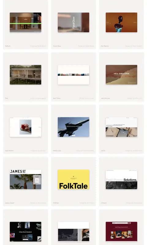
The page uses a near-white canvas and very light gray project panels to create a quiet gallery atmosphere. Muted gray is used for navigation, introductory copy, project labels, and links; the measured palette contains no distinct brand accent, so color comes mainly from the project thumbnails. A compact circular monogram anchors the upper-left corner, balanced by small navigation links at the upper right. The introduction sits centered in a narrow text block with substantial blank space around it, then gives way to a three-column portfolio gallery. Each project is presented as a pale, subtly rounded tile with a smaller landscape preview centered inside and understated metadata beneath. Typography is mostly regular-weight system sans-serif, with small italic serif-like project-count text adding an editorial note. The overall rhythm is spacious and consistent, while the varied artwork supplies contrast without changing the portfolio’s neutral frame.
配色
点色块复制色值。用途说明来自对页面的实测位置(背景、文字、描边、按钮)与截图判读。
品牌色
表层色
中性色
页面底色 · Gallery Mist表层 · Paper White表层 2 · Stone Wash主文字 · Soft Graphite
Primary system type for navigation, body copy, links, and project labels.
角色
示例
字号
字重
行高
字距
一级标题
Small, regular-weight identity or primary introductory heading.
The quick brown fox 敏捷的狐狸
20px
400
1.4
0
正文
Centered introductory paragraph describing the developer practice.
The quick brown fox 敏捷的狐狸
15px
400
1.5
0
辅助文字
Small italic project-count label above the gallery.
The quick brown fox 敏捷的狐狸
13px
400
1.5
-0.038em
导航
Compact upper-right Newsletter and Contact links.
The quick brown fox 敏捷的狐狸
15px
400
1.5
0
链接
Portfolio project titles and the CB Works identity link.
The quick brown fox 敏捷的狐狸
20px
400
1.4
0
间距与布局
基准单位 4px · 密度:宽松
193px版块间距
20px元素间距
—卡片内边距
750px内容最大宽度
20px
30px
193px
A compact header spans the top, with the circular monogram aligned left and two quiet text links aligned right. The introductory copy is centered in a narrow column with a large surrounding whitespace buffer. Below it, a small project-count caption introduces a three-column, single-page gallery. Cards repeat in aligned rows with consistent gutters and ample vertical separation. The measured content max width is 750px; preserve the spacious rhythm rather than crowding the gallery.
圆角与层次
卡片 · 5px
md · card
Most of the page reads as flat, with no prominent borders or interface chrome. Project tiles use a subtle 5px radius; some pale gray cards have a soft, diffuse shadow beneath the preview. Keep image framing and card layering restrained, and avoid heavy outlines or dramatic depth effects.
组件
下面的预览按实测的按钮、输入框、徽标、卡片样式重建(字体用替代字体)。
Monogram mark
Small circular outlined C mark at the upper-left; keep it monochrome and visually compact.
Header navigation
Newsletter and Contact appear as small, regular-weight gray text links aligned at the upper-right.
Introduction
Centered, muted-gray paragraph in a narrow text block, surrounded by substantial white space.
Project count
Small italic serif-like caption immediately above the gallery, identifying the selected-project collection.
Project card
Pale #f4f3f1 or #dbdad8 tile with a 5px radius; center a landscape project preview and place understated metadata below.
Portfolio gallery
Three-column desktop grid of repeated project cards; maintain even alignment and let thumbnail content vary.
Imagery · The gallery is built from landscape website-preview images, each inset within a pale project tile. The thumbnails vary widely in subject, color, and visual style because they represent client work; treat them as portfolio artwork, not as a source of interface colors. Keep previews neatly framed and visually centered, with no decorative overlay competing with their content.
Give the introduction generous surrounding whitespace.
Use a consistent three-column project grid on wide screens.
Frame previews within pale neutral cards.
Let each project thumbnail provide its own color and character.
✕ 不该做
Do not add a saturated interface accent absent from the measured palette.
Do not make navigation more prominent than the work.
Do not crowd the introductory copy or gallery.
Do not impose a uniform color treatment on varied project previews.
Do not use heavy borders or strong shadows.
Do not add oversized display typography or decorative gradients.
给 AI 的提示词
想快速出一个同风格的新页面,把这段话连同 DESIGN.md 一起发给 AI。
Build a new page in Carl Beaverson’s restrained portfolio style. Use Paper White (#ffffff) for the main canvas, Gallery Mist (#f4f3f1) and Stone Wash (#dbdad8) for quiet project surfaces, and Soft Graphite (#aaaaaa) for navigation, copy, and metadata. Create a compact top header with a small circular monogram at left and unobtrusive text links at right. Center a short introduction within a narrow column, leaving generous whitespace before a three-column project gallery. Each card should use a softly rounded neutral field, a centered landscape preview, and understated text beneath it. Use regular system sans-serif for most text and reserve a small editorial italic caption for the gallery label. Keep shadows subtle, avoid decorative UI accents, and let the project artwork supply the color.