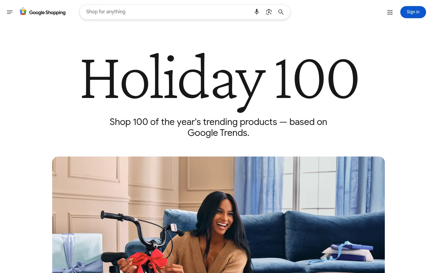
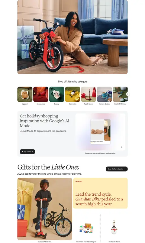
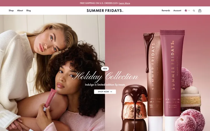
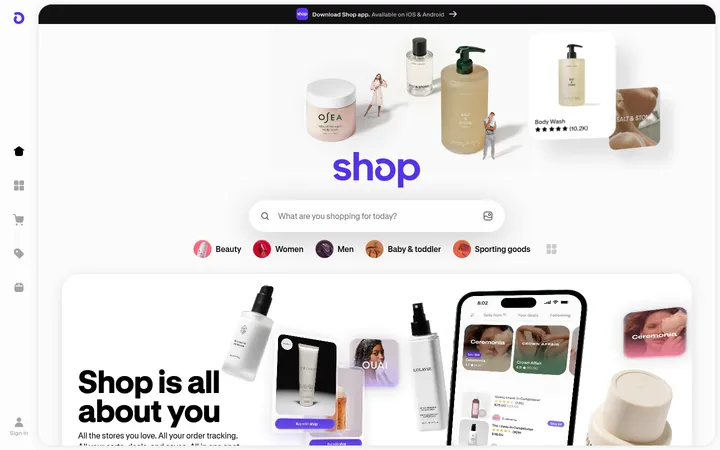
Google Shopping以克制的编辑式标题,串联一系列图片主导的精选礼物分类。柔和的节日色卡与简洁的购物入口让页面亲切易逛,同时不抢商品图片的视觉焦点。
North star · Keep the canvas quiet and let editorial typography, curated product imagery and selective trend-colour cards guide the shopping journey.
The page uses Gallery White (#ffffff) as a nearly continuous canvas, giving the oversized, high-contrast Crimson Pro title and vivid gift photography room to lead. Google Sans handles category headings, card copy and shopping controls in a clean, approachable voice; the display serif adds an editorial note without making the catalog feel formal. Product sections repeat a clear rhythm: a large lifestyle image, small product tiles and occasional trend cards in muted blue, green, cream or red. Those coloured surfaces are accents rather than broad page bands. The layout stays centered and generously spaced, with rounded media and cards softening the otherwise flat presentation. Product photography supplies most of the page’s visual variety, so the brand palette remains restrained and the shopping interface stays legible.
Category headings, card copy, body text, controls and shopping UI.
Aa 设计
Crimson Pro
网络字体 · 字重 200 / 400 · 占比 33%
免费替代:Cormorant Garamond
Oversized Holiday 100 title and editorial section headings.
Aa 设计
Roboto
网络字体 · 字重 400 / 700 · 占比 2%
免费替代:Roboto
Header navigation and utility labels.
角色
示例
字号
字重
行高
字距
特大标题
Oversized Holiday 100 campaign title.
Google
220px
400
0.91
-0.04em
一级标题
Primary editorial page heading.
Google
80px
200
1
-0.04em
二级标题
Gift-category section headings.
Google
48px
200
1
-0.02em
三级标题
Feature and supporting section headings.
Google
30px
200
1.2
0
四级标题
Card or component subheadings.
The quick brown fox 敏捷的狐狸
24px
400
1.25
0
正文
Product descriptions and trend-card copy.
The quick brown fox 敏捷的狐狸
14px
500
1.14
0
导航
Header utilities and navigation labels.
The quick brown fox 敏捷的狐狸
14px
400
1.43
0
间距与布局
基准单位 2px · 密度:适中
60px版块间距
8px元素间距
24px卡片内边距
1096px内容最大宽度
1px
4px
6px
8px
12px
14px
16px
20px
24px
38px
40px
60px
A centered content column sits within the measured 1096px maximum width, beginning with a compact Google Shopping header and a spacious campaign hero. Category sections follow in a consistent vertical sequence, mixing a large lead image, smaller product tiles and paired trend cards. Use the measured comfortable density and generous section gaps to distinguish categories; align headings and product grids to the same content edge. The catalog is image-heavy but organized into repeatable modules, not a dense marketplace grid.
圆角与层次
按钮 · 20px
卡片 · 20px
图片 · 20px
导航 · 2px
sm · nav
sm · other
The page is predominantly flat: white canvas, open spacing and minimal visible borders. Rounded cards and media create grouping without heavy shadows. Keep elevation subtle and limited to the header search/navigation treatment; use thin hairlines for utility separation rather than outlining every product tile.
组件
下面的预览按实测的按钮、输入框、徽标、卡片样式重建(字体用替代字体)。
Shopping header
Compact Google Shopping navigation with menu and brand at left, rounded search field across the center, and app grid plus blue Sign in control at right.
Campaign hero
Centered oversized Crimson Pro title, short Google Trends subtitle and a broad rounded lifestyle photograph.
Category navigation
Horizontal row of image-led gift categories with concise labels and a subtle next control.
AI inspiration panel
Pale neutral promotional surface combining serif heading, short supporting copy, a Try it now CTA and product-preview imagery.
Gift category section
Editorial category heading and description followed by a large lead product image, smaller product tiles and captions.
Trend card
Rounded coloured card with a small TRENDING label and short serif insight; use the measured blue, red, sage or cream surfaces.
Collection CTA
Compact dark rounded button aligned with category headings to open the full collection.
Imagery · Lifestyle product photography anchors the hero and each category, with smaller isolated product images and concise captions filling out the selection. Images are framed in rounded media blocks and retain their natural photographic colour; avoid imposing a heavy tint or decorative overlay. A visual AI shopping feature appears as a distinct promotional panel, while product visuals remain the main source of seasonal colour.
Set campaign and category headlines in an editorial serif.
Repeat a clear image-and-product rhythm for each category.
Keep coloured trend cards selective and category-specific.
Give product photography room to carry the visual story.
Use compact sans-serif controls and readable captions.
✕ 不该做
Do not turn the page into a dense marketplace grid.
Do not use trend colours as full-page background bands.
Do not add heavy shadows or outlines to every tile.
Do not let utility navigation compete with the campaign title.
Do not apply decorative filters over product photography.
Do not replace editorial serif headings with generic bold sans.
给 AI 的提示词
想快速出一个同风格的新页面,把这段话连同 DESIGN.md 一起发给 AI。
Build a new Google Shopping-style editorial guide on a Gallery White (#ffffff) canvas. Keep the header compact and functional, then center a large Crimson Pro-style campaign headline above a short Google Sans subtitle and a broad rounded lifestyle image. Organize content into repeatable gift-category sections with serif headings, concise descriptions, one prominent product image, smaller captioned product tiles and occasional trend cards. Use Powder Blue (#d2e3fc), Midnight Blue (#113979), Holiday Red (#980b0b), or Soft Sage (#a8dab5) sparingly for those cards, with legible contrasting text. Use Graphite Ink (#16171a) for primary text and Google Blue (#0b57d0) only for sign-in. Preserve generous whitespace, aligned content edges, rounded media and restrained elevation; prioritize authentic product photography over decoration.