North star · Keep the interface nearly black and spacious, letting crisp product imagery and restrained warm light carry the story.
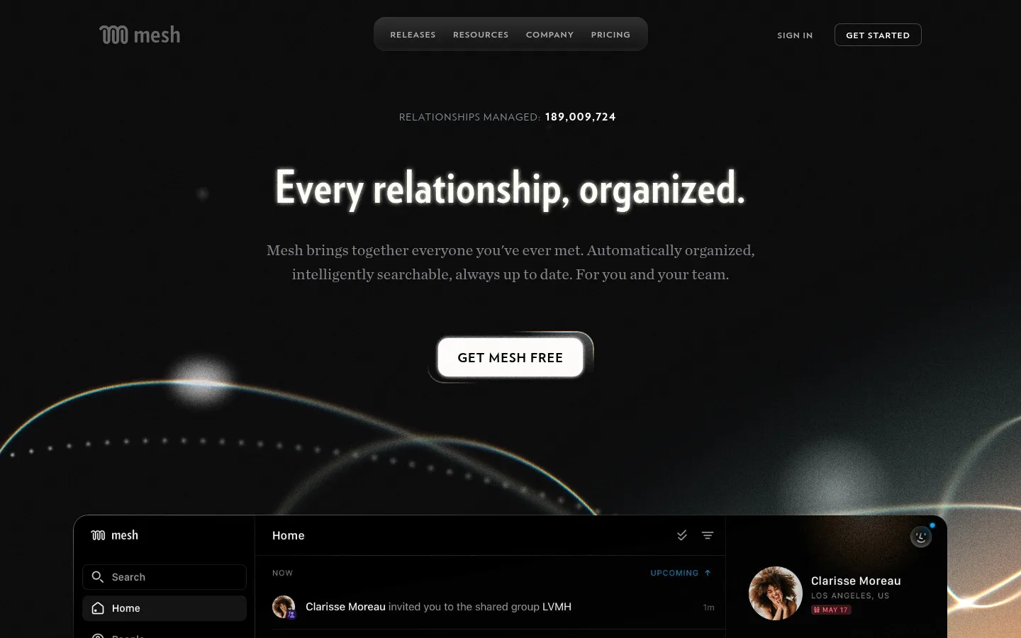
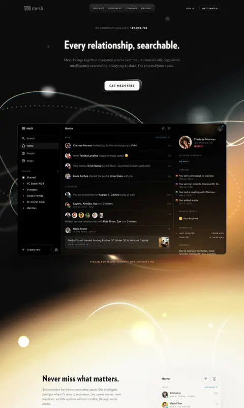
The homepage is anchored by a near-black canvas (#0f0f10), with black product surfaces and fine charcoal dividers keeping the interface cinematic rather than flat. White display text is reserved for strong contrast, while softer grays carry supporting copy. Warm peach accents appear sparingly in links and gradient details; they should not overpower the dark foundation. The opening hero centers its message and CTA above a large desktop product mockup, using luminous orbital lines and hazy light as atmospheric framing. Later feature sections shift into a bright, softly glowing field before returning to dark sections, creating a deliberate light-dark narrative. Verlag Condensed gives headlines a compact, assertive silhouette; Verlag handles navigation and body copy, with Chronicle Text adding a quiet editorial contrast. Layouts favor broad negative space, simple alignments, and restrained borders over dense card grids. Product imagery is the main visual proof, with interface detail kept legible against the ambient backdrop.
Primary sans for body text, navigation, links, and buttons.
Aa 设计
VerlagCondensed
网络字体 · 字重 900 / 700 · 占比 5%
免费替代:Oswald
Display and headline face for hero and section headings.
Aa 设计
ChronicleTextG1Roman
网络字体 · 字重 400 · 占比 3%
免费替代:Lora
Editorial supporting copy, notably hero and explanatory text.
角色
示例
字号
字重
行高
字距
特大标题
Large condensed headline treatment for prominent page statements.
Mesh
64px
700
1
0.014em
一级标题
Hero headline and primary section titles.
Mesh
48px
900
1
0.014em
二级标题
Editorial supporting statements beneath major headlines.
The quick brown fox 敏捷的狐狸
22px
400
1.55
0
三级标题
Feature-section headings and compact content titles.
The quick brown fox 敏捷的狐狸
20px
400
1.4
0
正文
Feature descriptions and explanatory copy.
The quick brown fox 敏捷的狐狸
16px
400
1.38
0
辅助文字
Small metadata and product interface labels.
The quick brown fox 敏捷的狐狸
12px
400
1.1
0
按钮
Primary CTA label text.
The quick brown fox 敏捷的狐狸
20px
400
1.35
0
导航
Compact uppercase navigation links.
The quick brown fox 敏捷的狐狸
12px
700
2.25
0.083em
链接
Uppercase inline action links.
The quick brown fox 敏捷的狐狸
14px
700
1
0.071em
眉题
Small uppercase section labels and overlines.
The quick brown fox 敏捷的狐狸
12px
700
1
0.083em
间距与布局
基准单位 2px · 密度:适中
44px版块间距
10px元素间距
—卡片内边距
1232px内容最大宽度
2px
4px
6px
7px
8px
10px
12px
16px
24px
36px
56px
104px
Use a centered, spacious composition with a measured page max width of 1232px. The hero aligns its headline, supporting copy, and CTA centrally, then gives the product mockup broad visual prominence. Feature content alternates between left-right product splits and open, full-width ambient fields. The measured spacing scale runs from 2px to 104px, with a comfortable density and a 44px section gap; preserve generous separation rather than compressing content. Footer navigation becomes a compact multi-column directory.
圆角与层次
按钮 · 50%
图片 · 50%
链接 · 12px
inset · other
sm · text
The page is mostly flat, using near-black surfaces and fine charcoal borders instead of stacked cards. Product mockups provide the main depth through their own interface panels and subtle edge definition. A restrained inset highlight and occasional soft glow can lift important controls; avoid broad, heavy drop shadows.
组件
下面的预览按实测的按钮、输入框、徽标、卡片样式重建(字体用替代字体)。
Top navigation
Compact uppercase links sit in a centered dark pill, balanced by the Mesh mark and sign-in/get-started actions.
Hero CTA
A prominent light button with dark text anchors the centered hero; keep its pill-shaped treatment and clear contrast.
Product mockup
Large, dark desktop CRM interface with a sidebar, activity feed, and contact details; present it as a visual centerpiece.
Feature split
Pair condensed feature headings and concise copy with a mobile or desktop product screen, leaving substantial surrounding space.
Ambient feature field
Use broad blurred warm-to-violet light and thin orbital lines behind product content without obscuring text.
Footer directory
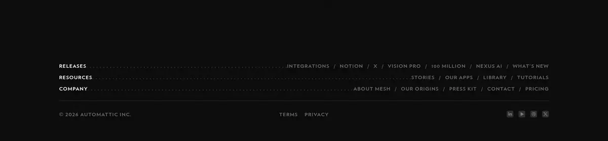
Small uppercase section headings and tightly grouped links sit on the dark canvas, separated by subtle hairlines.
Imagery · The product UI is presented in large desktop and mobile mockups, framed by soft, luminous orbital arcs and blurred light fields. These atmospheric visuals transition from warm gold and porcelain into violet and back to black. Keep interface screens crisp and dark, while surrounding effects remain diffuse and cinematic; the gradients belong to the page art direction, not the core UI palette.
Anchor dark sections in Midnight Canvas (#0f0f10).
Use Clean White (#ffffff) for high-priority headlines and navigation.
Keep warm accents limited to links and ambient gradient details.
Let large product mockups provide the primary evidence of the product.
Use condensed display type for bold, compact headlines.
Leave generous negative space around hero and feature content.
✕ 不该做
Do not turn the dark canvas into a flat black everywhere.
Do not use warm gradient colors as the dominant UI palette.
Do not crowd the hero with extra cards or decorative copy.
Do not blur or distort the product interface mockups.
Do not make dividers brighter than the main text.
Do not substitute generic photography for product-led imagery.
给 AI 的提示词
想快速出一个同风格的新页面,把这段话连同 DESIGN.md 一起发给 AI。
Build a new Mesh-style page with Midnight Canvas (#0f0f10) as the dominant background and Pure Black (#000000) for deep product surfaces. Use Clean White (#ffffff) for primary text, with Ash Type (#86868b) and Silver Copy (#b3b3b3) for supporting copy. Reserve Apricot Signal (#f2b98b), Copper Glow (#d49065), and Peach Light (#fec99b) for restrained warm accents and ambient gradients. Set headlines in a heavy condensed sans similar to Oswald; use an Inter-like sans for navigation and body, with an editorial serif for select supporting text. Center the opening message and CTA, then feature crisp product UI inside broad, softly glowing orbital imagery. Alternate dark and pale luminous sections, maintain generous whitespace, and finish with a compact dark footer directory. Keep borders subtle and avoid decorative clutter.