North star · Use assertive black-and-white typography and spacious, modular layouts, reserving vivid accents for actions and product storytelling.
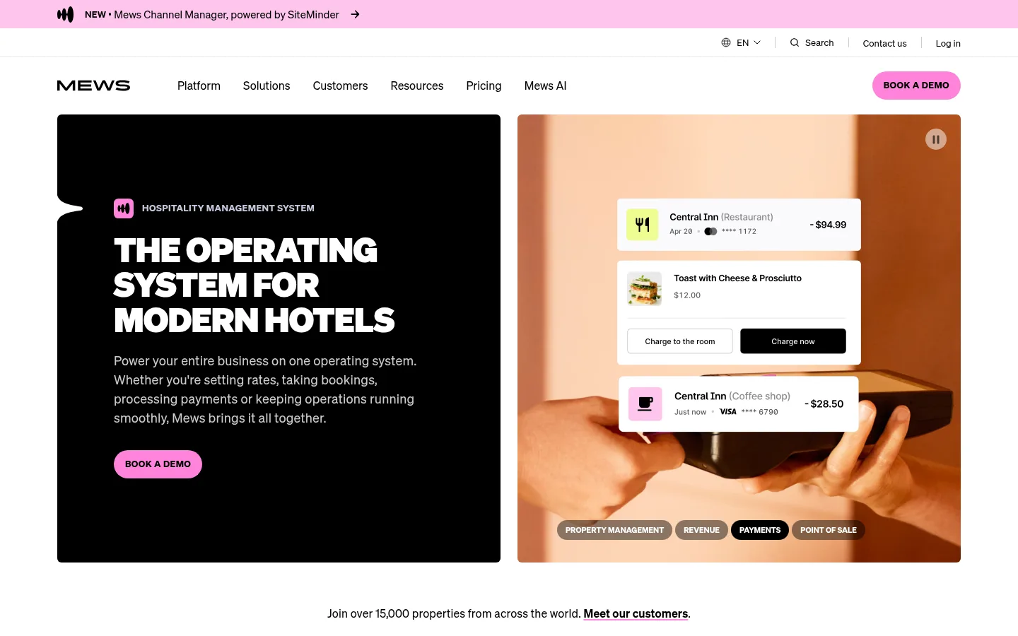
The page uses a mostly white canvas, interrupted by large black product and testimonial sections that create a clear rhythm. Black carries the main headings, body text, inverse panels, and much of the navigation; bright pink identifies announcement and demo actions, with occasional lime and pale blue surfaces adding contrast to product and results modules. Söhne’s compact, clean sans-serif character supports both oversized, tightly tracked headlines and readable explanatory copy. The hero is a two-column composition: a black text panel beside warm, human hospitality footage with floating interface examples. Below it, restrained customer logos and pale card tiles give way to denser product showcases. Layouts stay aligned to a centered content area, but vary between grids, wide splits, and single-column statements. Thin gray rules separate content without introducing heavy shadows; rounded pills make CTAs and labels distinct.
All page typography, from headlines and body copy to navigation, labels, and buttons.
角色
示例
字号
字重
行高
字距
一级标题
Hero headline and prominent page-level statement.
Mews
48px
700
1.1
-0.015em
二级标题
Major section headings, including product and impact sections.
Mews
40px
700
1.1
-0.025em
三级标题
Feature-card and content-module headings.
Mews
32px
700
1.15
-0.025em
四级标题
Smaller subheadings inside product and editorial modules.
Mews
28px
700
1.2
-0.01em
正文
Primary explanatory copy and longer descriptions.
The quick brown fox 敏捷的狐狸
18px
400
1.5
0.01em
辅助文字
Supporting labels, attribution, and compact metadata.
The quick brown fox 敏捷的狐狸
16px
400
1.5
0
按钮
Demo actions and other prominent interactive controls.
The quick brown fox 敏捷的狐狸
16px
400
1.5
0
导航
Primary navigation and utility links.
The quick brown fox 敏捷的狐狸
16px
400
1.5
0
眉题
Uppercase section labels such as product categories and integrations.
The quick brown fox 敏捷的狐狸
13px
700
1.5
0.03em
间距与布局
基准单位 4px · 密度:紧凑
32px版块间距
10px元素间距
16px卡片内边距
1278px内容最大宽度
1px
6px
7px
8px
10px
12px
14px
16px
20px
21px
24px
32px
36px
44px
48px
80px
The page is organized within a centered content area measured at a 1278px maximum width, with a compact overall density and clear alignment. The hero and main product stories use two-column splits; customer types, product capabilities, and awards use multi-column grids. Wide black bands interrupt white content sections, while testimonials and FAQ content use a single-column focus. Section spacing follows a repeated rhythm rather than oversized empty gaps; cards align consistently, with varied asymmetry reserved for product showcases and results.
圆角与层次
按钮 · 9999px
输入框 · 6px
卡片 · 4px
图片 · 6px
徽标 · 9999px
导航 · 9999px
链接 · 8px
hairline · input
The interface is largely flat: strong black and white surface changes establish hierarchy, not drop shadows. Fine gray borders define cards, input edges, and section rules. Rounded pills distinguish buttons, badges, and category labels, while media frames and product cards use modest rounding. Floating UI within the hero is part of the showcased imagery, not a general shadow-heavy card style.
组件
下面的预览按实测的按钮、输入框、徽标、卡片样式重建(字体用替代字体)。
Announcement strip
Full-width pink top banner with a compact product announcement, small brand mark, and forward arrow.
Primary navigation
White header with the wordmark, horizontal links, utility actions, and a pink pill-shaped demo CTA.
Split hero
Black rounded text panel paired with warm hospitality video or photography, with white headline, supporting copy, and pink CTA.
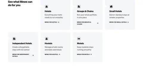
Category cards
Pale gray tiles arranged in a grid, each with a small icon, bold audience label, short copy, and compact link.
Product showcase
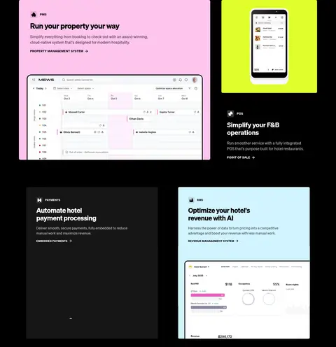
Black section with asymmetric feature panels, vivid pink, lime, or blue media surfaces, and embedded software screenshots.
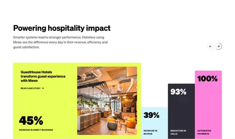
Results module
Bright hospitality case-study panel paired with contrasting metric bars and large percentage figures.
FAQ accordion
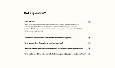
Warm off-white question area with thin horizontal rules, stacked questions, and compact plus/minus controls.
Footer
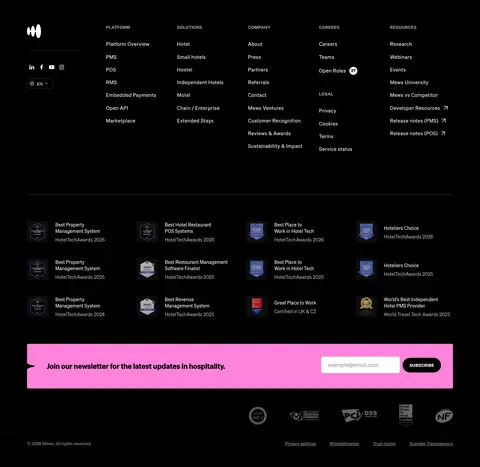
Large black multi-column link area with award marks, newsletter band, small legal links, and muted supporting text.
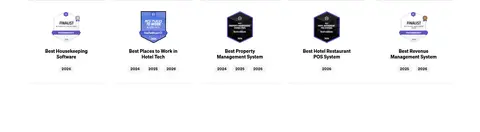
Imagery · Real hospitality photography and video dominate the hero and customer stories, using warm orange and natural skin tones against the otherwise monochrome interface. Software screenshots and mobile UI are layered over product panels to make features concrete. Awards and customer marks appear as small graphic assets; vivid lime, pink, and blue backgrounds mostly belong to media or data modules rather than the core canvas.
Reserve Candy Pink (#ffc5ee) for primary calls to action and announcement emphasis.
Use oversized, bold headlines with compact line breaks.
Pair product UI with real hospitality scenes where appropriate.
Break long content into clear white and black section bands.
Use thin borders and pill shapes instead of heavy card shadows.
✕ 不该做
Do not turn every section into a dark panel.
Do not use bright accents as large, continuous page backgrounds.
Do not add gradients or decorative shadows without a clear interface purpose.
Do not crowd the hero with extra copy or competing calls to action.
Do not make cards visually heavier than their content.
Do not use generic stock imagery that obscures the hospitality context.
给 AI 的提示词
想快速出一个同风格的新页面,把这段话连同 DESIGN.md 一起发给 AI。
Build a new page in the Mews visual style: a clean white canvas (#ffffff), confident Deep Ink (#000000) typography, and selective Candy Pink (#ffc5ee) accents for primary actions. Use Söhne or a close sans-serif substitute such as Inter, with bold, tightly tracked display headings and readable body copy. Create a centered, modular layout with clear spacing, alternating white and black section bands, and a mix of split feature panels and compact grids. Ground software claims in real hospitality photography or video, and pair product screens with restrained supporting surfaces such as Cloud Lilac (#f4f5f9), Electric Lime (#e8ff5b), and Ice Blue (#d2f4ff). Keep elevation minimal: thin Rule Gray (#e5e5e5) borders, flat surfaces, and rounded pill CTAs. Preserve strong contrast and a clear content hierarchy.