North star · Let the near-black canvas carry the page, and reserve vivid yellow-green for actions, data emphasis, and purposeful section contrast.
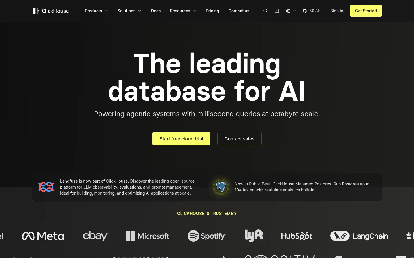
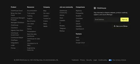
The page is anchored by a near-black canvas (#131312), with dark charcoal section bands and cards that create separation without turning the interface into a stack of bright panels. Signal Yellow (#faff69) is the defining accent: it marks primary actions, small labels, diagram highlights, and the full-width deployment section; dark text on yellow keeps those moments legible. Inter carries most navigation, body copy, and controls, while the heavier Basier display face gives the hero and selected headings a distinct, compact punch. Large centered hero typography gives way to left-aligned product narratives, customer stories, and side-by-side comparisons. The layout uses generous vertical breathing room between sections, then tighter spacing within cards and navigation. Customer marks, product diagrams, and testimonial video stills provide evidence rather than decorative imagery. Fine charcoal borders outline cards and controls; restrained shadows and layered dark surfaces keep depth subtle and technical.
Navigation, body copy, captions, links, and buttons across the page.
Aa 设计
basier
网络字体 · 字重 600 / 700 · 占比 8%
免费替代:Plus Jakarta Sans
Hero headline and selected display headings that need a heavier, more distinctive voice.
角色
示例
字号
字重
行高
字距
一级标题
Hero headline and highest-priority section headline.
ClickHouse
36px
600
1.25
0
二级标题
Supporting section headings and explanatory headline text.
The quick brown fox 敏捷的狐狸
24px
400
1.5
0
三级标题
Feature card titles and secondary feature headings.
The quick brown fox 敏捷的狐狸
20px
600
1.25
0
正文
Product explanations, testimonial text, and general copy.
The quick brown fox 敏捷的狐狸
16px
400
1.5
0
辅助文字
Small labels, supporting details, and compact metadata.
The quick brown fox 敏捷的狐狸
14px
400
1.5
0
按钮
Primary trial action and secondary action labels.
The quick brown fox 敏捷的狐狸
14px
500
1.25
0
导航
Header navigation and compact menu labels.
The quick brown fox 敏捷的狐狸
14px
400
1.43
0
链接
Inline and standalone links, including calls to explore documentation.
The quick brown fox 敏捷的狐狸
14px
400
1.5
0
间距与布局
基准单位 4px · 密度:宽松
96px版块间距
16px元素间距
—卡片内边距
1216px内容最大宽度
6px
8px
10px
12px
16px
24px
32px
40px
64px
96px
Use a centered content frame capped at the measured 1216px maximum width, with a spacious vertical section rhythm and generous separation between major content groups. The hero is centered and broad; subsequent areas alternate centered headings with left-aligned narratives, split content, card grids, and comparison layouts. The customer logo band spans wide, while the footer uses multiple compact columns. Keep cards internally compact relative to the large page-level gaps; preserve clear alignment and avoid filling every area with content.
圆角与层次
按钮 · 4px
卡片 · 8px
图片 · 4px
导航 · 8px
链接 · 8px
sm · card, nav
md · button, nav
xl · other
xl · other
Depth is restrained: dark panels and alternating charcoal section bands do most of the work. Thin #383838 borders define cards and controls, while small shadows appear sparingly. Use layered surfaces and subtle tonal gradients rather than prominent floating effects; keep the high-contrast yellow panels visually distinct without adding unnecessary shadow.
组件
下面的预览按实测的按钮、输入框、徽标、卡片样式重建(字体用替代字体)。
Primary CTA
Signal Yellow (#faff69) rectangular button with dark text, a fine matching outline, and modest rounded corners; used for cloud trial actions.
Secondary action
Dark button with white text and a restrained Olive Edge (#4f5101) outline; sits beside the primary hero CTA.
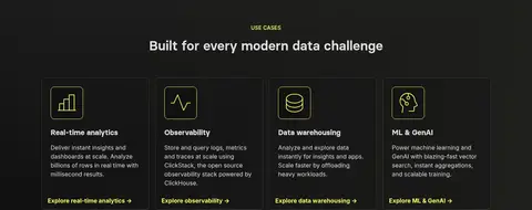
Use-case card
Dark card outlined in Quiet Border (#383838), with a simple yellow-green icon, short description, and an accent-colored exploration link.
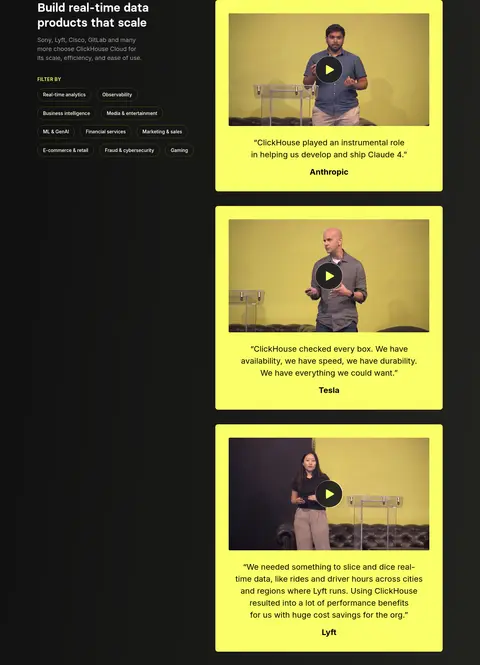
Testimonial video card
Rounded Signal Yellow (#faff69) panel containing a video still, centered play affordance, quotation, and bold customer attribution.
Customer logo strip
Wide dark trust band with a small yellow-green section label and a horizontally arranged set of customer marks.
Deployment panels
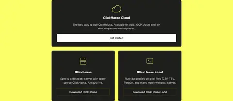
Bright yellow-green section containing dark cloud and self-managed option cards, each with concise descriptions and clear next steps.
FAQ rows
Compact dark accordion rows separated by fine gray rules, with numbered questions and a plus control at the trailing edge.
Imagery · Use customer logos as a horizontal trust strip, with product diagrams and data comparisons as the main explanatory visuals. Testimonial cards feature video stills framed inside vivid yellow panels, including clear play controls and attribution. Imagery is mostly functional and evidence-led rather than atmospheric; retain dark surroundings and use yellow highlights to focus attention on key data or media.
Keep the main canvas near-black and the overall contrast crisp.
Use #faff69 for primary actions and selective data emphasis.
Separate sections with tonal shifts rather than bright background blocks.
Use Inter for navigation and readable interface copy.
Reserve the display face for prominent headlines.
Frame technical information in restrained dark cards with fine borders.
✕ 不该做
Do not introduce unmeasured brand colors.
Do not use yellow-green as a default text color for long copy.
Do not add decorative shadows that overpower the subtle panels.
Do not make every section a card grid.
Do not replace customer and product evidence with generic stock imagery.
Do not crowd the page-level section spacing.
给 AI 的提示词
想快速出一个同风格的新页面,把这段话连同 DESIGN.md 一起发给 AI。
Build a new ClickHouse-style page using Carbon Canvas (#131312) as the dominant background, with Charcoal Panel (#1f1f1c) and Slate Band (#414141) for restrained section separation. Use Signal Yellow (#faff69) sparingly but decisively for primary CTAs, key metrics, diagram emphasis, and a standout feature band; use dark text on yellow. Set most UI and copy in Inter, reserving the heavier display face for major headlines. Keep the page spacious, aligned to a centered content frame, and vary the composition between centered introductions, split product explanations, compact cards, and evidence-led comparisons. Use customer marks, technical diagrams, and video testimonials with a functional presentation. Outline dark cards with Quiet Border (#383838), keep shadows subtle, and maintain clear hierarchy without decorative clutter.