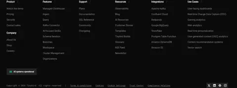
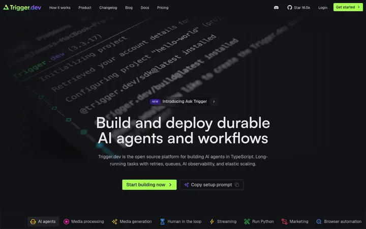
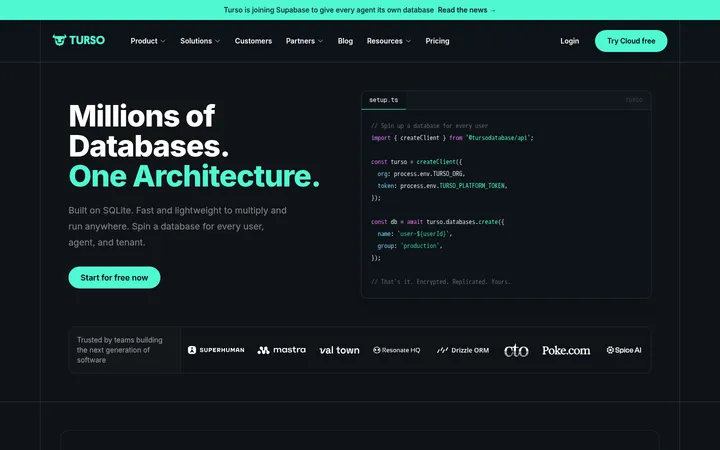
North star · Keep the near-black canvas quiet, and use bright green only to mark actions, active states, and essential proof.
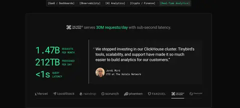
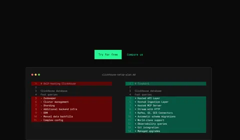
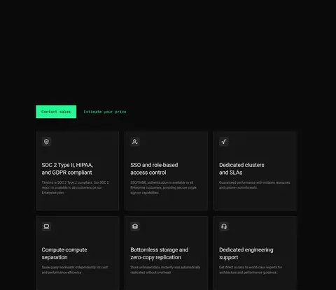
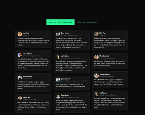
The visual system is built on a near-black #0a0a0a canvas that carries almost the entire page, with white headings and muted gray supporting copy. Bright green #27f795 is reserved for primary actions, selected category labels, and key performance figures, so the important interaction points stand out without introducing broad color bands. Roboto provides clean, readable headlines and body copy; Roboto Mono gives navigation, buttons, code examples, and small technical labels a distinctly developer-oriented voice. The layout alternates centered product storytelling with wide technical demonstrations and dense, three-column proof grids. Large stretches of dark negative space separate these groups, while cards use charcoal surfaces and thin gray borders rather than shadows. Imagery is functional: interface previews, architecture diagrams, terminal snippets, customer portraits, and a geometric green closing graphic. The overall effect is restrained, technical, and high contrast.
配色
点色块复制色值。用途说明来自对页面的实测位置(背景、文字、描边、按钮)与截图判读。
品牌色
强调色
表层色
中性色
功能色
页面底色 · Night Canvas表层 · Charcoal Panel表层 2 · Deep Panel主文字 · Signal White次要文字 · Quiet Gray描边 · Graphite Line强调 · Electric Mint强调 2 · Pine Accent强调 3 · Oxide Red
Display and heading typography, body copy, links, and card text.
Aa 设计
Roboto Mono
网络字体 · 字重 400 · 占比 18%
免费替代:IBM Plex Mono
Navigation, primary buttons, code examples, and compact technical labels.
角色
示例
字号
字重
行高
字距
特大标题
Large centered hero and prominent display headlines.
Tinybird
64px
400
1.13
-0.02em
一级标题
Primary page headline with a compact monospace treatment when applied.
Tinybird
56px
400
1
-0.084em
二级标题
Section headings introducing product and enterprise stories.
Tinybird
40px
400
1.2
0.01em
三级标题
Secondary feature and proof-card headings.
Tinybird
32px
400
normal
-0.04em
四级标题
Smaller feature-card and supporting headings.
The quick brown fox 敏捷的狐狸
24px
400
1.33
-0.013em
正文
Explanatory copy, testimonials, and standard interface text.
The quick brown fox 敏捷的狐狸
14px
400
1.57
0
辅助文字
Small metadata, labels, and supporting annotations.
The quick brown fox 敏捷的狐狸
12px
400
1.67
0
按钮
Monospaced primary CTA and other button labels.
The quick brown fox 敏捷的狐狸
14px
400
1.57
0
链接
Navigation, secondary actions, and inline links.
The quick brown fox 敏捷的狐狸
14px
400
1.57
0
代码
Terminal commands, developer examples, and technical snippets.
const style = 1;
14px
400
1.57
0
间距与布局
基准单位 8px · 密度:紧凑
40px版块间距
8px元素间距
20px卡片内边距
1332px内容最大宽度
2px
4px
8px
12px
16px
20px
24px
32px
40px
48px
152px
Use a centered, wide content frame capped at the measured 1332px maximum, with a compact top navigation and mostly centered section headings. Product narratives use single-column alignment; technical demonstrations and enterprise proof shift into multi-column compositions, including six-column workflow content and three-column card grids. Keep the page visually sparse between major blocks, then allow dense information inside diagrams, cards, and code panels. The measured spacing scale runs from 2px to 152px, with a compact 8px base unit and a 40px section gap; use large breathing intervals selectively rather than padding every block equally.
圆角与层次
按钮 · 4px
卡片 · 4px
图片 · 50%
没有测到阴影:页面是扁平的,层次靠底色和描边区分。
The page uses flat dark surfaces rather than drop shadows. Separate cards from the canvas with charcoal fills and thin graphite borders; technical panels may use an even darker inset surface. Keep corners subtly rounded according to the measured small card radius, and use restrained layering to distinguish nested interface regions.
组件
下面的预览按实测的按钮、输入框、徽标、卡片样式重建(字体用替代字体)。
Primary CTA
Electric Mint #27f795 fill with Night Canvas #0a0a0a text; Roboto Mono label, compact rectangular shape, and no shadow.
Secondary link
Muted gray or green text on the dark canvas, often positioned beside a primary CTA without a filled container.
Category selector
A narrow row of bracketed Roboto Mono labels inside a thin graphite outline; selected item is green.
Proof card
Charcoal #151515 panel with white copy and a fine #353535 border; used for testimonials and enterprise details.
Metric panel
Dark bordered showcase combining oversized green metrics, compact labels, customer proof, and supporting interface content.
Code panel
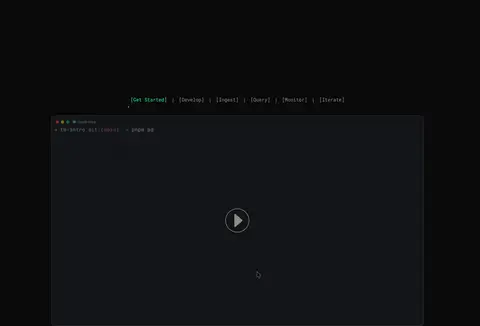
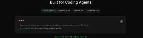
Near-black or charcoal terminal-style surface with monospace commands and sparse status-color accents.
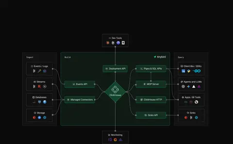
Technical diagram
Dark interconnected nodes and panels with subtle borders and limited green emphasis; keep colors within the illustration.
Imagery · Imagery is primarily functional product evidence: dark UI previews, terminal windows, architecture diagrams, and code comparison panels. Customer proof uses small portrait images inside testimonial cards. The page closes with a full-bleed geometric green line pattern. Keep media dark, tightly framed, and integrated into bordered panels; avoid decorative lifestyle photography or colorful stock imagery.
Reserve #27f795 for primary actions and important highlights.
Pair Roboto headlines and prose with Roboto Mono technical UI.
Use thin gray borders to define dark card edges.
Give major content groups generous dark negative space.
Keep diagrams and code panels restrained and functional.
✕ 不该做
Do not introduce bright full-width color bands.
Do not use shadows to create card elevation.
Do not let illustration colors redefine the site palette.
Do not crowd every section with equal-density content.
Do not style every label as uppercase.
Do not use decorative lifestyle imagery as the main product proof.
给 AI 的提示词
想快速出一个同风格的新页面,把这段话连同 DESIGN.md 一起发给 AI。
Build a new Tinybird-style developer SaaS page on a Night Canvas #0a0a0a background. Use Signal White #ffffff for headings and core text, Quiet Gray #8d8d8d for secondary copy, and Electric Mint #27f795 sparingly for primary CTA fills, active states, and essential metrics. Set readable content in Roboto and use Roboto Mono for buttons, navigation, code, and technical labels. Compose centered headline sections with wide product demonstrations, dark proof cards, diagrams, and selective multi-column grids. Separate cards using Charcoal Panel #151515 and thin Graphite Line #353535 borders; avoid drop shadows. Preserve generous dark intervals between content groups while keeping information inside cards compact. Treat portraits and technical illustrations as supporting evidence, not decorative color sources. Keep the result precise, technical, high contrast, and easy to scan.