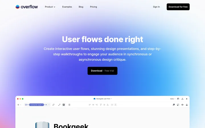
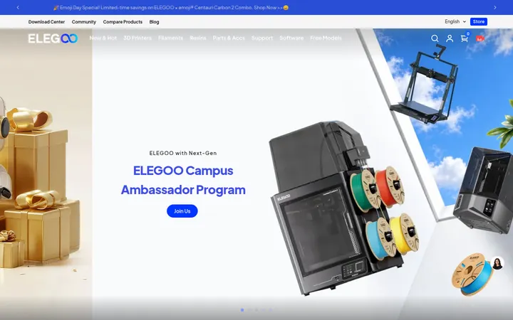
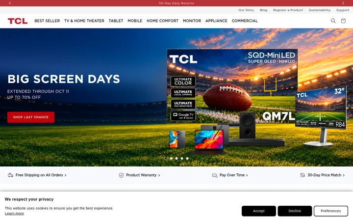
North star · Let cinematic product photography carry the emotion while a restrained, high-contrast interface keeps navigation and calls to action clear.
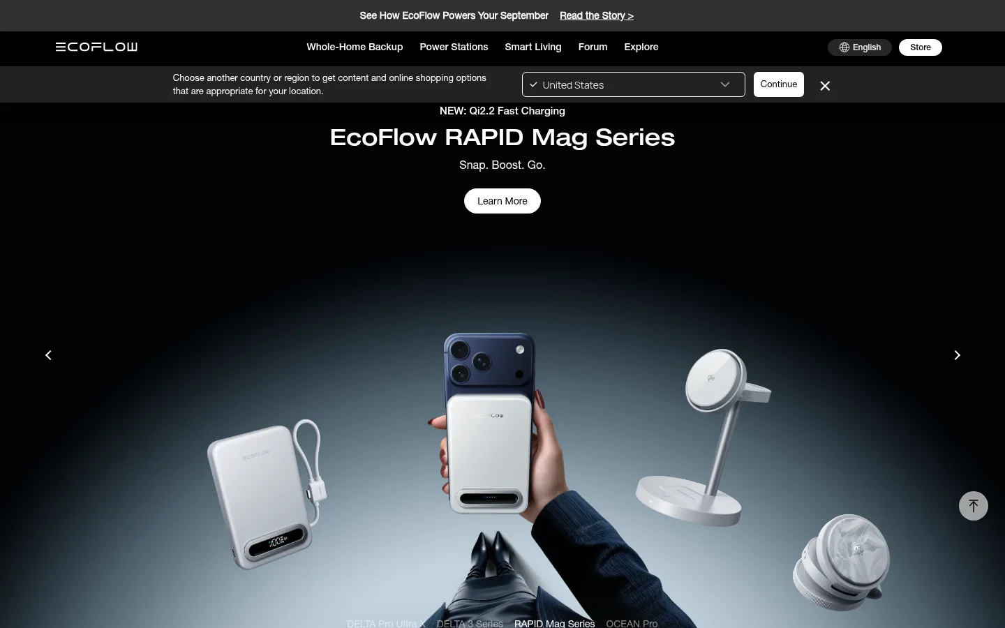
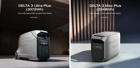
The visual strategy is built around contrast between a clean white merchandising canvas and long, cinematic black sections. White, black, and charcoal define the interface; the blue-gray tones that dominate some screenshots belong chiefly to campaign imagery rather than a recurring UI accent. Typography uses a Helvetica Neue–style sans serif, with centered, compact product headings and restrained supporting copy. The navigation stays small and quiet, while large headings establish each campaign or product panel. A wide hero and immersive photography lead into paired product tiles, with narrow white gutters separating the imagery. Lower on the page, the black editorial area groups action stories, award cards, and newsletter content into a continuous dark field. Layout alternates between centered promotional blocks and a more structured, left-aligned story area. Generous section spacing gives the photography room to carry the visual emphasis; controls remain simple, rounded, and high contrast.
Primary interface and body family for navigation, body copy, and links.
Aa 设计
EN-HelveticNeue-woff2-B
网络字体 · 字重 300 / 500 · 占比 26%
免费替代:Inter
Headings, buttons, and some emphasized interface text.
Aa 设计
EN-HelveticNeue-woff2-EB
网络字体 · 字重 500 · 占比 6%
免费替代:Inter
Primary hero heading role.
Aa 设计
en-Manrope-Light
网络字体 · 字重 300 / 500 · 占比 4%
免费替代:Manrope
Occasional navigation and store label text.
角色
示例
字号
字重
行高
字距
一级标题
Main hero or campaign headline, centered over the lead visual.
EcoFlow
32px
500
1.15
0
二级标题
Section and product-pair headings.
EcoFlow
28px
500
1.15
0
三级标题
Secondary product titles and supporting feature headings.
The quick brown fox 敏捷的狐狸
24px
300
1.15
0
四级标题
Smaller nested titles within content blocks.
The quick brown fox 敏捷的狐狸
20px
300
1.15
0
正文
Product descriptions, campaign copy, and general content.
The quick brown fox 敏捷的狐狸
14px
300
1.15
0
辅助文字
Small legal notes, image labels, and fine print.
The quick brown fox 敏捷的狐狸
12px
300
2.17
0
按钮
Primary CTA labels such as Learn More and Subscribe.
The quick brown fox 敏捷的狐狸
16px
500
1.38
0
导航
Top-level product and company navigation.
The quick brown fox 敏捷的狐狸
14px
300
1.29
0
链接
Compact secondary links and supporting actions.
The quick brown fox 敏捷的狐狸
12px
300
1.33
0
间距与布局
基准单位 4px · 密度:适中
80px版块间距
4px元素间距
28px卡片内边距
1280px内容最大宽度
4px
6px
10px
12px
14px
16px
18px
20px
24px
32px
40px
60px
80px
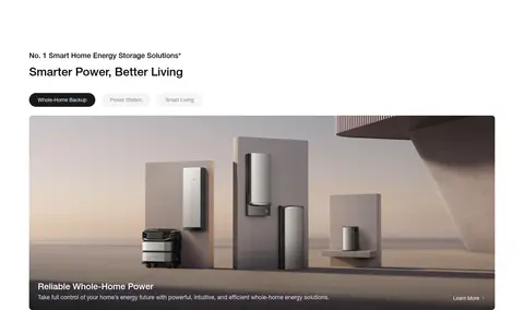
Use a wide desktop canvas with a measured maximum content width of 1280px and a comfortable density. Start with compact announcement and navigation bands, then give the hero and campaign sections room to breathe. Product campaigns frequently use two-column panels, separated by slim white gutters; the smart-home feature returns to a white, left-aligned content area. Lower editorial content spans a continuous black band with story cards and awards. Keep headings centered in promotional blocks, but align newsletter and editorial content to their own column structure. Maintain the measured 80px section rhythm where applicable.
圆角与层次
按钮 · 9999px
输入框 · 8px
卡片 · 8px
导航 · 9999px
链接 · 4px
inset · other
The page is mostly flat, with contrast and imagery creating hierarchy rather than drop shadows. Dark cards sit directly in the black editorial field, while thin pale gutters separate product panels. Rounded controls and cards provide the main softened edges. A measured inset shadow exists only as a minor detail, so avoid adding broad floating-card shadows.
组件
下面的预览按实测的按钮、输入框、徽标、卡片样式重建(字体用替代字体)。
Campaign hero
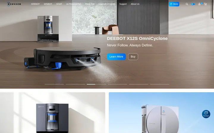
Full-width dark visual with centered headline, compact supporting line, and a rounded Learn More CTA; image remains the dominant element.
Top navigation
Black navigation band with restrained light text, brand mark, product links, language control, and a compact Store action.
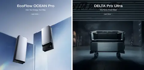
Product panel pair
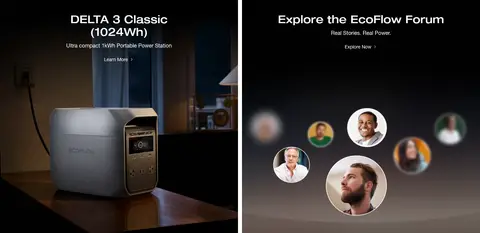
Two campaign tiles in a balanced grid, with centered titles and links placed over full-panel product photography.
Product card grid
Paired portable-power campaigns separated by narrow white gutters; product imagery and short titles carry the content.
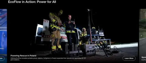
Editorial story feed
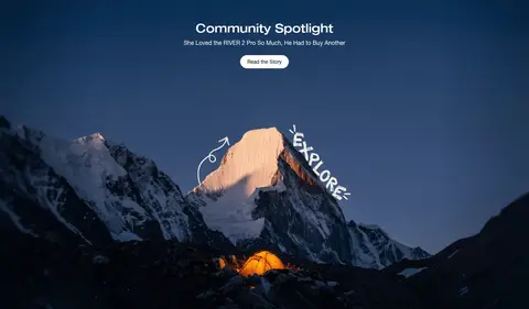
Dark, wide story area with a left-aligned heading, large action image, and compact adjacent story navigation.
Awards strip
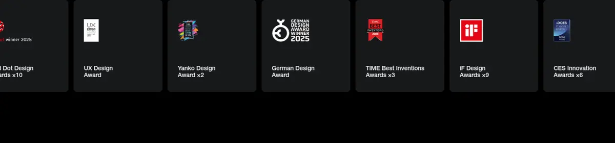
Row of charcoal award cards with compact marks, names, and counts against the black editorial background.
Newsletter form
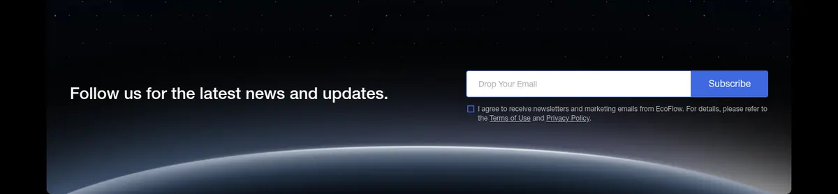
Dark newsletter panel with a concise prompt, email input, Subscribe action, and small consent copy.
Footer
Graphite footer surface with newsletter controls, grouped product and company links, region selector, and fine-print details.
Imagery · Photography and campaign artwork dominate: hero products are presented in cinematic, low-key scenes, while outdoor stories use landscape imagery and warm focal points. Product tiles use carefully staged home and studio settings, with the product clearly framed and copy overlaid near the top. The dark lower section mixes documentary-style action photography with award tiles. Screenshot colors within imagery may be blue-gray or warm-toned; treat them as campaign media, not UI palette.
Use black and white as the dominant interface contrast.
Let product photography fill large campaign panels.
Keep product headings centered and concise.
Separate adjacent tiles with slim, clean gutters.
Use rounded pill-like treatment for prominent CTAs.
Keep lower editorial and award content on dark surfaces.
✕ 不该做
Do not make campaign imagery the source of recurring UI colors.
Do not add gradients or decorative accents absent from the measured interface.
Do not crowd the hero with dense explanatory copy.
Do not use heavy shadows to lift every card.
Do not make navigation louder than the campaign content.
Do not replace the editorial black band with a pale background.
给 AI 的提示词
想快速出一个同风格的新页面,把这段话连同 DESIGN.md 一起发给 AI。
Build a new EcoFlow-style page with a restrained, high-contrast interface and image-led campaign sections. Use Gallery White (#ffffff), Power Black (#000000), and Graphite Panel (#18191b) for the main canvas and dark surfaces; reserve Signal Blue (#3f68e0) for a small form detail rather than a broad accent. Set type in a clean Helvetica Neue–like sans serif, with compact navigation, centered campaign headings, and concise supporting copy. Structure the page with a wide hero, paired product panels, and a dark editorial area for stories or proof points. Use large, cinematic product photography and let its own colors remain within the image. Keep CTAs simple and rounded, section transitions clean, and card elevation minimal. Preserve generous breathing room between major blocks while keeping small labels and footer links unobtrusive.