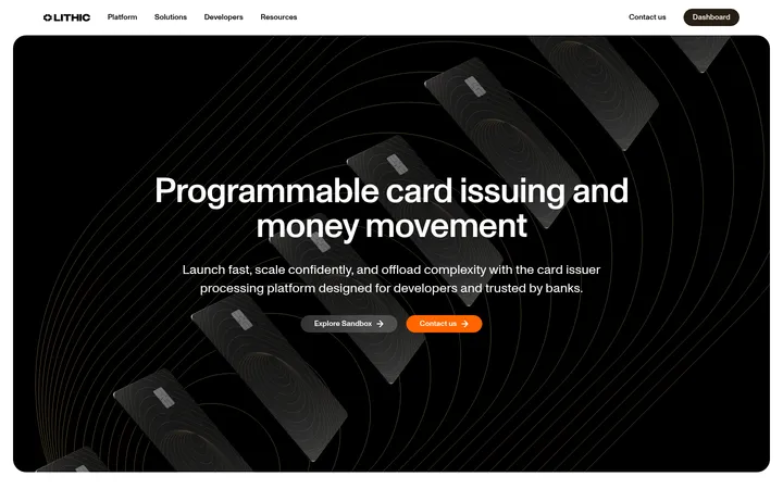
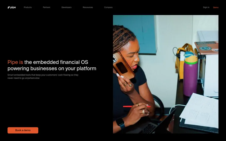
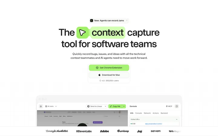
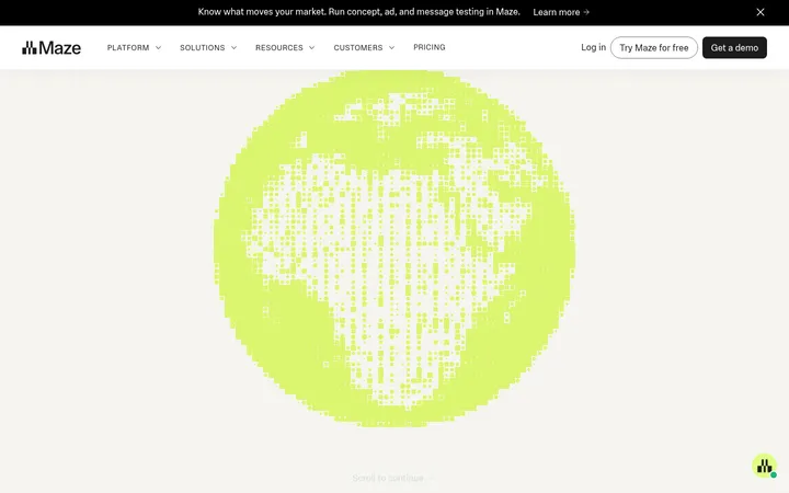
North star · Keep the canvas quiet and typography direct; use lime only to make the next meaningful action unmistakable.
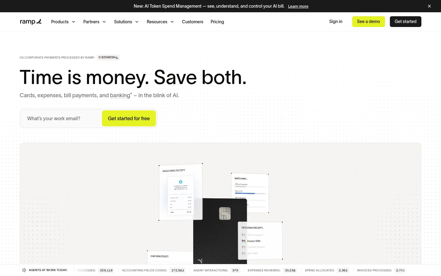
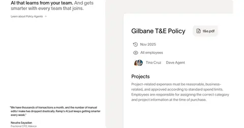
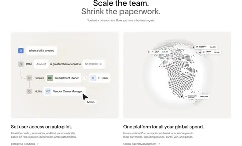
The page is built on a near-white canvas, with black-brown text and soft warm-gray bands providing structure without making the experience feel heavy. The sharp lime accent is reserved for high-priority actions, so buttons stand out immediately against the otherwise quiet palette. Lausanne’s clean sans-serif forms carry oversized, regular-weight headlines, compact navigation, and readable supporting copy without decorative typography. A wide, left-aligned hero establishes the proposition before a large finance-product visual; later sections alternate centered statements, split layouts, and card grids to keep the long page varied. Product screenshots and interface mockups are framed in pale rounded panels, while customer photography and testimonials add human proof. Hairline borders define cards and controls rather than pronounced shadows. Generous whitespace separates content groups, while dense interface imagery is confined to its own panels, keeping the page polished and legible.
配色
点色块复制色值。用途说明来自对页面的实测位置(背景、文字、描边、按钮)与截图判读。
品牌色
强调色
表层色
中性色
功能色
页面底色 · Canvas White表层 · Soft Stone主文字 · Near Black次要文字 · Warm Gray描边 · Quiet Line强调 · Signal Lime
Site-wide headings, navigation, body copy, labels, and buttons.
角色
示例
字号
字重
行高
字距
特大标题
Large lead statements and prominent hero messaging.
Ramp
64px
400
1
0
一级标题
Primary hero heading and major section titles.
Ramp
48px
400
1.04
0
二级标题
Feature-group headings and prominent content statements.
Ramp
40px
400
1.05
0
三级标题
Feature card titles and secondary section headings.
Ramp
28px
400
1.14
0
四级标题
Smaller feature and testimonial headings.
The quick brown fox 敏捷的狐狸
24px
400
1.17
0
正文
Supporting descriptions, product explanations, and testimonial copy.
The quick brown fox 敏捷的狐狸
14px
400
1.43
0
辅助文字
Small uppercase metric labels and eyebrow text.
The quick brown fox 敏捷的狐狸
10px
400
2.2
0.018em
按钮
CTA labels and compact action controls.
The quick brown fox 敏捷的狐狸
14px
400
1
0
导航
Top navigation and announcement bar text.
The quick brown fox 敏捷的狐狸
14px
400
1
0
链接
Inline links, customer-story links, and secondary actions.
The quick brown fox 敏捷的狐狸
16px
400
1.5
0
间距与布局
基准单位 4px · 密度:适中
64px版块间距
8px元素间距
20px卡片内边距
1312px内容最大宽度
4px
6px
8px
12px
16px
20px
24px
32px
64px
128px
The page uses a broad centered content area, measured at a 1312px maximum width, with left-aligned hero and feature copy and centered statements in selected sections. The hero stacks messaging above a large product visual. Later blocks alternate feature grids, split product-and-copy layouts, and testimonial collections. The measured spacing system uses a 4px base, comfortable density, and generous 64px section gaps; cards have roomy internal padding. The rhythm leaves substantial white space between major narratives.
圆角与层次
按钮 · 6px
输入框 · 6px
卡片 · 16px
图片 · 12px
导航 · 6px
链接 · 12px
inset · nav
The interface is mostly flat, with subtle #e8e8e8 hairlines defining cards and controls rather than visible drop shadows. Rounded surfaces and pale warm fills distinguish product panels from the canvas. Layered dashboard mockups and overlapping media create depth within showcase areas; avoid applying heavy elevation to page-level cards.
组件
下面的预览按实测的按钮、输入框、徽标、卡片样式重建(字体用替代字体)。
Announcement bar
A narrow dark strip above the white navigation, with centered update copy, a small learn-more link, and a close control.
Primary CTA
Signal Lime #e4f222 fill, Near Black #0c0a08 label, regular sans-serif text, and a subtly rounded compact shape.
Hero email form
A restrained email input and lime action grouped horizontally beneath the headline and supporting sentence.
Product showcase panel
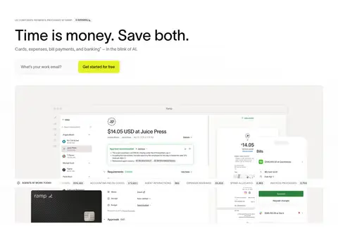
Large pale warm-gray rounded container framing layered finance-product UI; keep interface details within the media.
Feature card grid
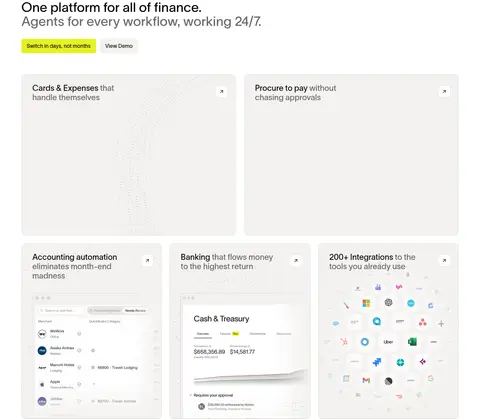
Two- and three-column product cards with warm pale surfaces, concise headings, small directional links, and interface imagery.
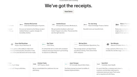
Testimonial card
Compact customer quote, attribution, and optional portrait or logo, separated with a fine border and generous whitespace.
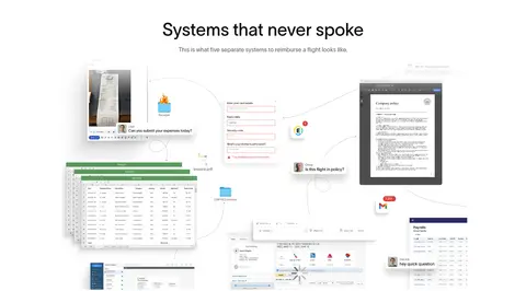
Imagery · Product UI is the dominant visual: finance dashboards, cards, approvals, and billing interfaces appear inside pale, rounded panels. Customer photography and video stills bring human context to the product narrative, while testimonial cards add social proof. Integration marks and abstract interface diagrams appear as supporting visuals. Images are generally crisp and minimally treated; muted gradients and warm backgrounds soften selected showcase areas. Colors inside screenshots and illustrations are content, not core brand palette.
Use a clean white canvas with warm-gray section surfaces.
Reserve Signal Lime for primary actions and key emphasis.
Set headlines in regular-weight, direct sans-serif typography.
Use generous whitespace between distinct page narratives.
Frame product interfaces in pale, softly rounded panels.
Use fine borders to define cards without adding visual heaviness.
✕ 不该做
Do not turn the page into a dark interface.
Do not spread lime across large decorative backgrounds.
Do not use heavy shadows to separate ordinary cards.
Do not make every section a centered card grid.
Do not mistake colors inside product screenshots for brand colors.
Do not use condensed, ornamental, or highly weighted headline styles.
给 AI 的提示词
想快速出一个同风格的新页面,把这段话连同 DESIGN.md 一起发给 AI。
Build a new Ramp-style fintech page on a clean white canvas. Use Near Black (#0c0a08) for confident regular-weight headlines and navigation, Warm Gray (#6d6c6b) for supporting copy, and Soft Stone (#f4f2f0) for selected content panels. Keep Signal Lime (#e4f222) for primary CTA buttons with dark text. Use Lausanne or a close sans-serif substitute such as Inter, with restrained hierarchy and clear, readable copy. Structure the page with generous whitespace, a broad centered content area, and a varied sequence of left-aligned hero content, product showcases, feature cards, and split customer stories. Frame realistic product UI in pale rounded panels; use fine Quiet Line (#e8e8e8) borders instead of heavy shadows. Keep illustration colors inside their own media.