North star · Keep the interface quiet and editorial, letting bold type and product imagery—not decorative brand colour—carry the visual impact.
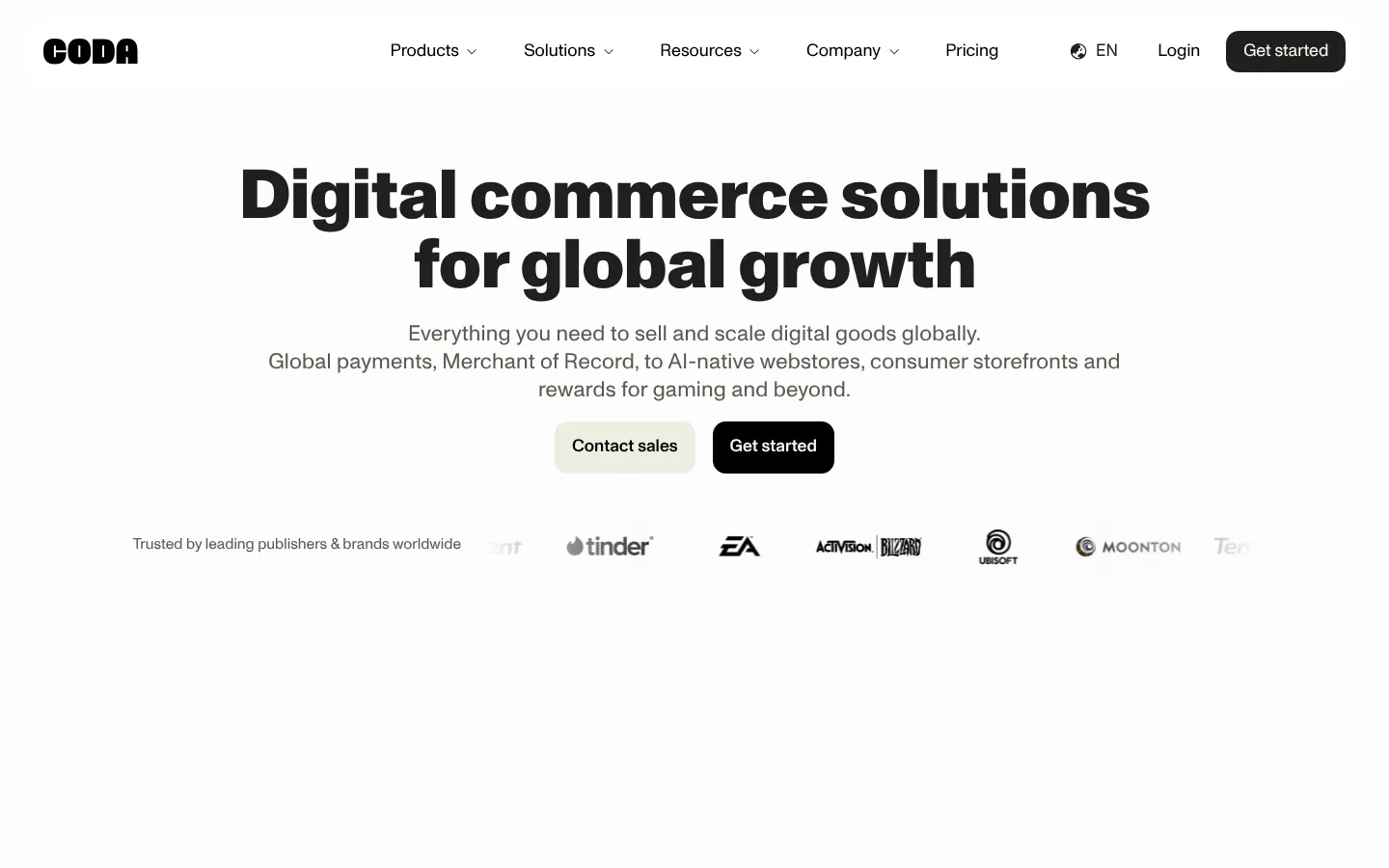
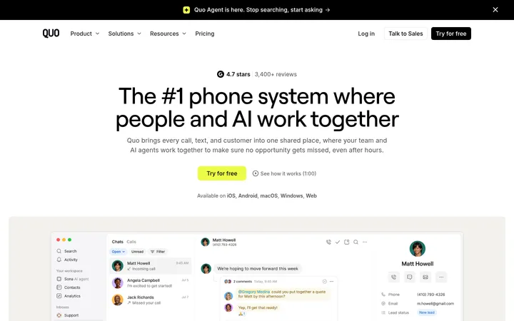
The page is built on an almost-white canvas (#fcfcfc), with black typography and dark charcoal bands used to anchor key moments. Soft olive-tinted panels (#edeee1 and #c0c2a9) distinguish benefit cards and the editorial content carousel without making the interface feel colourful overall. The opening hero is centered and typographic: a very bold, large headline sits above muted copy, paired CTA buttons, and a low-key row of customer marks. ABC Monument Grotesk carries nearly all interface and display text; uppercase heavy headings create contrast with regular-weight body copy. The page alternates expansive whitespace with compact, aligned grids and large media-led product cards. Product imagery supplies the strongest colour, including saturated orange, blue, green, and pink panels; those hues belong to product illustrations, not the core brand palette. Rounded buttons and cards soften the otherwise crisp, flat layout. A charcoal closing CTA and footer give the page a deliberate endpoint.
Primary display and interface typeface for headings, body text, navigation, links, and buttons.
Aa 设计
jetBrainsMono
网络字体 · 字重 400 · 占比 4%
免费替代:JetBrains Mono
Compact uppercase code-like labels and outlined category badges.
角色
示例
字号
字重
行高
字距
特大标题
Oversized bold hero and campaign display headlines.
Coda
71.5px
800
1
-0.01em
一级标题
Primary page headline, often uppercase in measured styles.
Coda
62.5px
900
0.9
-0.01em
二级标题
Major section headings and prominent feature titles.
Coda
45px
800
1
-0.01em
三级标题
Subsection titles and card group headings.
Coda
31.5px
500
1.2
-0.01em
四级标题
Smaller card or content titles.
The quick brown fox 敏捷的狐狸
27px
500
1.2
-0.01em
正文
Hero supporting copy and general explanatory text.
The quick brown fox 敏捷的狐狸
18px
400
1.5
0
辅助文字
Small captions, partner labels, and supporting metadata.
The quick brown fox 敏捷的狐狸
15.5px
400
1
0
按钮
CTA labels and action controls.
The quick brown fox 敏捷的狐狸
15.5px
500
1.43
0.01em
链接
Text links and secondary navigation actions.
The quick brown fox 敏捷的狐狸
15.5px
500
1.43
0.01em
代码
Uppercase technical labels and category badges.
const style = 1;
14px
400
0.9
0
间距与布局
基准单位 1px · 密度:紧凑
36px版块间距
9px元素间距
27px卡片内边距
1129px内容最大宽度
4px
9px
13px
18px
27px
36px
63px
72px
The content sits within a measured maximum width of 1129px, with centered hero messaging and mostly centered section titles. The homepage balances sparse opening space and full-bleed media with compact multi-column cards: three-column feature areas, four-column award listings, and a denser footer. Section gaps and card padding follow the measured spacing scale, while repeated bands create a steady scroll rhythm. Alignment shifts to left for editorial and resource content. Overall density is compact inside cards but generous between major page moments.
圆角与层次
按钮 · 13px
卡片 · 13px
徽标 · 9999px
链接 · 9999px
没有测到阴影:页面是扁平的,层次靠底色和描边区分。
The interface is predominantly flat, with no measured shadow system. Separate sections through background contrast, pale card fills, and thin dark borders rather than floating layers. Cards and buttons use rounded corners, while pill-shaped badges and links provide the few more pronounced silhouettes. Maintain clear contrast between light sections and the charcoal closing band.
组件
下面的预览按实测的按钮、输入框、徽标、卡片样式重建(字体用替代字体)。
Primary CTA
Rounded dark button with light text; use as the high-contrast action in the hero and closing CTA.
Secondary CTA
Pale olive filled button with black text, paired beside the dark action in the hero and CTA band.
Benefit cards
Pale olive card grid with black copy, restrained padding, and rounded corners; cards communicate platform advantages.
Product showcase cards
Large rounded media panels with product interface mockups and vivid illustration-led colour; keep copy legible over the artwork.
Outlined badge
Compact uppercase JetBrains Mono label with a dark outline and pill-shaped border.
Editorial carousel
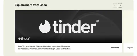
Pale olive content band framing a prominent horizontal case-study image, caption, and compact navigation controls.
Logo rows
Small monochrome customer, award, and press marks spaced across a light background.
Footer
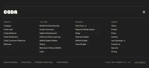
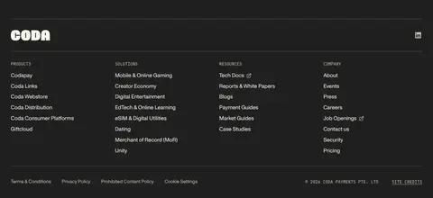
Charcoal band with a bright wordmark, thin dividers, grouped text links, and subdued legal details.
Imagery · Media is concentrated in product showcases and editorial cards rather than used as general decoration. The product cards contain vivid interface mockups and campaign-style artwork, including payment screens, storefronts, and a distribution map; these colours are illustrative rather than core brand colours. Customer, award, and press marks appear as compact logo rows. A featured case-study image is framed as a broad horizontal carousel card.
Make the hero headline bold, large, and centrally aligned.
Reserve Pale Olive for cards and secondary actions.
Use Charcoal for the closing CTA and footer.
Keep product mockups vivid and confined to media panels.
Use rounded controls and cards without adding shadows.
✕ 不该做
Do not turn illustration colours into global brand accents.
Do not fill every section with a tinted background.
Do not crowd the hero with extra controls or copy.
Do not use decorative gradients as a core visual motif.
Do not add heavy shadows or floating-card effects.
Do not use monospaced type for general body copy.
给 AI 的提示词
想快速出一个同风格的新页面,把这段话连同 DESIGN.md 一起发给 AI。
Build a new Coda-style page with a quiet editorial foundation. Use Gallery White (#fcfcfc) as the canvas, True Black (#000000) for primary text, and Olive Ink (#5a5a4f) for muted copy and hairlines. Set headings and interface text in ABC Monument Grotesk or Space Grotesk, with heavy display headlines and regular body copy; reserve JetBrains Mono for occasional uppercase labels. Organize content in a centered, measured-width layout with generous gaps between major sections and compact, rounded cards within grids. Use Pale Olive (#edeee1) and Sage Stone (#c0c2a9) sparingly for card surfaces. Keep CTAs simple: dark charcoal or black with light text, paired with a pale secondary button. Let product imagery carry saturated colour. Finish with a charcoal CTA and footer; avoid shadows and decorative gradients.