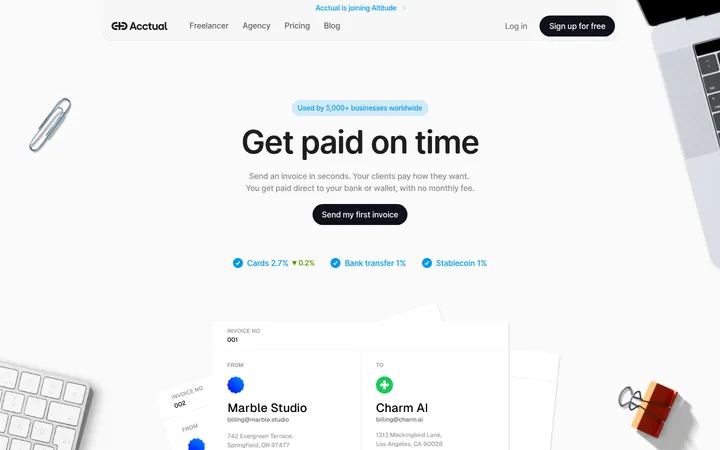
North star · Use generous white space and restrained dark contrast to make the payment product feel clear, dependable, and easy to act on.
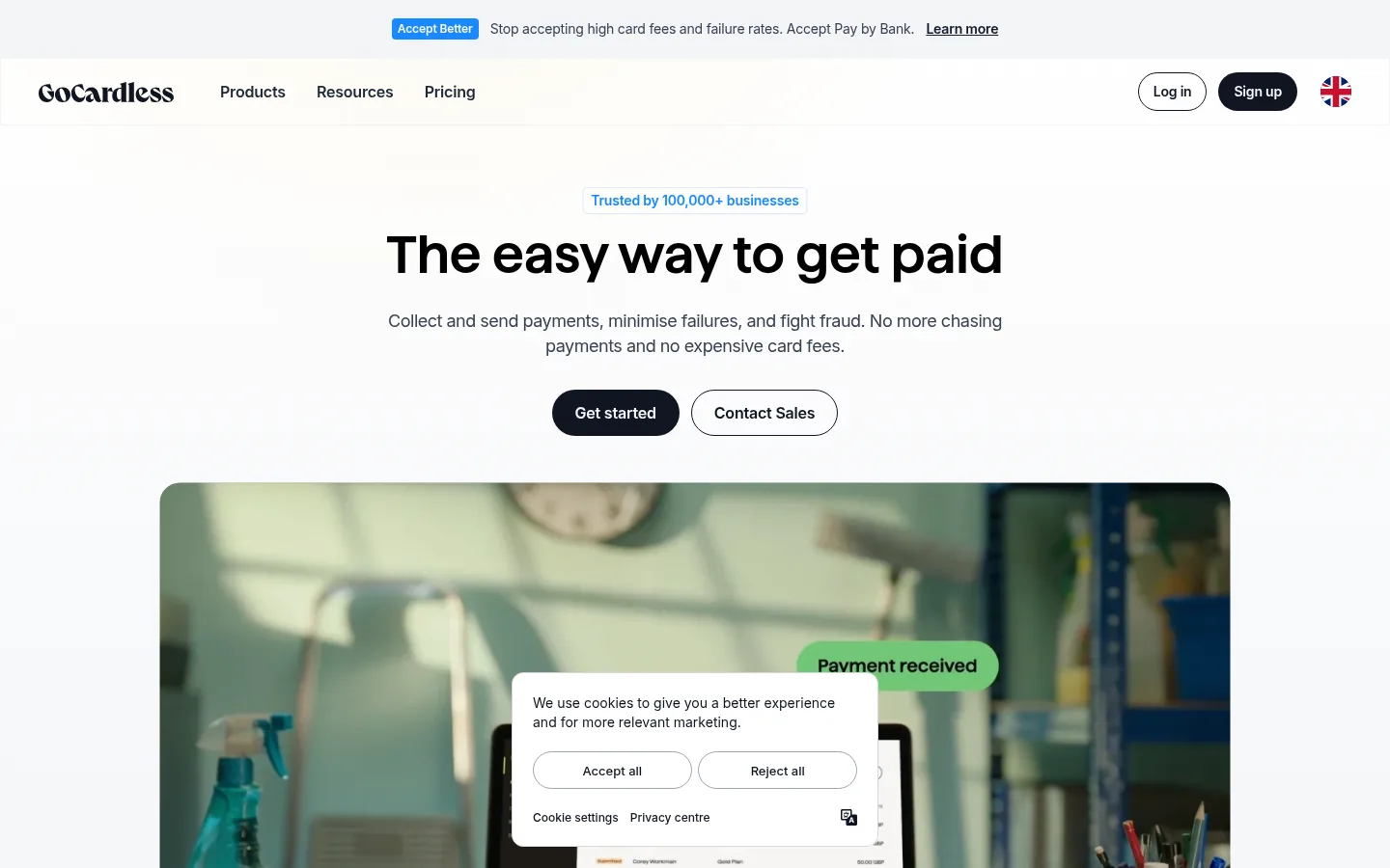
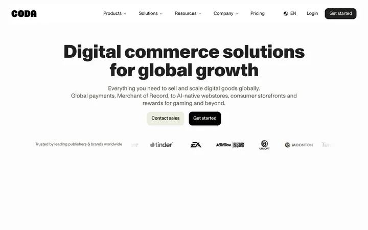
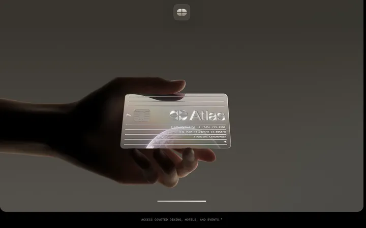
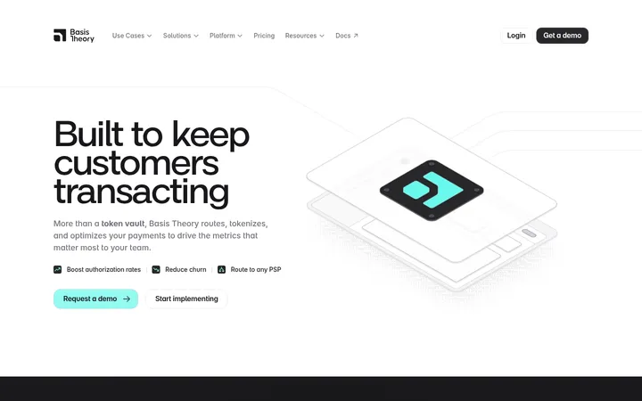
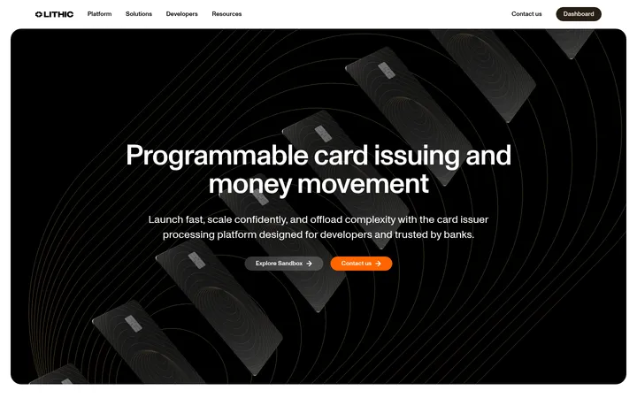
The homepage builds trust through a predominantly white canvas, restrained neutral surfaces, and a strong near-black/navy contrast. The hero is centered and typographic: a large Haffer XH SemiBold headline sits above concise Inter copy and paired pill-shaped actions. Blue is used sparingly for announcement and trust cues, while yellow is a small, high-visibility accent rather than a broad brand field. The first product image is a wide, rounded lifestyle photograph with a payment interface layered into the scene; lower sections use pale cards and dark interface mockups to make features tangible. Layout alternates broad areas of breathing room with compact, clearly grouped content. Cards rely more on fine pale borders than pronounced shadows, and the dark footer provides a decisive visual endpoint. Keep illustrations and interface mockup colours subordinate to the core palette.
Centered hero headline introducing the core payment proposition.
GoCardless
54px
600
1.2
0
二级标题
Major section headings, including the feature overview.
GoCardless
42px
700
1.19
0.012em
三级标题
Selected sub-section and feature headings.
GoCardless
36px
600
1.22
0
四级标题
Compact card and supporting content headings.
The quick brown fox 敏捷的狐狸
24px
700
1.33
-0.021em
正文
Hero supporting copy, feature descriptions, and explanatory paragraphs.
The quick brown fox 敏捷的狐狸
16px
400
1.5
-0.012em
辅助文字
Small trust notes, card details, and footer metadata.
The quick brown fox 敏捷的狐狸
14px
400
1.57
-0.014em
导航
Primary navigation labels and header actions.
The quick brown fox 敏捷的狐狸
16px
600
1.5
-0.012em
链接
Inline calls to action and text links.
The quick brown fox 敏捷的狐狸
16px
400
1.5
-0.012em
间距与布局
基准单位 4px · 密度:紧凑
32px版块间距
10px元素间距
48px卡片内边距
1360px内容最大宽度
2px
4px
6px
8px
10px
12px
16px
20px
21px
24px
32px
48px
64px
Use a centered content frame capped at the measured 1360px maximum width, with the hero copy aligned centrally and feature content arranged in grouped columns. The page density is compact within cards but spacious between major content areas. Preserve the measured 32px section gap as a rhythm cue and use broad vertical breathing room where the screenshot shows open transitions. Keep alignment disciplined and let media span wider than text blocks. The lower-page statistics sit in a dark horizontal band above the footer.
圆角与层次
按钮 · 9999px
卡片 · 12px
图片 · 50%
导航 · 9999px
链接 · 11px
hairline · other
hairline · card, other
hairline · other
The interface is mostly flat. Pale one-pixel borders define the feature cards, with only faint measured hairline shadows where present. Dark sections and UI mockups create layering through contrast rather than heavy elevation. Use rounded cards and pill controls, but keep overlays and media framing visually quiet.
组件
下面的预览按实测的按钮、输入框、徽标、卡片样式重建(字体用替代字体)。
Announcement strip
A slim, pale header band pairs a blue acceptance label with short payment messaging and an underlined link.
Navigation
Brand mark and grouped navigation sit on white; compact outlined and dark pill actions align at the right.
Hero
Centered trust cue, large display headline, short supporting copy, and paired dark-filled and outlined rounded actions.
Feature cards
Pale, lightly bordered cards organize payment recovery, fraud protection, international payments, checkout, and integrations.
Product builder panel
A broad dark panel pairs explanatory copy and a yellow action with a bright payment-interface preview.
Statistics band
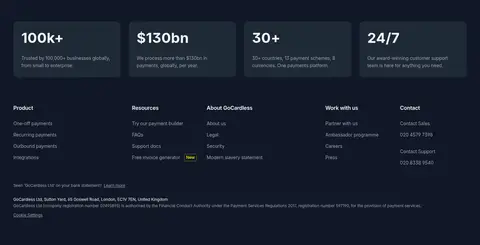
Four compact dark metric cards display scale and support proof points above the footer.
Footer
Deep navy surface groups links into columns, followed by muted legal and company details.
Imagery · Lead with a wide lifestyle photograph of a real workspace, framed with rounded corners and a payment interface visible within the scene. Supporting visuals are product UI mockups, payment-state illustrations, flags, charts, and partner marks. Treat these as demonstrations of the service rather than brand colour references; keep their varied colours contained within cards or media. Avoid glossy 3D styling.
Reserve dark fills for strong actions and inverse sections.
Use blue sparingly for trust and announcement cues.
Give cards fine borders and restrained shadows.
Contain colourful interface mockups within their media.
✕ 不该做
Do not turn the page into a saturated blue layout.
Do not use yellow as a large background field.
Do not crowd the hero with extra navigation or copy.
Do not add heavy shadows to otherwise flat cards.
Do not treat screenshot illustration colours as brand palette.
Do not use decorative display fonts for body text.
给 AI 的提示词
想快速出一个同风格的新页面,把这段话连同 DESIGN.md 一起发给 AI。
Build a new GoCardless-style fintech page with a predominantly #ffffff canvas, subtle #f9fafb surfaces, and fine #f3f4f6 borders. Use #374151 for readable body copy and #111827 or #0f1521 for dark actions and inverse panels. Reserve #1a88ff for small trust or announcement cues and #ffe500 for a limited CTA accent. Set most text in Inter; use a close Inter-like semibold display treatment for prominent headlines. Keep the hero centered with a concise headline, supporting copy, and rounded paired actions. Arrange practical product features in lightly bordered cards, and use realistic payment UI mockups or workspace photography inside rounded media frames. Maintain open section transitions, restrained elevation, and a dark metric/footer area. Ensure mockup colours remain contained rather than redefining the palette.