North star · Keep the page predominantly white and editorial, using dark product panels and restrained mint or lime only to direct attention.
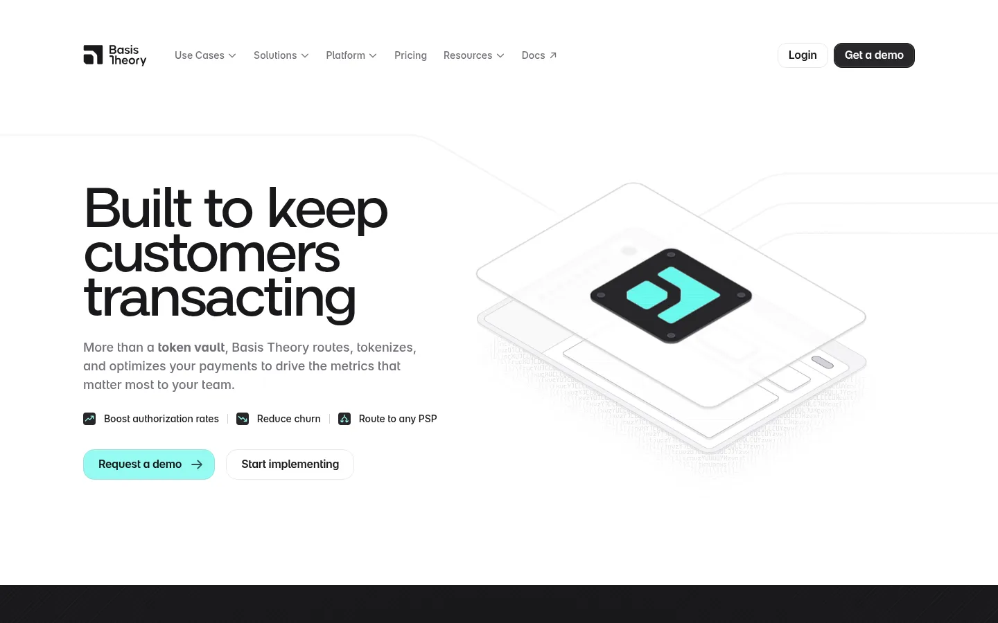
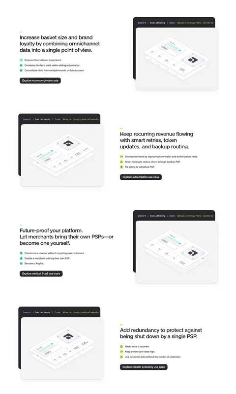
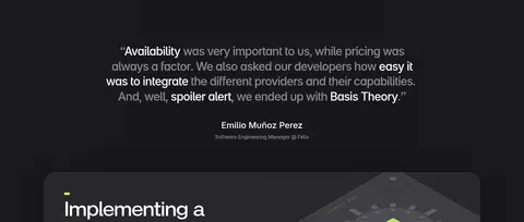
The visual system is anchored by white canvas and near-black typography, with near-black bands used selectively for merchant proof and a testimonial. Pale gray panels and cards separate content without relying on prominent borders. Mint and lime provide the strongest action cues; blue, lavender, and other measured accent tones appear sparingly and should not be promoted over the screenshot’s restrained palette. Large, compact sans-serif headlines establish hierarchy, while monospace labels and supporting copy give the page a developer-oriented texture. The hero aligns a stacked headline and concise benefits on the left with a floating payment-stack illustration on the right. Subsequent feature stories alternate text and product mockups, then transition into a dark implementation panel, a light security panel, and a dark closing CTA. Soft shadows, rounded card silhouettes, and generous whitespace keep the technical content approachable.
Dominant monospace labels, captions, and code-like UI details.
Aa 设计
Chivo Mono
网络字体 · 字重 400 · 占比 14%
免费替代:IBM Plex Mono
Monospaced body copy and supporting technical text.
Aa 设计
Inter
网络字体 · 字重 500 / 600 / 700 · 占比 10%
免费替代:Inter
Smaller interface headings and utility text.
Aa 设计
Neo Grotesk Medium
网络字体 · 字重 500 / 400 · 占比 2%
免费替代:Space Grotesk
Display headlines and major section headings.
角色
示例
字号
字重
行高
字距
特大标题
Oversized hero or campaign-style display headlines.
Basis Theory
80px
400
0.8
-0.04em
一级标题
Primary hero headline, stacked into short lines.
Basis Theory
64px
500
0.9
-0.03em
二级标题
Major feature and section headings.
Basis Theory
56px
400
1
-0.04em
三级标题
Feature-story headlines and prominent subheads.
Basis Theory
32px
500
1.2
-0.03em
四级标题
Compact panel and card headings.
The quick brown fox 敏捷的狐狸
18px
500
1.5
-0.006em
正文
Technical supporting paragraphs and explanatory copy.
The quick brown fox 敏捷的狐狸
14px
400
1.5
0
辅助文字
Eyebrows, certification labels, and compact metadata.
The quick brown fox 敏捷的狐狸
12px
400
1
0.02em
代码
Code samples and developer-oriented interface labels.
const style = 1;
12px
400
1
0.02em
间距与布局
基准单位 8px · 密度:紧凑
32px版块间距
8px元素间距
—卡片内边距
1200px内容最大宽度
1px
2px
4px
8px
10px
12px
16px
22px
24px
30px
32px
40px
56px
The page uses a centered, roughly 1200px maximum-width content frame and a compact spacing scale, but the composition feels airy because hero and feature sections have substantial open space. The hero is a two-column split with left-aligned copy and right-side illustration. Feature stories alternate media and text alignment down a single broad column; later panels sit as large rounded cards. Full-width dark bands interrupt the white sequence. Keep headings left-aligned except for the centered security statement.
圆角与层次
按钮 · 12px
卡片 · 16px
图片 · 9999px
链接 · 4px
inset · button, link
xl · card
xl · card
sm · card
Most page regions stay flat and white, while product mockups and certification cards lift through soft, diffuse shadows. Dark product surfaces layer behind light interface previews to suggest depth. Use rounded corners and subtle edge definition rather than visible heavy borders; reserve the inset highlight treatment for interactive buttons or links.
组件
下面的预览按实测的按钮、输入框、徽标、卡片样式重建(字体用替代字体)。
Primary demo button
Mint surface (#94faf0) with blue measured text (#0000ee), rounded shape, and a small right-arrow cue; shown prominently in the hero.
Developer docs button
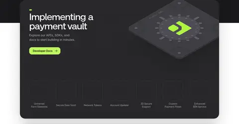
Lime accent (#bff660) button placed inside the dark implementation card for a clear developer action.
Hero benefit row
Three compact benefit labels with small dark square icons, aligned under the hero description and before the CTA pair.
Product mockup card
Layered dark code header behind a pale interface preview, with rounded corners and soft shadow; reused alongside alternating feature copy.
Dark proof band
Full-width near-black section with merchant logos and concise social proof, creating a strong break in the white page rhythm.
Security credentials
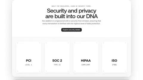
Light rounded panel with a centered security heading and a row of white PCI, SOC 2, HIPAA, and ISO cards.
Closing CTA panel
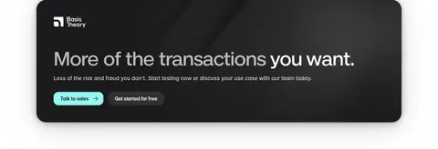
Large near-black rounded card with a headline, short reassurance, and contrasting mint and dark action buttons.
Imagery · Use clean, softly lit 3D-style product illustrations: floating payment cards, vault interfaces, and layered dashboard mockups. Keep them predominantly white and pale gray with fine outlines, restrained shadows, and small dark or mint interface marks. The illustrations sit beside copy rather than filling the canvas. Security credentials are presented as simple certification cards; avoid lifestyle photography or decorative imagery unrelated to payments.
Use near-black bands as deliberate section breaks.
Set large headlines in compact, tightly tracked sans serif.
Use monospace for technical labels and supporting copy.
Alternate feature text and product mockups.
Reserve mint and lime for clear interaction cues.
✕ 不该做
Do not turn the page into a uniformly dark interface.
Do not use bright accents as large background fields.
Do not add lifestyle photography in place of product mockups.
Do not crowd the hero or feature sections with extra decoration.
Do not use heavy borders where soft shadows and whitespace suffice.
Do not make supporting copy as prominent as the headline.
给 AI 的提示词
想快速出一个同风格的新页面,把这段话连同 DESIGN.md 一起发给 AI。
Build a fintech SaaS page with Basis Theory’s quiet, developer-oriented visual language. Use Gallery White (#ffffff) as the main canvas and Ink Black (#18181b) for strong text and selected full-width bands. Give the hero a left-aligned stacked headline, short explanatory copy, compact benefit row, and mint demo action in Mint Signal (#94faf0); place a layered payment-vault illustration alongside it. Use Neo Grotesk-style display headings and monospace supporting labels. Alternate feature copy with pale product mockups, then use a dark implementation panel, a light security-card panel, and a dark rounded closing CTA. Keep the layout broad, airy, and centered, with soft shadows, restrained rounded surfaces, and Citrus Green (#acd157) or Lime Flash (#bff660) as occasional technical or action accents. Avoid unnecessary ornament and photography.