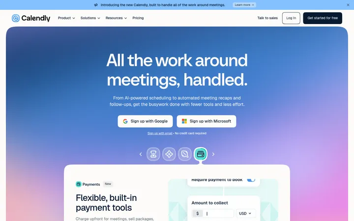
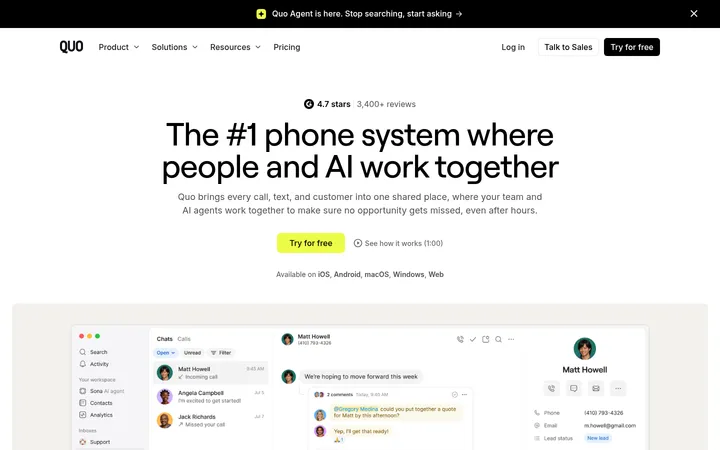
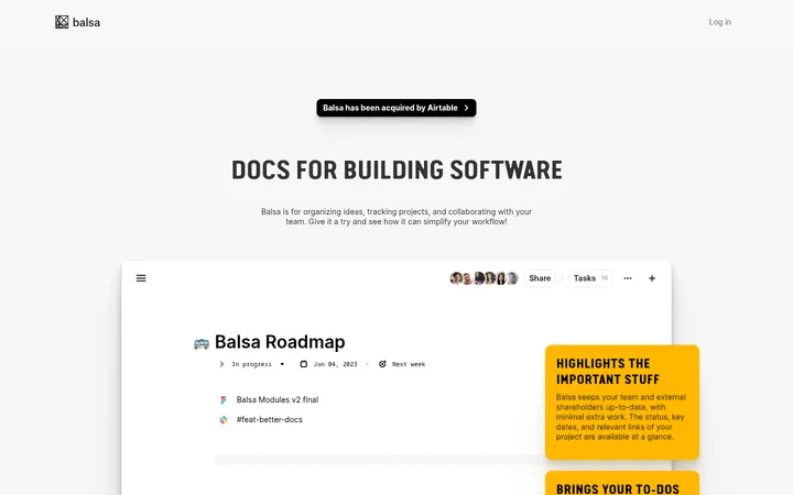
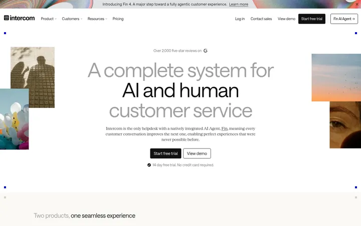
North star · Keep the page calm and grayscale, using bold Cal Sans headlines, white rounded product cards, and dark pill CTAs to make each next step obvious.
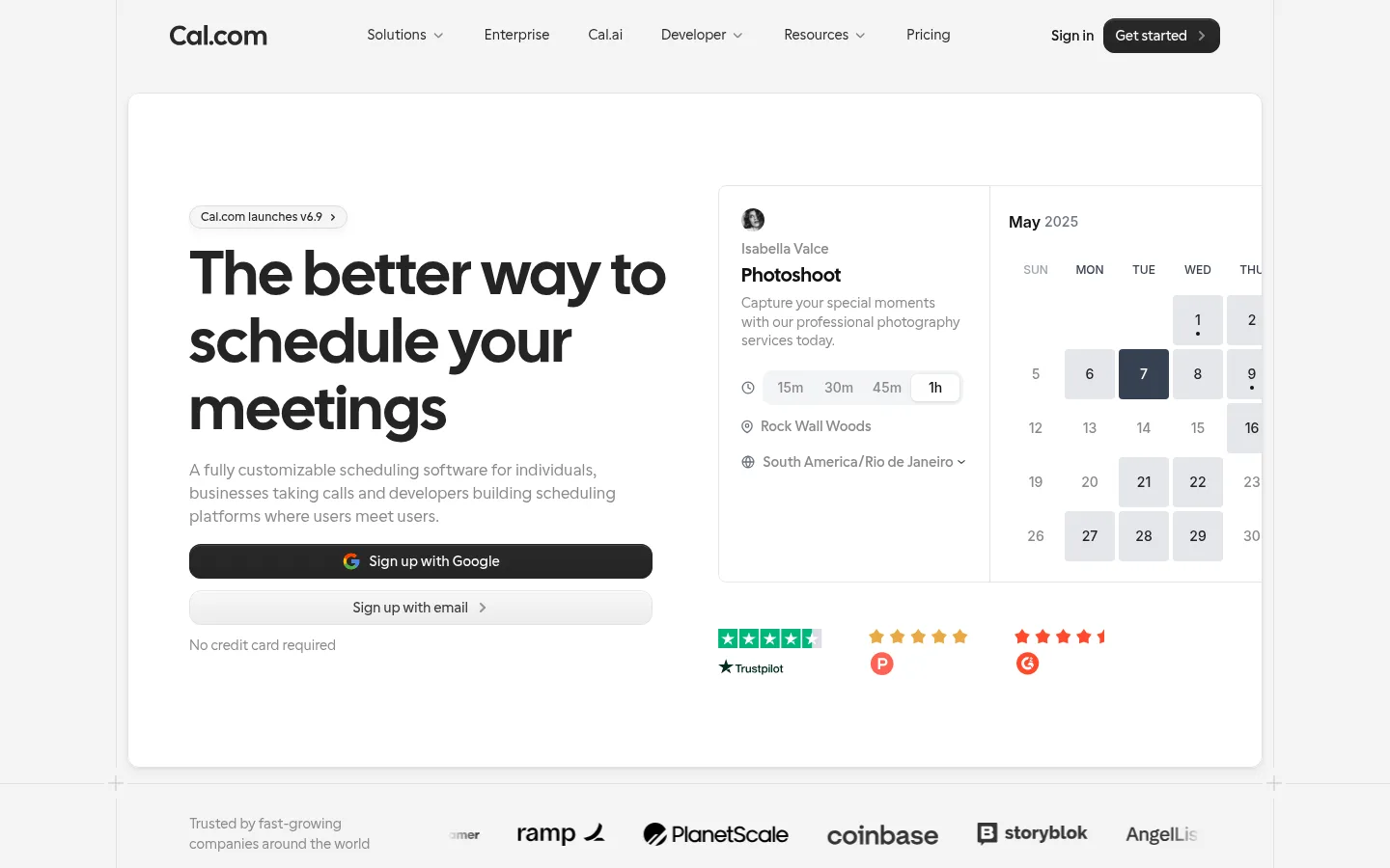
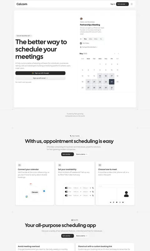
The page is built around a quiet grayscale palette: a #f4f4f4 canvas, white panels, charcoal headings, muted supporting text, and fine gray dividers. The blue accent is scarce in the first viewport, so the overall identity reads as monochrome rather than brightly branded. Cal Sans supplies the prominent, compact headlines, while a light UI sans keeps descriptive copy restrained. A centered, bounded content area organizes the long page into distinct bands, with a spacious hero and dense product examples balanced by generous transitions. White cards hold feature details, testimonials, and interface previews; their rounded corners and subtle shadows add separation without heavy outlines. Product imagery is mostly scheduling UI mockups and small integration marks, with bright calendar states and review badges appearing inside those examples rather than defining the site palette. Repeated dark pill CTAs provide strong, consistent action points.
配色
点色块复制色值。用途说明来自对页面的实测位置(背景、文字、描边、按钮)与截图判读。
品牌色
强调色
表层色
中性色
页面底色 · Quiet Mist表层 · Paper White主文字 · Cal Ink次要文字 · Soft Graphite弱文字 · Deep Label描边 · Fine Silver强调 · Booking Blue
Most body copy, captions, and links across the page.
Aa 设计
Cal Sans
网络字体 · 字重 600 / 400 · 占比 11%
免费替代:Plus Jakarta Sans
Display headlines and section headings.
Aa 设计
Matter Regular
网络字体 · 字重 400 · 占比 4%
免费替代:Inter
Small supporting UI text and occasional interface labels.
Aa 设计
Inter
网络字体 · 字重 500 / 400 / 600 · 占比 3%
免费替代:Inter
Secondary interface and embedded product-preview text.
Aa 设计
Matter SemiBold
网络字体 · 字重 400 · 占比 1%
免费替代:Inter
Emphasized interface labels and compact supporting text.
角色
示例
字号
字重
行高
字距
特大标题
Oversized hero headline that introduces the scheduling proposition.
Cal.com
64px
600
1.1
0
一级标题
Primary hero title and dominant page-level heading.
Cal.com
48px
600
1.1
0
二级标题
Section titles for features, testimonials, and FAQs.
The quick brown fox 敏捷的狐狸
24px
600
1.3
0
三级标题
Short card titles and nested feature headings.
The quick brown fox 敏捷的狐狸
20px
600
1
0.01em
正文
Main explanatory paragraphs and supporting product descriptions.
The quick brown fox 敏捷的狐狸
16px
300
1.5
0
辅助文字
Compact labels, helper copy, and small card metadata.
The quick brown fox 敏捷的狐狸
14px
300
1.4
0
链接
Text links and secondary actions, typically in restrained UI styling.
The quick brown fox 敏捷的狐狸
16px
300
1.5
0
间距与布局
基准单位 4px · 密度:适中
80px版块间距
10px元素间距
24px卡片内边距
1048px内容最大宽度
2px
4px
6px
8px
10px
12px
16px
20px
24px
48px
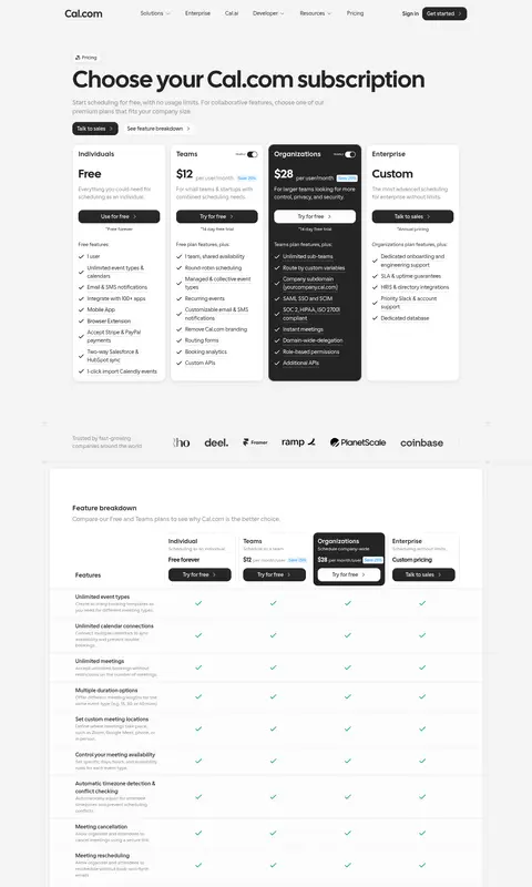
The page uses a centered, bounded content frame, with measured maximum width of 1048px. A spacious hero pairs left-aligned headline, copy, and signup actions with a booking-calendar product preview on the right. Below, full-width section bands alternate with contained white panels, card grids, and centered section introductions. The 80px section gap and comfortable density give the long homepage breathing room, while interface previews and review cards create locally denser areas. Headings and descriptions are predominantly left-aligned within content, with centered alignment for several feature and CTA introductions.
圆角与层次
按钮 · 7px
卡片 · 16px
图片 · 8px
链接 · 12px
inset · other
md · card
inset · link
md · other
Cards are separated mainly by white-on-pale-gray contrast, rounded corners, and subtle measured shadows. Fine gray borders and hairlines define panel edges without making the layout feel boxed in. Dark pill CTAs sit distinctly above the page, while the overall surface treatment remains soft rather than heavily layered.
组件
下面的预览按实测的按钮、输入框、徽标、卡片样式重建(字体用替代字体)。
Top navigation
Compact brand-led header with grouped text links, sign-in, and a dark rounded Get started action.
Hero booking panel
Large white rounded panel pairing a left-aligned headline, supporting copy, signup actions, and a calendar-booking preview.
Signup actions
Prominent dark pill for Google signup, paired with a lighter email option and subdued reassurance text.
How-it-works cards
Three white rounded cards explain calendar connection, availability, and meeting choice with compact UI previews.
Feature preview cards
White product cards combine short feature descriptions with embedded scheduling settings and booking interface examples.
Testimonial cards
Quote-led white cards use compact identity details and restrained borders or shadows to organize customer proof.
FAQ list
Stacked question rows use text-first presentation and simple expand/collapse indicators.
Imagery · Product imagery is primarily UI mockups: booking pages, calendars, availability controls, and small integration logos. The hero places a detailed scheduling preview beside the main message; later feature cards embed smaller cropped interface examples. Treatment stays bright and restrained, with white surfaces and pale dividers. Trust badges and colorful calendar selections appear within examples, not as the core brand palette.
Set primary headings in bold Cal Sans or a close substitute.
Place product explanations inside clean white cards.
Use dark pill-shaped CTAs for the main action.
Keep supporting copy muted and visually subordinate.
Treat bright colors inside calendar previews as product content.
✕ 不该做
Do not make vivid blue the dominant page color.
Do not crowd the hero with decorative imagery.
Do not add heavy borders around every content block.
Do not let testimonial cards overpower the product story.
Do not use oversized shadows or glossy effects.
Do not invent additional palette values or measured spacing.
给 AI 的提示词
想快速出一个同风格的新页面,把这段话连同 DESIGN.md 一起发给 AI。
Build a new Cal.com-style page with a quiet, product-led SaaS visual system. Use Quiet Mist (#f4f4f4) for the page canvas, Paper White (#ffffff) for primary cards, Cal Ink (#242424) for headlines and dark CTAs, Soft Graphite (#898989) for supporting copy, and Fine Silver (#d3d3d3) for subtle dividers. Keep Booking Blue (#0099ff) sparse. Use a bold geometric sans for headlines and a lighter sans for body text. Organize content in a centered, bounded frame with generous section breaks, a clear hero, and white rounded cards for product details. Show scheduling UI previews as functional illustrations, not decorative hero art. Favor subtle elevation and consistent dark pill actions; keep the page airy, readable, and grayscale-led.