North star · Keep the interface legible and restrained against immersive, continuous sky-and-landscape scenes.
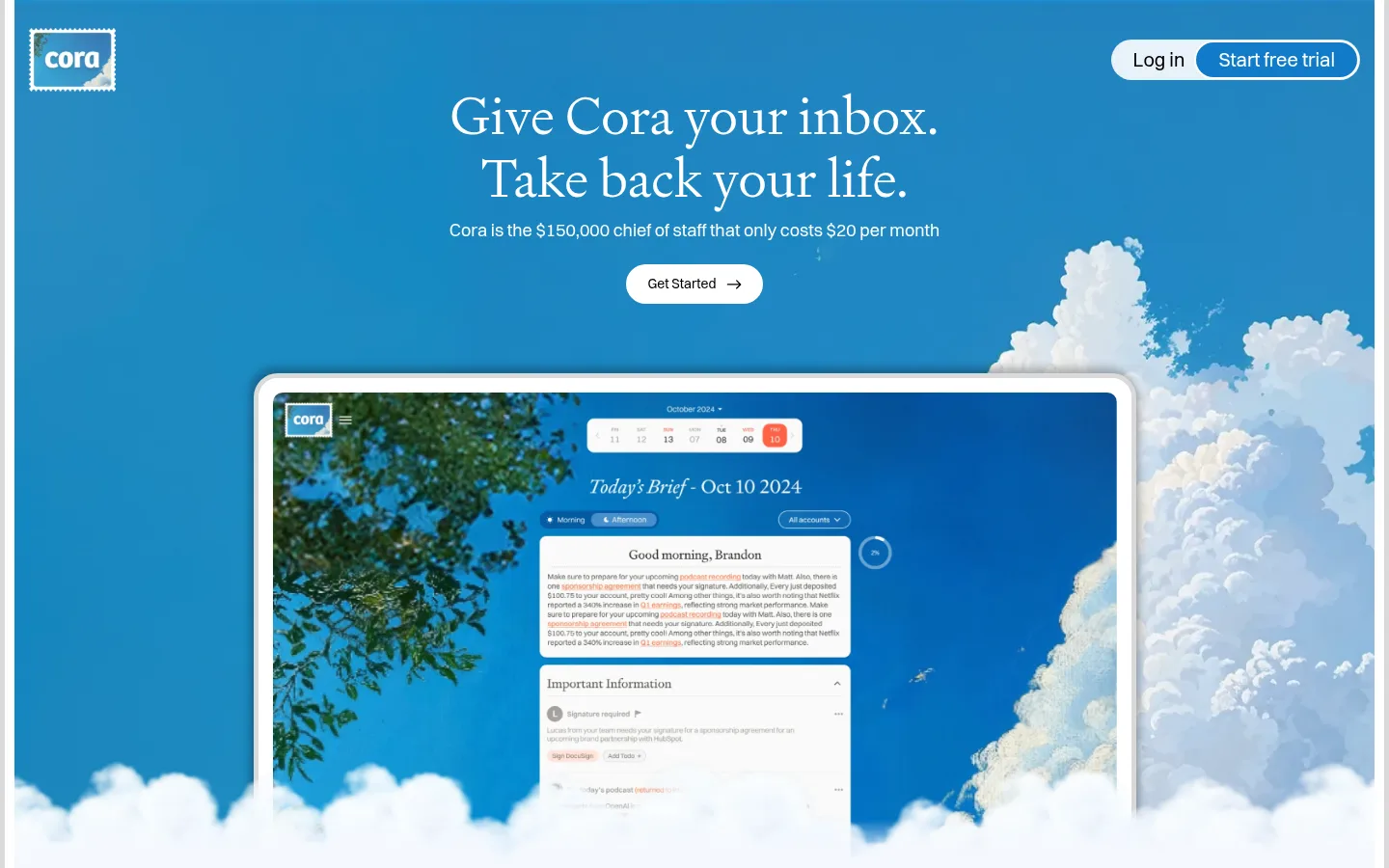
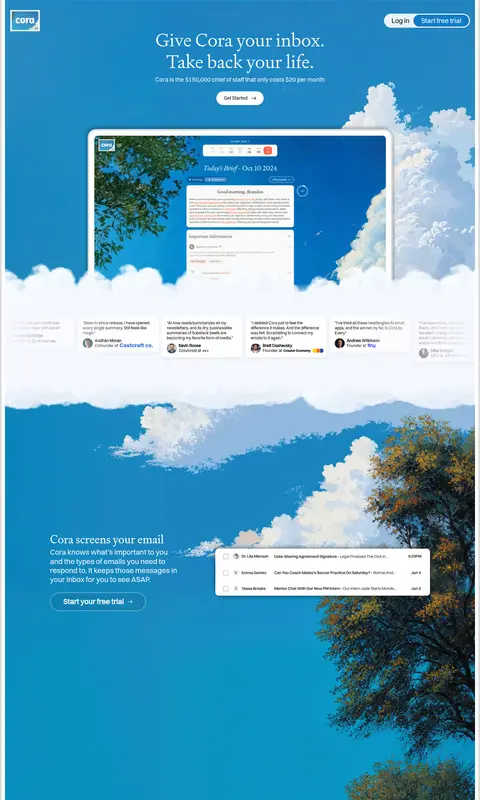
The visual identity is built around a saturated blue canvas (#117bc8) that carries the page from the hero through the feature story, giving the long scroll the feeling of one open sky. White is the main contrast for the serif headline, body copy, navigation, and pill-shaped calls to action; black and pale grays are mostly contained in product and pricing surfaces. Signifier’s light, editorial serif gives major statements a human tone, while Switzer handles compact supporting copy and controls. The layout is spacious and centered at the top, then shifts into alternating text-and-product compositions surrounded by broad scenic backgrounds. Cloud imagery softens the interface and visually connects product demonstrations to the sky-colored canvas. Later, a golden field scene introduces a warm photographic-feeling counterpoint around learning, pricing, and FAQ content. Keep UI cards crisp and readable, and let the atmospheric imagery provide the richness rather than adding decorative interface clutter.
Major section headings throughout the long-form story.
Cora
36px
400
1.2
0
三级标题
Feature and content-group headings.
Cora
34px
400
1.02
0
四级标题
Smaller card or subsection headings.
The quick brown fox 敏捷的狐狸
24px
400
1.02
0
正文
Feature explanations and primary supporting copy.
The quick brown fox 敏捷的狐狸
14px
600
1.24
0
辅助文字
Compact labels and fine-print details.
The quick brown fox 敏捷的狐狸
12px
500
1.24
0
按钮
CTA and other action labels.
The quick brown fox 敏捷的狐狸
14px
600
1.24
0
链接
Small navigation and inline links.
The quick brown fox 敏捷的狐狸
12px
400
1.24
0
间距与布局
基准单位 2px · 密度:宽松
100px版块间距
8px元素间距
14px卡片内边距
1410px内容最大宽度
4px
6px
8px
10px
11px
12px
14px
15px
16px
20px
The page uses a broad, spacious canvas with a measured maximum content width of 1410px. The hero centers its headline, subtitle, and primary action, with navigation anchored at the top and a large product preview below. Further down, feature copy and interface previews sit within expansive scenic sections; centered content and split alignments alternate rather than relying on a dense grid. The measured section gap is 100px, with an 8px element gap and 14px card padding. Maintain generous breathing room and keep small controls distinct against the background.
圆角与层次
按钮 · 9999px
卡片 · 12px
图片 · 50%
导航 · 9999px
md · card
md · card
sm · other
md · card, section
Most of the page feels open and atmospheric rather than built from stacked panels. White cards and product previews use clear surface contrast, rounded corners, and soft shadows; the larger display has a visible pale frame. Use thin, light outlines on pill controls, and reserve stronger layering for product mockups and pricing surfaces.
组件
下面的预览按实测的按钮、输入框、徽标、卡片样式重建(字体用替代字体)。
Hero navigation
Place the compact brand mark at the upper left and a white pill-style login/trial group at the upper right.
Centered hero
Stack a large Signifier headline, short Switzer value statement, and white rounded primary action over the blue sky canvas.
Product preview
Show the inbox briefing interface inside a prominent pale-framed, rounded display, partially softened by cloud imagery.
Feature callouts
Pair concise white feature copy and a small outlined pill CTA with floating email-interface previews across open scenic space.
Testimonial strip
Set compact white quote cards in a horizontal band that contrasts with the blue background.
Pricing cards
Use high-contrast white plan surfaces with dark text and prominent black trial buttons, surrounded by the warm field scene.
FAQ list
Stack dark, compact question rows over the golden scenic background with clear disclosure affordances.
Imagery · Scenic cloud and sky imagery frames the product demonstration, then gives way to tree-lined sky and a broad golden field later in the page. Product previews appear as crisp, framed interface compositions within the landscape rather than as isolated catalog photography. Let natural clouds overlap or soften section transitions, while keeping text and app surfaces sharply legible. The scenery is an important part of the visual identity, but its blue and gold tones belong to imagery, not extra interface palette colors.
Keep interface previews crisp against atmospheric backgrounds.
✕ 不该做
Do not replace the continuous blue story with unrelated color bands.
Do not let landscape imagery reduce text contrast.
Do not crowd the hero with secondary interface elements.
Do not use heavy decorative borders across every card.
Do not treat image-only gold and green tones as UI palette colors.
Do not make supporting copy compete with the serif headlines.
给 AI 的提示词
想快速出一个同风格的新页面,把这段话连同 DESIGN.md 一起发给 AI。
Build a new page in Cora’s visual style: use Cora Sky (#117bc8) as the expansive primary canvas, with Cloud White (#ffffff) for headlines, controls, and clean surfaces. Set major statements in a light editorial serif similar to Signifier, and use a Switzer-like sans serif for navigation, descriptions, and buttons. Keep the top-level message centered and spacious, then let feature sections shift between concise copy and crisp product previews. Use clouds, sky, or landscape imagery as atmospheric framing, not as a source for extra UI colors. Separate functional content with white cards, restrained pale borders, and soft shadows; use Action Blue (#1073bb) for a primary filled trial CTA and Deep Harbor (#09436c) only for secondary actions. Preserve generous whitespace and strong contrast.