Cursor 首页以温暖的浅色底和克制的字体搭配大幅产品界面演示,整体清爽而有编辑感。功能介绍、客户评价与动态内容交替呈现,让页面更像一份精心编排的软件刊物,而非传统销售落地页。
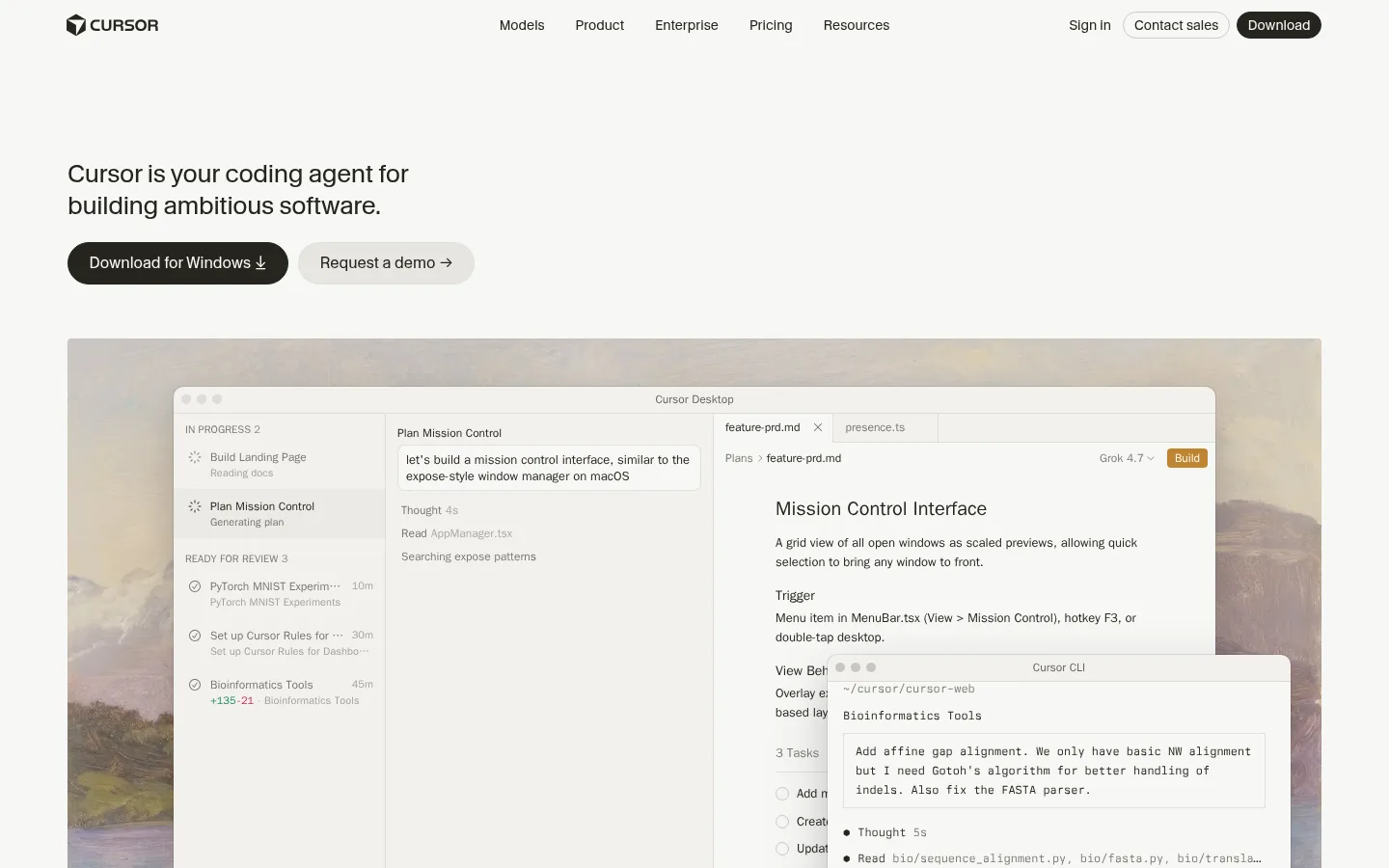
North star · Keep the page quiet and editorial so warm neutrals, concise copy, and large, believable product interfaces do the persuasive work.
The visual system is built on a warm, near-white canvas (#f7f7f4) and soft elevated panels (#f2f1ed), with deep brown-black text (#26251e) supplying clear contrast. Muted grays carry secondary copy and hairlines, while orange (#f54e00) marks links and selective actions rather than filling large areas. The page uses CursorGothic for approachable, unshowy headings and body copy; Berkeley Mono introduces a technical voice in captions and code. System UI appears in interface details, with EB Garamond used sparingly in measured content. A wide, centered content frame supports alternating text-and-demo feature rows, broad product imagery, testimonial columns, and compact content lists. Generous section pauses keep the long page calm and legible. Product screenshots and real-world photography provide most visual interest; shadows and rounded corners are reserved for interface mockups and selected cards, while the surrounding structure stays flat and understated.
配色 点色块复制色值。用途说明来自对页面的实测位置(背景、文字、描边、按钮)与截图判读。
品牌色
Soft Ink
#26251e
Primary headings, body copy, navigation, dark buttons, and interface text.
Gallery Canvas
#f7f7f4
Dominant page background, maintaining a warm off-white field behind every section.
强调色
Signal Orange
#f54e00
Text links and small warning or emphasis details; not a large-area background.
Ochre Action
#c08532
Accent-colored actions inside interactive product-demo interfaces.
表层色
Warm Panel
#f2f1ed
Main elevated panel and code/media surface; also forms the contrasting footer band.
Putty Surface
#d9d5cf
Occasional warm support surface and footer or control detail.
Cool UI Gray
#b6b9be
Low-frequency cool gray found in interface or media details, not the core page palette.
中性色
Quiet Stone
#787771
Muted supporting text, footer details, labels, and occasional interface badges.
Soft Hairline
#dddcd8
Fine borders around cards, controls, and subtle divisions.
Mist Divider
#e2e2de
Pale borders and badge outlines, mostly in product UI and compact controls.
Pale Divider
#e7e7e3
Subtle separators and light interface details where a border is barely visible.
Muted Ash
#84837e
Secondary text and subdued link labels.
Graphite Gray
#70706f
Small amounts of subdued footer and secondary text.
Dusty Gray
#a09f9a
Occasional low-emphasis text detail.
Stone Gray
#8c8b85
Occasional muted text detail, chiefly supporting interface or footer content.
功能色
Forest Green
#34785c
Rare success-colored button or interface state; not a defining page-wide brand color.
文字 背景 对比度 WCAG #26251e Soft Ink#f7f7f4 Gallery Canvas14.33:1 AAA #26251e Soft Ink#f2f1ed Warm Panel13.6:1 AAA #26251e Soft Ink#d9d5cf Putty Surface10.52:1 AAA #26251e Soft Ink#b6b9be Cool UI Gray7.81:1 AAA #787771 Quiet Stone#f7f7f4 Gallery Canvas4.18:1 AA-large #787771 Quiet Stone#f2f1ed Warm Panel3.97:1 AA-large
字体 字号阶梯:Major Third(比例约 1.275,正文 16px)。示例用免费替代字体渲染,数值为实测。
Aa 设计
CursorGothic 网络字体 · 字重 400 / 500 · 占比 44%
免费替代:Inter
Headings, body, navigation, links, and buttons
Aa 设计
system-ui 系统字体 · 字重 400 / 500 / 700 / 600 / 510 · 占比 31%
免费替代:Inter
Product UI details and some compact controls
Aa 设计
berkeleyMono 网络字体 · 字重 400 / 500 / 700 · 占比 17%
免费替代:IBM Plex Mono
Code and small technical captions
Aa 设计
EB Garamond 网络字体 · 字重 400 / 500 · 占比 5%
免费替代:EB Garamond
Occasional serif text inside content or product demonstrations
Aa 设计
Lato 网络字体 · 字重 400 / 600 · 占比 3%
免费替代:Lato
Minor measured webfont usage
角色 示例 字号 字重 行高 字距 一级标题 Hero statement introducing Cursor as a coding agent.
The quick brown fox 敏捷的狐狸
26px 400 1.25 -0.012em 二级标题 Feature, testimonial, and section headings.
The quick brown fox 敏捷的狐狸
22px 400 1.3 -0.005em 正文 Feature explanations, testimonials, and general page copy.
The quick brown fox 敏捷的狐狸
16px 400 1.5 0.005em 辅助文字 Compact metadata, dates, and technical labels.
The quick brown fox 敏捷的狐狸
12px 400 1.63 0 按钮 Download, demo, and product-interface actions.
The quick brown fox 敏捷的狐狸
14px 400 1.5 0 导航 Header navigation and footer navigation links.
The quick brown fox 敏捷的狐狸
14px 400 1.5 0.01em 链接 Inline calls to action and editorial content links.
The quick brown fox 敏捷的狐狸
16px 400 1.5 0.005em 代码 Code snippets and command-line interface text.
const style = 1;
12px 400 1.63 0
间距与布局 基准单位 2px · 密度:适中
67px 版块间距
8px 元素间距
17px 卡片内边距
1300px 内容最大宽度
1px
2px
3px
4px
5px
6px
8px
10px
12px
13px
15px
16px
18px
20px
Use a centered, wide page frame with a measured maximum width of 1300px. The hero begins with left-aligned copy and actions, followed by a broad product demo. Feature sections alternate copy and interface media across two columns; later blocks use three-column testimonials and feature cards, then compact four-column content lists. Keep alignment calm and spacing comfortable, with substantial section breathing room and a single-column centered closing CTA. The footer shifts to a warm surface band.
圆角与层次 xl · card
hairline · other
md · other, card
xl · card
Keep most page structure flat, using fine gray borders for quiet separation. Reserve broad, soft shadows and rounded corners for large product-window mockups and selected media cards. Use light panel surfaces to distinguish demos and testimonial cards without adding heavy outlines or layered effects.
组件 下面的预览按实测的按钮、输入框、徽标、卡片样式重建(字体用替代字体)。
Header navigation Simple wordmark at left, centered product links, and compact sign-in, contact, and download actions; typography is CursorGothic at measured nav sizing.
Hero actions Dark pill-shaped primary download action beside a pale secondary demo action, below a concise left-aligned heading.
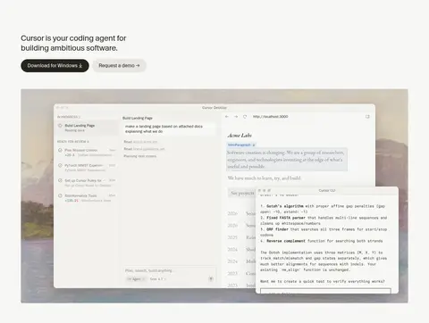
Product demo frame Large, rounded interface mockup combining agent task lists, editor or browser panels, and realistic content; use a soft shadow rather than a heavy border.
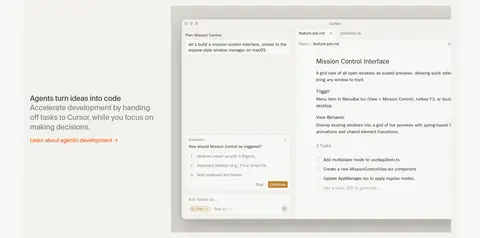
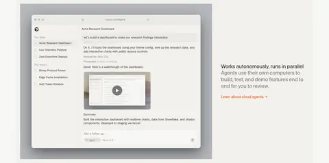
Feature split Alternating two-column composition with concise explanatory text and a large product screenshot or interactive demo.
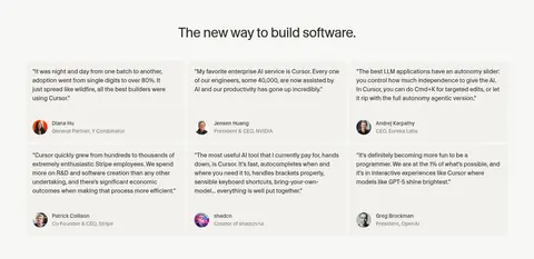
Testimonial card Warm surface card with compact quote copy and a small portrait-and-attribution row; maintain a subtle edge and quiet visual hierarchy.
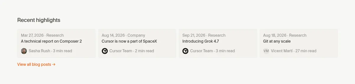
Editorial content row Compact date or category metadata above a readable title and author line, with thin dividers or soft surface grouping.
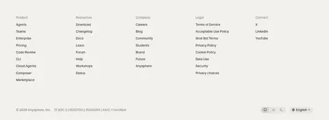
Footer link columns Warm panel band with multiple compact columns of categorized navigation links and subdued legal details.
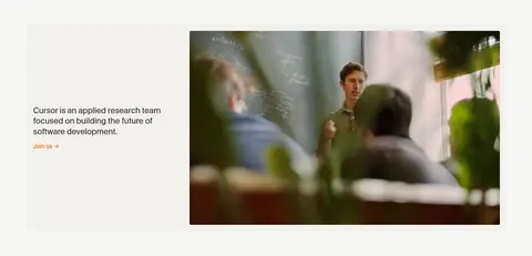
Imagery · Treat product UI as the main visual asset: show credible application windows, code, browser previews, and agent workflows in large, carefully framed demonstrations. Use screenshots and interface mockups with restrained shadows and soft corner rounding. Add limited photographic imagery for research or customer context, preserving its natural color. Avoid decorative illustration or abstract graphics that compete with the product.
页面版块 共 13 个版块,按页面从上到下排列,每个都标了类型、布局和交互套路。
该做与不该做 ✓ 该做 Use #f7f7f4 as the dominant page canvas. Set primary text and dark actions in #26251e. Use #f2f1ed for elevated cards and demo surfaces. Reserve #f54e00 for links and small emphasis. Give product interfaces the largest visual footprint. Alternate feature copy and interface demonstrations. Keep long-page sections spacious and easy to scan. ✕ 不该做 Do not introduce saturated backgrounds across large page areas. Do not use orange as the primary CTA fill by default. Do not replace product evidence with decorative illustration. Do not put a heavy border around every section or card. Do not center every heading; preserve varied left alignment. Do not let monospaced type dominate headings or body copy. 给 AI 的提示词 想快速出一个同风格的新页面,把这段话连同 DESIGN.md 一起发给 AI。
复制 Build a new Cursor-style page with a warm editorial software aesthetic. Use Gallery Canvas (#f7f7f4) for the main background, Soft Ink (#26251e) for copy and dark actions, and Warm Panel (#f2f1ed) for product demos and selected cards. Apply Signal Orange (#f54e00) sparingly to inline links. Set headings and body in a clean CursorGothic-like sans serif; use a restrained monospaced face for code and metadata. Create a wide centered layout, alternating concise text blocks with large, believable product-interface mockups. Keep most sections flat, adding soft shadows only to interface windows. Use comfortable vertical rhythm, concise copy, thin neutral dividers, and varied left-aligned compositions. Finish with a simple centered CTA and a muted warm footer band. Avoid loud gradients, ornamental graphics, and overly dense UI.
DESIGN.md Tailwind v4 CSS 变量 Design Tokens
---
title: "Cursor design system"
variant: extended
source: https://cursor.com/
captured_at: 2026-10-12
theme: light
industry: ai
generator: Design DNA (https://four.wiralomi.com/style/cursor-com)
ai_generated: true
ai_label: "本文件由 AI 辅助生成:数值取自公开网页的实测样式,命名、用途说明与建议为模型解读。商标归原所有者。 / AI-assisted content"
---
# Cursor · Design System
> Warm editorial minimalism for ambitious software builders
**Theme:** light · **Industry:** ai · **Source:** https://cursor.com/ · **Captured:** 2026-10-12 (1440×900 desktop)
_AI-assisted content: values are measured from the public page at capture time; names, roles and guidance are model-written interpretations. Trademarks belong to their owners._
Cursor’s homepage pairs a warm, nearly white canvas with restrained typography and expansive product-interface demos. Alternating feature compositions, proof points, and editorial content make the page feel like a thoughtful software publication rather than a conventional sales funnel.
## North star
Keep the page quiet and editorial so warm neutrals, concise copy, and large, believable product interfaces do the persuasive work.
## Overview
The visual system is built on a warm, near-white canvas (## Colors
| Name | Hex | Token | Group | Role |
|---|---|---|---|---|
| Warm Panel | ` | `--color-warm-panel` | surface | Main elevated panel and code/media surface; also forms the contrasting footer band. |
| Soft Ink | ` | `--color-soft-ink` | brand | Primary headings, body copy, navigation, dark buttons, and interface text. |
| Gallery Canvas | ` | `--color-gallery-canvas` | brand | Dominant page background, maintaining a warm off-white field behind every section. |
| Signal Orange | ` | `--color-signal-orange` | accent | Text links and small warning or emphasis details; not a large-area background. |
| Forest Green | ` | `--color-forest-green` | semantic | Rare success-colored button or interface state; not a defining page-wide brand color. |
| Quiet Stone | ` | `--color-quiet-stone` | neutral | Muted supporting text, footer details, labels, and occasional interface badges. |
| Soft Hairline | ` | `--color-soft-hairline` | neutral | Fine borders around cards, controls, and subtle divisions. |
| Ochre Action | ` | `--color-ochre-action` | accent | Accent-colored actions inside interactive product-demo interfaces. |
| Mist Divider | ` | `--color-mist-divider` | neutral | Pale borders and badge outlines, mostly in product UI and compact controls. |
| Pale Divider | ` | `--color-pale-divider` | neutral | Subtle separators and light interface details where a border is barely visible. |
| Muted Ash | ` | `--color-muted-ash` | neutral | Secondary text and subdued link labels. |
| Putty Surface | ` | `--color-putty-surface` | surface | Occasional warm support surface and footer or control detail. |
| Cool UI Gray | ` | `--color-cool-ui-gray` | surface | Low-frequency cool gray found in interface or media details, not the core page palette. |
| Graphite Gray | ` | `--color-graphite-gray` | neutral | Small amounts of subdued footer and secondary text. |
| Dusty Gray | ` | `--color-dusty-gray` | neutral | Occasional low-emphasis text detail. |
| Stone Gray | ` | `--color-stone-gray` | neutral | Occasional muted text detail, chiefly supporting interface or footer content. |
### Semantic aliases
`--color-canvas` → ` (Gallery Canvas) · `--color-surface` → ` (Warm Panel) · `--color-surface-2` → ` (Putty Surface) · `--color-surface-3` → ` (Cool UI Gray) · `--color-text` → ` (Soft Ink) · `--color-text-muted` → ` (Quiet Stone) · `--color-text-subtle` → ` (Muted Ash) · `--color-border` → ` (Soft Hairline) · `--color-accent` → ` (Signal Orange) · `--color-accent-2` → ` (Ochre Action) · `--color-accent-3` → ` (Forest Green) · `--color-on-accent` → `
### Contrast (WCAG 2.x)
| Text | Background | Ratio | Level |
|---|---|---|---|
| ` | ` | 14.33:1 | AAA |
| ` | ` | 13.6:1 | AAA |
| ` | ` | 10.52:1 | AAA |
| ` | ` | 7.81:1 | AAA |
| ` | ` | 4.18:1 | AA-large |
| ` | ` | 3.97:1 | AA-large |
| ` | ` | 3.07:1 | AA-large |
| ` | ` | 2.28:1 | fail |
| ` | ` | 3.54:1 | AA-large |
| ` | ` | 3.36:1 | AA-large |
### Gradients
- `linear-gradient(oklab(0.263084 -0.00230259 0.0124794 / 0.05) 0%, oklab(0.263084 -0.00230259 0.0124794 / 0.05) 100%), linear-gradient(rgb(242, 241, 237) 0%, rgb(242, 241, 237) 100%)`
- `linear-gradient(to top, color(srgb 0.988235 0.988235 0.988235 / 0.92) 0%, color(srgb 0.988235 0.988235 0.988235 / 0.62) 36%, color(srgb 0.988235 0.988235 0.988235 / 0.22) 68%, rgba(0, 0, 0, 0) 100%)`
- `linear-gradient(to top in oklab, rgb(242, 241, 237) 0%, rgba(0, 0, 0, 0) 100%)`
- `linear-gradient(in oklab, rgb(242, 241, 237) 0%, rgba(0, 0, 0, 0) 100%)`
## Typography
| Family | Token | Source | Weights | Role | Free substitute |
|---|---|---|---|---|---|
| CursorGothic | `--font-body` | webfont | 400, 500 | Headings, body, navigation, links, and buttons | Inter |
| system-ui | `--font-system-ui` | system | 400, 500, 700, 600, 510 | Product UI details and some compact controls | Inter |
| berkeleyMono | `--font-mono` | webfont | 400, 500, 700 | Code and small technical captions | IBM Plex Mono |
| EB Garamond | `--font-eb-garamond` | webfont | 400, 500 | Occasional serif text inside content or product demonstrations | EB Garamond |
| Lato | `--font-lato` | webfont | 400, 600 | Minor measured webfont usage | Lato |
- **CursorGothic:** Use regular weight as the default, with subtle negative tracking in headings and natural sentence case.
- **system-ui:** Native-feeling interface text; measured weights range from regular to bold.
- **berkeleyMono:** Monospaced, compact technical labels; keep case and formatting true to code.
- **EB Garamond:** Use sparingly for interface or editorial details, not as the main site voice.
- **Lato:** Low-share supporting font; avoid letting it override the dominant CursorGothic style.
### Type scale — Major Third (ratio ≈ 1.275, base 16px)
| Role | Size | Weight | Line height | Letter spacing | Case | Family | Used for |
|---|---|---|---|---|---|---|---|
| h1 | 26px | 400 | 1.25 | -0.012em | — | CursorGothic | Hero statement introducing Cursor as a coding agent. |
| h2 | 22px | 400 | 1.3 | -0.005em | — | CursorGothic | Feature, testimonial, and section headings. |
| body | 16px | 400 | 1.5 | 0.005em | — | CursorGothic | Feature explanations, testimonials, and general page copy. |
| caption | 12px | 400 | 1.63 | 0 | — | berkeleyMono | Compact metadata, dates, and technical labels. |
| button | 14px | 400 | 1.5 | 0 | — | CursorGothic | Download, demo, and product-interface actions. |
| nav | 14px | 400 | 1.5 | 0.01em | — | CursorGothic | Header navigation and footer navigation links. |
| link | 16px | 400 | 1.5 | 0.005em | — | CursorGothic | Inline calls to action and editorial content links. |
| code | 12px | 400 | 1.63 | 0 | — | berkeleyMono | Code snippets and command-line interface text. |
OpenType features in use: `"cswh"` , `"ss09"` , `"ss08"` , `"case"` .
## Spacing & layout
- Base unit **2px**, density **comfortable**.
- Scale (most used values): 1, 2, 3, 4, 5, 6, 8, 10, 12, 13, 15, 16, 18, 20 px.
- Section rhythm 67px · element gap 8px · card padding 17px · max content width 1300px.
Use a centered, wide page frame with a measured maximum width of 1300px. The hero begins with left-aligned copy and actions, followed by a broad product demo. Feature sections alternate copy and interface media across two columns; later blocks use three-column testimonials and feature cards, then compact four-column content lists. Keep alignment calm and spacing comfortable, with substantial section breathing room and a single-column centered closing CTA. The footer shifts to a warm surface band.
## Shape & elevation
- Radius: button `4px` · card `4px` · media `50%` · badge `4px` · nav `9999px` · link `4px` · xs `2px` · sm `3px` · md `4px` · lg `8px` · xl `10px` · 2xl `12px` · pill `9999px`
- Shadow `xl` (card): `rgba(0, 0, 0, 0.14) 0px 28px 70px 0px, rgba(0, 0, 0, 0.1) 0px 14px 32px 0px, oklab(0.263084 -0.00230259 0.0124794 / 0.1) 0px 0px 0px 1px`
- Shadow `hairline` (other): `rgb(252, 252, 252) 0px 0px 0px 2px`
- Shadow `md` (other, card): `rgba(0, 0, 0, 0) 0px 0px 0px 0px, rgba(0, 0, 0, 0) 0px 0px 0px 0px, rgba(0, 0, 0, 0) 0px 0px 0px 0px, rgba(0, 0, 0, 0) 0px 0px 0px 0px, rgba(0, 0, 0, 0.1) 0px 10px 15px -3px, rgba(0, 0, 0, 0.1) 0px 4p`
- Shadow `xl-2` (card): `rgba(0, 0, 0, 0.3) 0px 22px 70px 4px, rgba(0, 0, 0, 0.15) 0px 0px 0px 0.5px`
- Shadow `xl-3` (card): `rgba(0, 0, 0, 0.25) 0px 25px 50px -12px, rgba(0, 0, 0, 0.15) 0px 12px 24px -8px, oklab(0.263084 -0.00230259 0.0124794 / 0.1) 0px 0px 0px 0.5px`
- Shadow `lg` (card): `rgba(0, 0, 0, 0.35) 0px 8px 30px 0px, rgba(0, 0, 0, 0.15) 0px 0px 0px 0.5px`
- Motion: standard transition `0.15s cubic-bezier(0.4, 0, 0.2, 1)` on interactive elements.
Keep most page structure flat, using fine gray borders for quiet separation. Reserve broad, soft shadows and rounded corners for large product-window mockups and selected media cards. Use light panel surfaces to distinguish demos and testimonial cards without adding heavy outlines or layered effects.
## Imagery
Treat product UI as the main visual asset: show credible application windows, code, browser previews, and agent workflows in large, carefully framed demonstrations. Use screenshots and interface mockups with restrained shadows and soft corner rounding. Add limited photographic imagery for research or customer context, preserving its natural color. Avoid decorative illustration or abstract graphics that compete with the product.
## Components
### Header navigation
Simple wordmark at left, centered product links, and compact sign-in, contact, and download actions; typography is CursorGothic at measured nav sizing.
### Hero actions
Dark pill-shaped primary download action beside a pale secondary demo action, below a concise left-aligned heading.
### Product demo frame
Large, rounded interface mockup combining agent task lists, editor or browser panels, and realistic content; use a soft shadow rather than a heavy border.
### Feature split
Alternating two-column composition with concise explanatory text and a large product screenshot or interactive demo.
### Testimonial card
Warm surface card with compact quote copy and a small portrait-and-attribution row; maintain a subtle edge and quiet visual hierarchy.
### Editorial content row
Compact date or category metadata above a readable title and author line, with thin dividers or soft surface grouping.
### Footer link columns
Warm panel band with multiple compact columns of categorized navigation links and subdued legal details.
### Measured component styles
- **Primary button** (“Build”): background ## Do
- Use ## Don't
- Do not introduce saturated backgrounds across large page areas.
- Do not use orange as the primary CTA fill by default.
- Do not replace product evidence with decorative illustration.
- Do not put a heavy border around every section or card.
- Do not center every heading; preserve varied left alignment.
- Do not let monospaced type dominate headings or body copy.
## Agent prompt
Build a new Cursor-style page with a warm editorial software aesthetic. Use Gallery Canvas (## Page sections (top to bottom)
| # | Type | Layout | UX patterns | UI patterns |
|---|---|---|---|---|
| 1 | hero | Left-aligned headline and two actions above a broad, full-width product demo. | Download primary action, Request-demo secondary action, Interactive product demo | Compact header navigation, Large interface mockup, Dark and pale pill actions |
| 2 | logo-cloud | Centered heading above a single horizontal row of customer logos. | Social proof | Monochrome logo row, Centered heading |
| 3 | feature-split | Two-column feature copy paired with a large interactive mission-control interface. | Feature explanation, Learn-more link, Interactive demo | Text-and-demo split, Product UI card |
| 4 | feature-split | Large agent dashboard on the left, explanatory text on the right. | Autonomous workflow explanation, Cloud-agent link | Dashboard screenshot, Alternating text and media |
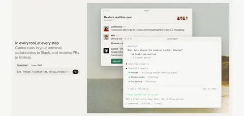
| 5 | feature-split | Left-side heading and command snippet beside product interface imagery. | Tool-compatibility explanation, Install-command cue, Feature anchor | Code caption, Layered product windows |
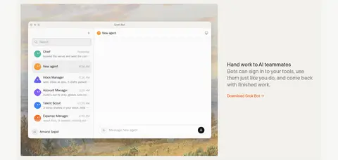
| 6 | feature-split | Product interface image paired with brief explanatory copy and an action link. | Explain delegated tasks, Download link | Large app mockup, Text-and-image split |
| 7 | testimonials | Centered section heading above three columns of testimonial content. | Customer proof, Named attribution | Three-column cards, Compact portrait and role |
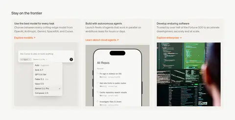
| 8 | feature-grid | Three-column feature cards with text, links, and product imagery. | Explore models, Learn about agents, Explore enterprise | Three-column grid, Image-led cards, Small orange links |
| 9 | content-feed | Section title above four compact, horizontally arranged update entries. | Scan dated updates, Open changelog | Four-column list, Small metadata, Text link |
| 10 | team | Brief left-aligned mission copy paired with a wide team photograph. | Careers call to action | Two-column split, Natural photography |
| 11 | content-feed | Heading above a four-column row of recent editorial highlights. | Browse recent articles, Open blog | Date and category labels, Compact title and author |
| 12 | cta | Centered closing headline with one prominent download action. | Download action | Large centered heading, Dark pill button |
| 13 | footer | Warm full-width footer band with five categorized link columns and a compact legal row. | Browse categorized resources, Access legal and language options | Multi-column link lists, Muted legal details, Pale footer surface |
## Source CSS custom properties (selected)
```css
--color-bg: