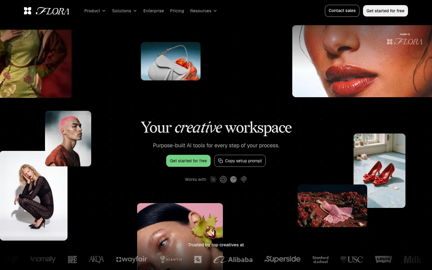
North star · Treat pure black as an uninterrupted stage, and let vivid creative work, precise Geist typography, and small green actions provide the hierarchy.
The page is anchored by a nearly continuous #000000 canvas, letting interface previews and vivid creative imagery provide most of the visual contrast. #eeeeee carries prominent headlines and key copy; #b4b4b4 and #a7a7a7 recede into navigation, captions, and secondary descriptions. The restrained green #71d083 marks the primary free-start CTA, while #40c575 appears as a smaller link accent. Geist supplies a modern, compact sans-serif voice for navigation, product copy, and controls, contrasted in the hero by an elegant serif wordmark and display treatment visible in the screenshot. The composition alternates open black space with dense media-led demonstrations, workflow cards, model collections, and press or case-study content. Images are framed as floating rounded rectangles and embedded product previews rather than decorative backgrounds, with occasional full-width atmospheric video. Fine dark hairlines define cards without competing with their contents; restrained tonal overlays help text remain legible on media.
Navigation, headings, body copy, controls, and links throughout the page.
角色
示例
字号
字重
行高
字距
特大标题
Oversized hero headline and prominent showcase titles.
FLORA
80px
400
1.2
-0.03em
一级标题
Main section headlines and key product statements.
FLORA
30px
500
1.37
-0.017em
二级标题
Feature-section headings and supporting headline hierarchy.
The quick brown fox 敏捷的狐狸
22px
600
1.2
-0.03em
三级标题
Workflow, technique, case-study, and editorial card titles.
The quick brown fox 敏捷的狐狸
21px
600
1.29
0
四级标题
Smaller feature headings and supporting labels.
The quick brown fox 敏捷的狐狸
20px
500
1.37
-0.01em
正文
Descriptions, explanatory paragraphs, and general interface copy.
The quick brown fox 敏捷的狐狸
14px
400
1.37
0
辅助文字
Compact media labels, metadata, and supporting notes.
The quick brown fox 敏捷的狐狸
12px
500
1.38
0
按钮
CTA and utility-button labels.
The quick brown fox 敏捷的狐狸
14px
400
1
0
导航
Top navigation links and menu items.
The quick brown fox 敏捷的狐狸
14px
400
1.29
0.029em
链接
Inline actions and editorial or product links.
The quick brown fox 敏捷的狐狸
14px
500
1.43
0
间距与布局
基准单位 4px · 密度:宽松
128px版块间距
8px元素间距
8px卡片内边距
1280px内容最大宽度
2px
3px
4px
5px
6px
8px
10px
12px
16px
20px
24px
36px
40px
48px
64px
80px
Use a centered content frame capped at the measured 1280px maximum, while letting hero artwork and atmospheric media feel broad and immersive. The page is predominantly single-column black canvas, interrupted by three-column feature or case-study arrangements and denser card collections. Keep generous section pauses, aligned left-edge section headings, and open hero space around the central message. Reserve tighter spacing for product UI, model catalogs, and card interiors; avoid uniform, tightly packed grids across the full page.
圆角与层次
按钮 · 12px
卡片 · 20px
图片 · 12px
导航 · 12px
链接 · 24px
inset · link
inset · nav
The interface is mostly flat: black surfaces and fine dark borders define cards instead of heavy shadows. Use measured rounded corners to soften media, cards, and controls, while selected editorial links gain a faint inset white outline. Layer imagery spatially around the hero copy, but preserve clear separation and strong contrast.
组件
下面的预览按实测的按钮、输入框、徽标、卡片样式重建(字体用替代字体)。
Primary CTA
Green #71d083 rounded button with black text, Geist 14px regular, and compact horizontal padding; label is “Get started for free”.
Outlined utility button
Transparent dark button with light text and a thin #b4b4b4 border; used for “Copy setup prompt” and secondary actions.
Top navigation
Light and muted Geist links across the black canvas, paired with a bordered contact action and a bright filled signup CTA.
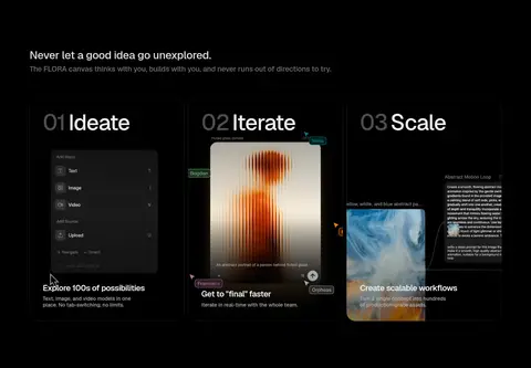
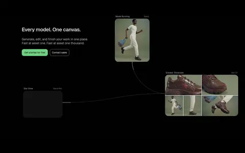
Feature cards
Dark media-led cards with #1c1c1c borders, rounded corners, compact padding, and embedded workflow or model imagery.
Editorial link card
Light text sits within an image or dark card; select links use a faint inset white outline and rounded framing.
Floating hero media
Rounded creative images distributed around a centered headline, with varied crops and generous black negative space.
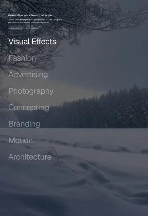
Imagery · Lead with polished creative photography in floating rounded media frames: fashion, beauty, products, portraits, and campaign imagery. Mix stills with product-interface previews and workflow videos to demonstrate the canvas rather than relying on abstract illustration. A full-width atmospheric landscape video provides a rare tonal break; retain dark overlays where copy sits over imagery. Warm image colors belong to the showcased work, not the brand palette.
Separate sections with generous black breathing room.
Use subtle borders to define dark cards.
✕ 不该做
Do not add unmeasured brand colors.
Do not turn the page into a light dashboard.
Do not crowd the hero with competing copy.
Do not use heavy shadows as the default.
Do not treat image colors as brand accents.
Do not make every section a uniform card grid.
给 AI 的提示词
想快速出一个同风格的新页面,把这段话连同 DESIGN.md 一起发给 AI。
Build a new FLORA-style page as a dark creative-product experience. Use Canvas Black (#000000) as the dominant uninterrupted background; set primary copy in Gallery White (#eeeeee), with Soft Silver (#b4b4b4) and Quiet Gray (#a7a7a7) for supporting text. Reserve Flora Green (#71d083) for the main CTA and Link Green (#40c575) for occasional inline emphasis. Use Geist or a close sans-serif, clear weight hierarchy, and restrained tracking. Compose a spacious centered hero with floating, rounded creative images, then alternate product demonstrations, workflow examples, and editorial proof. Keep card edges subtle in Hairline Charcoal (#1c1c1c), using dark surfaces rather than pronounced shadows. Make imagery vivid and media-led, but ensure text stays legible over any video or photography.