North star · Keep the interface quiet and warm so bold type and collected imagery—not decorative UI—lead discovery.
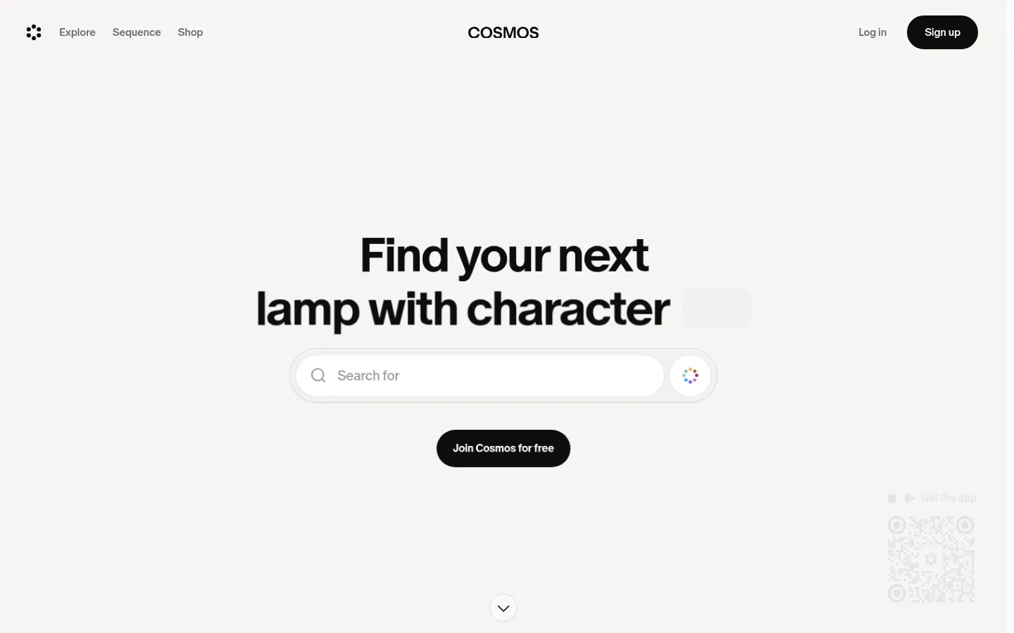
The page uses a warm off-white canvas (#f7f5f3) for its spacious hero and footer, contrasted with broad white content sections. Near-black (#0d0d0d) anchors headings, navigation, and pill-shaped calls to action; muted grays make supporting labels and secondary brand names recede. Cosmos Oracle is used throughout, with bold, tightly tracked display text and compact supporting copy. The hero centers a two-line headline above a rounded search field and black CTA, with ample open space around them. Below, content moves into a horizontal feature-card row, a sparse typographic brand list, and a dense creator-card feed. Photography and video previews provide color and texture without changing the neutral interface. Thin pale borders define cards and controls; shadows remain subtle, preserving a mostly flat, gallery-like feel. Rounded pills and cards soften the otherwise crisp grid and editorial hierarchy.
All page typography, from display headings and navigation to buttons and captions.
角色
示例
字号
字重
行高
字距
特大标题
Large, bold hero headline and prominent closing message.
Cosmos
72px
700
1
-0.042em
一级标题
Primary section headings and high-emphasis page titles.
Cosmos
48px
500
1
-0.04em
二级标题
Feature titles and secondary section headings.
The quick brown fox 敏捷的狐狸
26px
500
1.15
-0.04em
正文
Feature descriptions and prominent supporting copy.
The quick brown fox 敏捷的狐狸
20px
500
1.15
-0.1em
辅助文字
Card metadata, helper text, and small labels.
The quick brown fox 敏捷的狐狸
16px
400
1.4
-0.125em
导航
Primary navigation and prominent menu labels.
The quick brown fox 敏捷的狐狸
20px
500
1.15
-0.1em
间距与布局
基准单位 8px · 密度:紧凑
32px版块间距
4px元素间距
—卡片内边距
—内容最大宽度
2px
4px
6px
8px
10px
12px
16px
20px
24px
32px
80px
The page alternates a full-width warm hero and footer with white content bands. The hero centers its headline, search control, and CTA, while subsequent sections align content to the left. Feature cards form a horizontally browsable row; brand names use a sparse vertical list; creator recommendations become a dense multi-column card strip. Preserve generous open space around the hero and larger section transitions, with more compact spacing inside card groups. No measured maximum content width is available.
圆角与层次
按钮 · 9999px
卡片 · 16px
导航 · 50%
sm · card
lg · card, footer
inset · card
The interface is predominantly flat, with white content bands against a warm canvas. Thin pale outlines separate cards and controls; card shadows are subtle and should not create a floating-dashboard appearance. Use rounded card corners and pill controls for softness, reserving stronger layering for compact overlays or card previews.
组件
下面的预览按实测的按钮、输入框、徽标、卡片样式重建(字体用替代字体)。
Pill CTA
Near-black button with white text, a fully rounded silhouette, and no prominent shadow; used for sign-up and Follow actions.
Search control
Centered white search field inside a softly outlined rounded container, paired with a circular action area.
Feature preview cards
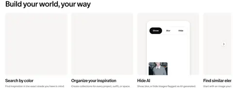
Horizontal row of image or video previews with rounded corners, short dark titles, and muted explanatory captions.
Brand list
Sparse vertical brand names, mixing dark emphasis with faded gray text to distinguish prominence.
Creator cards
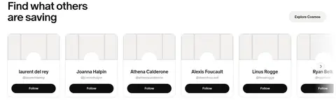
Image-led cards with creator name, handle, and a black Follow pill; separated by fine pale borders.
Get-the-app panel
Small QR-code download panel placed at the right edge of the hero and footer areas.
Imagery · Use collected reference imagery as the main visual content: editorial objects, interiors, fashion, and creator-saved images. Cards show cropped image previews with restrained borders and minimal chrome. Feature previews can include video or interface captures. Keep the hero mostly typographic and calm; the small multicolor search mark is a UI detail, not the core palette.
Use #f7f5f3 as the warm canvas for the hero and footer.
Keep broad content areas white and visually quiet.
Set primary headings and CTAs in Cosmos Ink (#0d0d0d).
Use the measured Cosmos Oracle family or a close sans substitute consistently.
Make primary actions fully rounded black pills with white labels.
Let reference imagery carry color while keeping surrounding UI neutral.
✕ 不该做
Do not introduce a saturated brand accent across the interface.
Do not fill every open area with cards or decoration.
Do not use heavy shadows to lift ordinary cards.
Do not make secondary captions as prominent as headings.
Do not turn the editorial brand list into a dense logo wall.
Do not mistake colors inside reference imagery for interface palette colors.
给 AI 的提示词
想快速出一个同风格的新页面,把这段话连同 DESIGN.md 一起发给 AI。
Build a new Cosmos-style page with a quiet, editorial discovery feel. Use Warm Canvas (#f7f5f3) for the hero and footer, Gallery White (#ffffff) for content bands, and Cosmos Ink (#0d0d0d) for headings, navigation, and pill CTAs. Use Soft Graphite (#6e6a69), Mist Text (#9a9796), and Faded Type (#d0cdcd) sparingly for secondary text; use Quiet Line (#e2e2e2) for fine borders. Set all typography in Cosmos Oracle or a close sans substitute, with bold tightly tracked display headings. Center a spacious hero around a headline, search field, and CTA; follow with image-led feature cards, a sparse brand list, and creator cards. Favor rounded shapes, restrained shadows, broad white space, and authentic editorial imagery. Avoid decorative gradients or loud interface colors.