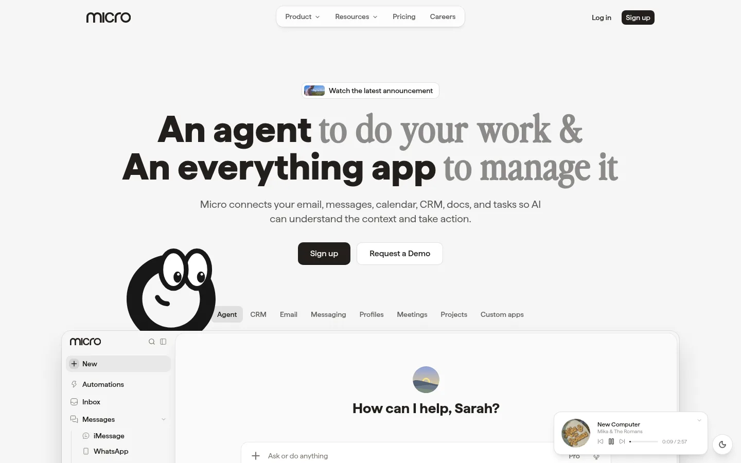
Micro 以克制的浅色画布、编辑式字体和细致的产品界面预览,呈现一体化 AI 工作空间。页面留白充足,配合深色行动按钮与柔和卡片,让内容清晰而不显拥挤。
North star · Keep the page quiet and spacious, using dark editorial type and realistic product previews to make the interface—not decorative color—the focal point.
The page is built around a near-white #f5f5f5 canvas, used almost continuously from the hero through the long sequence of feature sections. Dark #221f1c anchors the logo, headline emphasis, navigation, and primary sign-up buttons; muted #797267 handles secondary copy, while #e1e1e1 and related pale grays define subtle separators and component edges. The bright cyan accents measured in the palette are not a dominant page-wide brand color: they occur chiefly within interface previews and other product imagery. Haffer is the workhorse sans, paired with a distinctive display face for the oversized hero and editorial feature headings. The page alternates centered storytelling and left-aligned feature layouts, repeatedly showing the product in soft, rounded cards. Large stretches of whitespace separate the hero, proof points, and feature chapters, making a dense all-in-one product feel orderly rather than crowded.
配色 点色块复制色值。用途说明来自对页面的实测位置(背景、文字、描边、按钮)与截图判读。
品牌色
Deep Ink
#221f1c
Logo, primary headline text, navigation, and dark sign-up buttons.
强调色
Bright Cyan
#00bcff
Accent visible mainly inside product-interface cards and previews.
Sky Cyan
#40cdff
Secondary cyan accent occurring in product imagery and previews.
表层色
Clean White
#ffffff
White surfaces, including small announcement and interface cards.
中性色
Soft Canvas
#f5f5f5
Dominant page background across the hero and almost every section.
Quiet Rule
#e1e1e1
Subtle borders, dividers, and low-contrast interface details.
Warm Taupe
#797267
Muted supporting text and subdued button labels.
Pale Edge
#e7e7e7
Faint card, button, and badge borders in interface elements.
Card Gray
#dcdcdc
Pale card and interface boundaries in product previews.
功能色
Violet Marker
#7008e7
Sparse badge or text detail; not a defining page-wide brand color.
Burnt Signal
#ca3500
Sparse badge detail, likely within interface content rather than page chrome.
Interface Blue
#518bdb
Small badge or preview detail, not a dominant page accent.
Warm Amber
#e5a057
Minor warm-toned interface or illustration detail.
Deep Green
#007a55
Sparse badge detail within product UI.
Signal Red
#fb2c36
Tiny status or badge detail, not used as page chrome.
Plum Detail
#4a154b
Low-frequency badge detail within measured interface content.
文字 背景 对比度 WCAG #221f1c Deep Ink#f5f5f5 Soft Canvas15.04:1 AAA #221f1c Deep Ink#ffffff Clean White16.4:1 AAA #797267 Warm Taupe#f5f5f5 Soft Canvas4.36:1 AA-large #797267 Warm Taupe#ffffff Clean White4.76:1 AA #e1e1e1 Quiet Rule#f5f5f5 Soft Canvas1.2:1 不达标 #e1e1e1 Quiet Rule#ffffff Clean White1.31:1 不达标
字体 字号阶梯:Perfect Fourth(比例约 1.361,正文 14px)。示例用免费替代字体渲染,数值为实测。
Aa 设计
haffer 网络字体 · 字重 400 / 500 / 700 / 600 / 900 · 占比 69%
免费替代:Inter
Navigation, body copy, buttons, and most feature content.
Aa 设计
ui-monospace 系统字体 · 字重 400 / 500 · 占比 30%
免费替代:IBM Plex Mono
Eyebrows, captions, and small uppercase labels.
角色 示例 字号 字重 行高 字距 一级标题 Large two-line hero headline with contrasting display emphasis.
Micro
48px 700 1 0.02em 二级标题 Feature-section titles and prominent chapter headings.
The quick brown fox 敏捷的狐狸
24px 500 1.33 0 三级标题 Subsection headings within automation and product-feature areas.
The quick brown fox 敏捷的狐狸
20px 500 1.25 0 四级标题 Supporting headings and smaller explanatory feature titles.
The quick brown fox 敏捷的狐狸
18px 400 1.56 0 正文 Descriptions, explanatory copy, and interface-adjacent text.
The quick brown fox 敏捷的狐狸
14px 400 1.71 0 辅助文字 Small uppercase metadata and compact labels.
The quick brown fox 敏捷的狐狸
10px 400 2.4 0.22em 按钮 Sign-up, demo, and category or action controls.
The quick brown fox 敏捷的狐狸
14px 500 1.43 0 导航 Top navigation links and product navigation labels.
The quick brown fox 敏捷的狐狸
14px 500 1.43 0 眉题 Small tracked uppercase section labels.
The quick brown fox 敏捷的狐狸
10px 400 2.4 0.22em 代码 Compact monospace labels or technical-looking metadata.
const style = 1;
10px 400 2.4 0.22em
间距与布局 基准单位 4px · 密度:宽松
96px 版块间距
12px 元素间距
16px 卡片内边距
1056px 内容最大宽度
2px
4px
6px
8px
10px
12px
16px
20px
32px
48px
The main content sits within a measured maximum width of 1056px, with a spacious overall density and recurring large section gaps. The hero is centered beneath a compact top navigation, then leads into a wide product preview. Later chapters switch between centered feature introductions, multi-column card collections, and left-aligned split layouts. Content often shares space with cropped interface imagery, while the integration and memory sections use horizontal card or logo runs. Maintain broad breathing room between chapters and tighter groupings inside cards.
圆角与层次 sm · other, card, input
md · card
hairline · other, badge
hairline · card, nav
Most sections sit directly on the continuous canvas, so the page feels flat and open. Cards and floating interface panels gain separation from subtle gray edges and restrained shadows rather than heavy drop shadows. Use rounded card framing and layered product mockups selectively, with the screenshot itself providing most visual depth.
组件 下面的预览按实测的按钮、输入框、徽标、卡片样式重建(字体用替代字体)。
Top navigation Compact header with the Micro wordmark, centered rounded navigation surface, plain login link, and dark sign-up button.
Hero announcement Small white announcement pill with a thumbnail, dark text, and a delicate border above the main headline.
Hero actions Dark sign-up button paired with a white bordered demo button beneath centered supporting copy.
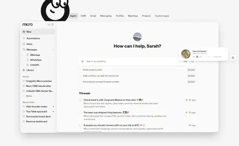
Workspace preview Wide, pale framed product screenshot with sidebar, workspace content, mascot, and layered notification elements.
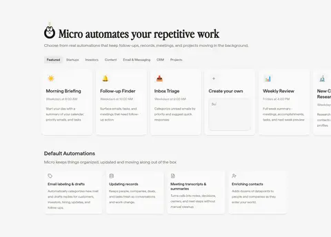
Automation cards Grouped feature cards with brief titles and descriptions, displayed in horizontal collections on the shared light canvas.
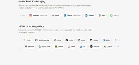
Integration rows Compact runs of recognizable service marks and labels, set against ample whitespace.
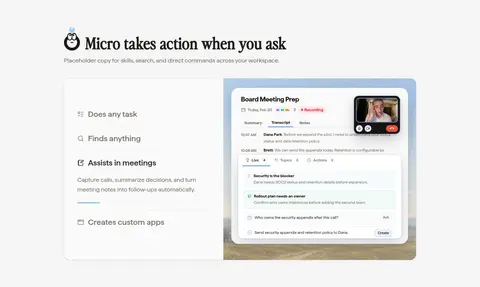
Imagery · Product UI is the primary visual: large workspace screenshots, message panels, automation cards, contact records, and integration marks. A simple monochrome mascot appears near feature headings and the hero preview. Interface imagery is framed in pale rounded containers with restrained borders and soft depth. Logos and colorful app icons appear in compact rows; vivid interface colors belong to those previews, not the surrounding page.
页面版块 共 10 个版块,按页面从上到下排列,每个都标了类型、布局和交互套路。
该做与不该做 ✓ 该做 Keep the #f5f5f5 canvas continuous across sections. Use #221f1c for the strongest text and primary actions. Set secondary copy in muted, warm gray. Give product screenshots generous room and pale framing. Use display typography selectively for editorial emphasis. Separate chapters with generous whitespace. Keep bright colors mostly inside product previews. ✕ 不该做 Do not turn the page into a saturated gradient landing page. Do not use accent colors as broad section backgrounds. Do not crowd the hero or feature chapters with extra decoration. Do not add heavy shadows to ordinary cards. Do not replace realistic product previews with generic stock imagery. Do not make every heading use the display face. Do not invent stronger visual contrast than the measured palette supports. 给 AI 的提示词 想快速出一个同风格的新页面,把这段话连同 DESIGN.md 一起发给 AI。
复制 Build a new Micro-style SaaS page on a continuous Soft Canvas (#f5f5f5) background. Use Deep Ink (#221f1c) for the wordmark, strong headings, navigation, and primary actions; use Warm Taupe (#797267) for supporting copy and Quiet Rule (#e1e1e1) for restrained edges. Keep the header compact and the hero centered, with a bold sans headline that can contrast with an editorial display face. Give the product interface the starring role: frame screenshots in pale rounded cards, with only subtle borders and shadows. Organize the rest as spacious feature chapters, alternating centered introductions, split layouts, and compact card or integration rows. Reserve cyan accents for interface imagery. Keep typography clean, hierarchy clear, and decoration minimal.
DESIGN.md Tailwind v4 CSS 变量 Design Tokens
---
title: "Micro design system"
variant: extended
source: https://www.micro.so/
captured_at: 2026-10-12
theme: light
industry: ai
generator: Design DNA (https://four.wiralomi.com/style/micro-so)
ai_generated: true
ai_label: "本文件由 AI 辅助生成:数值取自公开网页的实测样式,命名、用途说明与建议为模型解读。商标归原所有者。 / AI-assisted content"
---
# Micro · Design System
> A calm canvas for an all-in-one AI workspace
**Theme:** light · **Industry:** ai · **Source:** https://www.micro.so/ · **Captured:** 2026-10-12 (1440×900 desktop)
_AI-assisted content: values are measured from the public page at capture time; names, roles and guidance are model-written interpretations. Trademarks belong to their owners._
Micro pairs a restrained near-white canvas with editorial typography and detailed product-interface previews. Generous whitespace gives its long feature story room to breathe, while dark calls to action and soft cards keep the experience legible and grounded.
## North star
Keep the page quiet and spacious, using dark editorial type and realistic product previews to make the interface—not decorative color—the focal point.
## Overview
The page is built around a near-white ## Colors
| Name | Hex | Token | Group | Role |
|---|---|---|---|---|
| Soft Canvas | ` | `--color-soft-canvas` | neutral | Dominant page background across the hero and almost every section. |
| Quiet Rule | ` | `--color-quiet-rule` | neutral | Subtle borders, dividers, and low-contrast interface details. |
| Warm Taupe | ` | `--color-warm-taupe` | neutral | Muted supporting text and subdued button labels. |
| Deep Ink | ` | `--color-deep-ink` | brand | Logo, primary headline text, navigation, and dark sign-up buttons. |
| Violet Marker | ` | `--color-violet-marker` | semantic | Sparse badge or text detail; not a defining page-wide brand color. |
| Burnt Signal | ` | `--color-burnt-signal` | semantic | Sparse badge detail, likely within interface content rather than page chrome. |
| Bright Cyan | ` | `--color-bright-cyan` | accent | Accent visible mainly inside product-interface cards and previews. |
| Interface Blue | ` | `--color-interface-blue` | semantic | Small badge or preview detail, not a dominant page accent. |
| Pale Edge | ` | `--color-pale-edge` | neutral | Faint card, button, and badge borders in interface elements. |
| Warm Amber | ` | `--color-warm-amber` | semantic | Minor warm-toned interface or illustration detail. |
| Deep Green | ` | `--color-deep-green` | semantic | Sparse badge detail within product UI. |
| Signal Red | ` | `--color-signal-red` | semantic | Tiny status or badge detail, not used as page chrome. |
| Plum Detail | ` | `--color-plum-detail` | semantic | Low-frequency badge detail within measured interface content. |
| Card Gray | ` | `--color-card-gray` | neutral | Pale card and interface boundaries in product previews. |
| Clean White | ` | `--color-clean-white` | surface | White surfaces, including small announcement and interface cards. |
| Sky Cyan | ` | `--color-sky-cyan` | accent | Secondary cyan accent occurring in product imagery and previews. |
### Semantic aliases
`--color-canvas` → ` (Soft Canvas) · `--color-surface` → ` (Clean White) · `--color-text` → ` (Deep Ink) · `--color-text-muted` → ` (Warm Taupe) · `--color-text-subtle` → ` (Quiet Rule) · `--color-border` → ` (Quiet Rule) · `--color-accent` → ` (Bright Cyan) · `--color-accent-2` → ` (Sky Cyan)
### Contrast (WCAG 2.x)
| Text | Background | Ratio | Level |
|---|---|---|---|
| ` | ` | 15.04:1 | AAA |
| ` | ` | 16.4:1 | AAA |
| ` | ` | 4.36:1 | AA-large |
| ` | ` | 4.76:1 | AA |
| ` | ` | 1.2:1 | fail |
| ` | ` | 1.31:1 | fail |
| ` | ` | 2:1 | fail |
| ` | ` | 2.18:1 | fail |
### Gradients
- `linear-gradient(to left top, oklab(0.985098 0.0000447631 0.0000197291 / 0.75) 0px, oklab(0.985098 0.0000447631 0.0000197291 / 0.15) 50%, rgba(0, 0, 0, 0) 100%)`
- `linear-gradient(to top, oklab(0.985098 0.0000447631 0.0000197291 / 0.8) 0px, oklab(0.985098 0.0000447631 0.0000197291 / 0.2) 50%, rgba(0, 0, 0, 0) 100%)`
- `linear-gradient(to right top, oklab(0.985098 0.0000447631 0.0000197291 / 0.7) 0px, oklab(0.985098 0.0000447631 0.0000197291 / 0.1) 50%, rgba(0, 0, 0, 0) 100%)`
- `linear-gradient(to left bottom, oklab(0.985098 0.0000447631 0.0000197291 / 0.85) 0px, oklab(0.985098 0.0000447631 0.0000197291 / 0.25) 50%, rgba(0, 0, 0, 0) 100%)`
## Typography
| Family | Token | Source | Weights | Role | Free substitute |
|---|---|---|---|---|---|
| haffer | `--font-body` | webfont | 400, 500, 700, 600, 900 | Navigation, body copy, buttons, and most feature content. | Inter |
| ui-monospace | `--font-mono` | system | 400, 500 | Eyebrows, captions, and small uppercase labels. | IBM Plex Mono |
- **haffer:** Use a clean sans with regular-to-bold weights; keep body copy calm and sentence case.
- **ui-monospace:** Reserve for compact metadata; use uppercase with visibly tracked lettering.
### Type scale — Perfect Fourth (ratio ≈ 1.361, base 14px)
| Role | Size | Weight | Line height | Letter spacing | Case | Family | Used for |
|---|---|---|---|---|---|---|---|
| h1 | 48px | 700 | 1 | 0.02em | — | perfectlyNineties | Large two-line hero headline with contrasting display emphasis. |
| h2 | 24px | 500 | 1.33 | 0 | — | haffer | Feature-section titles and prominent chapter headings. |
| h3 | 20px | 500 | 1.25 | 0 | — | haffer | Subsection headings within automation and product-feature areas. |
| h4 | 18px | 400 | 1.56 | 0 | — | haffer | Supporting headings and smaller explanatory feature titles. |
| body | 14px | 400 | 1.71 | 0 | — | haffer | Descriptions, explanatory copy, and interface-adjacent text. |
| caption | 10px | 400 | 2.4 | 0.22em | uppercase | ui-monospace | Small uppercase metadata and compact labels. |
| button | 14px | 500 | 1.43 | 0 | — | haffer | Sign-up, demo, and category or action controls. |
| nav | 14px | 500 | 1.43 | 0 | — | haffer | Top navigation links and product navigation labels. |
| eyebrow | 10px | 400 | 2.4 | 0.22em | uppercase | ui-monospace | Small tracked uppercase section labels. |
| code | 10px | 400 | 2.4 | 0.22em | uppercase | ui-monospace | Compact monospace labels or technical-looking metadata. |
## Spacing & layout
- Base unit **4px**, density **spacious**.
- Scale (most used values): 2, 4, 6, 8, 10, 12, 16, 20, 32, 48 px.
- Section rhythm 96px · element gap 12px · card padding 16px · max content width 1056px.
The main content sits within a measured maximum width of 1056px, with a spacious overall density and recurring large section gaps. The hero is centered beneath a compact top navigation, then leads into a wide product preview. Later chapters switch between centered feature introductions, multi-column card collections, and left-aligned split layouts. Content often shares space with cropped interface imagery, while the integration and memory sections use horizontal card or logo runs. Maintain broad breathing room between chapters and tighter groupings inside cards.
## Shape & elevation
- Radius: button `8px` · input `10px` · card `14px` · media `8px` · badge `50%` · nav `8px` · xs `3px` · sm `6px` · md `8px` · lg `10px` · xl `14px` · 2xl `18px` · pill `9999px`
- Shadow `sm` (other, card, input): `rgba(0, 0, 0, 0) 0px 0px 0px 0px, rgba(0, 0, 0, 0) 0px 0px 0px 0px, rgba(0, 0, 0, 0) 0px 0px 0px 0px, rgba(0, 0, 0, 0) 0px 0px 0px 0px, rgba(0, 0, 0, 0.1) 0px 1px 3px 0px, rgba(0, 0, 0, 0.1) 0px 1px 2`
- Shadow `md` (card): `rgba(0, 0, 0, 0) 0px 0px 0px 0px, rgba(0, 0, 0, 0) 0px 0px 0px 0px, rgba(0, 0, 0, 0) 0px 0px 0px 0px, oklab(0.241527 0.00279061 0.00670661 / 0.065) 0px 0px 0px 1px, oklab(0 0 0 / 0.05) 0px 4px 6px -1p`
- Shadow `hairline` (other, badge): `rgba(0, 0, 0, 0) 0px 0px 0px 0px, rgba(0, 0, 0, 0) 0px 0px 0px 0px, rgba(0, 0, 0, 0) 0px 0px 0px 0px, rgb(250, 250, 250) 0px 0px 0px 1px, rgba(0, 0, 0, 0) 0px 0px 0px 0px`
- Shadow `hairline-2` (card, nav): `rgba(0, 0, 0, 0) 0px 0px 0px 0px, rgba(0, 0, 0, 0) 0px 0px 0px 0px, rgba(0, 0, 0, 0) 0px 0px 0px 0px, rgba(0, 0, 0, 0) 0px 0px 0px 0px, rgba(0, 0, 0, 0) 0px 0px 0px 0px`
- Shadow `md-2` (card): `rgba(0, 0, 0, 0) 0px 0px 0px 0px, rgba(0, 0, 0, 0) 0px 0px 0px 0px, rgba(0, 0, 0, 0) 0px 0px 0px 0px, rgba(0, 0, 0, 0) 0px 0px 0px 0px, oklab(0 0 0 / 0.05) 0px 4px 6px -1px, oklab(0 0 0 / 0.05) 0px 2p`
- Shadow `xl` (card): `rgba(0, 0, 0, 0) 0px 0px 0px 0px, rgba(0, 0, 0, 0) 0px 0px 0px 0px, rgba(0, 0, 0, 0) 0px 0px 0px 0px, oklab(0.241527 0.00279061 0.00670661 / 0.065) 0px 0px 0px 1px, oklab(0 0 0 / 0.18) 0px 25px 50px -`
- Motion: standard transition `0.15s cubic-bezier(0.4, 0, 0.2, 1)` on interactive elements.
Most sections sit directly on the continuous canvas, so the page feels flat and open. Cards and floating interface panels gain separation from subtle gray edges and restrained shadows rather than heavy drop shadows. Use rounded card framing and layered product mockups selectively, with the screenshot itself providing most visual depth.
## Imagery
Product UI is the primary visual: large workspace screenshots, message panels, automation cards, contact records, and integration marks. A simple monochrome mascot appears near feature headings and the hero preview. Interface imagery is framed in pale rounded containers with restrained borders and soft depth. Logos and colorful app icons appear in compact rows; vivid interface colors belong to those previews, not the surrounding page.
## Components
### Top navigation
Compact header with the Micro wordmark, centered rounded navigation surface, plain login link, and dark sign-up button.
### Hero announcement
Small white announcement pill with a thumbnail, dark text, and a delicate border above the main headline.
### Hero actions
Dark sign-up button paired with a white bordered demo button beneath centered supporting copy.
### Workspace preview
Wide, pale framed product screenshot with sidebar, workspace content, mascot, and layered notification elements.
### Automation cards
Grouped feature cards with brief titles and descriptions, displayed in horizontal collections on the shared light canvas.
### Integration rows
Compact runs of recognizable service marks and labels, set against ample whitespace.
### Measured component styles
- **Primary button** (“Accept”): background ## Do
- Keep the ## Don't
- Do not turn the page into a saturated gradient landing page.
- Do not use accent colors as broad section backgrounds.
- Do not crowd the hero or feature chapters with extra decoration.
- Do not add heavy shadows to ordinary cards.
- Do not replace realistic product previews with generic stock imagery.
- Do not make every heading use the display face.
- Do not invent stronger visual contrast than the measured palette supports.
## Agent prompt
Build a new Micro-style SaaS page on a continuous Soft Canvas (## Page sections (top to bottom)
| # | Type | Layout | UX patterns | UI patterns |
|---|---|---|---|---|
| 1 | hero | Centered hero content above a wide, two-column workspace preview with navigation-like product tabs. | Announcement link, Primary and secondary actions, Product-view tabs | Oversized mixed-style headline, Dark primary button, Large interface preview, Mascot illustration |
| 2 | logo-cloud | Short centered proof statement above a horizontal row of customer logos. | Social proof | Small centered copy, Monochrome logo row |
| 3 | product-showcase | A broad centered product showcase with supporting media and minimal visible text. | Product exploration | Large product imagery, Open whitespace |
| 4 | feature-grid | Left-aligned introduction followed by category controls, a featured horizontal card row, and smaller default automation cards. | Category filtering, Browse automation cards | Dense card collections, Compact category buttons, Pale rounded cards |
| 5 | feature-split | Two-column feature content with a list of actions beside a large product-meeting interface preview. | Capability list, Explore commands | Split layout, Illustrated product panel, Small feature icons |
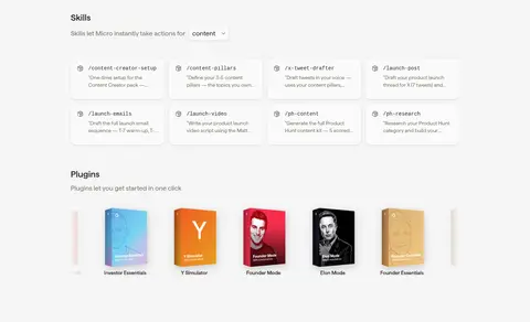
| 6 | product-grid | Stacked skill cards followed by a horizontal strip of plugin cover images. | Browse skills, Explore plugins | Compact rectangular cards, Book-like plugin covers, Section labels |
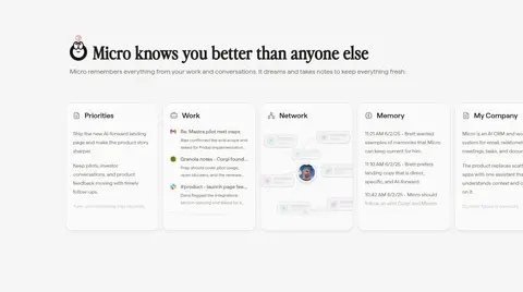
| 7 | feature-grid | Left-aligned heading and explanation above a horizontal row of memory and workspace cards. | Scan remembered context | Multi-card horizontal row, Light outlined panels |
| 8 | integrations | Two stacked integration areas with explanatory text and horizontal rows of service marks. | Review supported services | Logo chips, Horizontal integration rows, Small labels |
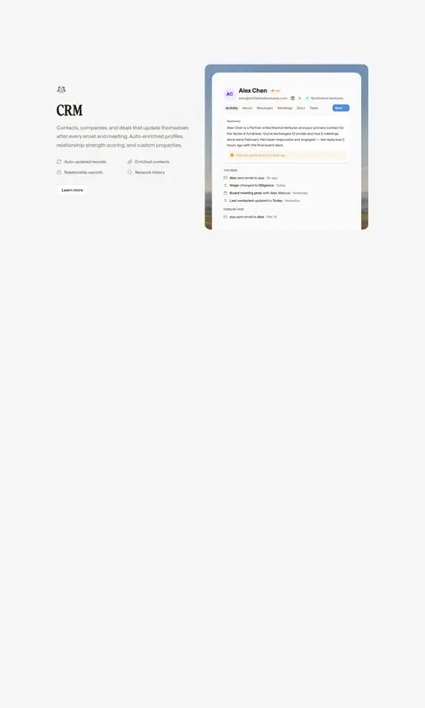
| 9 | feature-split | Product and CRM content arranged across a small number of columns with supporting visuals. | Learn more link, Review CRM capabilities | Feature illustration, Compact explanatory copy |
| 10 | footer | A long, mostly open closing area following the product feature sections. | End-of-page navigation | Minimal visible content |
## Source CSS custom properties (selected)
```css
--color-fd-background: