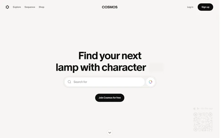
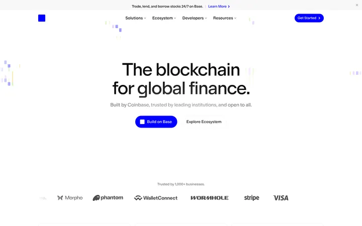
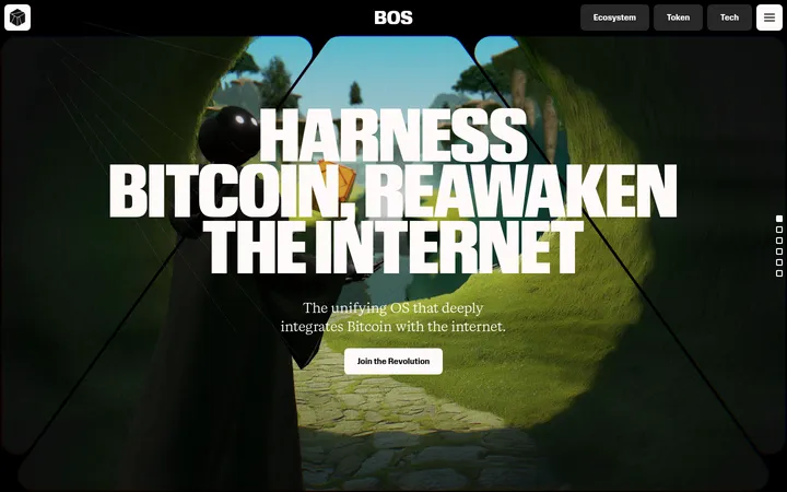
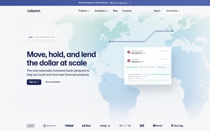
North star · Keep the page grounded in black and precise typography, using contrast and content structure—not decoration—to guide attention.
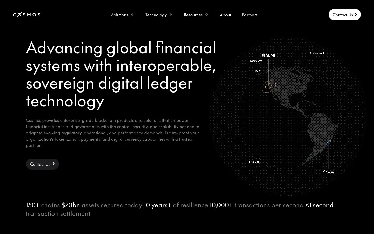
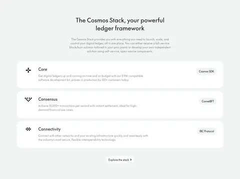
The page uses black as its defining canvas, giving white headings and labels strong contrast while muted gray body text keeps dense institutional copy quiet. A pale gray-white band interrupts the dark sequence for the Cosmos Stack, making its rounded white rows and dark text feel like a deliberate product explainer rather than a separate visual identity. The Future is used throughout in a clean, regular-weight sans serif; oversized hero text and measured heading hierarchy provide editorial emphasis without heavy bolding. A wide hero pairs left-aligned messaging with a dark, data-like globe illustration. Lower sections alternate split layouts, customer cards, statistics, and news cards, with occasional blue media imagery acting as a contained highlight. Thin borders, charcoal panels, and generous section breathing room define structure instead of shadows. Rounded cards and pill-shaped actions soften the otherwise precise, technical presentation.
Site-wide display, headings, body copy, navigation, captions, and links.
角色
示例
字号
字重
行高
字距
特大标题
Large homepage hero statement and other high-impact display messaging.
Cosmos
60px
400
1.13
0
一级标题
Primary page and major section headings.
Cosmos
36px
400
1.33
0.02em
二级标题
Section titles and prominent product or editorial headings.
Cosmos
32px
400
1.2
0
三级标题
Card titles, subsection headings, and stack feature labels.
The quick brown fox 敏捷的狐狸
24px
400
1.33
0
正文
Explanatory paragraphs, product descriptions, and supporting content.
The quick brown fox 敏捷的狐狸
16px
400
1.5
0.02em
辅助文字
Compact category labels, metadata, and small supporting notes.
The quick brown fox 敏捷的狐狸
12px
400
1.33
0
导航
Header navigation and footer navigation links.
The quick brown fox 敏捷的狐狸
16px
400
1.5
0.02em
链接
Inline links and text-based actions across cards and sections.
The quick brown fox 敏捷的狐狸
16px
400
1.5
0.02em
间距与布局
基准单位 4px · 密度:宽松
100px版块间距
12px元素间距
18px卡片内边距
1240px内容最大宽度
2px
4px
5px
8px
10px
12px
15px
16px
20px
24px
30px
32px
36px
40px
50px
80px
The page uses a centered content frame capped at the measured 1240px maximum width, with wide hero and section compositions. The hero and several feature blocks use two-column layouts; customer stories and news use multi-column card rows. Alignment is mostly left-led, with occasional centered messaging. Sections follow a spacious rhythm, while tightly grouped card content and compact footer columns create local density. A full-width light band gives the long dark sequence a clear pause.
圆角与层次
卡片 · 20px
图片 · 12px
导航 · 9999px
链接 · 20px
没有测到阴影:页面是扁平的,层次靠底色和描边区分。
The page is mostly flat, with no measured shadow system. Use thin #333333 borders to define dark cards and section boundaries, charcoal fills for selected panels, and the pale stack band for strong contrast. Rounded cards and pill-like controls provide the main depth cues; avoid floating layers and heavy shadow.
组件
下面的预览按实测的按钮、输入框、徽标、卡片样式重建(字体用替代字体)。
Pill action
Compact rounded link or CTA with regular white text on dark or inverse light fill; the header includes a standout white Contact Us pill.
Customer story cards
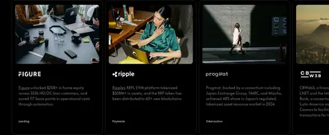
Dark cards with thin #333333 borders and rounded corners, pairing customer imagery, a brand mark, copy, and a small category label.
Product split panel
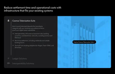
Two-column product showcase: dark explanatory content sits beside a bright blue-tinted media panel, with a small centered exploration link.
Stack feature rows
On the #f1f4f4 band, wide white rounded rows pair a small icon, feature heading and description with a compact product label.
Metric rows
Dark two-column metrics place concise labels opposite oversized white values, separated by subtle horizontal rules.
News cards
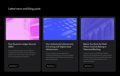
Three dark charcoal cards combine colorful thumbnail media, headline, summary, and a small rounded Read More link.
Newsletter form
A compact email input and Submit action sit within the dark footer, using a muted field surface and pill-like controls.
Imagery · Imagery is used as supporting evidence, not as a decorative wallpaper system. The hero features a dark globe with network markers and data-like detailing; customer cards use cropped real-world photographs. The Cosmos Stack section is largely typographic, while news thumbnails introduce saturated blue and magenta. Keep media framed within cards or columns, with dark surroundings and restrained labels.
Use #000000 as the default canvas for the dark page.
Reserve #f1f4f4 for a clear, full-width contrast section.
Set headings and body copy in regular-weight sans serif.
Use white for primary text and muted gray for supporting copy.
Structure content with split layouts, cards, and metric rows.
Let borders and spacing define hierarchy before adding decoration.
✕ 不该做
Do not turn #40b3ff into a site-wide background or dominant accent.
Do not use heavy shadows to lift cards off the canvas.
Do not use bold typography as the default hierarchy tool.
Do not fill dark sections with large, bright photographic backgrounds.
Do not crowd separate content groups together.
Do not add colors outside the measured palette as interface styling.
给 AI 的提示词
想快速出一个同风格的新页面,把这段话连同 DESIGN.md 一起发给 AI。
Build a new institutional blockchain page in Cosmos’s restrained visual style. Use #000000 as the primary canvas, #ffffff for key headings and navigation, #8f8f90 or #808080 for secondary copy, and #1e1f20 for occasional panels. Use #333333 for subtle card borders. Keep #40b3ff contained within product media, not as a broad interface accent. Set a regular-weight geometric sans serif similar to The Future, with large editorial headings, calm body copy, and generous whitespace. Compose the page from wide split sections, restrained customer or editorial cards, and clear data-led metrics. Use rounded cards and pill actions, but rely on flat surfaces rather than shadows. A #f1f4f4 full-width section may serve as a deliberate visual pause. Keep illustrations technical and dark, and frame photographs within their content cards.