North star · Let cinematic bicycle imagery and oversized, calm typography lead, while keeping interface color and decoration deliberately restrained.
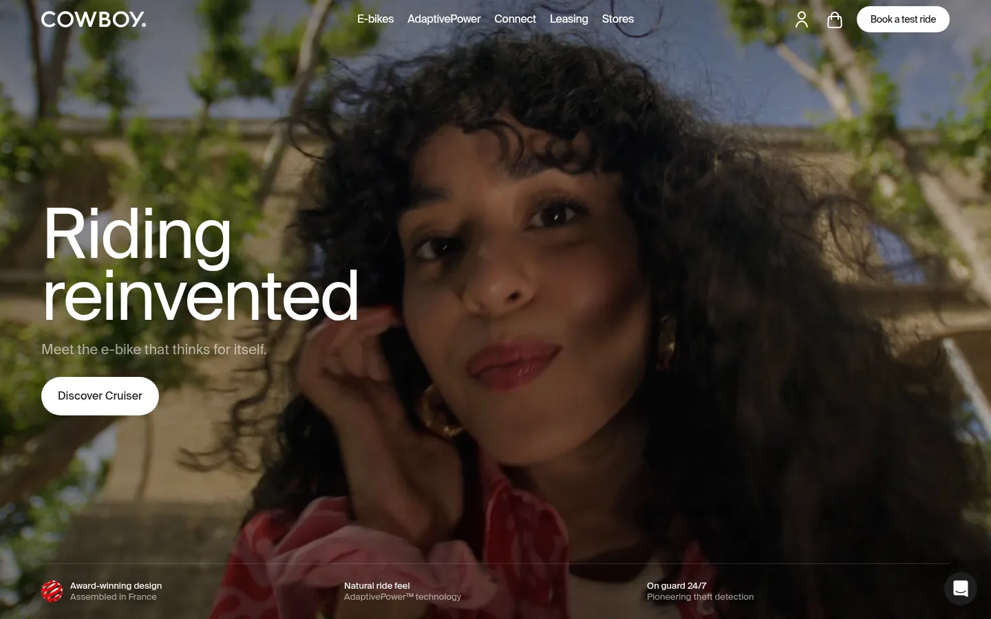
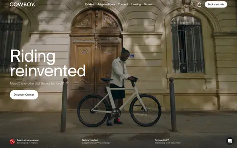
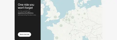
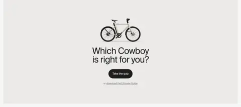
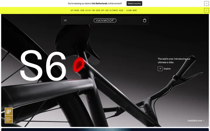
The visual system is anchored by a soft #f5f5f5 canvas, crisp white product panels, and deep #1d1d1d sections that frame cinematic hero and model imagery. Typography stays largely in SuisseIntl: regular-weight, clean sans-serif headlines scale dramatically against concise supporting copy, while occasional monospaced display styling adds a technical accent. The page alternates full-bleed, darkened lifestyle photography with bright, spacious bicycle showcases; its broad section changes create rhythm without relying on ornamental decoration. Product cards and controls use restrained rounded forms, while pale neutral surfaces keep the visual focus on bikes and riders. Large images, quiet navigation, compact proof points, and short feature lists make the experience feel editorial and premium rather than like a dense catalog. Warm beige and gray tones appear as limited section treatments or image-led gradients, not as dominant brand accents.
配色
点色块复制色值。用途说明来自对页面的实测位置(背景、文字、描边、按钮)与截图判读。
品牌色
表层色
中性色
功能色
页面底色 · Gallery Mist表层 · Studio White表层 2 · Graphite Ink表层 3 · Warm Parchment主文字 · Graphite Ink次要文字 · Soft Slate弱文字 · Studio White描边 · Iron Line
Primary navigation, headlines, body copy, links, buttons, and captions.
Aa 设计
ui-monospace
系统字体 · 字重 400 · 占比 1%
免费替代:IBM Plex Mono
Occasional technical or code-like display treatment, including measured h2 and code roles.
角色
示例
字号
字重
行高
字距
特大标题
Oversized hero-style campaign headlines.
Cowboy
100px
400
0.9
-0.025em
一级标题
Primary product and campaign headlines.
Cowboy
72px
400
1
-0.025em
二级标题
Occasional monospaced section heading treatment.
Cowboy
64px
400
1
0
三级标题
Secondary feature and editorial headings.
Cowboy
52px
400
1
-0.025em
四级标题
Smaller feature-card or supporting section headings.
Cowboy
44px
400
1
-0.025em
正文
Descriptions, product details, and editorial copy.
The quick brown fox 敏捷的狐狸
16px
400
1.47
0
辅助文字
Compact labels and image or feature captions.
The quick brown fox 敏捷的狐狸
14px
400
1
0
按钮
Calls to action and pill-control text.
The quick brown fox 敏捷的狐狸
16px
500
1
0
导航
Top navigation links and menu items.
The quick brown fox 敏捷的狐狸
16px
500
1
-0.025em
链接
Inline and secondary action links.
The quick brown fox 敏捷的狐狸
16px
400
1.47
0
代码
Technical or numerical display treatment.
const style = 1;
64px
400
1
0
间距与布局
基准单位 4px · 密度:适中
60px版块间距
10px元素间距
56px卡片内边距
1320px内容最大宽度
4px
6px
8px
10px
12px
20px
24px
48px
60px
64px
110px
120px
Use a broad centered content area, measured at a 1320px maximum width, with a comfortable density and ample breathing room. The page alternates full-bleed hero and product media with contained editorial sections, creating a clear light-dark-light rhythm. Most sections align content to the start; selected brand statements and technology features are centered. Product galleries and feature areas may use multiple columns, while media often spans the full viewport. Keep spacing on the measured 4px-based scale and preserve generous section gaps.
圆角与层次
按钮 · 8px
卡片 · 8px
图片 · 8px
徽标 · 8px
链接 · 8px
lg · button
The interface is mostly flat: broad color bands and image composition create hierarchy rather than stacked cards. Use restrained hairlines, especially in the footer, and measured rounded corners on cards and media. Buttons are generally clean filled pills without a visible shadow; where elevation is required, keep it soft and subtle.
组件
下面的预览按实测的按钮、输入框、徽标、卡片样式重建(字体用替代字体)。
Pill CTA
Use a pill-shaped action with SuisseIntl medium text; dark fill and white text for primary actions, or white fill and dark text for alternate actions.
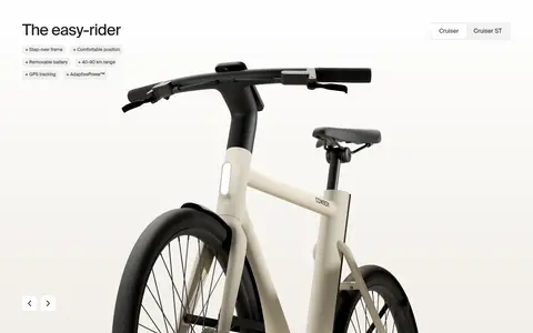
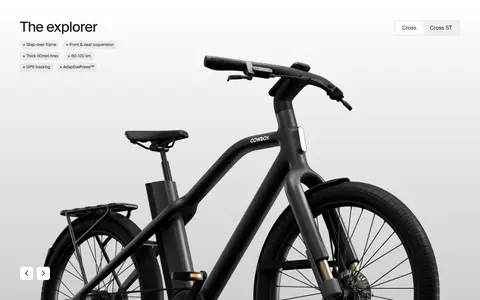
Product showcase
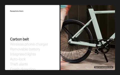
Place a large bike image on a bright white panel, with a concise model heading, compact feature list, and understated model controls.
Full-bleed campaign hero
Use immersive lifestyle media with a dark treatment, white navigation and headline, short supporting copy, and a contrasting light CTA.
Feature badge
Small dark rounded label with white text, used over or beside product imagery for concise technical claims.
Press proof cards
A horizontal series of light quote or award cards with compact editorial text and publication marks.
Feature list
Present short product capabilities with compact labels and simple plus-style markers, avoiding dense explanatory copy.
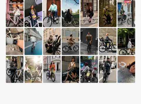
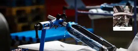
Imagery · Prioritize cinematic lifestyle photography and high-quality bicycle product imagery. Hero scenes are full-bleed and darkened enough to support readable white text; product sections use bright, uncluttered backgrounds and large isolated bikes. Feature videos and community photo grids add movement and human context. Warm or dark tones within imagery belong to the photographs, not a new interface palette.
Reserve #1d1d1d bands for strong contrast and campaign storytelling.
Let large, high-quality bicycle and rider imagery carry the page.
Keep headlines clean, oversized, and mostly regular weight.
Alternate immersive media with quiet product and editorial sections.
Use white or dark pill CTAs with clear contrast.
✕ 不该做
Do not introduce unmeasured accent colors into interface elements.
Do not make the layout resemble a dense conventional product catalog.
Do not add decorative gradients as a dominant page treatment.
Do not place long paragraphs over busy photography.
Do not use heavy shadows or ornamental borders to create hierarchy.
Do not let illustration or photograph colors redefine the interface palette.
给 AI 的提示词
想快速出一个同风格的新页面,把这段话连同 DESIGN.md 一起发给 AI。
Build a new Cowboy page that follows the brand’s restrained, editorial e-bike style. Use Gallery Mist (#f5f5f5) for the main canvas, Studio White (#ffffff) for clean product panels, and Graphite Ink (#1d1d1d) for high-contrast campaign bands, headlines, and primary controls. Keep Warm Parchment (#f1eee7) and Mist Gray (#cfcfcf) limited to subtle section treatments. Use SuisseIntl or a close sans-serif substitute such as Inter; reserve monospaced styling for occasional technical emphasis. Create broad, breathable sections that alternate full-bleed rider imagery with uncluttered bicycle showcases, concise feature lists, and editorial proof points. Keep navigation quiet, CTAs rounded and clear, and card decoration minimal. Treat photography colors as content, not interface accents.