North star · Let cinematic mobility photography lead, using black negative space and restrained red CTAs to keep every product scene clear and compelling.
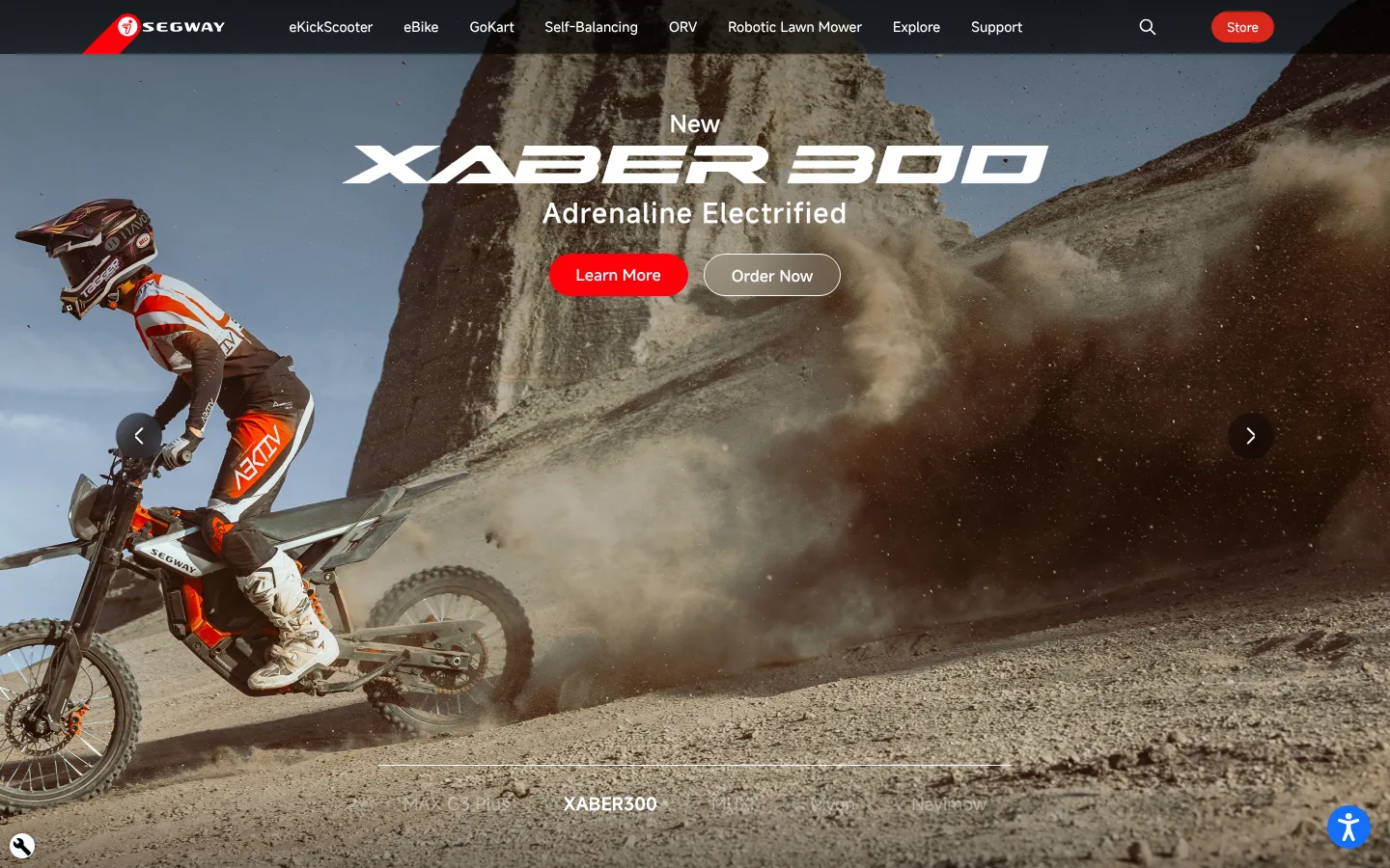
The page uses pure black as its persistent canvas, letting immersive product photography set each section’s mood. White navigation, headings and card labels stay legible over the dark interface, while vivid rider red marks primary actions; the darker brand red appears more selectively. Muted grays support footer text and secondary surfaces without competing with imagery. Misans forms a clean sans-serif system: substantial, centered campaign headlines contrast with compact navigation and concise supporting copy. The homepage alternates full-bleed promotional scenes with dark product-showcase areas, then shifts into a dense but orderly grid of rounded category cards. Wide gutters and generous gaps between major sections keep the long page from feeling crowded, while card-level content remains compact. Photo-led framing, subtle black overlays and restrained borders preserve contrast and cinematic depth; decoration is secondary to vehicles, riders and landscape imagery.
Primary body, navigation, captions and product labels
Aa 设计
Misans-Demibold
网络字体 · 字重 400 / 450 / 380 · 占比 17%
免费替代:Inter
Headings and button labels
Aa 设计
Misans-Regular
网络字体 · 字重 400 / 330 / 380 · 占比 11%
免费替代:Inter
Regular-weight links and card copy
Aa 设计
Misans-Semibold
网络字体 · 字重 520 / 400 · 占比 10%
免费替代:Inter
Large campaign and section headings
角色
示例
字号
字重
行高
字距
一级标题
Centered campaign headline over the homepage hero imagery.
Segway
48px
520
1.21
0
二级标题
Major product or editorial section headings.
Segway
40px
520
1.2
0
三级标题
Product and category titles with subtle tracking.
Segway
28px
450
normal
0.04em
四级标题
Secondary headings and compact card titles.
The quick brown fox 敏捷的狐狸
24px
400
1.4
0
正文
Supporting product descriptions and section copy.
The quick brown fox 敏捷的狐狸
16px
400
1.4
0
辅助文字
Small labels and supporting metadata.
The quick brown fox 敏捷的狐狸
12px
380
1.33
0
按钮
Primary and secondary CTA labels.
The quick brown fox 敏捷的狐狸
16px
400
2.75
0
导航
Top-level product and support navigation.
The quick brown fox 敏捷的狐狸
14px
380
4
0
链接
Footer and inline text links.
The quick brown fox 敏捷的狐狸
16px
400
1
0
间距与布局
基准单位 4px · 密度:宽松
114px版块间距
16px元素间距
—卡片内边距
1408px内容最大宽度
4px
5px
6px
8px
10px
12px
15px
16px
24px
28px
30px
32px
48px
114px
150px
A spacious, vertically scrolling homepage anchored by a centered, wide content area; measured maximum width is 1408px. The first viewport is a full-bleed campaign hero beneath a slim navigation bar. Below it, broad dark sections alternate between product showcases and category cards. Category imagery sits in a responsive grid, with rounded corners and text anchored over the images. Major sections have generous separation, while card interiors and footer columns are more compact. Keep headings and key campaign actions centered, and use alignment within cards to support quick scanning.
圆角与层次
按钮 · 9999px
卡片 · 20px
sm · other
The interface is mostly flat: black section fields and image-led cards provide the structure. Rounded card corners soften the grid, while fine dark borders are reserved for subtle separation. Black gradient overlays add depth over photography. Avoid prominent drop shadows or layered, floating panels; the red CTA supplies the main non-photographic emphasis.
组件
下面的预览按实测的按钮、输入框、徽标、卡片样式重建(字体用替代字体)。
Top navigation
Dark horizontal header with white Segway mark, compact white product links, search icon and a small pill-shaped red Store action.
Campaign hero
Full-bleed rider and terrain photography with centered white campaign typography, a bright red primary CTA and an outlined secondary action.
Product showcase
Dark product-focused band with centered heading and copy, prominent scooter imagery, carousel controls and small pagination indicators.
Category cards
Rounded, photo-led tiles for mobility and adjacent products; white labels and compact red Learn More buttons sit over darkened image areas.
Explore cards
Compact dark-gray service and app cards combining product imagery, brief white text and understated pill-shaped actions.
Footer
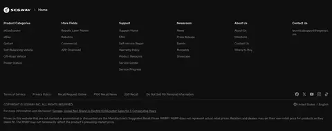
Near-black footer with multiple compact link columns, muted gray text, thin dividers and small social and locale details.
Imagery · Photography is the central visual device: riders, scooters, bikes and outdoor landscapes fill the hero and category cards. Images are cropped boldly, often edge-to-edge, with centered product campaign text or labels anchored over the scene. Dark gradient overlays improve text contrast. Product cutouts and app imagery appear in supporting cards; illustrations are not the defining brand signature.
Let large, cinematic product photography lead each campaign section.
Reserve Rider Red (#ff0009) for prominent actions.
Keep navigation, headings and card labels bright white.
Use rounded image cards for product categories.
Add dark image overlays wherever text crosses photography.
✕ 不该做
Do not introduce a bright page background.
Do not let gray surfaces overwhelm the black canvas.
Do not use red for large decorative panels.
Do not place dense copy over busy images without contrast treatment.
Do not add heavy shadows or ornamental borders.
Do not make navigation or card labels visually louder than the campaign.
给 AI 的提示词
想快速出一个同风格的新页面,把这段话连同 DESIGN.md 一起发给 AI。
Build a new Segway-style page around a Canvas Black (#000000) foundation, using cinematic, edge-to-edge mobility photography as the main storytelling device. Set navigation, headings and image-card labels in Signal White (#ffffff), with compact product links and a small Brand Red (#da291c) Store action. Use Rider Red (#ff0009) sparingly for high-priority CTAs. Choose a clean sans-serif close to Inter if Misans is unavailable; use stronger weights for headings and buttons, lighter weights for supporting copy. Alternate broad dark campaign bands with product showcases and rounded photo-led category cards. Use subtle black gradients behind text on images, keep spacing generous between major sections, and avoid heavy shadows, bright surfaces or decorative effects that compete with the products.