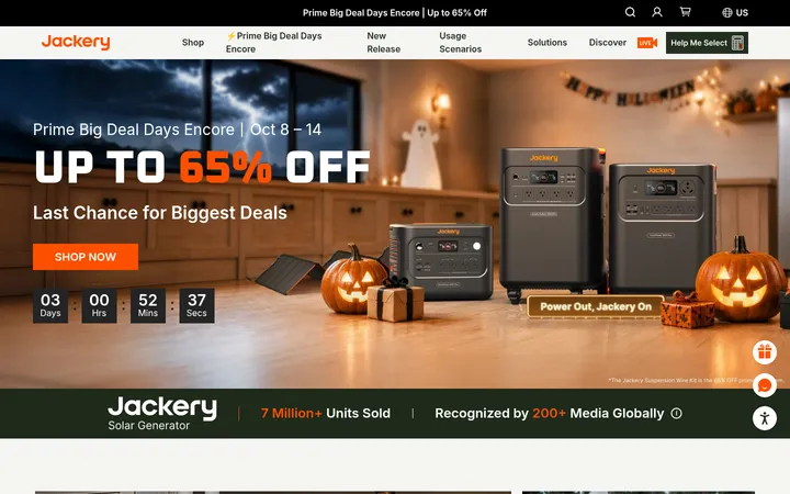
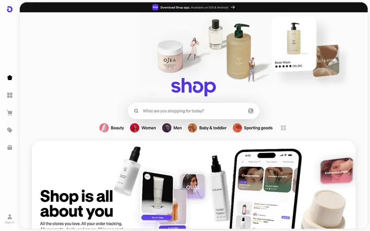
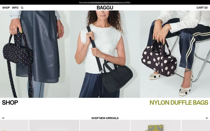
North star · Keep the storefront crisp and easy to shop, then let vivid outdoor photography and bold, friendly type carry the adventure.
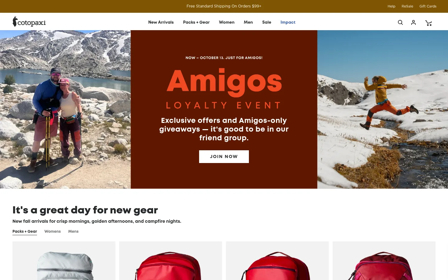
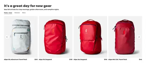
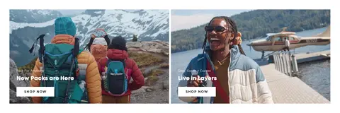
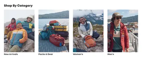
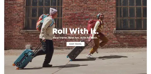
The page uses a predominantly white storefront canvas, with charcoal navigation and footer elements, pale gray product-image fields, and vivid color concentrated in photography and selected calls to action. A rust-toned Amigos campaign panel creates the first viewport’s strongest graphic interruption; it is campaign imagery, not a reason to recolor the wider interface. Mont is the dominant display and body face: rounded, heavy headings give product and editorial sections a friendly outdoor character. Gotham handles uppercase action labels and supporting interface copy. The layout moves from a wide photographic hero into a compact product carousel, paired editorial features, category tiles, travel storytelling, impact content, reviews, and a dark footer. Broad image blocks provide emotional scale while tight, orderly gutters keep shopping content efficient. Controls are mostly flat and square-edged, with restrained borders and only subtle card or button elevation.
Primary headings, product and body copy, captions, and navigation.
Aa 设计
Gotham
网络字体 · 字重 400 / 700 / 800 / 600 · 占比 39%
免费替代:Montserrat
Buttons, eyebrow labels, links, and selected interface or utility copy.
Aa 设计
Montserrat
网络字体 · 字重 400 / 700 · 占比 8%
免费替代:Montserrat
Secondary interface and form text, plus an occasional action label.
角色
示例
字号
字重
行高
字距
一级标题
Large primary campaign or page headline.
Cotopaxi
40px
800
1.2
0.005em
二级标题
Section headings for product and editorial blocks.
Cotopaxi
32px
700
1.3
0.005em
三级标题
Prominent feature and story titles.
Cotopaxi
30px
800
1.25
0
四级标题
Secondary section or card heading.
Cotopaxi
28px
600
1.2
0
正文
Product descriptions and supporting content.
The quick brown fox 敏捷的狐狸
16px
600
1.15
0
辅助文字
Compact product, review, and image captions.
The quick brown fox 敏捷的狐狸
14px
600
1.2
0
按钮
Uppercase CTA labels and purchase actions.
The quick brown fox 敏捷的狐狸
14px
700
1.5
0.107em
导航
Main navigation and utility menu labels.
The quick brown fox 敏捷的狐狸
13px
400
normal
0
链接
Product, editorial, and supporting links.
The quick brown fox 敏捷的狐狸
16px
400
1.5
0
眉题
Tracked uppercase campaign and section labels.
The quick brown fox 敏捷的狐狸
14px
700
1.5
0.107em
间距与布局
基准单位 2px · 密度:紧凑
40px版块间距
10px元素间距
26px卡片内边距
1400px内容最大宽度
3px
4px
5px
7px
8px
10px
15px
16px
20px
24px
25px
30px
35px
40px
A wide desktop storefront uses a centered content area, with the measured page max width at 1400px. The navigation and announcement bands sit above full-width campaign imagery. Product browsing uses a multi-column grid, followed by paired editorial panels, a four-category tile row, and alternating image-led storytelling and content blocks. Most sections are white and align their headings to the content edge; hero and campaign copy may center over imagery. Rhythm is compact and consistent, with clear separation between major content blocks.
圆角与层次
按钮 · 2px
输入框 · 2px
sm · button
sm · card
hairline · card
The interface is predominantly flat, with white sections separated by spacing rather than heavy card outlines. Product imagery rests in pale gray fields, and subtle shadows appear on a small number of cards or buttons. Borders are restrained: dark outlines appear on selected controls, while fine pale gray borders distinguish form fields. Avoid deep shadows or floating layers.
组件
下面的预览按实测的按钮、输入框、徽标、卡片样式重建(字体用替代字体)。
Announcement and navigation
A narrow ochre shipping strip precedes a white navigation bar with charcoal links, logo, and utility icons.
Campaign hero
Wide adventure photography frames a centered rust-toned campaign panel with prominent type and a white Join Now action.
Product carousel
A bold section title and short supporting line lead into a compact multi-column product row with pale image fields, names, and prices.
Editorial image panels
Paired outdoor photographs carry short overlay labels and white uppercase shopping actions.
Category tiles
A four-column row of portrait lifestyle images uses concise category titles beneath each image.
Impact and review blocks
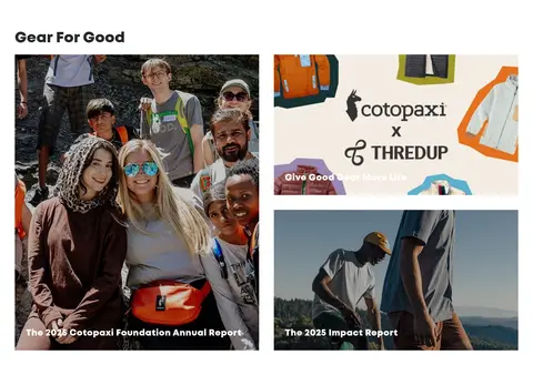
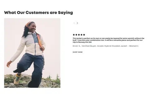
Impact stories use a staggered image grid; testimonials pair lifestyle photography with review copy and a small shopping link.
Newsletter and footer
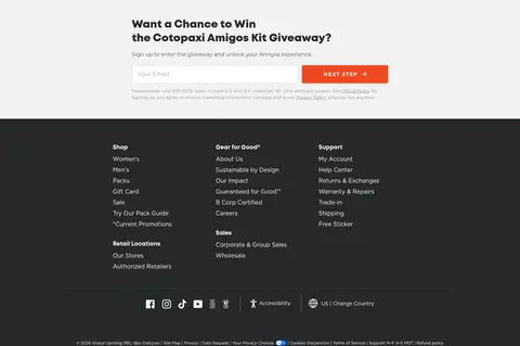
A light signup area presents form fields and an orange next-step action above a charcoal, multi-column footer.
Imagery · Photography defines the page: outdoor travelers, gear in use, product pack shots, and people in scenic environments. The hero combines two adventure images with a centered campaign panel; product photography is isolated against pale neutral fields. Editorial tiles use cropped, edge-to-edge images with readable text overlays where needed. Image color is intentionally lively and varied, while interface chrome stays restrained. No illustration or 3D treatment defines the visual identity.
Reserve vivid color for photography and selected actions.
Set headings in bold, rounded sans-serif type.
Make product imagery large, clear, and easy to scan.
Use compact uppercase labels for prominent actions.
Separate editorial blocks with generous visual breathing room.
✕ 不该做
Do not turn campaign image colors into site-wide interface colors.
Do not add gradients as a dominant brand background.
Do not use heavy shadows on cards or controls.
Do not crowd product cards with decorative UI.
Do not let text overlays obscure the subject of a photograph.
Do not replace the white, clean storefront with a dark theme.
给 AI 的提示词
想快速出一个同风格的新页面,把这段话连同 DESIGN.md 一起发给 AI。
Build a new Cotopaxi-style outdoor ecommerce page with a crisp white storefront, bold rounded sans-serif headings, and vivid adventure photography. Use Trail Charcoal (#25282a) for navigation, headings, links, and dark footer areas; Gallery White (#ffffff) for the main surfaces; and Mist Gray (#f2f2f2) for subdued media fields. Keep Trail Blue (#385cad) and Signal Ember (#f04923) for restrained action accents, and Harvest Ochre (#7f5504) for a narrow announcement band. Create a clear hierarchy from announcement and navigation to a large image-led hero, scannable product rows, editorial image panels, and supporting brand content. Favor square, flat controls, compact uppercase CTA text, consistent gutters, and subtle borders over elevation. Keep campaign-specific colors inside their campaign block rather than spreading them across the interface.