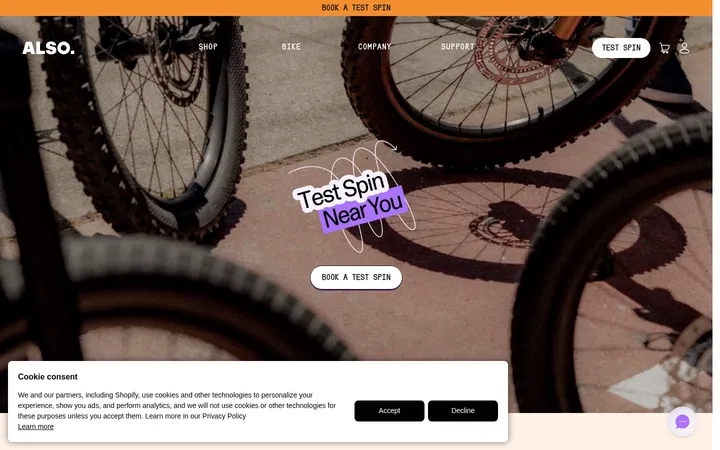
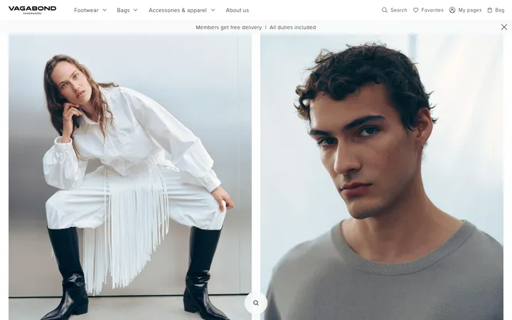
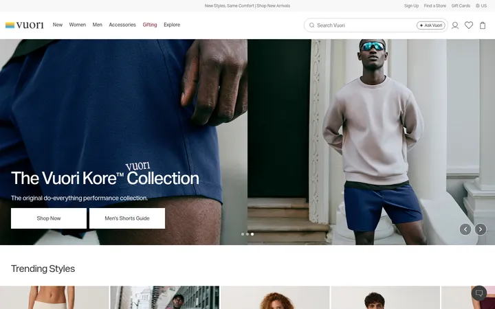
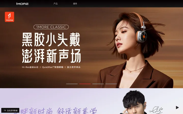
North star · Let cinematic bicycle imagery lead, while a quiet monochrome interface keeps product information clear and effortless to scan.
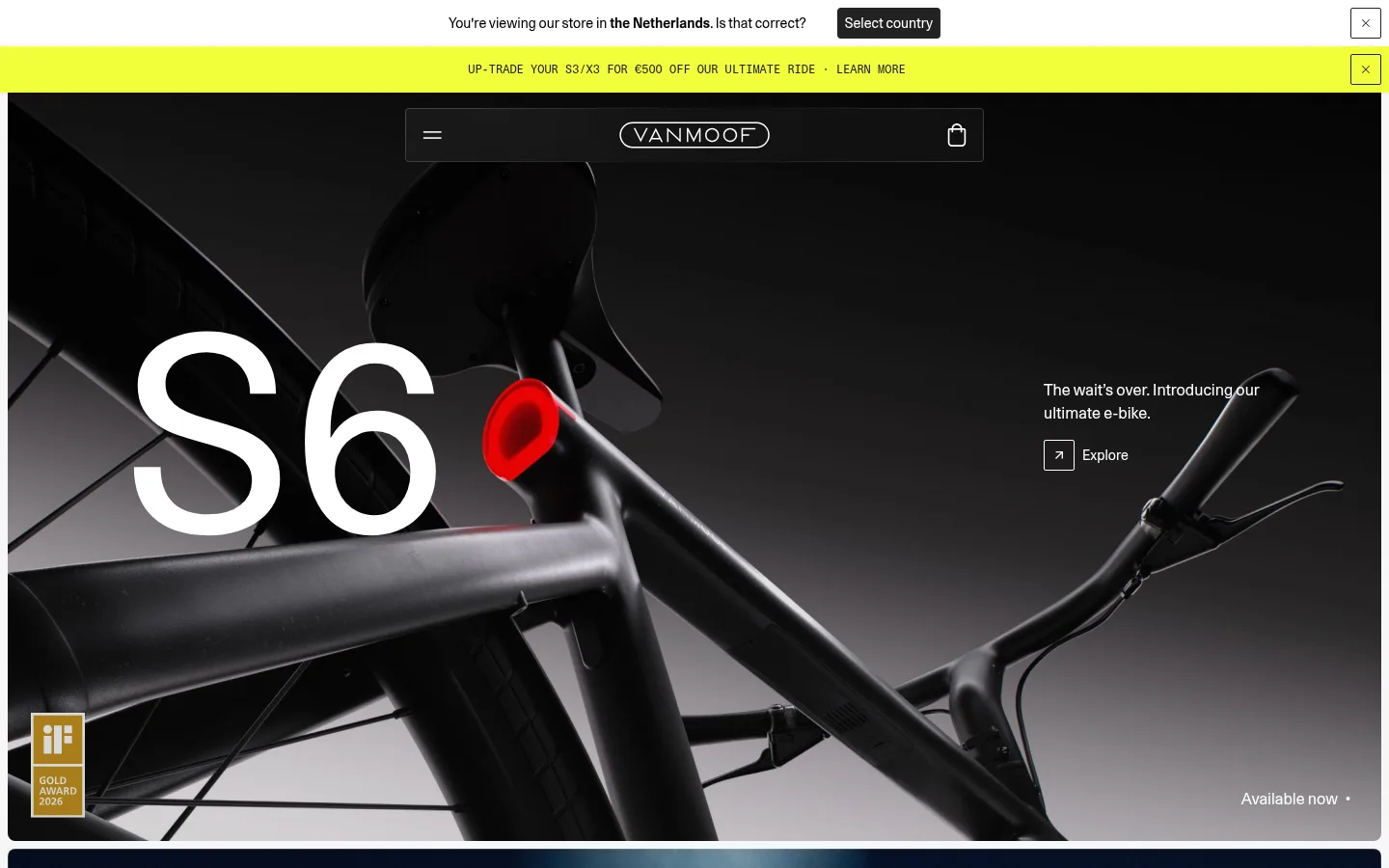
The visual strategy is deliberately restrained around dramatic product imagery. White and near-white surfaces give the page a clean retail canvas, while charcoal text and dark image overlays preserve legibility without adding decorative colour. The campaign banner’s vivid yellow is an exception: it functions as a temporary promotional signal, not the core interface palette. Large, lightweight Unica77LLWeb headings establish an editorial tone; compact body copy and navigation stay quiet and practical. A mono face appears sparingly for technical or uppercase-style details. Layout alternates full-bleed video or photography with inset pale panels, creating a measured rhythm between emotional storytelling and product explanation. Spacious margins surround feature content, while footer links and utility controls remain dense. Thin borders, restrained corner rounding, and almost no shadow keep cards crisp and visually subordinate to the bikes.
Primary face for display and headings, body copy, navigation, and buttons.
Aa 设计
Unica77Mono
网络字体 · 字重 400 · 占比 6%
免费替代:IBM Plex Mono
Sparing monospace treatment for compact technical or coded details.
角色
示例
字号
字重
行高
字距
特大标题
Oversized campaign lettering, such as the S6 hero model name.
VanMoof
280px
400
1
0
一级标题
Primary campaign and major section headlines.
VanMoof
80px
400
1
0
二级标题
Secondary section titles and broad product-story headlines.
VanMoof
48px
400
1.1
0
三级标题
Feature-panel and content-card headings.
VanMoof
32px
400
1.1
0
四级标题
Smaller subsection headings and supporting feature titles.
The quick brown fox 敏捷的狐狸
24px
400
1.1
0
正文
Product explanations, card copy, and editorial descriptions.
The quick brown fox 敏捷的狐狸
14px
400
1.43
0
辅助文字
Compact labels, image notes, and secondary metadata.
The quick brown fox 敏捷的狐狸
12px
400
1.33
0
按钮
Short CTA labels and utility actions.
The quick brown fox 敏捷的狐狸
12px
400
1.33
0
导航
Header navigation and footer category links.
The quick brown fox 敏捷的狐狸
14px
400
1.43
0
代码
Occasional uppercase technical or promotional detail.
const style = 1;
12px
400
1.2
0
间距与布局
基准单位 8px · 密度:紧凑
32px版块间距
8px元素间距
20px卡片内边距
1424px内容最大宽度
4px
6px
8px
12px
13px
14px
16px
24px
32px
40px
48px
64px
80px
The page uses a broad, centered desktop canvas with a measured maximum width of 1424px. Campaign media spans nearly the full available width, while informational panels sit inset within the pale background. Content alternates between full-width storytelling and more structured card or feature arrangements. Headings align to the left edge of their content; feature text stays close to relevant imagery. Section gaps are measured at 32px, with compact internal spacing and a relatively dense footer. Preserve the contrast between spacious campaign panels and concise utility areas.
圆角与层次
按钮 · 2px
卡片 · 8px
图片 · 4px
导航 · 4px
链接 · 4px
没有测到阴影:页面是扁平的,层次靠底色和描边区分。
The interface is mostly flat, with no measured shadows. Separate cards and content using pale surface changes or fine borders, including the measured #e0e0e0 hairline. Use restrained rounding on select cards and media; keep hero imagery and most text panels visually flush rather than floating.
组件
下面的预览按实测的按钮、输入框、徽标、卡片样式重建(字体用替代字体)。
Country selector notice
A narrow white utility strip with compact copy, a dark Select country button, and a separate close control.
Promotion banner
A vivid yellow-green horizontal offer strip with small uppercase monospace-style copy and a close icon.
Overlay navigation
A centered, dark translucent navigation capsule over the hero, with menu and bag icons framing the VanMoof wordmark.
Campaign hero
Full-bleed video or photography with oversized white model lettering, concise supporting copy, and a small outlined arrow CTA.
App feature panel
A pale #eeeeee product-information card with centered title and CTA, a row of compact feature explanations, and a large device image.
Editorial link cards
Image-led service and test-ride tiles with white headings, short descriptions, subtle dark overlays, and outlined arrow controls.
Footer link columns
A clean white footer with newsletter signup, compact product and support link groups, social links, and legal utilities.
Imagery · Photography and video dominate: close-up bicycle product shots, cinematic dark hero scenes, and lifestyle riding footage. Images are often full-bleed with text placed over open, low-detail portions of the frame; subtle dark gradients support contrast. The app feature uses a pale information panel paired with a large handlebar-display product image. Avoid illustration-led or decorative graphic treatments.
Let product photography carry the strongest visual impact.
Keep core interface surfaces white, near-white, or charcoal.
Use large, lightweight headings against concise supporting copy.
Place text over image areas with clear contrast and restrained overlays.
Alternate cinematic media with calm informational panels.
Keep buttons and card borders thin and understated.
✕ 不该做
Do not make promotional yellow the default interface colour.
Do not add shadows or floating-card effects.
Do not crowd full-bleed imagery with extra copy.
Do not use decorative gradients as a dominant page background.
Do not overuse monospace typography.
Do not substitute illustrations for the product photography-led approach.
给 AI 的提示词
想快速出一个同风格的新页面,把这段话连同 DESIGN.md 一起发给 AI。
Build a new VanMoof-style ecommerce page with a quiet monochrome interface and cinematic bicycle imagery. Use Gallery White (#ffffff), Cloud Canvas (#f7f7f7), Carbon Ink (#222222), and Mist Panel (#eeeeee) for the core surfaces and text; reserve Graphite (#313131) and Hairline Grey (#e0e0e0) for supporting copy and subtle structure. Set headings in a clean, lightweight sans-serif similar to Unica77LLWeb, with restrained compact body copy; use a mono face only for occasional technical labels. Organize the page as full-bleed campaign media alternating with inset product-information panels and image-led service cards. Keep CTAs concise and lightly outlined or dark-filled. Favor flat surfaces, fine separators, generous breathing room around stories, and dense utility links only in the footer. Treat any bright campaign colour as a temporary promotional banner, not the brand foundation.