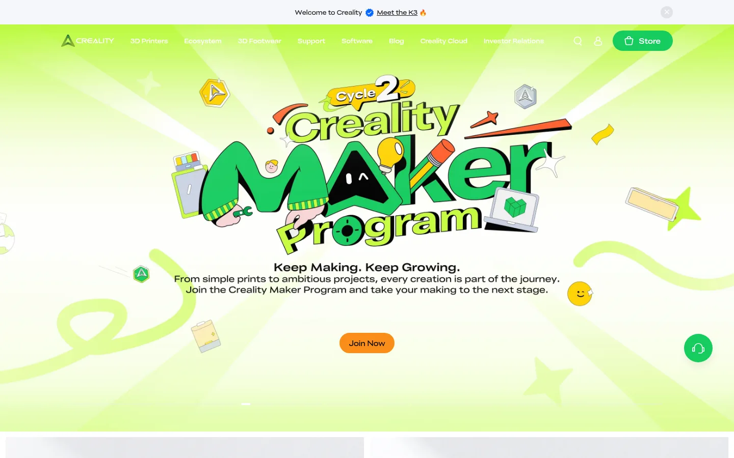
North star · Let product and campaign imagery lead, while a restrained white-and-gray interface and selective green actions keep the page easy to scan.
The page balances a clean commerce foundation with a lively maker identity. White is the main canvas, while pale gray (#f5f6fa) groups editorial cards, media coverage, newsletter content, and support links into calm section bands. Dark charcoal (#1e1e1e) carries most headings and body copy; Creality green (#17cc5f) marks key actions and selected links. Orange (#fa8c16) appears as a contrasting campaign CTA, while the first-screen lime palette belongs to the illustrated seasonal hero rather than the site-wide interface palette. CrealitySans is used throughout, with medium-weight headings and compact supporting copy. Wide campaign artwork gives way to a two-column product presentation and image-led content cards, then quieter editorial and footer regions. Generous whitespace separates sections, while repeated card layouts make the long page easy to scan.
Site-wide type for navigation, headings, body copy, buttons, links, captions, and footer content.
角色
示例
字号
字重
行高
字距
一级标题
Campaign headline or primary page-level title.
Creality
40px
500
1.2
0
二级标题
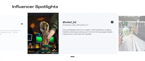
Major section headings, such as Influencer Spotlights and Media Coverage.
Creality
32px
500
1.5
0
三级标题
Product and content-card titles.
The quick brown fox 敏捷的狐狸
24px
400
1.2
0
四级标题
Secondary card or subsection headings.
The quick brown fox 敏捷的狐狸
20px
500
1.5
0
正文
Product descriptions, editorial summaries, and general interface copy.
The quick brown fox 敏捷的狐狸
14px
400
1.43
0
辅助文字
Small supporting labels and fine-print information.
The quick brown fox 敏捷的狐狸
12px
300
1.33
0
按钮
CTA labels such as Learn More, Store, and Join Now.
The quick brown fox 敏捷的狐狸
14px
500
1.43
0
导航
Compact primary navigation labels across the header.
The quick brown fox 敏捷的狐狸
12px
500
1.33
0
链接
Editorial links, footer destinations, and supporting calls to action.
The quick brown fox 敏捷的狐狸
16px
400
1.5
0
间距与布局
基准单位 8px · 密度:紧凑
40px版块间距
8px元素间距
36px卡片内边距
1200px内容最大宽度
6px
8px
11px
12px
14px
16px
20px
24px
32px
40px
56px
80px
120px
The desktop page uses a centered content system measured at a 1200px maximum width, with full-bleed campaign artwork and broad section backgrounds. Product and editorial areas switch between two-column and multi-card grids; testimonial and blog regions use repeated cards. Headings generally align to the left edge of their content. A compact spacing rhythm keeps controls and card content close, while larger gaps distinguish major page sections. The overall density is compact, but image-led blocks retain open space.
圆角与层次
按钮 · 9999px
输入框 · 9999px
md · button
Most content is presented as flat, square-cornered white or pale-gray panels, with separation coming from whitespace and section bands rather than visible outlines. Inputs use a subtle measured border. Buttons are pill-shaped; measured button shadow is restrained, so avoid adding heavy shadows or layered card effects.
组件
下面的预览按实测的按钮、输入框、徽标、卡片样式重建(字体用替代字体)。
Campaign hero
Full-bleed illustrated campaign area with centered creative, supporting copy, and a prominent orange Join Now pill CTA.
Primary action
Green pill buttons with white text, including Learn More and Store; keep labels short and weight moderate.
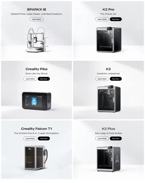
Product showcase
Large, image-led product panels with centered model name, short claim, and compact action buttons.
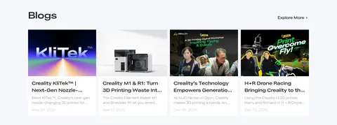
Editorial card
Photography or thumbnail above a dark title and muted description; use restrained green links where shown.
Media quote card
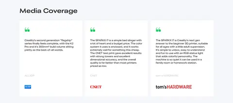
Pale-gray section containing white testimonial cards, short quotes, a green quote mark, and publication branding.
Newsletter form
Email field on a pale-gray ground with a rounded outline and a compact action control.
Support shortcuts
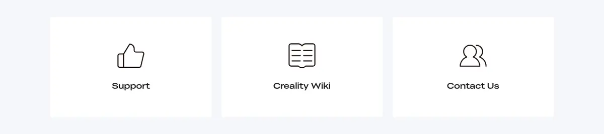
Three evenly arranged support destinations, each pairing a simple dark line icon with a concise label.
Imagery · The homepage pairs large product photography—printers, scanners, and accessories—with real-life maker scenes, influencer posts, and editorial thumbnails. The opening campaign uses bold, playful illustrated lettering and a luminous lime backdrop; treat those colors and graphic motifs as campaign artwork, not defaults for every section. Keep product images clearly framed against light backgrounds, and preserve the more documentary feel of community photography.
Use white as the main canvas and pale gray to group related content.
Reserve Creality green for clear actions and selected link accents.
Let product photography and campaign artwork carry the visual interest.
Keep headings direct, dark, and easy to distinguish from body copy.
Use compact pill-shaped buttons for primary actions.
Separate major content groups with whitespace and broad section bands.
✕ 不该做
Do not apply the campaign’s lime illustration palette to every section.
Do not introduce unmeasured colors, spacing values, or corner radii.
Do not add heavy shadows or decorative borders to every card.
Do not let secondary copy compete with product names or main actions.
Do not crowd full-bleed campaign artwork with extra interface decoration.
Do not use oversized, high-contrast typography for routine navigation or footer links.
给 AI 的提示词
想快速出一个同风格的新页面,把这段话连同 DESIGN.md 一起发给 AI。
Build a responsive Creality-style commerce homepage with a clean white canvas (#ffffff), pale-gray content bands (#f5f6fa), charcoal copy (#1e1e1e), and selective Maker Green actions (#17cc5f). Use Orange (#fa8c16) only for a distinctive campaign CTA. Apply CrealitySans or a close Inter substitute throughout, with medium-weight headings and compact, readable body text. Start with a full-bleed, playful illustrated campaign hero, then organize product showcases and maker-use imagery into clear grids. Continue with community, media, blog, newsletter, and support content before a structured footer. Keep product photography prominent, card treatments mostly flat, and CTAs pill-shaped. Follow the measured 1200px maximum content width and 8px-based spacing rhythm; do not invent measurements or treat hero artwork colors as global brand tokens.