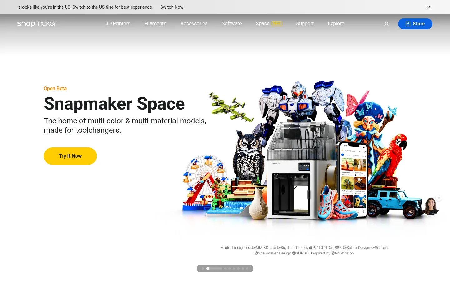
North star · Keep the interface quiet and product-led: use white space and large imagery for impact, reserving vivid accents for clear actions.
The page uses Gallery White (#ffffff) as its dominant canvas, letting product renders, creative prints, and lifestyle scenes provide most of the visual color. Ink (#1c1e20) anchors headings and the dark newsletter/footer band; near-black panels frame cinematic video content. Signal Yellow (#ffcd00) is reserved for prominent rounded calls to action, while blue appears selectively on store and subscription actions. Roboto carries the full interface, from compact navigation and body copy to bold display headlines. The typography is direct and unornamented, with strong weight contrast and tight display tracking. A centered, wide content area organizes product-category cards, image-led use-case tiles, editorial quotes, and blog cards into clear grids. Generous white space around the hero contrasts with a compact rhythm in supporting content. Large imagery is often edge-to-edge or softly rounded, while cards remain understated and rely more on image and spacing than decoration.
配色
点色块复制色值。用途说明来自对页面的实测位置(背景、文字、描边、按钮)与截图判读。
品牌色
强调色
表层色
中性色
功能色
页面底色 · Gallery White表层 · Stage Black表层 2 · Mist Gray表层 3 · Pure Black表层 4 · Ink主文字 · Ink次要文字 · Soft Graphite弱文字 · Gallery White描边 · Soft Graphite强调 · Signal Yellow强调 2 · Store Blue
All interface typography: navigation, headings, body copy, links, buttons, and footer.
角色
示例
字号
字重
行高
字距
特大标题
Large bold hero and campaign headlines.
Snapmaker
56px
700
1.14
-0.004em
一级标题
Primary section or page headline.
Snapmaker
36px
700
1
-0.007em
二级标题
Major section headings and prominent editorial titles.
Snapmaker
32px
700
1.25
0
三级标题
Card and supporting feature headings.
The quick brown fox 敏捷的狐狸
24px
400
1.25
0
四级标题
Compact category and utility-card headings.
The quick brown fox 敏捷的狐狸
20px
700
1.4
0
正文
Descriptions, testimonials, and supporting information.
The quick brown fox 敏捷的狐狸
14px
400
1.43
0
按钮
Short, semibold CTA labels.
The quick brown fox 敏捷的狐狸
14px
600
1
0
链接
Navigation, inline actions, and footer links.
The quick brown fox 敏捷的狐狸
14px
400
1.71
-0.002em
间距与布局
基准单位 4px · 密度:紧凑
40px版块间距
8px元素间距
—卡片内边距
1328px内容最大宽度
1px
4px
6px
8px
10px
12px
16px
20px
23px
24px
30px
32px
36px
40px
48px
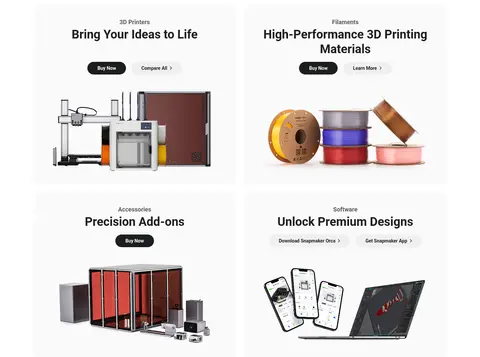
A wide desktop composition uses a measured 1328px maximum page width and a compact underlying spacing scale. The hero gives its full-bleed media room to dominate while aligning copy to the left; subsequent product categories use a centered two-column card grid. Use-case tiles and editorial content return to left-aligned headings and image-led grids. Sections generally sit on white with clear vertical separation; dark newsletter and footer bands close the page. Keep alignment intentional and avoid dense text blocks.
圆角与层次
按钮 · 9999px
卡片 · 16px
图片 · 50%
徽标 · 3px
链接 · 16px
xl · card
sm · other
The interface is mostly flat: white canvas, pale card fills, and image contrast do most of the grouping. Use measured 16px card rounding and pill-shaped buttons. Cards may receive a very soft, broad shadow, but avoid strong stacked elevation. Thin gray borders are secondary details rather than the primary layout system; dark gradients belong over media.
组件
下面的预览按实测的按钮、输入框、徽标、卡片样式重建(字体用替代字体)。
Hero action
Prominent yellow pill CTA with black or Ink text; keep its label short and visually distinct from nearby text links.
Product category card
Pale, softly rounded card pairing a small category label, centered bold heading, compact actions, and a large product image.
Use-case tile
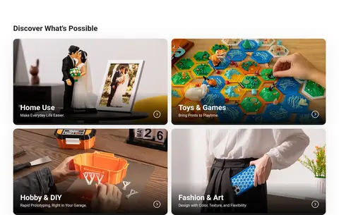
Rounded lifestyle image tile with a dark lower gradient, white title and supporting copy, plus a small directional affordance.
Campaign video panel
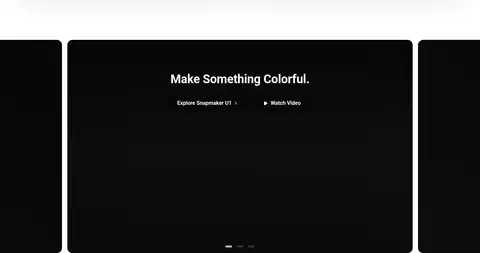
Wide, near-black media panel with centered white headline and restrained text actions; use shading to support legibility.
Testimonial card
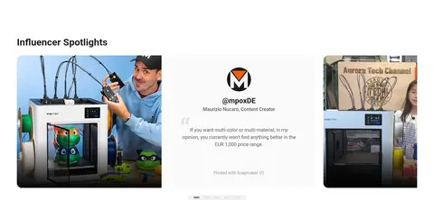
Light rounded card combining creator imagery or identity, a short quote, attribution, and restrained supporting copy.
Newsletter form
Dark-band signup row with heading and supporting text beside an email field and blue Subscribe action.
Footer link columns
Compact multi-column navigation on Ink, using small muted links and a subdued legal and locale row.
Imagery · Lead with crisp product renders and photographs of printers, materials, accessories, and finished creative projects. The hero juxtaposes concise copy with a large, colorful maker showcase. Use-case cards crop lifestyle photography into rounded image panels with dark bottom overlays for readable captions. Video-led campaign panels use near-black framing and gradient shading. Keep product details sharp and backgrounds secondary; avoid decorative illustration outside the products and media.
Use white space to let product imagery carry the visual impact.
Keep headings bold, direct, and in Roboto.
Reserve Signal Yellow (#ffcd00) for the primary action.
Use rounded image cards for use-case and testimonial content.
Apply dark gradients only when media needs readable captions.
Separate the footer from the light content with an Ink band.
✕ 不该做
Do not add unmeasured colors to the core interface palette.
Do not turn every link or card into a bright CTA.
Do not use heavy shadows as the main grouping device.
Do not crowd product imagery with decorative UI.
Do not make every section dark or use-case imagery overly stylized.
Do not use display type that feels ornamental or highly condensed.
给 AI 的提示词
想快速出一个同风格的新页面,把这段话连同 DESIGN.md 一起发给 AI。
Build a new Snapmaker-style page as a clean, product-led interface. Use Gallery White (#ffffff) for the main canvas and Ink (#1c1e20) for headings and copy; switch to Ink or Stage Black (#111111) only for a deliberate media or footer band. Use Roboto throughout, with bold headlines and compact, clear supporting text. Organize content in a wide centered layout with calm section spacing and image-first cards. Let realistic product photography or renders supply color and detail. Use Signal Yellow (#ffcd00) for the primary rounded CTA, and Store Blue (#0c63e2) only for a secondary action such as signup. Keep cards softly rounded and mostly flat, adding restrained shadows or media gradients only where useful. Favor clear grids, concise copy, and visible product details over ornament.