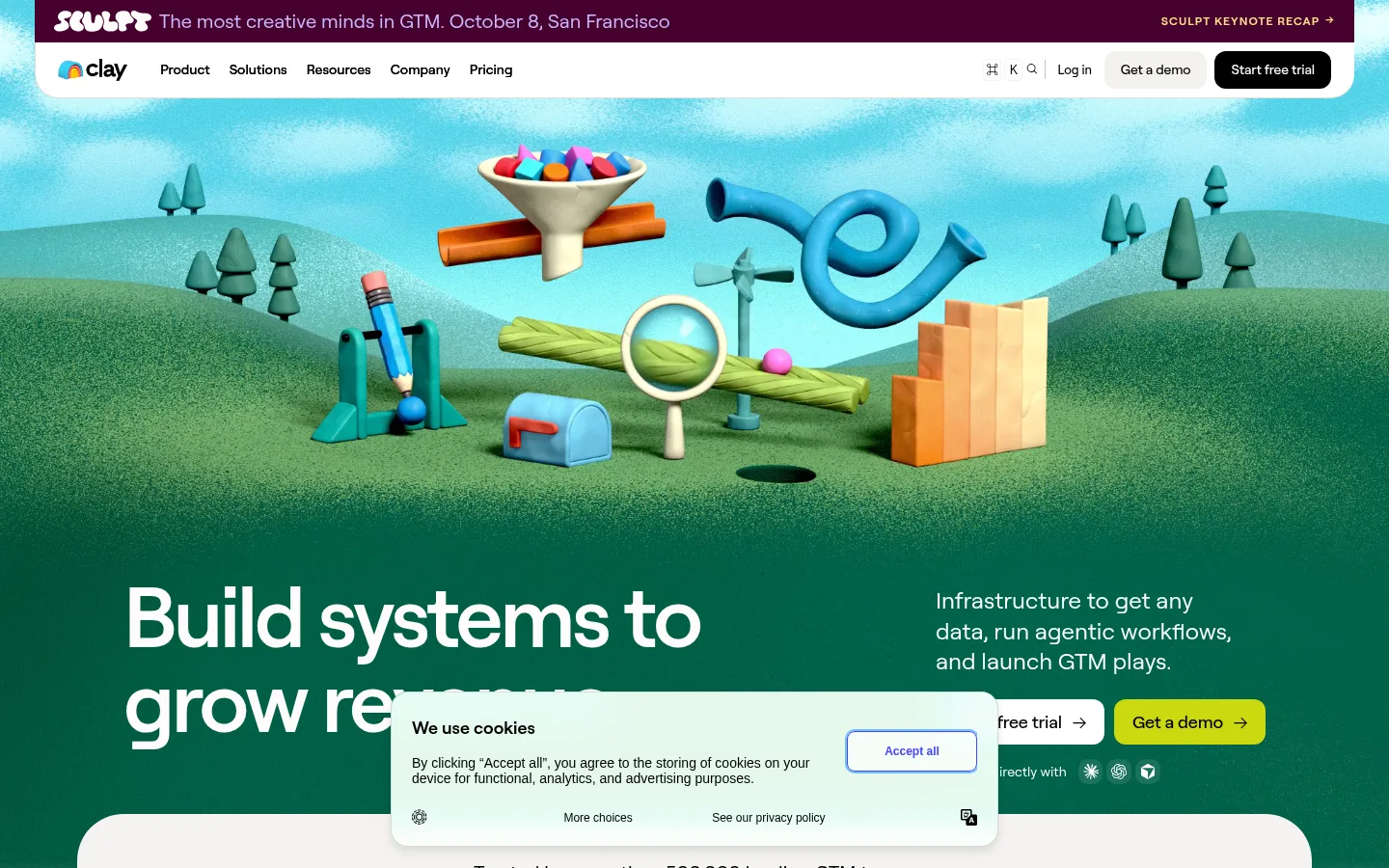
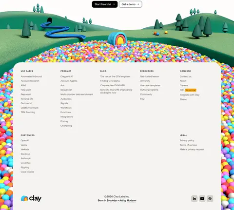
Clay以鲜活立体的3D场景搭配简洁白底界面,让复杂的GTM工具显得直观亲切。深绿色首屏之后,是留白充足的产品展示、淡彩功能模块、醒目的行动按钮和信息丰富的页脚。
North star · Keep the interface calm and legible, then use distinctive color-coded panels and sculptural 3D imagery to make each GTM capability memorable.
The visual system contrasts a deep-green hero with an otherwise white, expansive page. The green establishes a distinctive brand canvas, while the warm off-white and pale blue, yellow-green, peach, and pink surfaces organize product stories into clear, color-coded feature blocks. Black and warm charcoal carry most text; vivid blue, orange, magenta, and acid-lime appear as selective accents, not a competing palette. Roobertvf is used throughout, with large, tightly tracked headlines and calm, readable body text. Layout alternates centered introductions and full-width demonstrations with aligned split panels, keeping the interface airy despite a long homepage. Product UI, customer marks, and colorful 3D scenes provide variety; the illustrations should be read as expressive campaign imagery rather than literal interface colors. Cards rely on rounded corners and subtle borders over heavy shadows. Compact pill-like controls and restrained motion keep the experience polished and approachable.
配色 点色块复制色值。用途说明来自对页面的实测位置(背景、文字、描边、按钮)与截图判读。
品牌色
Clay Green
#035d44
Signature dark-green hero and brand section background.
强调色
Acid Lime
#eef773
Bright highlight for selected controls and occasional small UI accents.
Signal Blue
#395afa
Selective blue for data-product actions and interface highlights.
Burnt Orange
#b53d0a
Warm accent associated with agent-focused feature content.
Electric Magenta
#cc089e
Rare vivid accent for activation-themed controls or interface details.
Olive Marker
#808000
Low-frequency accent, most plausibly a small UI or illustrated detail.
Citrus Button
#cbd810
High-visibility demo call to action against the dark-green hero.
表层色
Warm Chalk
#f4f3f0
Soft neutral for secondary buttons, navigation details, and footer or link surfaces.
Mist Blue
#f0f8ff
Pale blue backing for data-focused product feature panels.
Pistachio Haze
#fcfee2
Very pale yellow-green feature or illustration backing.
Petal Tint
#fff0fa
Pale pink surface for activation content and lightly tinted cards.
中性色
Gallery White
#ffffff
Main page canvas, navigation surfaces, and contrast space around feature sections.
True Ink
#000000
Primary headings, navigation, and high-contrast text or button content.
Soft Graphite
#1b1a18
Muted primary text and text on pale neutral controls.
Stone Copy
#55534e
Secondary and footer copy with softer contrast than primary text.
功能色
Quiet Line
#e2e1dd
Fine borders and separators that define cards without adding visual weight.
文字 背景 对比度 WCAG #000000 True Ink#ffffff Gallery White21:1 AAA #000000 True Ink#f4f3f0 Warm Chalk18.93:1 AAA #000000 True Ink#035d44 Clay Green2.65:1 不达标 #000000 True Ink#f0f8ff Mist Blue19.58:1 AAA #1b1a18 Soft Graphite#ffffff Gallery White17.39:1 AAA #1b1a18 Soft Graphite#f4f3f0 Warm Chalk15.67:1 AAA
字体 字号阶梯:Augmented Fourth(比例约 1.406,正文 16px)。示例用免费替代字体渲染,数值为实测。
Aa 设计
Roobertvf 网络字体 · 字重 400 / 500 / 600 / 575 / 700 · 占比 100%
免费替代:Inter
Site-wide interface, display headings, body text, navigation, and labels.
角色 示例 字号 字重 行高 字距 特大标题 Oversized hero headline, set tight and prominent against the green field.
Clay
88px 575 1 -0.04em 一级标题 Primary page or major section headline.
Clay
72px 500 1 -0.03em 二级标题 Feature-section and prominent content headings.
Clay
48px 500 1 -0.04em 三级标题 Subsection titles, often paired with product demonstrations.
Clay
44px 500 1.1 -0.02em 四级标题 Smaller card and supporting section headings.
The quick brown fox 敏捷的狐狸
24px 400 1.3 0 正文 Product explanations, supporting copy, and general interface text.
The quick brown fox 敏捷的狐狸
16px 400 1.4 0 辅助文字 Compact labels, customer details, and metadata.
The quick brown fox 敏捷的狐狸
12px 400 1.3 0 导航 Header links and compact navigation items.
The quick brown fox 敏捷的狐狸
14px 500 1.5 0 眉题 Uppercase category labels above feature headings.
The quick brown fox 敏捷的狐狸
12px 600 1.2 0.09em
间距与布局 基准单位 8px · 密度:适中
64px 版块间距
16px 元素间距
18px 卡片内边距
1280px 内容最大宽度
2px
4px
6px
8px
10px
12px
16px
20px
24px
32px
40px
48px
64px
Use a centered page frame capped at the measured 1280px maximum, with generous section separation and a comfortable content density. The homepage alternates centered headline-led blocks with split feature layouts and wide product demonstrations. Feature sections align text and media in clear columns, while cards and content grids organize secondary stories. Preserve substantial white space around the product and keep the hero visually full-bleed. The measured spacing system is based on an 8px unit, with 64px section rhythm and 16px element gaps.
圆角与层次 inset · other, button
inset · other
inset · other
inset · other
Keep most surfaces flat and let color fields, spacing, and rounded shapes establish hierarchy. Cards use restrained borders and light contrast rather than pronounced drop shadows. Reserve layering for the floating hero navigation, cookie notice, media, and product mockups; do not make every feature card look elevated.
组件 下面的预览按实测的按钮、输入框、徽标、卡片样式重建(字体用替代字体)。
Announcement and navigation A narrow conference announcement sits above a white rounded navigation bar. Keep links compact and place demo and trial actions at the right.
Hero Use a full-width #035d44 canvas with large white type, supporting copy, and contrasting trial and #cbd810 demo actions over prominent 3D scenery.
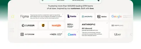
Logo cloud Place customer marks in a broad pale card beneath a short trust statement, with a dense but orderly multi-column arrangement.
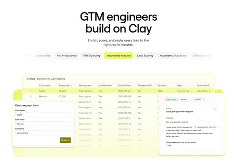
Workflow selector Present a centered heading, concise explanation, and a row of compact pill-like options above an illustrative workflow preview.
Feature panel Pair a category eyebrow and headline with supporting copy, a compact CTA row, and product or 3D media. Use a distinct measured pale tint for each capability.
Product showcase Use a spacious white block with a concise heading and large rounded workflow or product image; avoid ornamental borders and heavy shadows.
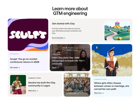
Content cards Combine event, educational, customer, and community stories in a varied but aligned card grid, with clear labels and simple text links.
Footer Finish with a large, rounded light surface over colorful 3D landscape artwork and organize many destinations into compact link columns.
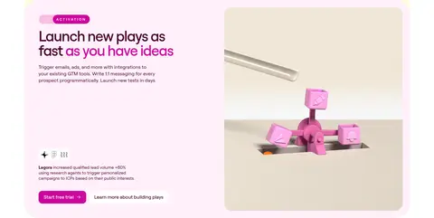
Imagery · Lead with colorful, tactile 3D landscapes and sculptural objects, framed as wide hero art rather than interface screenshots. Use product UI captures to explain workflow features, and prominent video thumbnails for customer proof. Feature illustrations can be playful and surreal; place them inside softly tinted, rounded panels. Treat the screenshot palette within these illustrations as imagery, not as additional interface brand colors.
页面版块 共 12 个版块,按页面从上到下排列,每个都标了类型、布局和交互套路。
该做与不该做 ✓ 该做 Use white space to separate long-form product sections. Keep Roobert-style typography clean and tightly tracked in large headlines. Reserve deep green for the defining hero treatment. Assign pale feature tints consistently to capability panels. Use 3D artwork as expressive storytelling, not interface decoration. Keep actions compact, rounded, and easy to distinguish. Use customer logos and product captures as proof points. ✕ 不该做 Do not use every accent color at once in core interface chrome. Do not turn the white content sections into dark panels. Do not add heavy shadows to every card. Do not use dense text blocks where a split layout can clarify content. Do not mistake vivid illustration colors for the site's core palette. Do not use oversized, highly ornamental navigation. Do not crowd the hero headline and CTA with extra interface elements. 给 AI 的提示词 想快速出一个同风格的新页面,把这段话连同 DESIGN.md 一起发给 AI。
复制 Build a new Clay-style SaaS page with a calm white foundation and a distinctive #035d44 hero. Use Roobertvf, or Inter as a free substitute, with tightly tracked large headlines and clear, regular-weight body copy. Keep the content in a centered frame, separated by generous white space. Organize capabilities into rounded split panels using measured pale surfaces such as Mist Blue #f0f8ff, Pistachio Haze #fcfee2, and Petal Tint #fff0fa. Use black #000000 or Soft Graphite #1b1a18 for text, and reserve Signal Blue #395afa, Burnt Orange #b53d0a, and Citrus Button #cbd810 for selective accents and actions. Favor tactile 3D scenes, product captures, and customer proof; treat illustration colors as artwork. Keep borders subtle and elevation restrained.
DESIGN.md Tailwind v4 CSS 变量 Design Tokens
---
title: "Clay design system"
variant: extended
source: https://www.clay.com/
captured_at: 2026-10-12
theme: light
industry: ai
generator: Design DNA (https://four.wiralomi.com/style/clay-com)
ai_generated: true
ai_label: "本文件由 AI 辅助生成:数值取自公开网页的实测样式,命名、用途说明与建议为模型解读。商标归原所有者。 / AI-assisted content"
---
# Clay · Design System
> Playful 3D worlds meet precise GTM infrastructure
**Theme:** light · **Industry:** ai · **Source:** https://www.clay.com/ · **Captured:** 2026-10-12 (1440×900 desktop)
_AI-assisted content: values are measured from the public page at capture time; names, roles and guidance are model-written interpretations. Trademarks belong to their owners._
Clay pairs a vivid, sculptural 3D landscape with a clean, white SaaS interface to make complex go-to-market tooling feel approachable. A deep-green hero gives way to spacious product demonstrations and softly tinted feature panels, with compact calls to action and a dense, practical footer.
## North star
Keep the interface calm and legible, then use distinctive color-coded panels and sculptural 3D imagery to make each GTM capability memorable.
## Overview
The visual system contrasts a deep-green hero with an otherwise white, expansive page. The green establishes a distinctive brand canvas, while the warm off-white and pale blue, yellow-green, peach, and pink surfaces organize product stories into clear, color-coded feature blocks. Black and warm charcoal carry most text; vivid blue, orange, magenta, and acid-lime appear as selective accents, not a competing palette. Roobertvf is used throughout, with large, tightly tracked headlines and calm, readable body text. Layout alternates centered introductions and full-width demonstrations with aligned split panels, keeping the interface airy despite a long homepage. Product UI, customer marks, and colorful 3D scenes provide variety; the illustrations should be read as expressive campaign imagery rather than literal interface colors. Cards rely on rounded corners and subtle borders over heavy shadows. Compact pill-like controls and restrained motion keep the experience polished and approachable.
## Colors
| Name | Hex | Token | Group | Role |
|---|---|---|---|---|
| Gallery White | ` | `--color-gallery-white` | neutral | Main page canvas, navigation surfaces, and contrast space around feature sections. |
| True Ink | ` | `--color-true-ink` | neutral | Primary headings, navigation, and high-contrast text or button content. |
| Warm Chalk | ` | `--color-warm-chalk` | surface | Soft neutral for secondary buttons, navigation details, and footer or link surfaces. |
| Quiet Line | ` | `--color-quiet-line` | semantic | Fine borders and separators that define cards without adding visual weight. |
| Soft Graphite | ` | `--color-soft-graphite` | neutral | Muted primary text and text on pale neutral controls. |
| Acid Lime | ` | `--color-acid-lime` | accent | Bright highlight for selected controls and occasional small UI accents. |
| Stone Copy | ` | `--color-stone-copy` | neutral | Secondary and footer copy with softer contrast than primary text. |
| Mist Blue | ` | `--color-mist-blue` | surface | Pale blue backing for data-focused product feature panels. |
| Clay Green | ` | `--color-clay-green` | brand | Signature dark-green hero and brand section background. |
| Signal Blue | ` | `--color-signal-blue` | accent | Selective blue for data-product actions and interface highlights. |
| Burnt Orange | ` | `--color-burnt-orange` | accent | Warm accent associated with agent-focused feature content. |
| Electric Magenta | ` | `--color-electric-magenta` | accent | Rare vivid accent for activation-themed controls or interface details. |
| Olive Marker | ` | `--color-olive-marker` | accent | Low-frequency accent, most plausibly a small UI or illustrated detail. |
| Citrus Button | ` | `--color-citrus-button` | accent | High-visibility demo call to action against the dark-green hero. |
| Pistachio Haze | ` | `--color-pistachio-haze` | surface | Very pale yellow-green feature or illustration backing. |
| Petal Tint | ` | `--color-petal-tint` | surface | Pale pink surface for activation content and lightly tinted cards. |
### Semantic aliases
`--color-canvas` → ` (Gallery White) · `--color-surface` → ` (Warm Chalk) · `--color-surface-2` → ` (Clay Green) · `--color-surface-3` → ` (Mist Blue) · `--color-surface-4` → ` (Pistachio Haze) · `--color-text` → ` (True Ink) · `--color-text-muted` → ` (Soft Graphite) · `--color-text-subtle` → ` (Stone Copy) · `--color-border` → ` (Quiet Line) · `--color-accent` → ` (Clay Green) · `--color-accent-2` → ` (Signal Blue) · `--color-accent-3` → ` (Burnt Orange)
### Contrast (WCAG 2.x)
| Text | Background | Ratio | Level |
|---|---|---|---|
| ` | ` | 21:1 | AAA |
| ` | ` | 18.93:1 | AAA |
| ` | ` | 2.65:1 | fail |
| ` | ` | 19.58:1 | AAA |
| ` | ` | 17.39:1 | AAA |
| ` | ` | 15.67:1 | AAA |
| ` | ` | 2.2:1 | fail |
| ` | ` | 16.21:1 | AAA |
| ` | ` | 7.68:1 | AAA |
| ` | ` | 6.92:1 | AA |
### Gradients
- `linear-gradient(rgb(255, 255, 255), rgb(255, 253, 249) 15%)`
- `linear-gradient(rgba(255, 255, 255, 0) 35%, rgb(255, 255, 255))`
- `linear-gradient(rgba(255, 255, 255, 0), rgb(255, 255, 255))`
- `linear-gradient(rgba(0, 0, 0, 0), rgba(0, 0, 0, 0.4))`
## Typography
| Family | Token | Source | Weights | Role | Free substitute |
|---|---|---|---|---|---|
| Roobertvf | `--font-body` | webfont | 400, 500, 600, 575, 700 | Site-wide interface, display headings, body text, navigation, and labels. | Inter |
- **Roobertvf:** Use medium or semibold display weights with tight negative tracking; body remains regular and readable. Eyebrows are compact, uppercase, and letter-spaced.
### Type scale — Augmented Fourth (ratio ≈ 1.406, base 16px)
| Role | Size | Weight | Line height | Letter spacing | Case | Family | Used for |
|---|---|---|---|---|---|---|---|
| display | 88px | 575 | 1 | -0.04em | — | Roobertvf | Oversized hero headline, set tight and prominent against the green field. |
| h1 | 72px | 500 | 1 | -0.03em | — | Roobertvf | Primary page or major section headline. |
| h2 | 48px | 500 | 1 | -0.04em | — | Roobertvf | Feature-section and prominent content headings. |
| h3 | 44px | 500 | 1.1 | -0.02em | — | Roobertvf | Subsection titles, often paired with product demonstrations. |
| h4 | 24px | 400 | 1.3 | 0 | — | Roobertvf | Smaller card and supporting section headings. |
| body | 16px | 400 | 1.4 | 0 | — | Roobertvf | Product explanations, supporting copy, and general interface text. |
| caption | 12px | 400 | 1.3 | 0 | — | Roobertvf | Compact labels, customer details, and metadata. |
| nav | 14px | 500 | 1.5 | 0 | — | Roobertvf | Header links and compact navigation items. |
| eyebrow | 12px | 600 | 1.2 | 0.09em | uppercase | Roobertvf | Uppercase category labels above feature headings. |
OpenType features in use: `"ss03", "ss10", "ss11", "ss12"` , `"ss01", "ss03", "ss10", "ss11", "ss12"` , `"ss10", "ss12"` .
## Spacing & layout
- Base unit **8px**, density **comfortable**.
- Scale (most used values): 2, 4, 6, 8, 10, 12, 16, 20, 24, 32, 40, 48, 64 px.
- Section rhythm 64px · element gap 16px · card padding 18px · max content width 1280px.
Use a centered page frame capped at the measured 1280px maximum, with generous section separation and a comfortable content density. The homepage alternates centered headline-led blocks with split feature layouts and wide product demonstrations. Feature sections align text and media in clear columns, while cards and content grids organize secondary stories. Preserve substantial white space around the product and keep the hero visually full-bleed. The measured spacing system is based on an 8px unit, with 64px section rhythm and 16px element gaps.
## Shape & elevation
- Radius: button `12px` · input `20px` · card `18px` · nav `4px` · link `18px` · xs `4px` · sm `10px` · md `12px` · lg `14px` · xl `18px` · 2xl `24px` · pill `9999px`
- Shadow `inset` (other, button): `rgba(255, 255, 255, 0.05) 0px 0px 0px 1px inset`
- Shadow `inset-2` (other): `rgb(240, 248, 255) 0px 0px 0px 2px inset`
- Shadow `inset-3` (other): `rgb(255, 243, 237) 0px 0px 0px 2px inset`
- Shadow `inset-4` (other): `rgb(252, 254, 226) 0px 0px 0px 2px inset`
- Shadow `inset-5` (other): `rgb(255, 240, 250) 0px 0px 0px 2px inset`
- Shadow `inset-6` (other): `rgb(244, 243, 240) 0px 0px 0px 2px inset`
- Motion: standard transition `0.3s cubic-bezier(0.075, 0.82, 0.165, 1)` on interactive elements.
Keep most surfaces flat and let color fields, spacing, and rounded shapes establish hierarchy. Cards use restrained borders and light contrast rather than pronounced drop shadows. Reserve layering for the floating hero navigation, cookie notice, media, and product mockups; do not make every feature card look elevated.
## Imagery
Lead with colorful, tactile 3D landscapes and sculptural objects, framed as wide hero art rather than interface screenshots. Use product UI captures to explain workflow features, and prominent video thumbnails for customer proof. Feature illustrations can be playful and surreal; place them inside softly tinted, rounded panels. Treat the screenshot palette within these illustrations as imagery, not as additional interface brand colors.
## Components
### Announcement and navigation
A narrow conference announcement sits above a white rounded navigation bar. Keep links compact and place demo and trial actions at the right.
### Hero
Use a full-width ### Logo cloud
Place customer marks in a broad pale card beneath a short trust statement, with a dense but orderly multi-column arrangement.
### Workflow selector
Present a centered heading, concise explanation, and a row of compact pill-like options above an illustrative workflow preview.
### Feature panel
Pair a category eyebrow and headline with supporting copy, a compact CTA row, and product or 3D media. Use a distinct measured pale tint for each capability.
### Product showcase
Use a spacious white block with a concise heading and large rounded workflow or product image; avoid ornamental borders and heavy shadows.
### Content cards
Combine event, educational, customer, and community stories in a varied but aligned card grid, with clear labels and simple text links.
### Footer
Finish with a large, rounded light surface over colorful 3D landscape artwork and organize many destinations into compact link columns.
### Measured component styles
- **Primary button** (“TAM Sourcing”): background ## Do
- Use white space to separate long-form product sections.
- Keep Roobert-style typography clean and tightly tracked in large headlines.
- Reserve deep green for the defining hero treatment.
- Assign pale feature tints consistently to capability panels.
- Use 3D artwork as expressive storytelling, not interface decoration.
- Keep actions compact, rounded, and easy to distinguish.
- Use customer logos and product captures as proof points.
## Don't
- Do not use every accent color at once in core interface chrome.
- Do not turn the white content sections into dark panels.
- Do not add heavy shadows to every card.
- Do not use dense text blocks where a split layout can clarify content.
- Do not mistake vivid illustration colors for the site's core palette.
- Do not use oversized, highly ornamental navigation.
- Do not crowd the hero headline and CTA with extra interface elements.
## Agent prompt
Build a new Clay-style SaaS page with a calm white foundation and a distinctive ## Page sections (top to bottom)
| # | Type | Layout | UX patterns | UI patterns |
|---|---|---|---|---|
| 1 | hero | Full-bleed deep-green hero with 3D landscape above headline and action copy. | primary demo CTA, free-trial CTA, value proposition | deep-green canvas, white headline, 3D scenery, floating navigation |
| 2 | logo-cloud | Trust statement centered above a wide, dense grid of customer marks. | social proof, customer recognition | pale rounded card, logo grid, compact testimonials |
| 3 | product-showcase | Centered headline, workflow category controls, and wide product demonstration. | workflow selection, feature exploration | centered heading, pill-like tabs, product interface preview |
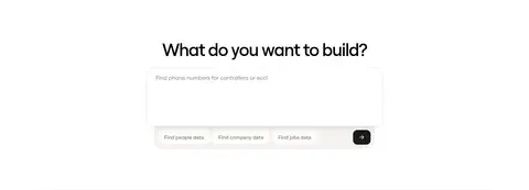
| 4 | contact | Centered prompt above a compact input area and suggestion controls. | free-form query, suggested prompts, submit action | minimal input, centered title, compact option row |
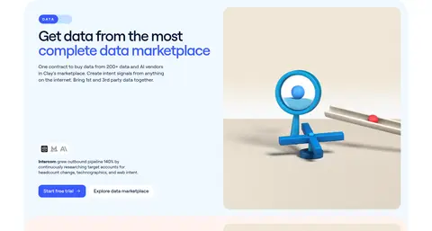
| 5 | feature-split | Pale blue split panel with explanatory content beside rounded 3D product art. | feature explanation, trial CTA, marketplace link | Mist Blue panel, eyebrow label, rounded media |
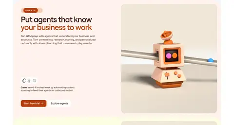
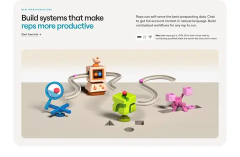
| 6 | feature-split | Warm pale panel with copy and an expressive agent illustration side by side. | feature explanation, agent discovery, trial CTA | warm accent tint, split layout, 3D robot artwork |
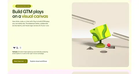
| 7 | feature-split | Yellow-green split panel pairing workflow copy and a playful 3D scene. | workflow explanation, trial CTA, visual workflow link | Pistachio Haze surface, category eyebrow, rounded 3D media |
| 8 | feature-split | Pale pink split panel with activation copy, links, and colorful 3D artwork. | activation explanation, trial CTA, learn-more link | Petal Tint surface, eyebrow label, bright 3D illustration |
| 9 | product-showcase | Large light panel with headline and support copy above wide workflow artwork. | start-trial link, capability overview | rounded showcase, large 3D workflow scene, two-column intro |
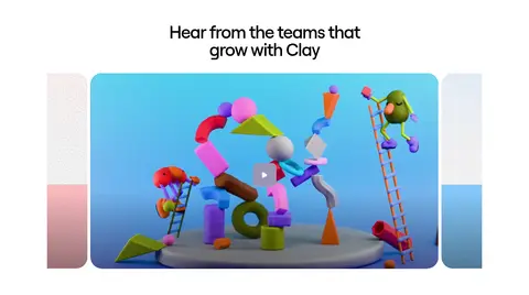
| 10 | testimonials | Centered section title above a prominent customer video and adjacent media. | customer stories, video playback, case-study links | video thumbnail, rounded media, centered heading |
| 11 | content-feed | Centered introduction followed by a varied grid of event, learning, and community cards. | resource discovery, event tickets, community stories | mixed card sizes, image-led tiles, compact text links |
| 12 | footer | Centered final CTA above 3D landscape, with rounded multi-column footer over the scene. | final free-trial CTA, demo CTA, site navigation | colorful 3D landscape, light footer surface, multi-column links |
## Source CSS custom properties (selected)
```css
--loam---web-library_color---neutral--black<deleted|variable-c36ac7e1-8fbe-02c8-b299-0725f37835b2>: