North star · Keep the page editorial and spacious, using quiet warm neutrals for structure and pastel product visuals for moments of color.
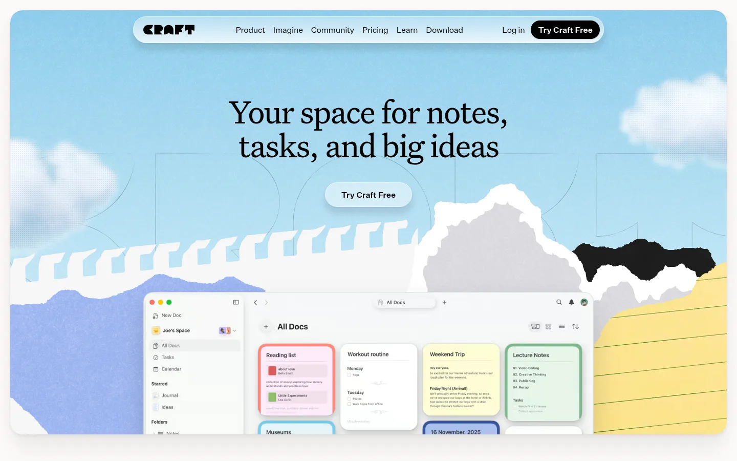
Craft’s visual strategy balances an understated editorial foundation with expressive product imagery. The warm canvas (#fcf9f7) carries most of the page, while near-black (#030302) anchors headings, navigation, primary actions, and the closing footer. Large, regular-weight serif headlines give the page a literary tone; compact sans-serif navigation, body copy, and buttons keep the interface practical. The hero is an expansive illustrated scene with a floating product interface, followed by generous open intervals and centered statements. Feature stories use pastel blue, green, and yellow panels as backdrops for layered interface mockups rather than turning the whole page into colored bands. Portraits and testimonials add human proof between product sections. Cards are softly rounded and elevated with restrained shadows; thin gray rules provide quiet separation. Keep the overall canvas airy and calm, letting occasional saturated illustration details and dark CTA surfaces provide contrast.
Primary sans for body copy, navigation, and controls.
Aa 设计
apple-system
系统字体 · 字重 400 / 600 / 500 / 700 · 占比 28%
免费替代:Inter
System-ui captions, small labels, and interface details.
Aa 设计
UntitledSerifFont
网络字体 · 字重 400 · 占比 26%
免费替代:Source Serif 4
Display headlines, section titles, and editorial testimonial quotes.
角色
示例
字号
字重
行高
字距
特大标题
Hero headline and largest editorial statements.
Craft
66px
400
1
-0.03em
一级标题
Primary page headline in the hero.
Craft
54px
400
1.1
-0.02em
二级标题
Major feature and pricing section headings.
Craft
46px
400
1.22
-0.03em
三级标题
Secondary feature and content headings.
Craft
36px
400
1.22
-0.03em
四级标题
Smaller editorial headings and card titles.
Craft
32px
400
1.5
-0.04em
正文
Feature descriptions, explanatory copy, and navigation.
The quick brown fox 敏捷的狐狸
16px
400
1.4
-0.02em
辅助文字
Compact labels, supporting metadata, and testimonial attribution.
The quick brown fox 敏捷的狐狸
15px
400
1.5
-0.11em
按钮
CTA labels and interactive control text.
The quick brown fox 敏捷的狐狸
14px
500
1.43
0
导航
Top-level links in the floating navigation bar.
The quick brown fox 敏捷的狐狸
16px
400
1.4
-0.02em
间距与布局
基准单位 8px · 密度:适中
48px版块间距
8px元素间距
24px卡片内边距
1400px内容最大宽度
2px
3px
4px
5px
6px
8px
10px
12px
16px
20px
24px
32px
40px
48px
60px
Use a centered composition within the measured 1400px maximum page width. The hero is a broad, rounded visual stage with centered headline and CTA above a large app preview. Below, alternate centered editorial headings with wide feature panels, portraits, testimonials, and smaller feature cards. Preserve the measured comfortable density, 48px section gap, and 8px element gap as the spacing system; do not compress the long scroll into a dense dashboard. Finish with pricing, a prominent CTA, and a multi-column footer.
圆角与层次
按钮 · 14px
卡片 · 24px
图片 · 14px
徽标 · 4px
导航 · 9999px
链接 · 9999px
xl · card, section, link
md · media
md · link, nav, button
md · other
Use soft, broad shadows to lift hero media, feature panels, and floating cards from the warm canvas. Rounded card edges and subtle hairlines define components without heavy outlines. The navigation and CTA may feel gently elevated, while the footer remains a flat, near-black block.
组件
下面的预览按实测的按钮、输入框、徽标、卡片样式重建(字体用替代字体)。
Floating navigation
Pill-shaped light navigation centered over the hero, with the Craft mark, compact links, and a dark rounded Try Craft Free action.
Hero stage
Large rounded illustrated scene with centered serif headline, a light CTA, and a desktop product preview layered across its lower area.
Pastel feature panel
Wide rounded panel in blue, green, or yellow, pairing explanatory copy and a small CTA with overlapping app-interface mockups.
Testimonial quote
Editorial italic serif quote with a compact person label, small portrait or avatar, and generous surrounding whitespace.
Pricing cards
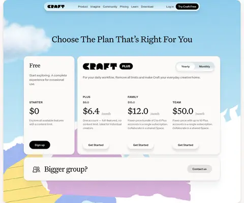
Side-by-side light and near-black subscription cards with serif pricing copy and pill-shaped action buttons.
Footer directory
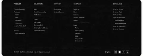
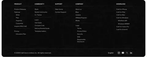
Near-black footer organized into several narrow link columns, with a fine divider and compact legal and social details.
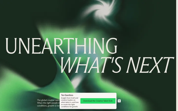
Imagery · The page relies on illustrated product scenes and screenshots rather than generic stock imagery. The hero combines a layered paper-cut landscape with an oversized desktop app preview; feature panels show interface cards against pastel backdrops. Small portrait photography supports user stories, while award icons and social tiles add brief visual accents. Keep mockups crisp and contained, with illustrations treated as localized color fields.
Use the warm canvas as the default page background.
Reserve serif typography for prominent editorial moments.
Use pastel panels behind product demonstrations, not as continuous page bands.
Keep primary actions dark, rounded, and visually distinct.
Give feature stories and testimonials generous breathing room.
Use soft shadows to lift media and cards subtly.
✕ 不该做
Do not turn the page into a dense application dashboard.
Do not use saturated accent colors as full-page backgrounds.
Do not replace the editorial serif headlines with heavy bold sans-serif.
Do not add strong outlines where hairlines or shadows suffice.
Do not let decorative mockup colors define the global palette.
Do not crowd the hero headline, CTA, and product preview together.
给 AI 的提示词
想快速出一个同风格的新页面,把这段话连同 DESIGN.md 一起发给 AI。
Build a new page in Craft’s calm editorial style. Use Warm Canvas (#fcf9f7) as the broad background and Soft Ink (#030302) for headings, navigation, and primary actions. Set large headlines in a regular serif similar to Source Serif 4, then use a clean sans such as Inter for body copy and controls. Create a spacious hero with a centered headline and CTA above a layered product illustration. Organize the page into generous feature stories with interface mockups on localized Periwinkle Wash (#b8caf5), Craft Green (#9bd8a9), or Butter Yellow (#fde99b) panels. Use Paper White (#ffffff) for card interiors, Quiet Rule (#e1e1e1) for subtle boundaries, and restrained soft shadows for depth. Include editorial quotes, clear pricing cards, and a structured dark footer. Prioritize whitespace and product clarity over decoration.