North star · Keep the canvas quiet and spacious; reserve vivid blue-violet gradients for product storytelling and let black typography lead.
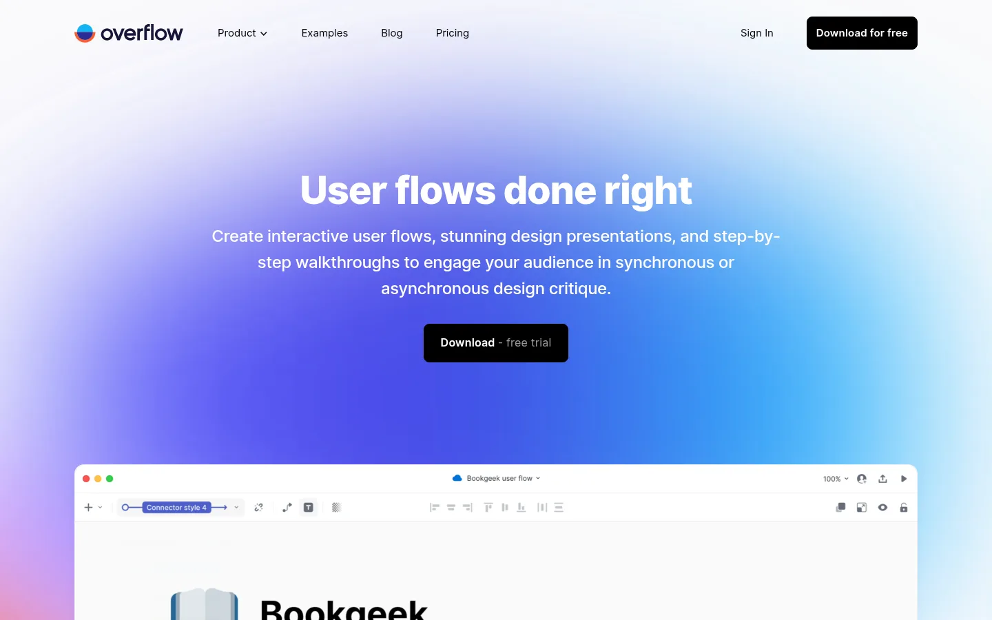
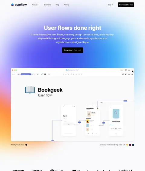
The page is built on a near-white #fafafc canvas, with black text providing strong contrast and pale gray #f2f2f4 reserved for occasional full-width section bands. Blue and violet gradients create the defining visual signature: the hero uses a broad, atmospheric wash behind its headline and product preview, while other gradients frame selected interface imagery. Keep these hues as highlights rather than turning every section into a saturated panel. Inter is used throughout, with heavy, tightly tracked display headings, readable regular-weight body copy, and compact navigation. The layout is spacious and centered around a measured 1224px maximum width, alternating centered showcases with left-aligned feature stories and multi-column content. Product screenshots and diagrams carry most of the visual detail; keep surrounding UI quiet. Black rounded CTAs, subtle card shadows, and generous section separation establish a clear hierarchy without decorative clutter.
配色
点色块复制色值。用途说明来自对页面的实测位置(背景、文字、描边、按钮)与截图判读。
强调色
表层色
中性色
功能色
页面底色 · Gallery Mist表层 · Soft Divider主文字 · Studio Ink次要文字 · Quiet Graphite弱文字 · Gallery Mist描边 · Soft Divider强调 · Violet Signal强调 2 · Link Blue强调 3 · Flow Blue
Site-wide typeface for display headings, body copy, navigation, buttons, and links.
角色
示例
字号
字重
行高
字距
特大标题
Large hero display headline.
Overflow
56px
800
1.14
-0.021em
一级标题
Primary page and major section headings.
Overflow
48px
800
1.16
-0.017em
二级标题
Feature and testimonial section headings.
Overflow
32px
700
1.25
-0.012em
三级标题
Feature-card and supporting content headings.
The quick brown fox 敏捷的狐狸
24px
500
1.58
-0.017em
四级标题
Smaller feature labels and nested headings.
The quick brown fox 敏捷的狐狸
20px
500
1.75
-0.012em
正文
Paragraphs explaining features and product benefits.
The quick brown fox 敏捷的狐狸
16px
400
1.75
0
辅助文字
Image notes, testimonial attribution, and small supporting labels.
The quick brown fox 敏捷的狐狸
14px
400
1.75
0
按钮
Primary download and secondary action labels.
The quick brown fox 敏捷的狐狸
16px
550
1
0.013em
导航
Header navigation links and footer navigation.
The quick brown fox 敏捷的狐狸
15px
400
1.75
0
链接
Prominent text links and testimonial names.
The quick brown fox 敏捷的狐狸
20px
700
1.2
-0.005em
间距与布局
基准单位 8px · 密度:宽松
156px版块间距
26px元素间距
—卡片内边距
1224px内容最大宽度
3px
8px
10px
12px
13px
15px
16px
19px
20px
24px
32px
40px
48px
60px
64px
156px
Use a centered content area with a measured maximum width of 1224px, surrounded by broad page margins. The hero centers its headline and copy over a large product preview; later sections alternate centered showcases, left-aligned feature stories, and multi-column grids. Section spacing is deliberately generous, with measured section rhythm of 156px. Keep the overall density spacious and let media create visual weight instead of filling empty areas with extra UI.
圆角与层次
按钮 · 8px
输入框 · 8px
卡片 · 24px
图片 · 12px
链接 · 22px
md · card
md · card
md · button
hairline · input
Most sections sit flat on the canvas, with no pervasive borders. White media cards use a 24px radius and soft measured shadows; selected product previews gain separation through gradient framing. Buttons are black, rounded, and visually solid, while input treatment remains minimal. Avoid stacking many elevated surfaces.
组件
下面的预览按实测的按钮、输入框、徽标、卡片样式重建(字体用替代字体)。
Top navigation
A compact black-text header with product links, sign-in, and a black download CTA; maintain clear separation from the light canvas.
Hero and product preview
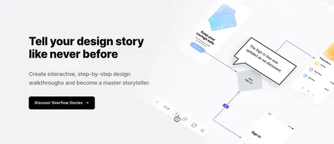
Centered display headline, supporting copy, and black trial CTA sit over a broad blue-violet atmospheric gradient; a large rounded product screenshot anchors the lower hero.
Showcase card
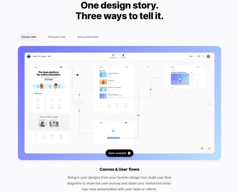
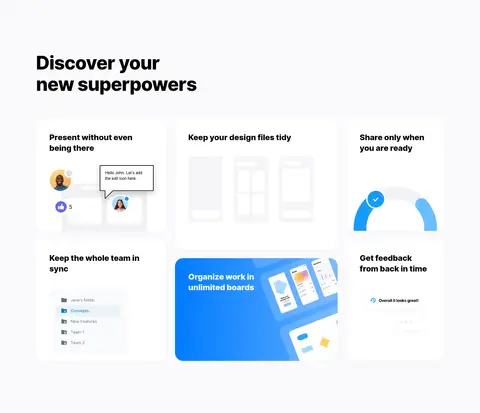
White product-media card with a 24px radius and subtle shadow; selected examples receive a blue-violet gradient frame.
Primary button
Black fill, white label, 8px radius, and measured 16px medium-weight Inter text; use for download actions.
Feature story
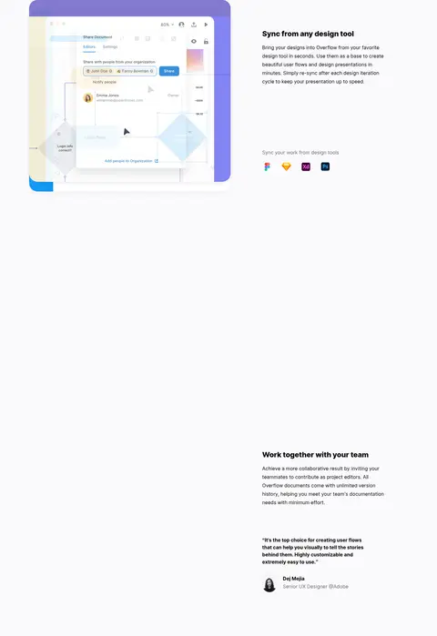
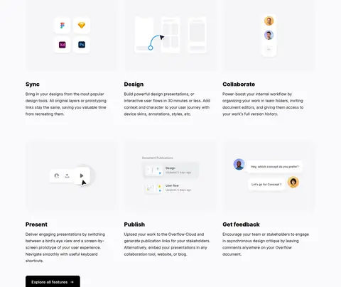
Pair an interface screenshot or illustration with a concise heading and explanatory copy; alternate media and text placement across rows.
Testimonial
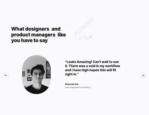
Combine a short bold quote with a portrait and understated name and role attribution; keep the surrounding section spacious.
Footer
White footer with grouped text links, muted supporting copy, and the Overflow mark; keep the navigation compact and orderly.
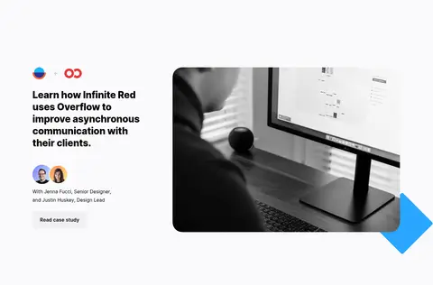
Imagery · Use product interface screenshots, user-flow diagrams, and feature illustrations as the primary imagery. Frame selected previews with soft blue-to-violet gradients or rounded white cards, leaving the surrounding canvas uncluttered. Testimonials include small portrait images, while the case-study area uses a restrained monochrome workspace photograph. Treat embedded artwork as product content, not as a source for new brand colors.
Reserve blue-violet gradients for hero and product media.
Give major content groups generous separation.
Let real product screenshots explain the interface.
Use rounded white cards with restrained shadows.
Keep primary actions black with white labels.
✕ 不该做
Do not turn every section into a saturated gradient panel.
Do not introduce colors outside the measured palette.
Do not crowd the layout with extra decorative elements.
Do not use heavy borders around every card.
Do not let product mockup colors redefine the brand palette.
Do not center every feature section; retain alignment variation.
给 AI 的提示词
想快速出一个同风格的新页面,把这段话连同 DESIGN.md 一起发给 AI。
Build a new Overflow-style page on a #fafafc canvas with Inter typography and generous section spacing. Use Studio Ink (#000000) for strong headings, navigation, and primary buttons; use Quiet Graphite (#666666) for secondary copy. Set a broad, calm hero with a vivid but localized gradient from Violet Signal (#7272fb) to Cloud Blue (#b8e1ff), then anchor it with a large, rounded product-interface preview. Use Soft Divider (#f2f2f4) only for subtle section bands. Alternate centered showcases with left-aligned feature splits and multi-column grids. Keep product screenshots and diagrams prominent, while surrounding UI stays sparse. Use white cards with restrained shadows and rounded corners, black CTAs, concise supporting copy, and a compact footer. Treat colors inside mockups as illustration detail, not site chrome.