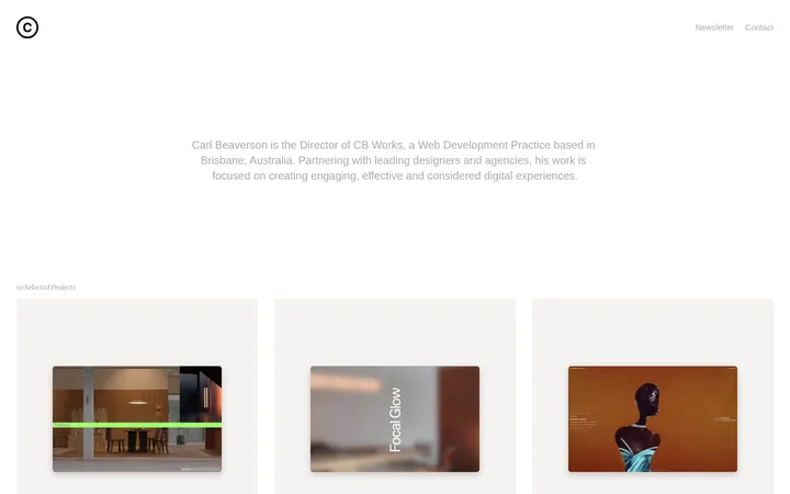
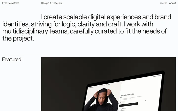
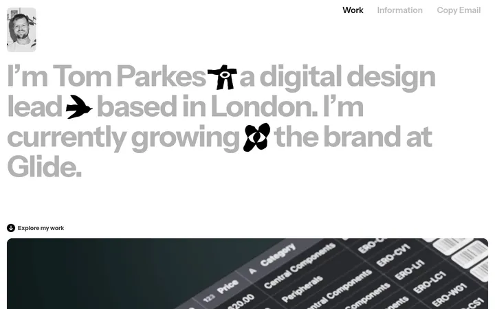
North star · Treat the portfolio as a calm, architectural index: use warm neutral planes, precise outlines, and consistent column alignment to foreground the work.
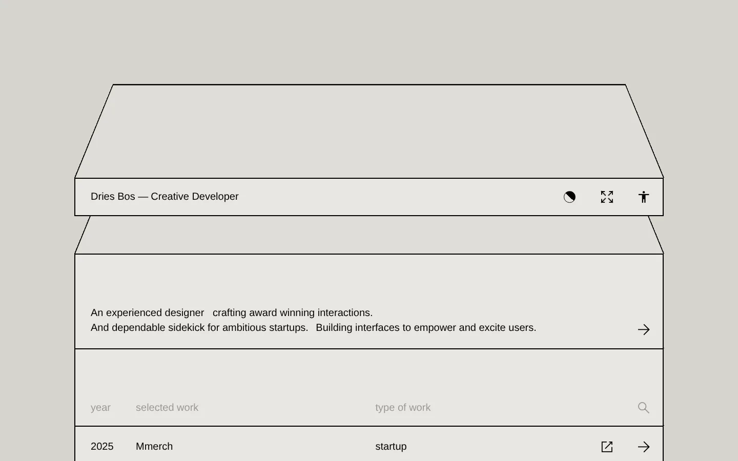
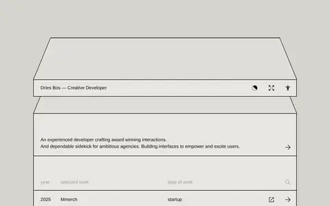
The page is built from a warm, muted neutral palette: a gray-beige canvas frames slightly lighter panels, while near-black text and rules provide the strongest contrast. These colors are functional rather than decorative; they distinguish the page background from the enclosed work index and make every row boundary legible. Sohne Buch supplies the main interface and body text in a consistent, unembellished sans-serif voice. The composition resembles a precise architectural object: an outlined, perspective-like top form leads into a rectangular content frame, followed by an introductory statement, filter labels, and a dense sequence of project rows. Alignment is strict and repeated across year, project, work type, and action columns. Generous breathing room around the introductory copy gives way to tighter row rhythm below. Imagery is not the visual driver in the supplied view; the portfolio’s structure, typography, and linework carry the identity.
配色
点色块复制色值。用途说明来自对页面的实测位置(背景、文字、描边、按钮)与截图判读。
品牌色
表层色
中性色
功能色
页面底色 · Warm Canvas表层 · Panel Chalk表层 2 · Soft Stone主文字 · Near Ink描边 · Near Ink
Primary interface, project list, navigation, and introductory copy
角色
示例
字号
字重
行高
字距
正文
Introductory statement, project names, navigation, and work-index text.
The quick brown fox 敏捷的狐狸
20px
400
1.45
0
辅助文字
Small secondary labels and compact metadata.
The quick brown fox 敏捷的狐狸
13px
400
1
0
间距与布局
基准单位 1px · 密度:适中
75px版块间距
6px元素间距
—卡片内边距
—内容最大宽度
6px
13px
20px
25px
30px
A centered, outlined content frame sits within a broad canvas, with a shallow perspective-like top shape leading into the interface. The page uses a consistent column system for year, selected work, work type, and row actions. Introductory copy occupies a more open band; below it, the project index becomes tightly stacked and highly repetitive. Keep edges aligned, preserve clear outer margins, and avoid adding unsupported width or spacing values.
圆角与层次
没有测到阴影:页面是扁平的,层次靠底色和描边区分。
The interface is predominantly flat, with no measured shadows. Thin, dark outlines create separation and a crisp, diagram-like structure; repeated horizontal rules divide the project rows. Layering comes from the framed panels and perspective-like top outline, not from shadows, rounded cards, or glossy effects.
组件
下面的预览按实测的按钮、输入框、徽标、卡片样式重建(字体用替代字体)。
Outlined identity bar
A pale horizontal panel sits within the larger outline, with the name at left and compact utility icons aligned at right.
Introductory statement
A short two-line introduction occupies an open band, with a right-aligned arrow acting as the forward cue.
Project index header
Muted labels identify year, selected work, and work type; a search icon closes the row.
Project rows
Repeated pale rows align year, project title, category, and compact external-link or arrow actions; dark hairlines divide entries.
Footer index
A restrained closing panel groups work and about links with contact and social destinations, plus a return-to-top arrow.
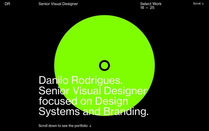
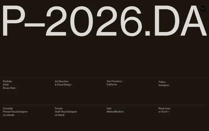
Imagery · The supplied page view relies on interface structure rather than photography or decorative illustration. Its most distinctive visual is the outlined, perspective-like form above the content frame, which reads as a simple geometric construction. Keep project imagery subordinate to the list-based identity when creating a new page; avoid introducing colorful stock photography, gradients, or ornamental illustrations that compete with the restrained palette.
Use the warm gray canvas around clearly framed content.
Keep text and structural rules near-black and high contrast.
Align project metadata into consistent columns.
Use repeated horizontal dividers to organize long indexes.
Reserve muted gray for secondary labels.
Keep the hierarchy typographic and restrained.
✕ 不该做
Do not introduce bright accent colors or gradients.
Do not add shadows to flat panels.
Do not round the square-cornered outlines.
Do not scatter project metadata outside its columns.
Do not let decorative imagery overwhelm the work index.
Do not turn every row into an elevated card.
给 AI 的提示词
想快速出一个同风格的新页面,把这段话连同 DESIGN.md 一起发给 AI。
Build a new portfolio page in Dries Bos’s quiet, architectural style. Use Warm Canvas (#d6d4cd) as the surrounding ground, Panel Chalk (#e8e7e3) for the main framed surface, and Near Ink (#050200) for text and crisp outlines. Use Soft Stone (#dfddd8) only for secondary tonal separation and Quiet Gray (#999794) for subdued metadata. Set the interface in Sohne Buch or a close sans-serif alternative such as Inter, with neutral tracking and regular-weight text. Organize content into a centered outlined frame with a clear introduction followed by a precise multi-column index. Separate repeated entries with rules, keep corners square, and avoid shadows, gradients, bright accents, and decorative imagery. Maintain spacious framing and compact, orderly content.