North star · Keep the warm canvas and thin rules quiet so oversized, pixel-notched typography carries the identity.
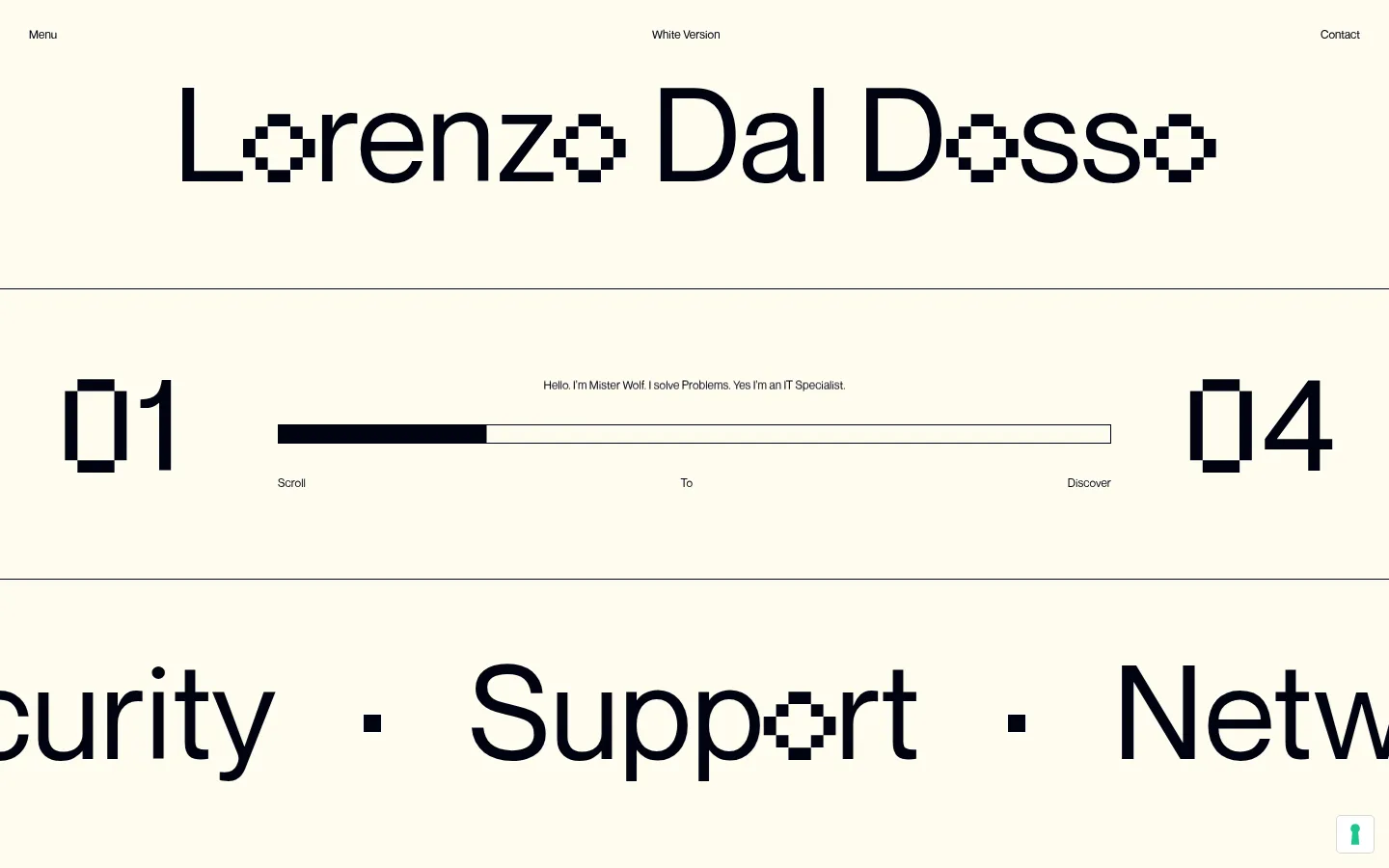
The page uses a warm off-white canvas (#fffcf0) as a nearly continuous background, giving its large, near-black typography (#000310) room to dominate. A hairline gray (#595959) divider separates the masthead, introductory progress panel, and oversized service marquee without introducing card-like blocks. The wordmark and service names are the main visual assets: custom-looking geometric lettering is interrupted by checkerboard or pixel-cut details, while the rest of the interface stays quiet and legible. Small navigation labels sit at the top edge, with the large centered name below them. The hero’s numbered endpoints and thin progress track create a structured, horizontal composition. Typography is deliberately contrast-led: extremely large display text against tiny utility labels. Spacing feels open and section-based rather than modular; content spans broadly across the viewport, and the marquee is visibly cropped at the edges. There is no prominent photography or decorative color system.
Oversized display wordmark, service marquee, and large hero numerals.
Aa 设计
NeueMontreal-Regular
网络字体 · 字重 400 · 占比 31%
免费替代:Inter
Small navigation labels and compact captions.
Aa 设计
-apple-system
系统字体 · 字重 700 · 占比 23%
免费替代:Inter
Bold body copy, small buttons, and compact link or privacy-control text.
角色
示例
字号
字重
行高
字距
特大标题
Oversized name, service words, and prominent hero numerals.
Lorenzo Dal Dosso
135px
400
2.22
0
正文
Short introductory statement and compact explanatory text.
The quick brown fox 敏捷的狐狸
14px
700
2.71
0
辅助文字
Small supporting labels and secondary interface copy.
The quick brown fox 敏捷的狐狸
12px
400
1
0
按钮
Compact consent or utility controls.
The quick brown fox 敏捷的狐狸
10px
700
1
0
导航
Top-edge navigation and version labels.
The quick brown fox 敏捷的狐狸
12px
400
1
0
链接
Small utility links and interactive text.
The quick brown fox 敏捷的狐狸
10px
700
1
0
间距与布局
基准单位 2px · 密度:适中
58px版块间距
3px元素间距
—卡片内边距
864px内容最大宽度
3px
5px
10px
15px
16px
30px
35px
58px
A broad, centered composition organized into horizontal bands, with a measured page maximum width of 864px. The masthead places tiny navigation at the upper edge and a large centered wordmark beneath it. Thin rules divide the title area from the introduction/progress strip and the service marquee. The hero uses widely separated numbered endpoints around a central progress line and short caption. Large marquee lettering runs beyond the viewport edges, while small utility text remains sparse. Comfortable spacing and low content density keep the typographic elements prominent.
圆角与层次
按钮 · 4px
hairline · button
The page is predominantly flat, with no card stack or visible depth effects. Thin gray rules provide the main separation between content bands, while the progress track is outlined rather than raised. A subtle hairline shadow is measured on a small consent control only; do not use broad shadows or layered panels.
组件
下面的预览按实测的按钮、输入框、徽标、卡片样式重建(字体用替代字体)。
Top navigation
Tiny utility labels sit at the left, center, and right edges of the masthead, including menu, version, and contact links.
Oversized wordmark
A large centered name dominates the first band; selected letters contain pixel-like checkerboard cutouts.
Progress introduction
A short centered statement sits above a thin outlined horizontal track, with large numbered markers at opposite ends.
Section dividers
Fine gray horizontal rules separate the masthead, progress area, and service marquee without enclosing content in cards.
Service marquee
Large black service words run horizontally across the canvas, separated by centered dots and clipped at viewport edges.
Privacy utility
Small consent and privacy controls appear near the lower portion of the page, remaining visually secondary.
Imagery · No photography, product imagery, or illustration is visible in the measured first viewport. The visual interest comes from typographic forms and the checkerboard-like cutouts integrated into the logo and service words. Keep the presentation flat and graphic; avoid adding decorative images or mockups that would compete with the wordmark and scrolling service text.
Let #000310 oversized typography lead the composition.
Separate major horizontal bands with thin #595959 rules.
Keep navigation and utility labels very small and unobtrusive.
Use pixel-cut details sparingly within prominent lettering.
Allow the service marquee to extend and crop beyond viewport edges.
✕ 不该做
Do not add bright accent colors or gradients.
Do not turn the layout into a card grid.
Do not add prominent photography or decorative illustrations.
Do not use heavy shadows or layered panels.
Do not crowd the open space with explanatory copy.
Do not make utility controls compete with the wordmark.
给 AI 的提示词
想快速出一个同风格的新页面,把这段话连同 DESIGN.md 一起发给 AI。
Build a new portfolio page in Lorenzo Dal Dosso’s restrained typographic style. Use Gallery Ivory (#fffcf0) as the page canvas and Midnight Ink (#000310) for the main wordmark, headings, and oversized display text. Reserve Soft Graphite (#595959) for muted labels and thin horizontal dividers; keep Paper White (#ffffff) and Pure Black (#000000) confined to small utility controls. Organize content as broad horizontal bands with generous breathing room, tiny edge-aligned navigation, a centered oversized title, and a compact progress or introductory strip. Use large, regular geometric sans-serif display lettering and small quiet utility text. Add subtle pixel-cut typographic details only where they reinforce the identity. Keep the page flat, avoid prominent imagery, cards, gradients, and heavy shadows, and let large marquee text crop at the viewport edges.